Choose the grid
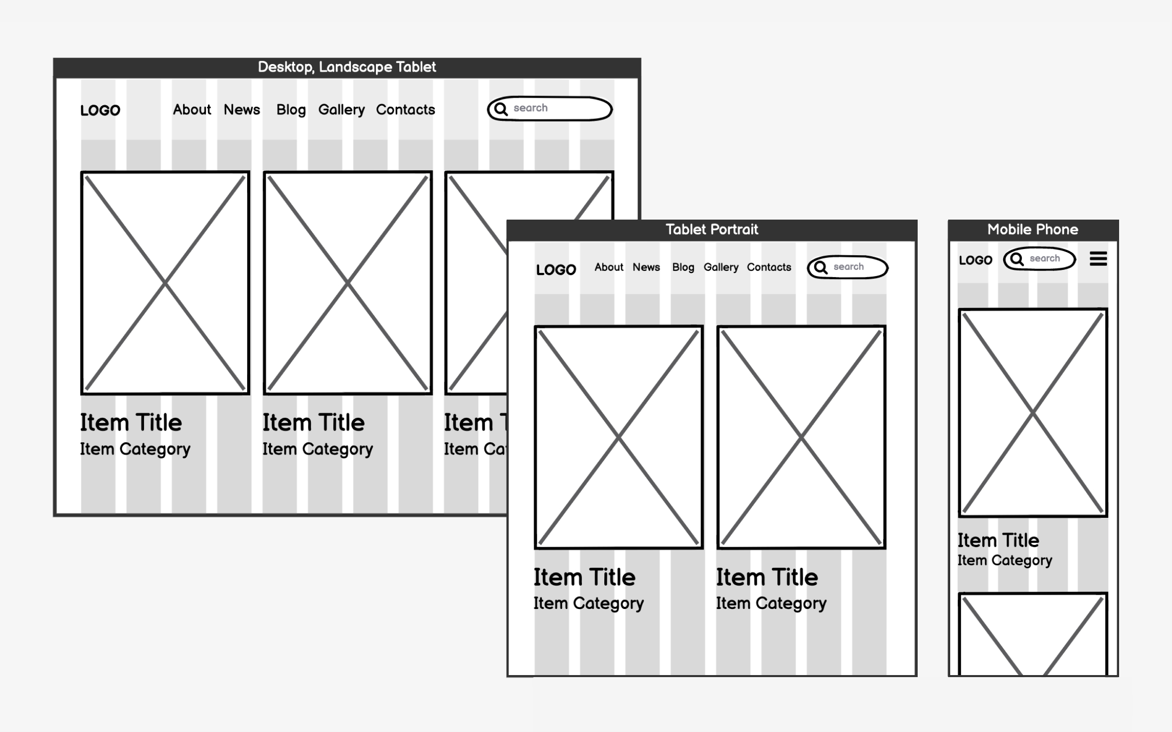
Grids are the invisible structure that keeps your content organized as screens change size. Imagine laying out photos on a table — on a large table, you might arrange them 4 across. On a smaller table, you'd reorganize to 3 or 2 across. On a tiny table, you'd stack them. Grids help websites do this automatically.
The 12-column grid has become the industry standard because it's mathematically flexible. You can divide 12 evenly by 2, 3, 4, or 6, giving you many layout options. A product gallery might use 4 columns (showing 3 products per row), while a blog might use 3 columns (main content plus a sidebar). On mobile, everything typically stacks into 1 column.
Each column has a set width (usually 60-80 pixels) with gaps between them called gutters. As screens shrink, columns drop off or stack vertically. This creates a predictable system where designers and developers speak the same language about layouts.
