Step 6: Use design patterns
Familiarity drives good mobile UX. Users bring expectations from every app they've used before. Both iOS and Android have established design patterns that users instinctively understand, and leveraging these patterns reduces the learning curve for your app.[1]
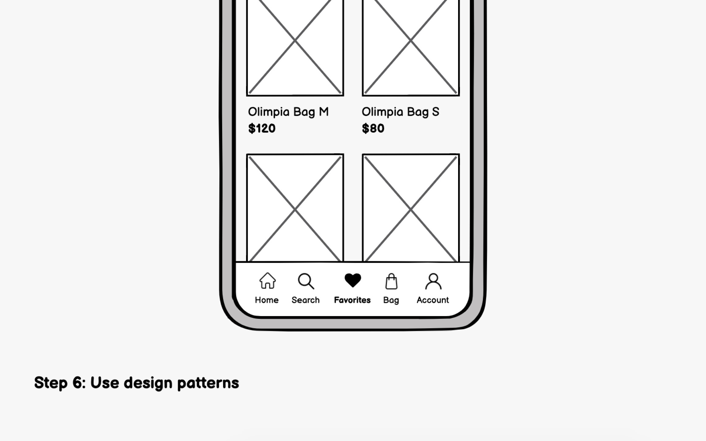
Some examples of iOS patterns (Human Interface Guidelines) include:
- Bottom tab bar for primary navigation, limited to 5 items maximum
- Swipe from left edge to go back, a system-wide gesture users expect everywhere
- Large titles that shrink on scroll, creating clear hierarchy
Some examples of Android patterns (Material Design) include:
- Bottom navigation bar for top-level destinations, also limited to 3-5 items
- Floating Action Button (FAB) for the single most important action on a screen
- Top app bar with contextual actions that change based on screen content
Pro Tip: Download top apps on both iOS and Android to feel the pattern differences firsthand.
Top contributors