Step 8: Ensure your content scales well
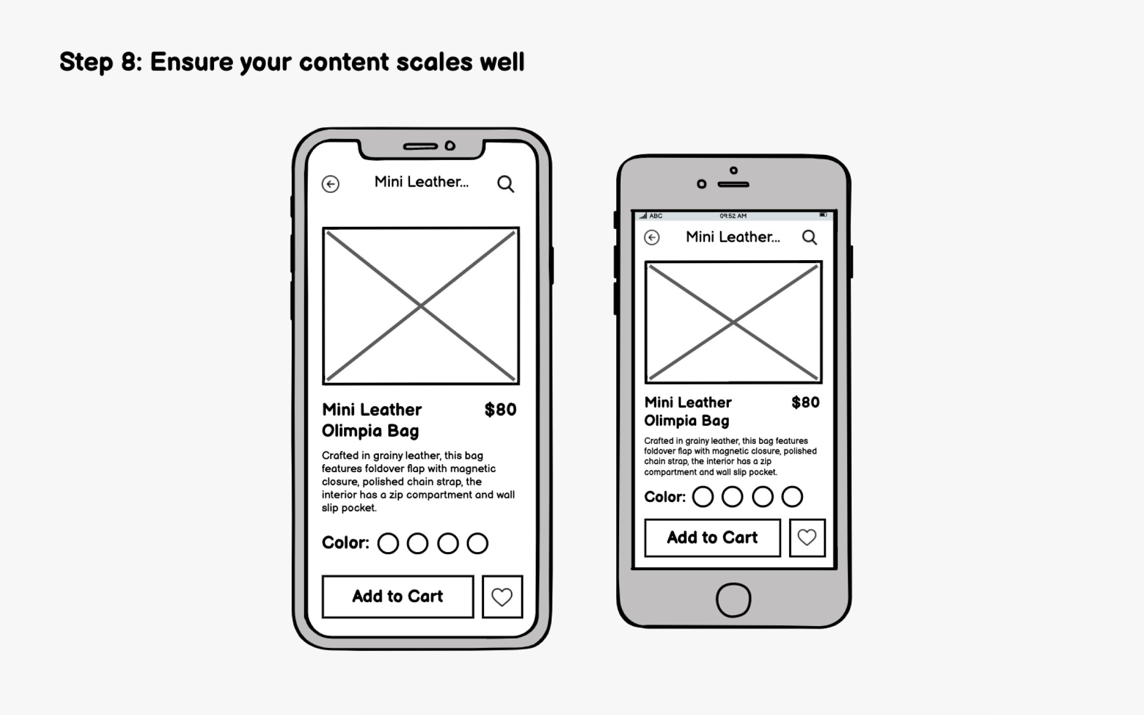
A wireframe that looks perfect on one device may break on others. After adding real content, test how your design adapts across different screen sizes and orientations.
Mobile screens vary significantly. Beyond width, aspect ratios differ too, with some phones offering nearly square displays while others stretch tall and narrow.
Check your wireframes against:
- Smaller screens: Does essential content still fit? Are tap targets large enough?
- Larger screens: Does the layout use extra space well, or does it feel stretched?
- Different aspect ratios: Does vertical content still make sense on shorter, wider screens?
If you're supporting both portrait and landscape (common for media apps), wireframe both orientations. Content may need to reflow entirely, with side-by-side layouts in landscape collapsing to stacked layouts in portrait.
