iOS vs. Android modals
Designing mobile modals involves understanding nuances between Android and iOS, but the core best practices remain similar across platforms.
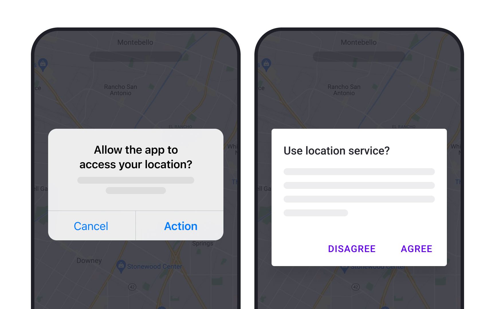
In Android, these are known as dialogs, featuring optional titles, content, and buttons. Roboto is the preferred typeface, and button labels are usually all caps. Solid dividers between buttons are avoided.[1]
On iOS, they're called alerts. They have a title, optional content, and buttons, using the San Francisco typeface. The primary button is slightly bolder, and dividers separate content and buttons.[2]
Understanding these subtle differences helps designers create modals that are both effective and consistent, no matter the operating system.