Lightbox
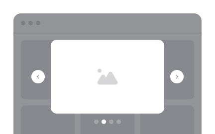
A lightbox is a design pattern that displays images or videos, in an overlay on top of the current page, focusing user attention without leaving the context.


TL;DR
- Overlay that highlights images or media.
- Keeps users on the same page context.
- Reduces distraction by dimming background.
- Common in galleries, portfolios, and e-commerce.
Definition
A lightbox is an interface element that opens media or content in a modal-style overlay, dimming the background while allowing users to interact with the content without navigating away from the page.
Detailed Overview
Lightboxes are one of the most recognizable interaction patterns on the web. They are commonly used to showcase images, videos, or product details in a way that captures attention while preserving the user’s place in the overall experience. The background dims to reduce visual noise, while the media itself appears in a centered frame, often with navigation controls.
A common question is why lightboxes are used instead of opening media on a new page. The answer lies in continuity. Opening a new page forces users to break their flow, while lightboxes keep the context intact. For example, in a product gallery, clicking a thumbnail opens a larger image without taking the user away from the shopping page. This design reduces friction and helps maintain engagement.
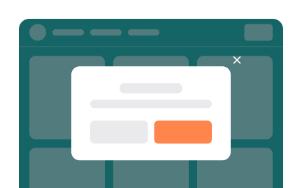
Another recurring question concerns best practices for usability. Lightboxes should be easy to open and close, support keyboard navigation, and provide clear exit points such as an “X” icon or clicking outside the overlay. Poorly designed lightboxes trap users, creating frustration. Designers must ensure that interactions feel intuitive and predictable, especially for less experienced users.
Accessibility is often raised as a challenge. Screen readers and keyboard users can struggle with poorly implemented lightboxes. Focus management is essential: when the lightbox opens, focus should shift inside it, and when closed, return to the original trigger. Proper ARIA labels and roles ensure assistive technologies can interpret the overlay correctly.
Performance is another consideration. Lightboxes should load quickly and scale for different devices. On mobile, where space is limited, overlays must adapt to smaller screens, often taking up the full viewport rather than floating in the center. Responsive design ensures that the experience remains smooth across devices.
Learn more about this in the Lightbox Exercise, taken from the Imagine Terminology Lesson, a part of the UX Design Foundations Course.
A lightbox provides an overlay for viewing media without leaving the page. This keeps users in context, making it easier to explore galleries or product details without losing their place.
By dimming the background and focusing attention, it reduces distraction while preserving continuity in the user journey.
Opening media in a new page interrupts the flow, while a lightbox lets users interact quickly and then return seamlessly. For example, browsing product images in an e-commerce store feels faster and more natural in a lightbox than on multiple standalone pages.
This pattern shortens the user journey and reduces unnecessary clicks, leading to higher engagement.
They should be easy to close, support multiple input methods, and avoid trapping users. Clear visual cues, such as a close icon, clickable background, and swipe gestures on mobile, make interactions intuitive.
Testing with real users ensures the overlay feels like an enhancement, not an obstacle.
Accessibility requires proper focus management, ARIA attributes, and keyboard support. When a lightbox opens, focus should shift to it, and when it closes, return to the original element. Without these adjustments, screen reader and keyboard users may be unable to interact effectively.
Inclusive implementation ensures the overlay is usable for all audiences, not just those on a mouse-and-screen setup.
No. Lightboxes work best for lightweight, focused content such as images or videos. For complex interactions, such as filling out detailed forms or completing multi-step tasks, a full page is often clearer.
Designers should weigh context before choosing a lightbox, ensuring it simplifies rather than complicates the experience.
Recommended resources
Courses

UX Design Foundations


UI Components I


Design Terminology