AI Chat Page

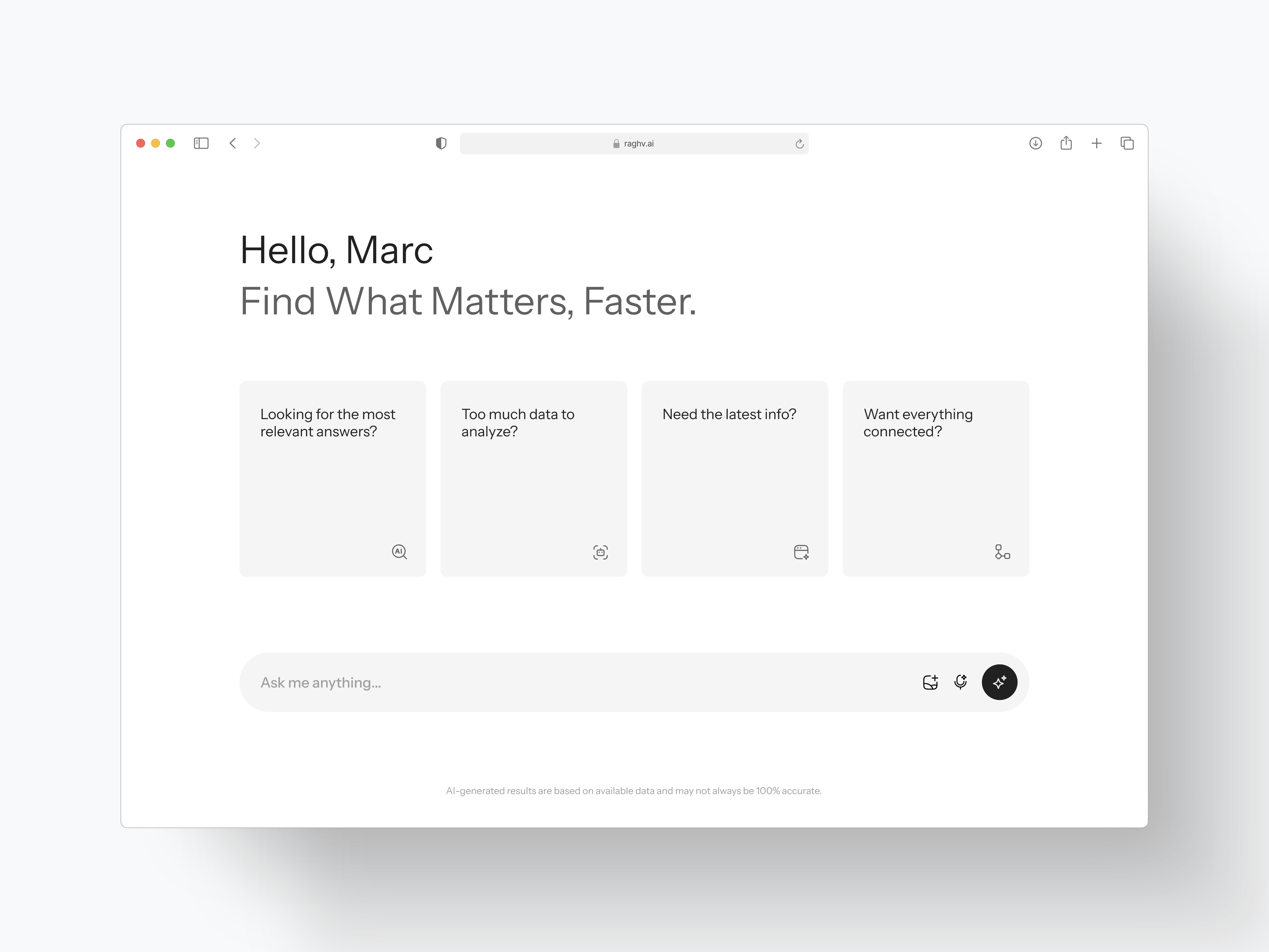
Meet your AI-powered assistant for smarter insights! This sleek, minimalistic dashboard design enhances data accessibility and streamlines decision-making. 🌟
Tools used
Topics
Share
Reviews
5 reviews

Hello Raghvendra! It has an excellent screen!
I like that it is very simple and suggests some actions.
I think for more understanding and association of elements, I would bring the icon closer to each question. On the other hand, I would include a more concrete example of what you may be asked, and it can be a concrete example according to each question. This would help to understand more accurately what is the goal of each card.
Even one of these cards could indicate that this IA offers more specific options about its usefulness. I would love to see more about this screen! Excellent exploration.

So neat!
I love the block with its own icon and the overall minimalistic approach. This might be a personal preference, but I need to zoom in a little to read the text in the block. I can read just fine from 60 cm away, but the text seems to need a breather by adding a few pixels in letter spacing. Other than that, it's a breeze!

Your AI Chat Page looks clean and easy to use
The minimal design makes the experience smooth, and the layout helps users focus on their tasks. A bit more contrast or visual hierarchy could improve readability.
Great job on making AI interaction simple and effective

Your UX design is really impressive and left many positive emotions. The elements in the interface are streamlined, helping users easily access and use. In particular, the arrangement of reasonable distance brings a sense of comfort when interacting. However, if this application is deployed in practice, I feel it will be a strong point if you add chat history. This not only helps users easily track information but also creates more cohesion in conversations. I look forward to receiving interesting updates from you in the future, to see the development and further development of the product. Please continue this wonderful work!
The design is clean, modern, and functional, with a strong focus on simplicity and usability. However, it could benefit from more unique branding, accessibility considerations, and dynamic elements to enhance user engagement. Expanding the design to include additional states and interactions would provide a more comprehensive view of its capabilities. Overall, it’s a solid foundation with room for refinement.
You might also like

Lumen — Accessible Signup Form


SONZ - Entertainment platform


Camp & Travel Explorer - App Design

Uxcel Halloween Icon Pack


Solar system Dashboard Utility


Color System

Popular Courses

Introduction to Figma


UX Writing


Common UX/UI Design Patterns & Flows