Interface Materials & Layers
Master the art of creating depth and hierarchy using Apple's materials and layering system.
Think of materials and layers as the building blocks that give depth to every screen you see on Apple devices. When you pull down a notification or peek into your control center, you see these materials in action — that subtle blur effect that makes your content feel like it's floating above the background. It's not just about making things look pretty though.
Each material, from the clear glass of a navigation bar to the frosted surface of an action sheet, has its own personality and purpose. The way these materials work together creates natural hierarchies that guide users through an interface. They shift and adapt as you move through an app, responding to your touches and gestures in ways that feel almost physical.
What's really clever is how these materials change between light and dark modes, or how they maintain their character across different devices. When designers understand this system of materials and layers, they can create interfaces that don't just look like they belong on Apple platforms — they feel like they do. It's a delicate balance of technical sophistication and natural behavior that makes Apple's interfaces both beautiful and intuitive to use.
Interface materials in iOS create relationships between
Materials work together to define how interface elements relate. From
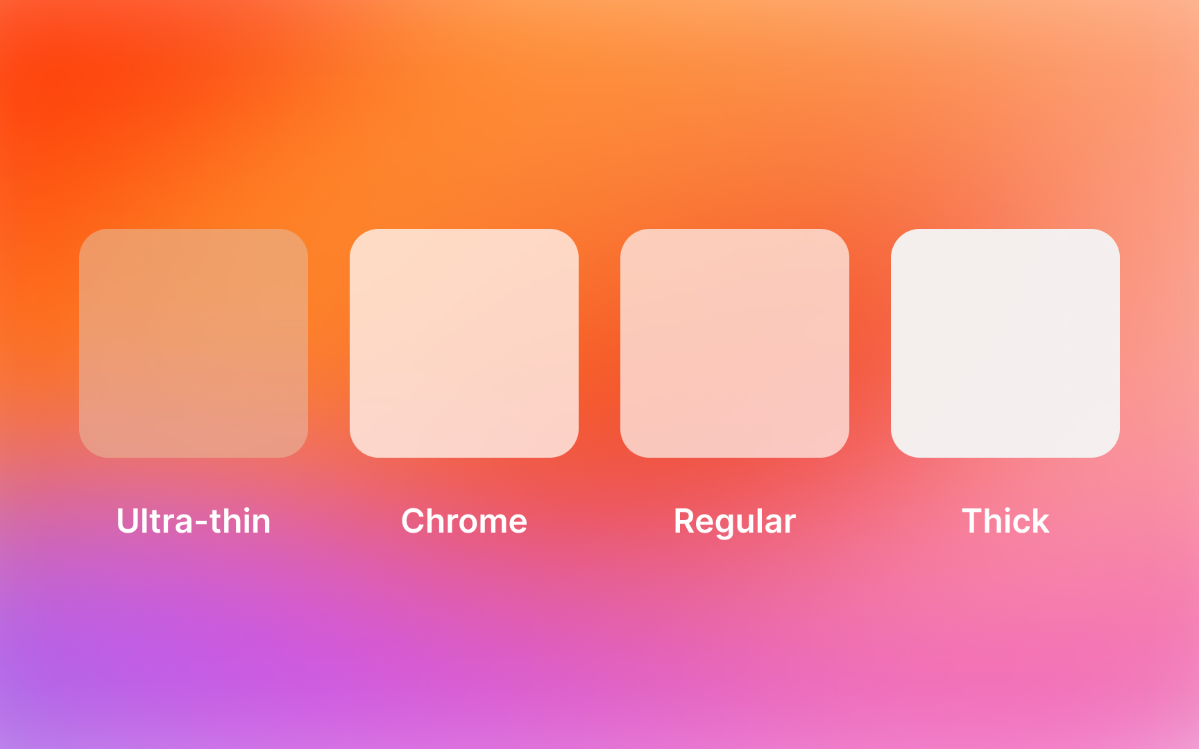
Core materials work in harmony: regular material provides the foundation, thin and ultra-thin create transitions, while chrome materials maintain orientation in navigation elements.
Essential relationships include:
- Upper layers using thicker materials for prominence
- Background elements employing ultra-thin for depth
- Navigation utilizing chrome for consistent wayfinding
- Content areas balancing regular and thin materials[1]
Each
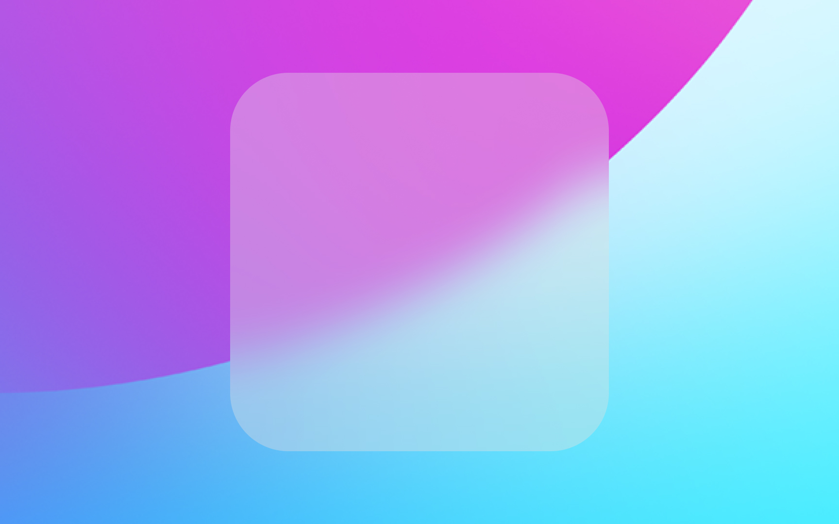
A material's properties determine its personality in the interface. Thick material maintains a strong presence with intense
Core properties include:
- Light transmission: how much underlying content shows through
- Blur intensity: degree of background content diffusion
- Vibrancy: how colors and contrast adapt to the background
- Motion response: behavior during scrolling and interaction
Material hierarchy in
Higher layers in the interface typically use thicker materials to draw attention, while lower layers use thinner materials to recede. Chrome material marks
Sequential layering follows specific patterns for clarity. Modal sheets use thick material to separate from the main interface, while background elements employ ultra-thin material to provide depth without distraction.
Key hierarchy patterns:
- Primary actions using thicker materials
- Secondary
content using regular materials - Supporting elements using thin materials
- Background using ultra-thin materials
Blur intensity directly impacts
Key blur characteristics:
- Intensity varies by material type
- Adapts to background content
- Changes with scrolling
motion - Maintains legibility across modes

Transparency in
The key to effective transparency lies in its contextual behavior. Materials adjust their transparency based on background content complexity and
System materials automatically balance transparency with vibrancy effects. When transparency increases, vibrancy adjusts to maintain optimal contrast for overlaying content, creating harmonious layering that works across different contexts and
Essential transparency considerations:
- Content legibility requirements
- Background complexity handling
- Light and dark mode adaptation
- Interactive state changes
Light mode materials create distinctive visual effects through their
In light mode, materials adjust their transparency and
Light mode considerations:
- Contrast ratios for text legibility
- Vibrancy adaptation to bright backgrounds
- Shadow subtlety and depth perception
- Material distinction preservation
In dark mode, materials adjust their transparency and vibrancy to preserve hierarchy. The system increases
Dark mode adaptations:
- Reduced transparency levels
- Adjusted
blur intensity - Modified vibrancy effects
- Refined
shadow treatment
VisionOS uses materials differently from
Unlike iOS materials, glass doesn't have separate dark and light modes. Instead, it adjusts itself to make sure content stays easy to read no matter what's in the background. Windows in visionOS also use other materials for specific needs: thin material for buttons, regular material for dividing sections, and thick material to stand out above other layers.
Key points about visionOS materials:
- Glass lets surroundings show through
- No dark or light modes needed
- Avoid blocking the view
- Use other materials sparingly
Pro Tip: Think of visionOS windows like real glass — they should let users stay aware of what's around them.
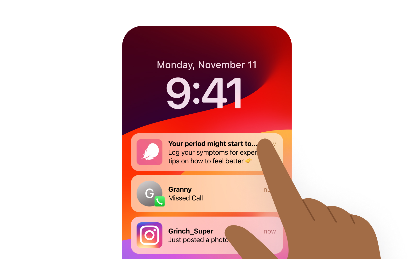
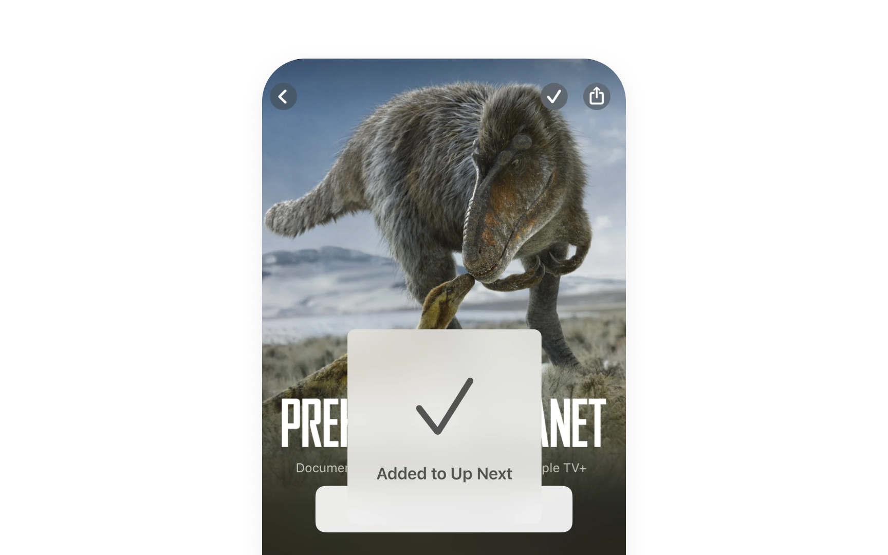
Materials in
In the Notification Center, this
Interactive states:
- Initial notification state
- Expanded preview state
- Dismissal transition
- Background dimming
References
- Materials | Apple Developer Documentation | Apple Developer Documentation
Top contributors

Topics
From Course

Images provided by

Share


Similar lessons

Intro to Design Layouts

Intro to Design Grids
