<?xml version="1.0" encoding="utf-8"?>

Element size refers to the physical or digital dimensions of components within a user interface, such as buttons, text fields, images, and icons. It plays a central role in determining usability, accessibility, and the overall aesthetic of a product. Proper sizing ensures that elements are both functional and visually balanced across different platforms and devices.

In UX design, element size influences how easily users can interact with a product. A button that is too small may frustrate users on mobile devices, while oversized elements can clutter a layout and reduce clarity. Guidelines such as Apple’s Human Interface Guidelines and Google’s Material Design provide recommended minimum sizes to make interactive elements easier to tap or click.

For product managers, element size becomes relevant when considering consistency, accessibility standards, and performance across the product. Oversized images or poorly scaled graphics can affect loading times and mobile responsiveness, which in turn impact user satisfaction and retention. Aligning teams on element dimensions ensures design consistency and technical efficiency.

Accessibility is another key factor. Users with motor impairments may struggle to hit small targets, while those with visual impairments benefit from larger, high-contrast text and controls. By following standards such as the Web Content Accessibility Guidelines (WCAG), teams create inclusive designs that support all users.

Real-world examples demonstrate its importance. Amazon optimizes the size of “Add to Cart” buttons to ensure quick and reliable actions across devices, improving conversions. Similarly, Apple’s iOS keyboards use carefully calculated key sizes that balance screen real estate with usability, a choice that directly impacts typing efficiency and user comfort.

Teams that neglect element size often face usability complaints and increased support costs. Balancing aesthetics with practicality creates interfaces that are functional, inclusive, and appealing. Continuous testing across devices helps refine dimensions to suit diverse contexts.

Learn more about this in the Dimensions Exercise, taken from the Anatomy of UI Components Lesson, a part of the UI Components I Course.

Key Takeaways

  • Element size shapes usability, accessibility, and layout clarity.
  • UX designers rely on sizing guidelines for consistent interactions.
  • Product managers link size decisions to performance and retention.
  • Accessibility requires thoughtful sizing for diverse user needs.
  • Real-world brands optimize element size to improve conversions.

Recommended resources

Courses

UX Design Foundations Course
Popular
Course

UX Design Foundations

Gene Kamenez
Gene Kamenez
Learn the essentials of UX design to build a strong foundation in core principles. Gain practical skills to support product development and create better user experiences.
Design Terminology Course
Course

Design Terminology

Alesya Dzenga
Alesya Dzenga
Learn UX terminology and key UX/UI terms that boost collaboration between designers, developers, and stakeholders for smoother, clearer communication.
UI Components I Course
Course

UI Components I

Colin Michael Pace
Colin Michael Pace
Learn to create user-friendly interfaces using core UI components, building a solid foundation for designing intuitive and efficient digital products.
Common Design Patterns Course
Course

Common Design Patterns

Gene Kamenez
Gene Kamenez
Learn design patterns most valued in product development to create intuitive, visually compelling experiences that seamlessly blend form and function.
Color Psychology Course
Course

Color Psychology

Cameron Chapman
Cameron Chapman
Learn how color influences perception, emotion, and behavior. Discover how to apply color psychology to design more impactful and engaging experiences.
Accessibility Foundations Course
Course

Accessibility Foundations

Ljubisa Kukulj
Ljubisa Kukulj
Learn the fundamentals of digital accessibility and how to create inclusive experiences for all users. Explore key principles, tools, and best practices.
Wireframing Course
Course

Wireframing

Colin Michael Pace
Colin Michael Pace
Learn to create effective wireframes that seamlessly integrate into your design workflows, improving communication and driving better design outcomes.
UI Components II Course
Course

UI Components II

Colin Michael Pace
Colin Michael Pace
Learn advanced techniques to design dynamic, scalable interfaces using optimized UI components and streamlined navigation for better user experiences.
Design Composition Course
Course

Design Composition

Gene Kamenez
Gene Kamenez
Learn the fundamental principles of visual layout, balance, and structure to create compelling and effective design compositions that engage and intrigue users.
Mobile Design Course
Course

Mobile Design

Denis Jeliazkov
Denis Jeliazkov
Learn mobile UI/UX patterns, workflows, and platform-specific strategies to create exceptional, user-friendly mobile experiences across different devices.
Typography Course
Course

Typography

Cameron Chapman
Cameron Chapman
Learn typography fundamentals, from typeface and font selection to layout and spatial arrangement, to create captivating designs that communicate powerfully.
UX Design Patterns with Checklist Design Course
Course

UX Design Patterns with Checklist Design

George Hatzis
George Hatzis
Learn common UX design patterns and how to apply them with practical checklists, ensuring the creation of intuitive, user-friendly, and exceptional interfaces.
HTML Foundations Course
Course

HTML Foundations

Yan Sokalau
Yan Sokalau
Learn the fundamentals of HTML, from basic formatting and structure to advanced elements and best practices, to create accessible and responsive web pages.
Enhancing UX Workflow with AI Course
Course

Enhancing UX Workflow with AI

Colin Michael Pace
Colin Michael Pace
Learn how to integrate AI into UX design to create smarter, more personalized user experiences. Explore tools, trends, and best practices in AI-driven design.
CSS Foundations Course
Course

CSS Foundations

Yan Sokalau
Yan Sokalau
Learn the basics of CSS, including the box model, element style, and content positioning, to improve communication, design handoff, and web decision-making.
Introduction to Figma Course
Course

Introduction to Figma

Gene Kamenez
Gene Kamenez
Learn essential Figma tools like layers, styling, typography, and images. Master the basics to create clean, user-friendly designs
3D Design Foundations Course
Course

3D Design Foundations

Learn essential 3D design principles, from spatial thinking and dimensional relationships to form, lighting, and texture, for a solid foundation in the field.
Information Architecture Course
Course

Information Architecture

Colin Michael Pace
Colin Michael Pace
Learn the basics of organizing, structuring, and labeling content to design clear, user-friendly information systems that enhance usability and navigation.
Apple Human Interface Guidelines Course
Course

Apple Human Interface Guidelines

Denis Jeliazkov
Denis Jeliazkov
Learn Apple’s Human Interface Guidelines to design modern, high-performing apps, focusing on UI principles and best practices for creating effective interfaces.
Introduction to Design Audits Course
Course

Introduction to Design Audits

Romina Kavcic
Romina Kavcic
Learn the art of systematic design evaluation to improve consistency, effectiveness, and create more user-centered products that meet user expectations.
Improve your UX & Product skills with interactive courses that actually work

FAQs

How do element size standards vary between platforms?

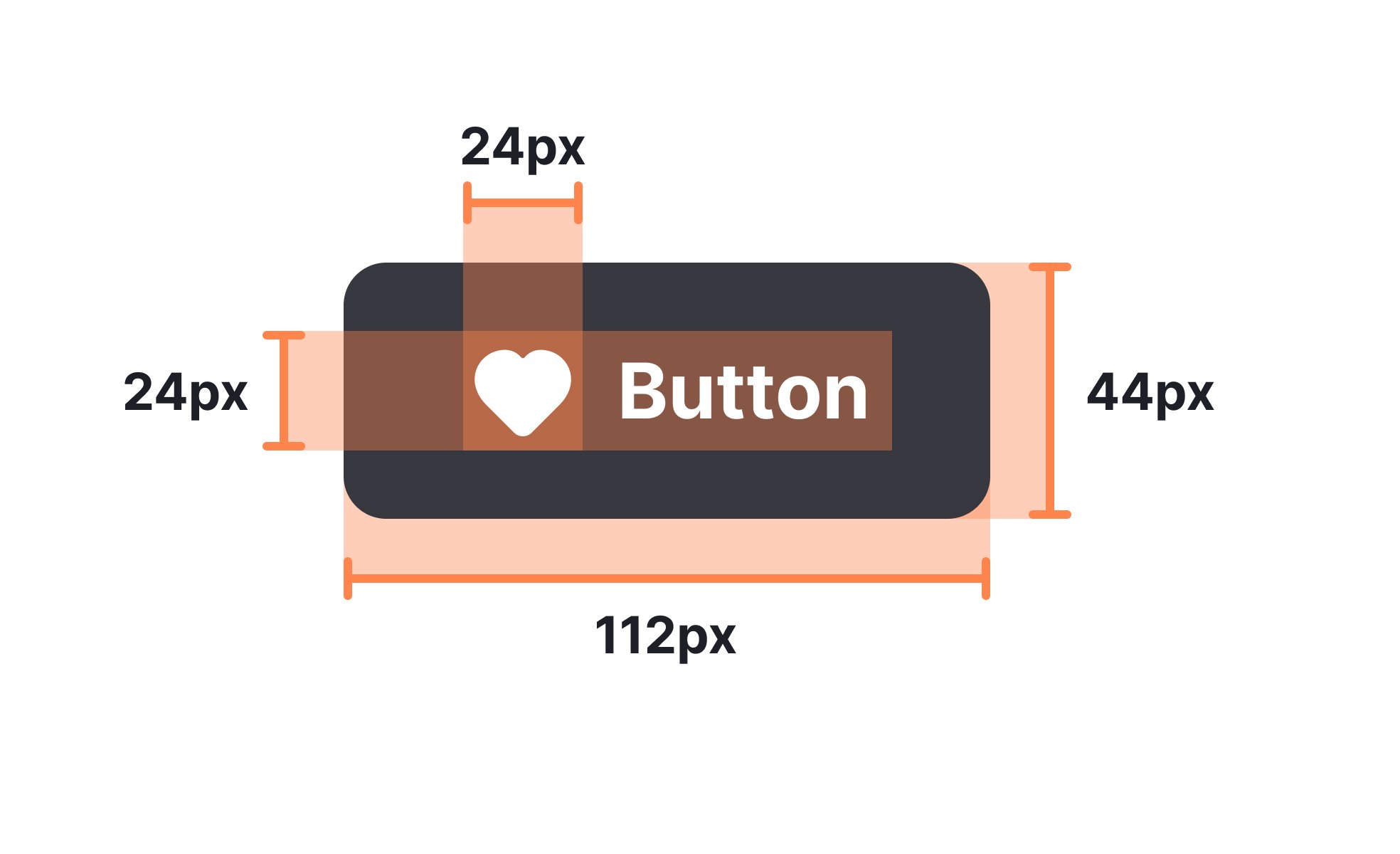
Standards differ because platforms account for device type and typical usage. For instance, Apple recommends a minimum of 44x44 pixels for tap targets on iOS, while Google suggests 48x48 density-independent pixels for Android. These standards consider average finger size, screen density, and device ergonomics.

Teams building cross-platform products must account for both sets of standards, testing interactions on real devices to ensure consistency. Ignoring platform-specific recommendations often leads to usability gaps that alienate portions of the audience.


How does element size influence accessibility?

Accessibility guidelines stress sufficient size for tap targets, legible text, and scalable layouts. A small interactive element can exclude users with motor impairments or reduce usability for those navigating with assistive technologies. Larger, well-spaced elements improve inclusivity and reduce user frustration.

Inclusive design is not about making everything larger but about making interactions more reliable. Scalable text, adaptive layouts, and proper spacing help diverse users complete tasks without barriers.


What are common mistakes in defining element size?

A common mistake is designing elements for high-resolution displays without testing on smaller screens. Another is prioritizing aesthetics over function, leading to text that looks elegant but is unreadable. Teams also sometimes ignore padding and spacing, which are integral to effective sizing.

Balancing user needs with brand identity ensures functional yet visually pleasing components. Regular usability testing highlights when element size compromises either experience or accessibility.