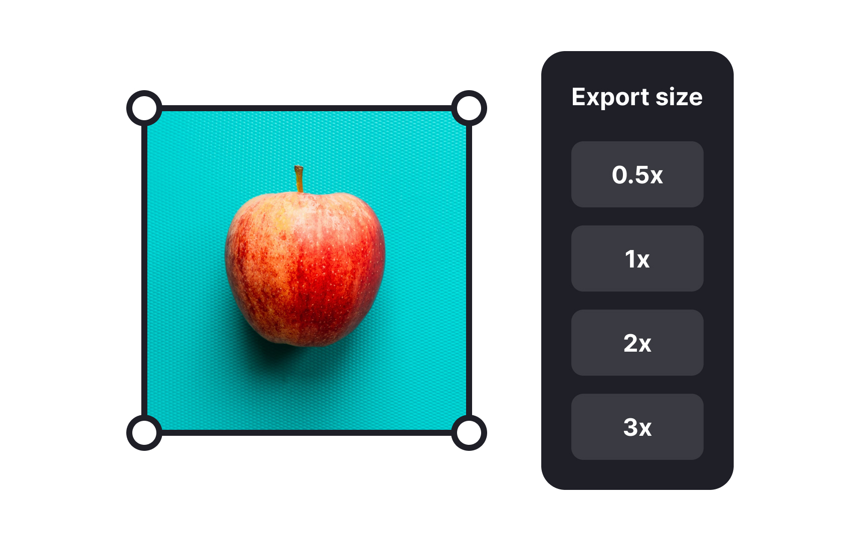
Export size
When exporting images for various devices, designers should think about screen clarity and size. Different screens have different resolutions, meaning they show images with varying levels of detail. Standard screens might only need a basic level of detail, while higher-resolution screens will require more.
The terms "@1x," "@2x," and "@3x" are key considerations when tailoring images to different screens:
- @1x represents the standard size for an image. It's suitable for regular screens, like those on many desktop computers and older mobile devices.
- @2x is geared towards high-resolution screens that display twice the detail. If you're designing for newer smartphones or HD monitors, using @2x ensures your images don't look blurry or pixelated.
- @3x is for the very latest, ultra-detailed screens. This triples the image size, ensuring a super-sharp appearance for the most cutting-edge displays.
By understanding and utilizing these options, designers ensure their images look fabulous no matter where they appear. It's about matching your image's clarity to the device's capabilities, so users always see your work at its best.