Fluid layouts
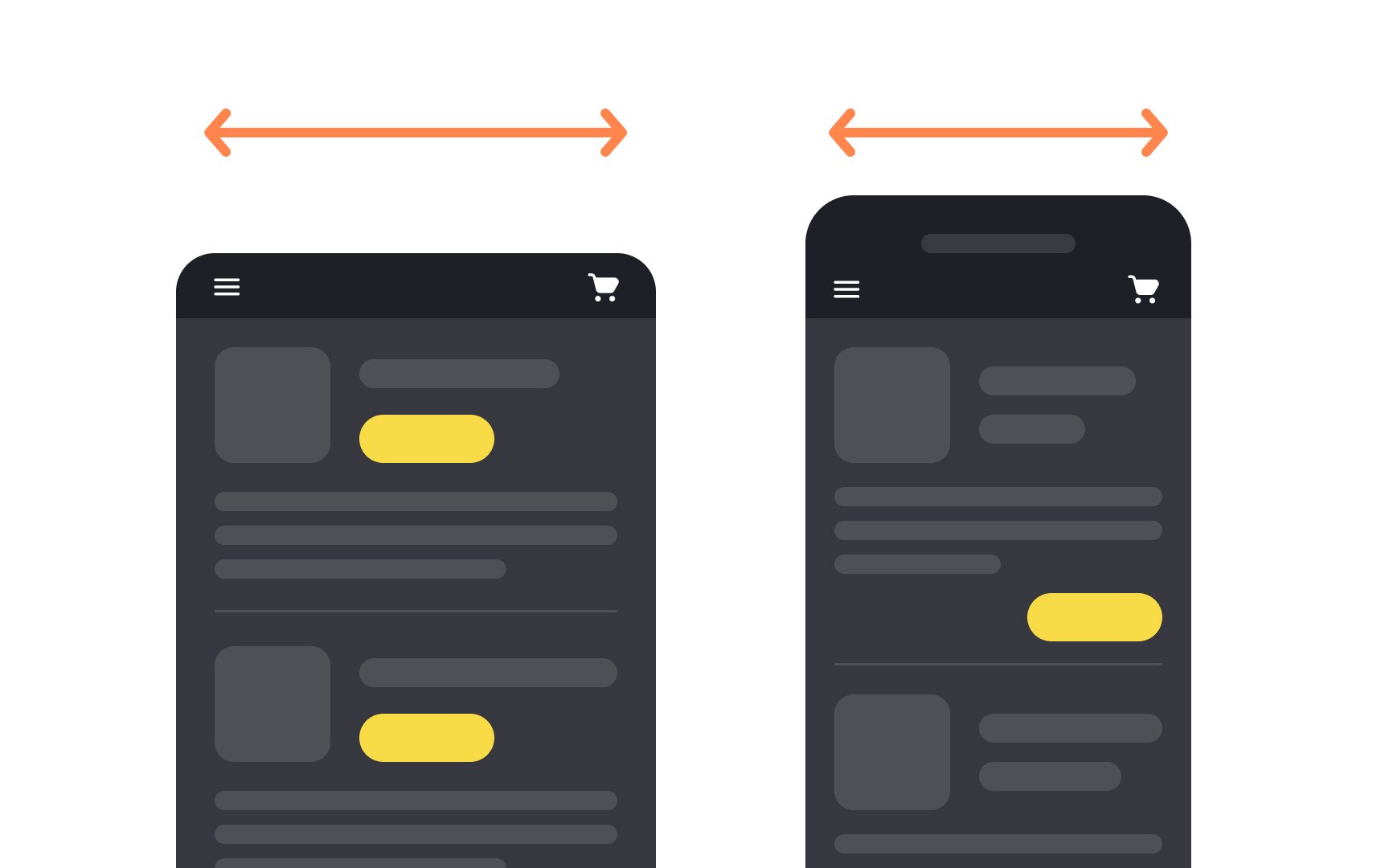
Fluid or liquid layouts naturally shrink or stretch as the browser resizes. Regardless of whether the width is assigned or not, the layout fills up users' viewport no matter how big or small it is. At the same time, texts and images keep their size. This means that when the layout adjusts to fill the screen, only the containers stretch or shrink, not the contents inside them.
With fluid layouts, users are more likely to see all available content without vertical or horizontal scrolling. Horizontal scrolling can only appear on the narrowest screens or on sites with large fixed-width content.
The best practices for creating fluid layouts include:
References
Top contributors