Image Usage & Asset Design
Create and implement visual assets that feel native to Apple platforms.
Visual assets in Apple's interfaces are more than decorative elements — they're carefully crafted components that respond to their environment. Like materials with varying properties, images adapt to different contexts, scales, and platforms. Each visual asset, from tiny thumbnails to hero graphics, carries specific behaviors that shape how it interacts with surrounding interface elements. Display technologies, color spaces, and dynamic adaptations all influence how images appear across devices.
These behaviors aren't random — they're calibrated to support natural interaction patterns while maintaining consistency with Apple's visual language. Understanding how images respond to different environments, adapt to platform capabilities, and maintain their clarity across contexts enables the creation of interfaces that feel truly native to Apple platforms.

Key image properties:
- Resolution independence: scaling clearly across sizes
- Environmental adaptation: responding to display conditions
- System integration: working with platform behaviors
- Performance impact: balancing quality and speed
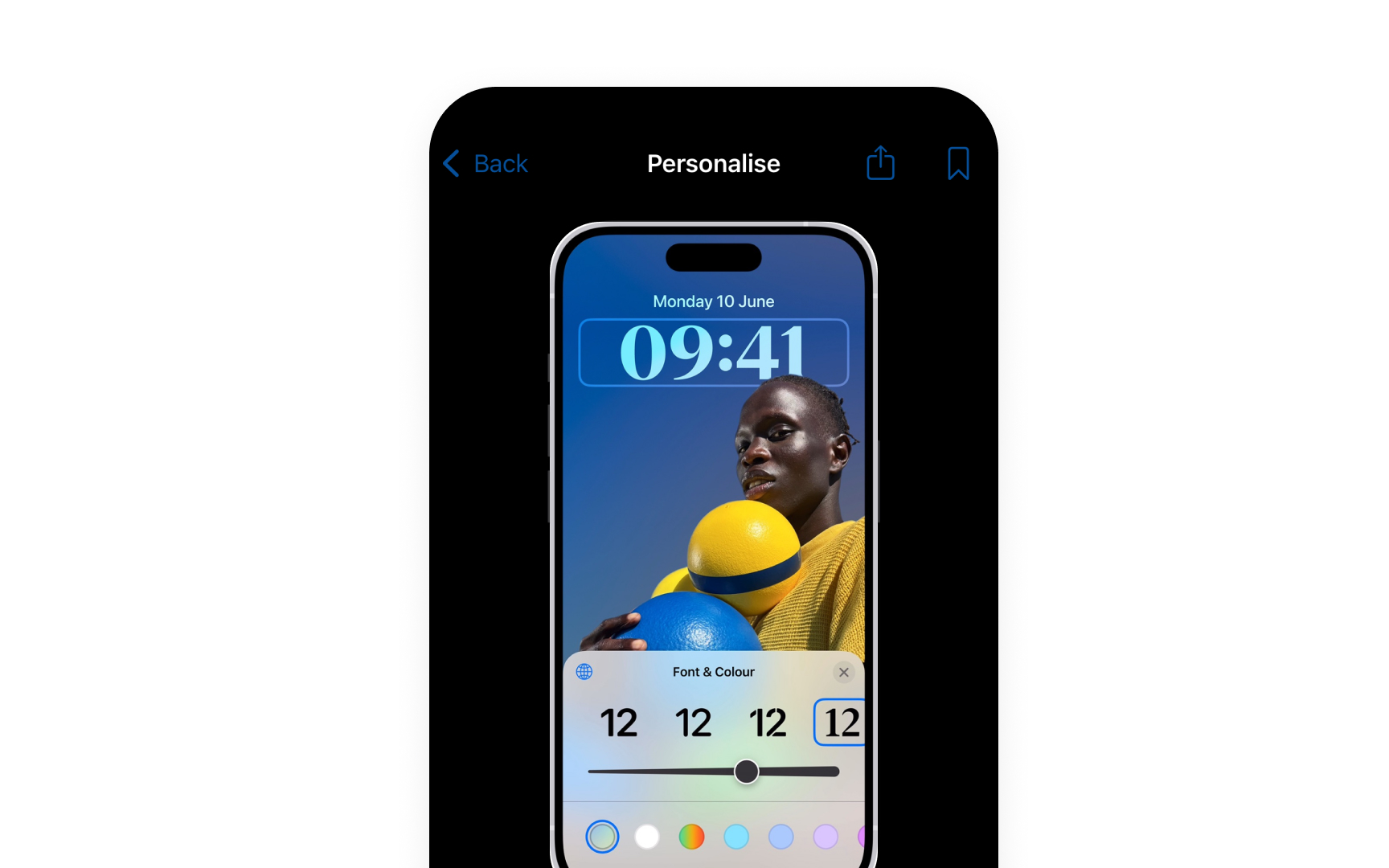
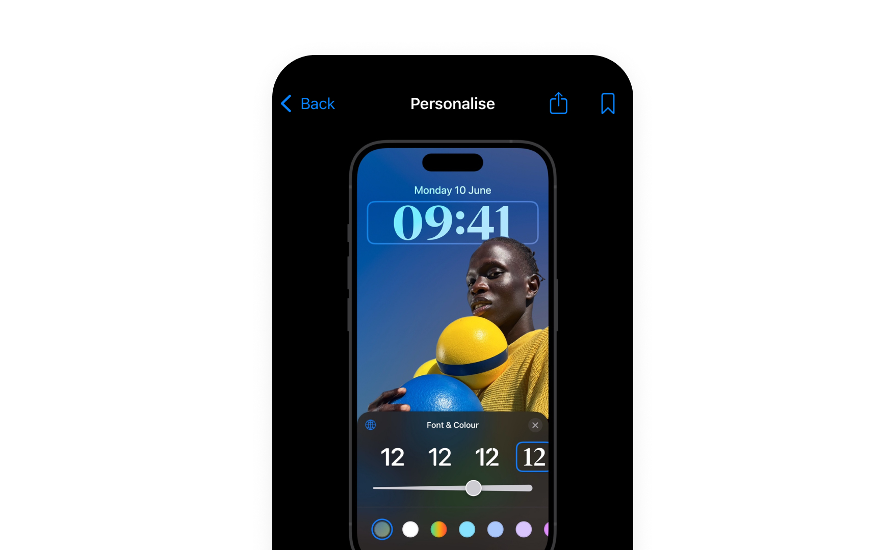
Images must adapt seamlessly to Dark Mode,
Proper image implementation affects both appearance and performance. Format choices and optimization directly impact loading times and memory usage while maintaining visual quality.[1]
Pro Tip: Start with the smallest required image size and scale up — this helps focus on essential details first.
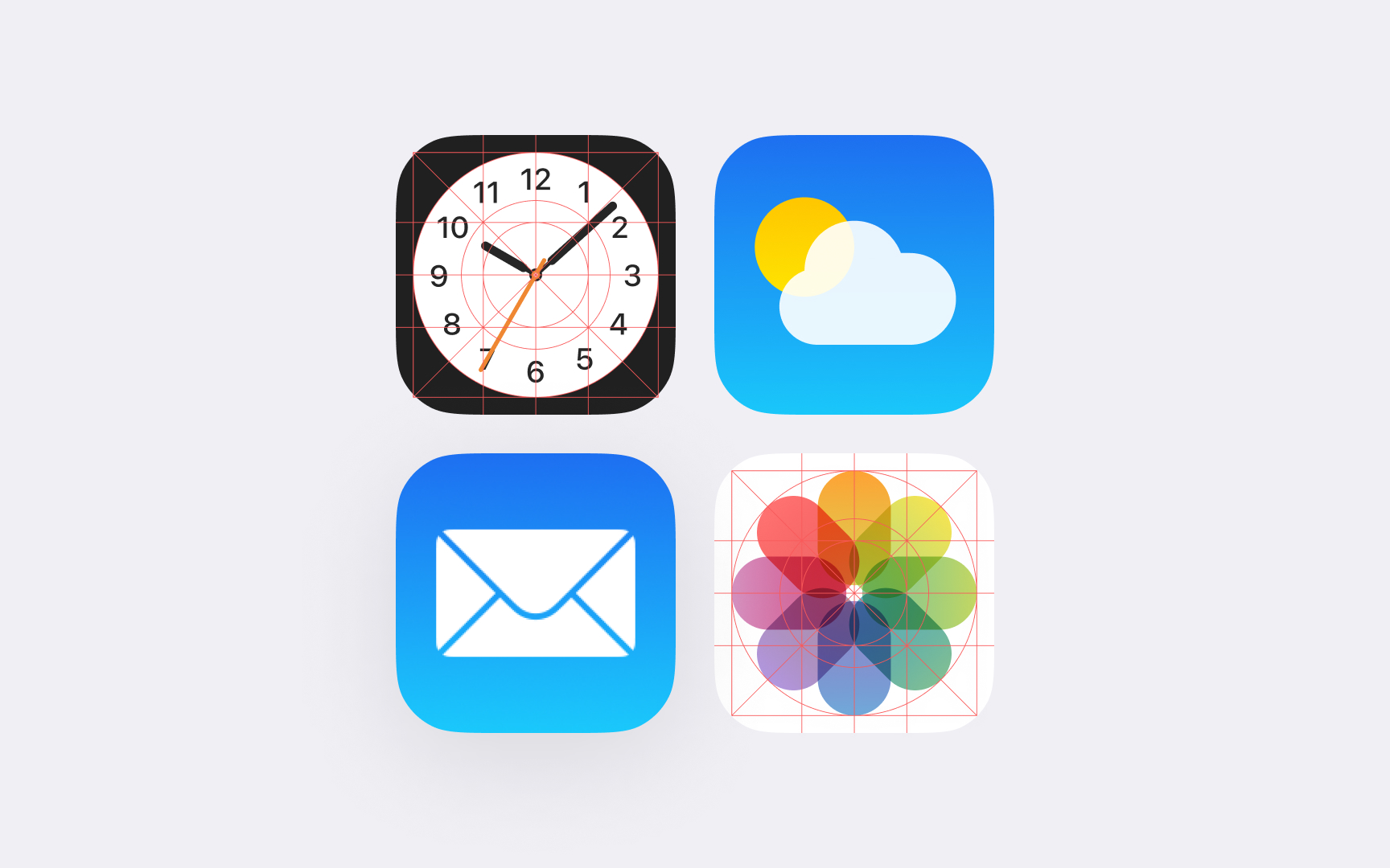
Core image roles:
- Content images: photos and illustrations that convey information
- Background images: setting context while supporting overlaid
content - Decorative images: adding visual interest without functional purpose
- Interface icons: communicating actions and navigation
Each role shapes how an image interacts with its surroundings. Content images maintain clarity and focus, while background images often blur or dim to support overlaid elements. Interface icons adapt to different states and contexts automatically.
The role determines technical requirements like resolution, format, and optimization approach. Understanding these roles helps create more intentional and effective visual hierarchies.
Pro Tip: Choose image roles before deciding on visual treatment — the role should guide technical and design decisions.
Every image in iOS interfaces needs to adapt gracefully across different display scales. Like materials that respond to their environment,
Scale requirements:
- Resolution independence. Vector formats or multi-resolution
assets - Scale factors. @1x, @2x, and @3x for different display densities
- Pixel alignment. Crisp edges at all sizes
- Dynamic resizing. Maintaining quality when scaled
When scaled, images shouldn't lose their visual integrity or become blurry. Different display technologies — from Retina to Pro Display XDR — demand different approaches to resolution. An image that looks sharp on one display might need adjustment for another.
PDF vectors and resolution-specific PNGs provide the foundation for scale-independent assets. The system automatically chooses the best version for each display environment.
Pro Tip: Create assets at the largest required size first — scaling down maintains better quality than scaling up.
In design workflows, managing color involves several key steps:
- Color spaces. Choose sRGB for standard displays, P3 for a 25% wider color range
- Profile embedding. Save files with color profile data from design tools
- Profile types. Display P3 for modern devices, sRGB for compatibility
- Asset catalogs. Maintain color fidelity when implementing in Xcode
Color profiles help translate colors accurately between design tools, development environments, and different devices. Modern Apple devices support P3 color space, but maintaining sRGB versions ensures compatibility across all devices.
Pro Tip: Export files as Display P3, but always provide sRGB versions for compatibility.
Apple platforms demand high-quality visuals while maintaining smooth performance. Understanding proper file preparation helps designers create
Design export guidelines:
- UI elements. Export as PNG with transparency
- Photos. Save as JPEG at appropriate quality (60-80%)
- Icons. Provide PNG at all required scales (@1x, @2x, @3x)
- Vectors. Export as PDF for resolution independence
Each asset type needs specific attention:
- Interface graphics. Keep transparent areas minimal
- Large photos. Consider dimensions and compression level
- Repeated elements. Use the smallest acceptable dimensions
- Background images. Optimize for memory constraints
When preparing design files, focus on the essential visual information. Extra detail often gets lost on device screens while adding unnecessary file weight.
Pro Tip: Check exported file sizes — if an asset seems unusually large, review its complexity and compression settings.
Adaptation scenarios:
- Dark mode. Assets adjust for light and dark appearances
- Dynamic type. Images scale with text size changes
- Reduced motion. Static alternatives for animations
- Display zoom. Proper scaling without quality loss
Two approaches to adaptive assets:
- Asset variants. Different versions for each context
- Dynamic rendering. Single assets that adapt automatically
Image choices affect how well interfaces adapt to user preferences and settings. Providing appropriate asset variations ensures the interface remains clear and functional in all contexts.
Pro Tip: Design dark mode variants first — they often reveal contrast issues that affect light mode too.
Layout principles:
- Space efficiency. Balance image size with screen real estate
- Content focus. Support rather than overwhelm the main
content - Screen sizes. Adapt layouts for different devices
- Safe areas. Respect platform-specific layout guides
Common layout patterns:
Thumbnails in lists and grids- Hero images at content tops
- Decorative backgrounds behind content
- Inline images within the text flow
Pro Tip: Test image layouts in both portrait and landscape — content should remain clear in all orientations.
Each Apple platform has unique requirements for
Platform considerations:
- iOS/iPadOS. Touch-optimized sizes, variable orientation
- macOS. Precise cursor interaction, window resizing
- watchOS. Small display, glance-based viewing
- visionOS. Depth perception, environmental adaptation
Key differences between platforms:
- Screen densities and resolutions
- Interface scaling factors
- Standard image dimensions
- Asset catalog specifications
What works well on one platform might need adjustment for another. Even simple interface elements like toolbar
Pro Tip: Start with iOS specs, then adapt assets for other platforms — don't simply reuse them without consideration.
Key requirements:
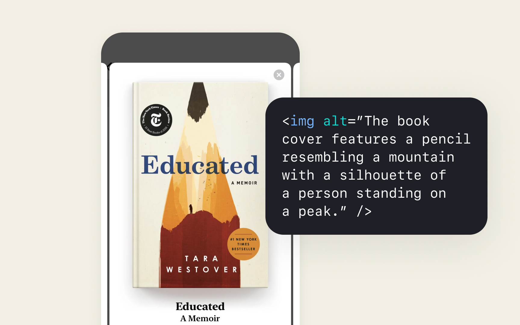
- Alt text. Clear descriptions of image content and function
- Decorative images. Marked properly to be ignored by VoiceOver
- Text in images. Avoided or provided as actual text
- Contrast ratios. Maintained for embedded text and
icons
When images convey information:
- Use clear, concise descriptions
- Explain the purpose, not just the content
- Include any text shown in the image
- Describe interactive elements
System frameworks handle many accessibility features automatically, but proper image preparation ensures the best experience for all users.
Pro Tip: Test your interface with VoiceOver to ensure image descriptions make sense in context.
Each image type in Apple interfaces requires specific file formats that ensure optimal display and performance. Choosing the right format depends on the asset's purpose and platform requirements.
Format guidelines:
- SVG/PDF. Scalable interface elements and
icons - PNG. Elements requiring pixel-perfect transparency
- JPEG. Photos and complex
images - HEIC. High-efficiency photo compression
Each format serves specific needs:
- SVGs and PDFs scale perfectly at any size
- PNGs maintain crisp edges and alpha channels
- JPEGs efficiently compress photographic
content - HEIC balances high quality with a small file size
Format choice affects both visual quality and app performance. Using inappropriate formats can result in larger file sizes or quality loss.
Pro Tip: Use SVG for interface icons to ensure they scale perfectly across all devices.
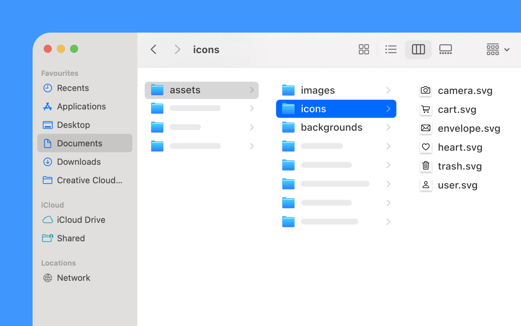
Clear asset organization helps maintain efficient workflows and ensures proper implementation across platforms. A systematic approach to naming and structuring
Organization principles:
- Naming conventions. Clear, consistent, descriptive names
- Folder structure. Logical grouping by purpose and type
- Version control. Clear indication of current assets
- Platform variants. Organized by device requirements
Best practices for asset management:
- Group related assets together
- Use scale indicators (@2x, @3x)
- Separate
dark mode variants - Maintain clear file hierarchies
- Document asset usage and context
Well-organized assets save time during updates and make it easier to maintain consistency across an app's interface.
Pro Tip: Create a clear naming system before starting asset creation — changing names later causes confusion.
References
- Images | Apple Developer Documentation | Apple Developer Documentation
Topics
From Course

Images provided by

Share


Similar lessons

Common UI Component Definitions I

Image Terminology
