Mobile Responsiveness
Mobile responsiveness ensures layouts and content automatically adapt to different screen sizes, maintaining clarity and usability on all devices.

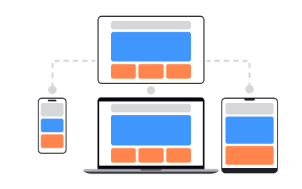
What is Mobile Responsiveness?
Potential customers visit your website on their phones and encounter broken layouts, unreadable text, or functionality that simply doesn't work on mobile devices. You've probably lost business because users couldn't complete purchases or find information on your mobile site.
Most websites treat mobile responsiveness as an afterthought when it should be the primary design constraint, since mobile traffic typically accounts for 60-70% of web usage across most industries.
Mobile responsiveness is the technical and design approach that ensures websites and web applications automatically adapt their layout, content, and functionality to provide optimal user experiences across all device sizes and capabilities, from large desktop monitors to small smartphone screens.
Mobile-responsive websites see 67% higher conversion rates, 50% better search rankings, and significantly lower bounce rates compared to non-responsive sites that force users to pinch, zoom, and struggle with tiny buttons.
Consider how responsive design isn't just about making content fit smaller screens. It's about reimagining user experiences for different contexts, interaction methods, and attention patterns that change dramatically between desktop and mobile usage.
Why Mobile Responsiveness Matters for Digital Success
Your website provides excellent desktop experiences but frustrates mobile users with poor readability, difficult navigation, slow loading, or missing functionality that drives them to competitors with better mobile optimization.
The cost of poor mobile responsiveness hits immediately and measurably. You get lost mobile conversions, poor Google search rankings through mobile-first indexing, higher bounce rates, and competitive disadvantage in markets where mobile dominates desktop usage.
What effective mobile responsiveness delivers:
Higher conversion rates across all devices because responsive design creates consistent user experiences that guide visitors toward desired actions regardless of how they access your site.
When someone finds your site on their phone and later returns on their computer, they should have the same positive experience that builds trust and familiarity.
Better search engine rankings through Google's mobile-first indexing that prioritizes mobile-optimized sites in search results, directly impacting organic traffic and visibility.
Reduced development and maintenance costs because responsive design creates one website that works everywhere rather than requiring separate mobile and desktop versions.
Improved user satisfaction through consistent branding and functionality that builds trust and reduces friction for users switching between devices during research and purchase processes.
Future-proof design that adapts to new screen sizes and device types without requiring complete redesign, protecting your investment as technology continues evolving.
Advanced Mobile Responsiveness Strategies
Once you've implemented basic responsive design, develop sophisticated adaptive and performance optimization approaches.
Adaptive Content Delivery: Serve different content variations based on device capabilities, network speed, and user context rather than just resizing the same content for all devices.
Progressive Enhancement: Build responsive experiences that work with basic functionality first, then layer on advanced features for devices and connections that can support them effectively.
Performance-First Responsiveness: Optimize responsive design for loading speed and interaction performance, especially on slower mobile networks and older devices with limited processing power.
Cross-Device Experience Continuity: Design responsive experiences that maintain user context and progress when users switch between devices during extended interaction sessions.
Recommended resources
Courses

UX Design Foundations


Design Terminology


Common Design Patterns
Lessons

Basics of Native Mobile Design

Accessibility Research