Responsive design
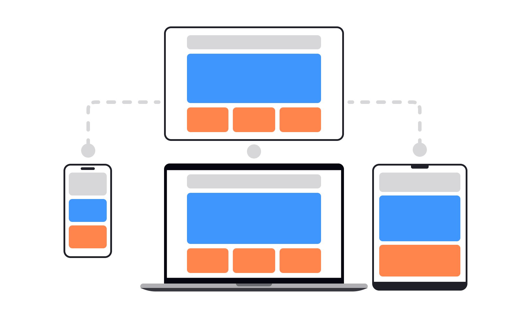
Responsive design uses CSS to create different page layouts depending on the device's screen size.[1] Instead of showing completely different versions for mobile and desktop, the page automatically reconfigures itself as needed.
Responsive design is used to create mobile-friendly websites that look good on various devices. While it doesn't offer tailor-made solutions like adaptive design, it's still commonly used today.