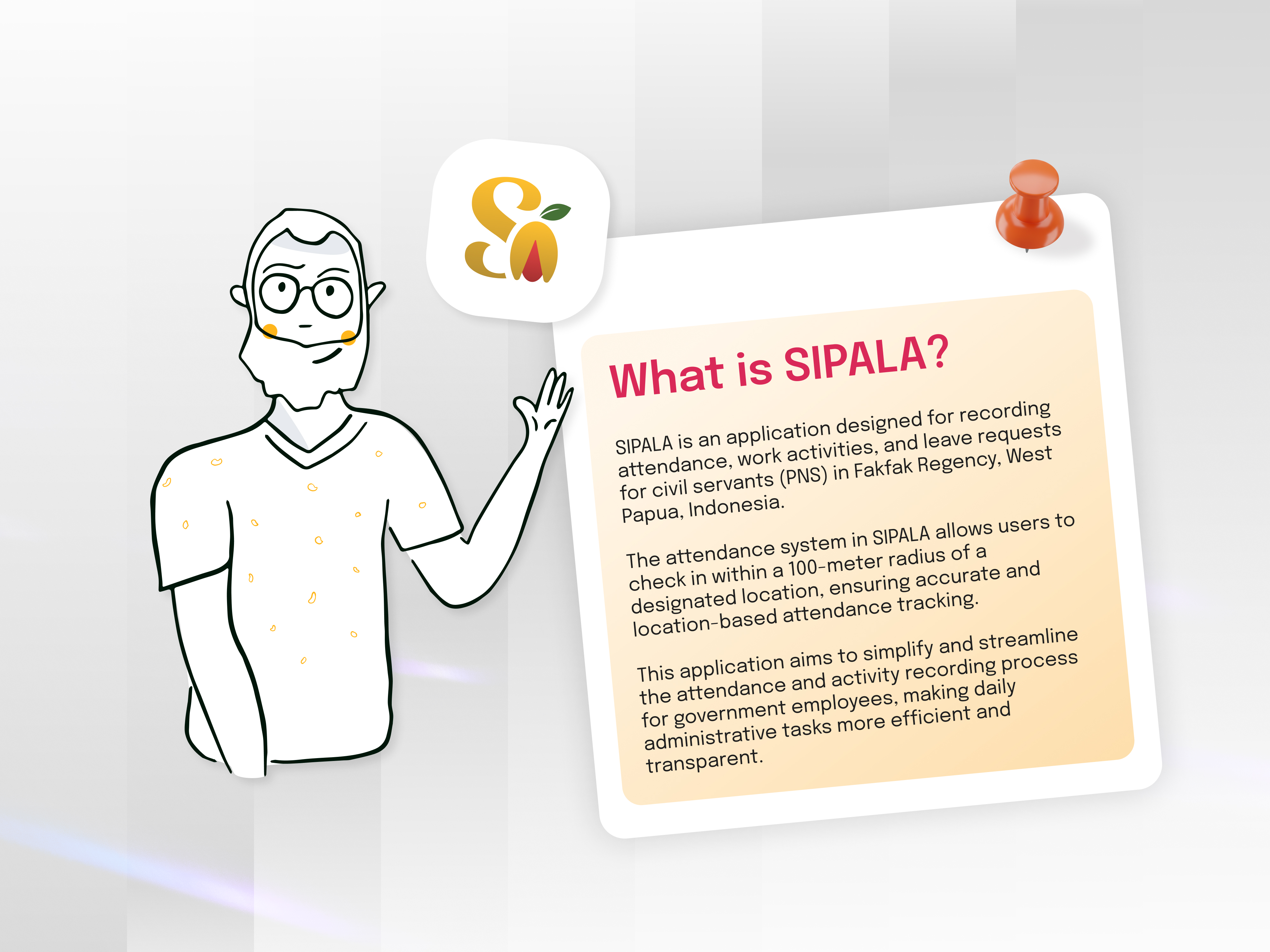
SIPALA - Attendance, Leave, and Activity Management System


Tools used
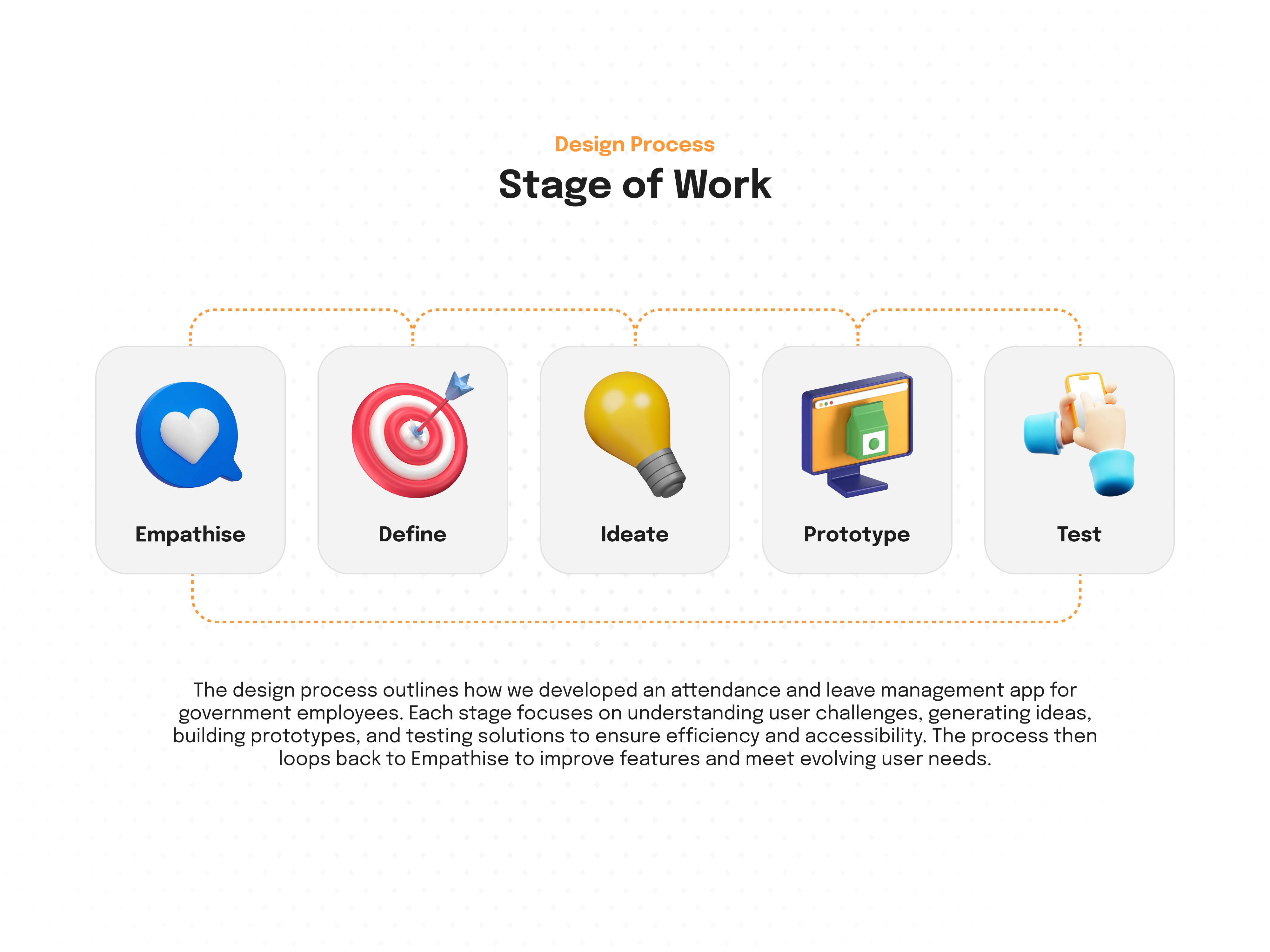
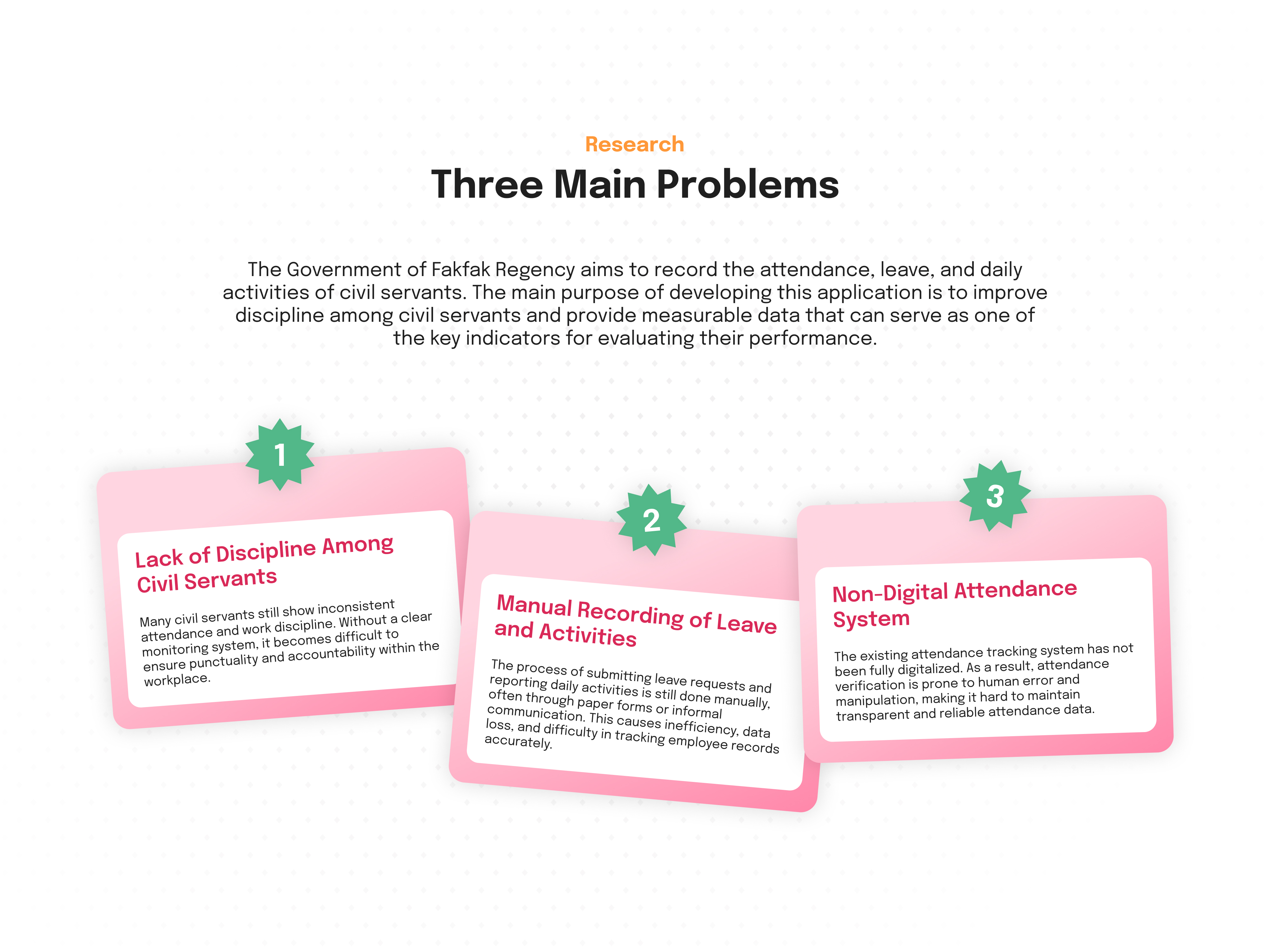
From brief

Topics
Share
Reviews
8 reviews

This seems like a really solid project, Wecak!
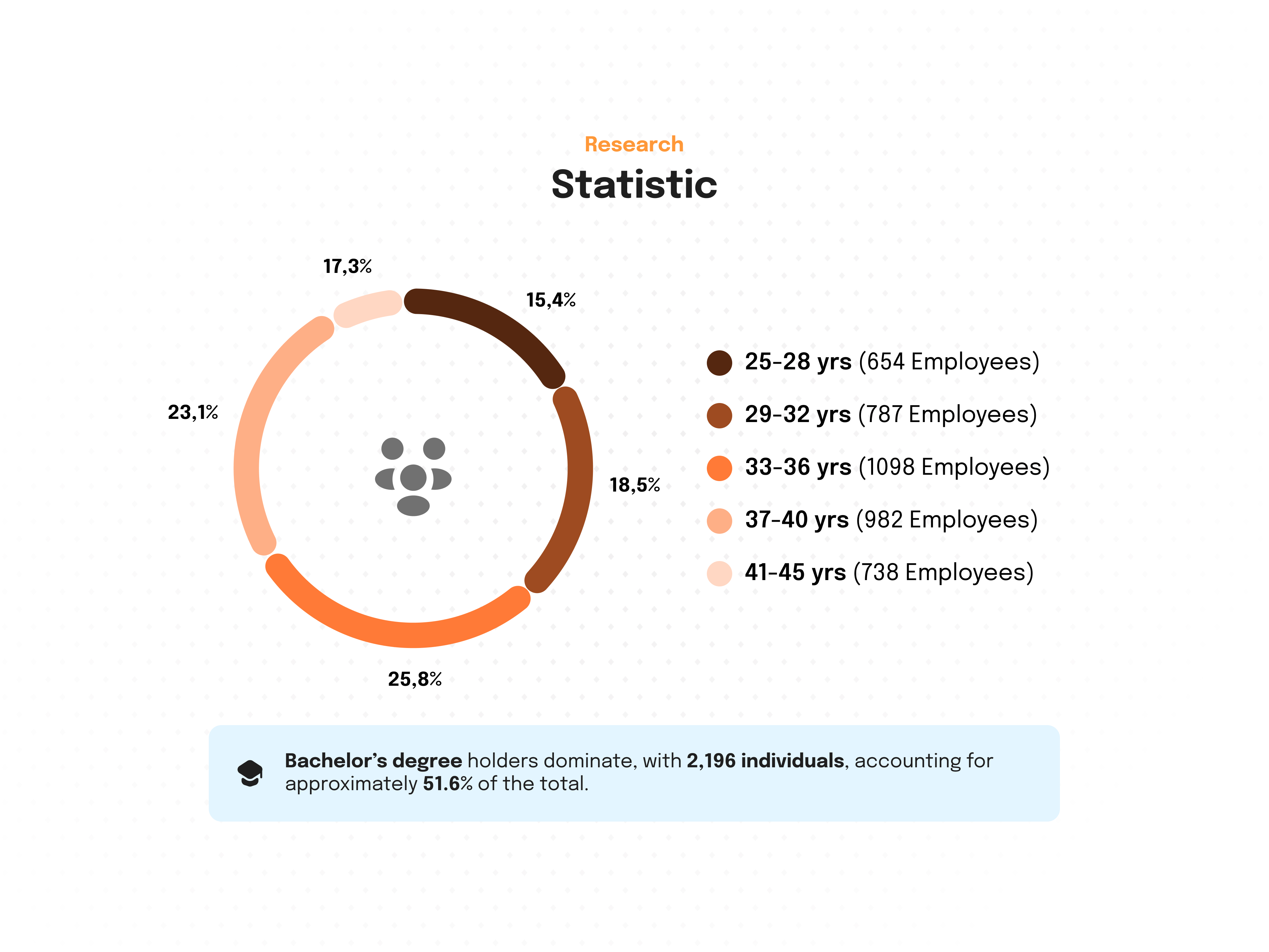
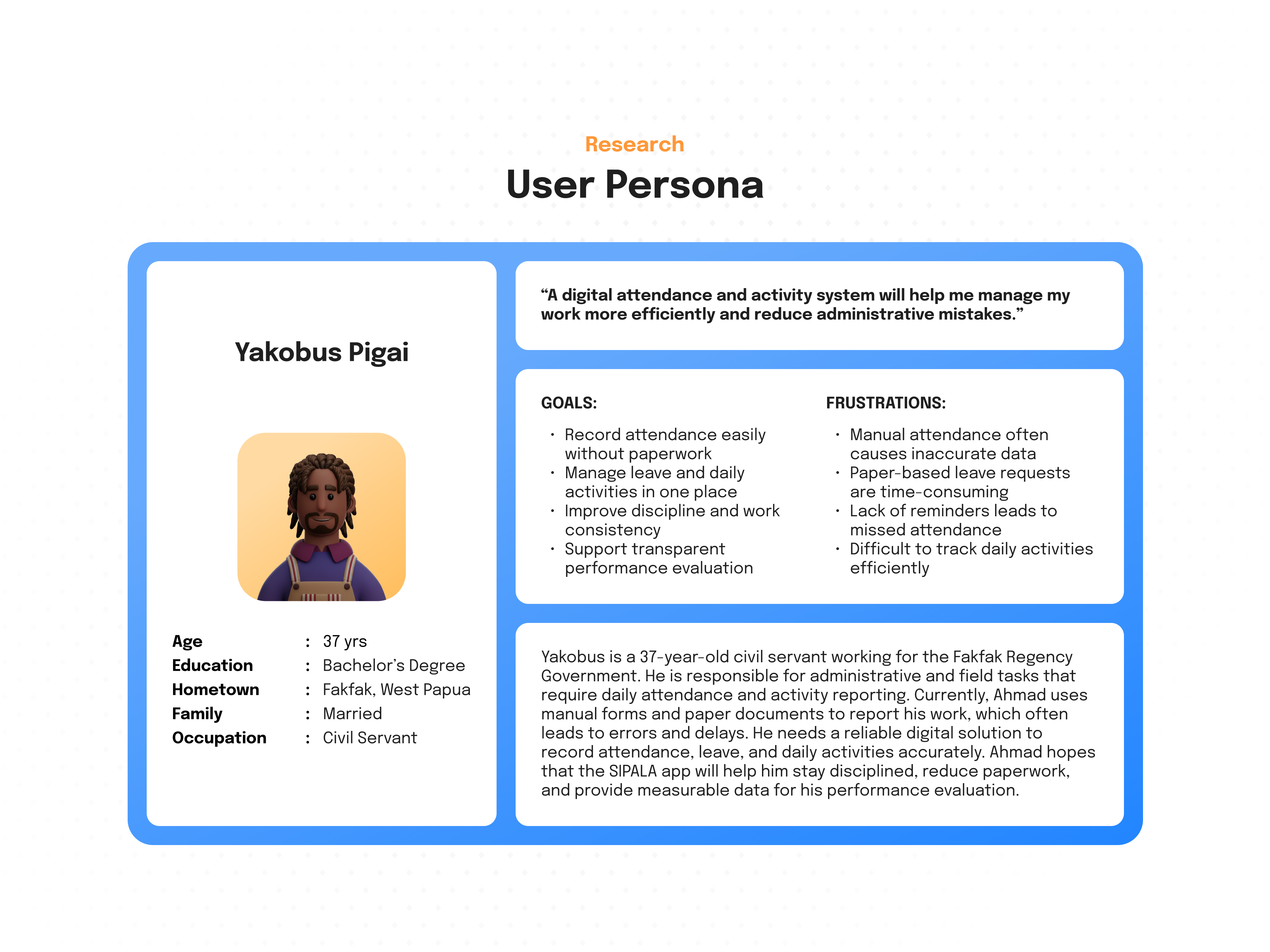
I like how you broke down your presentation, but I think the “why” is missing for a lot of the deliverables. For example, you shared the age range of employees and that 51.6% had a bachelor degree, but why is that important and how did it shape your design decisions?
Overall, really solid work with a lot of thought. Amazing job!

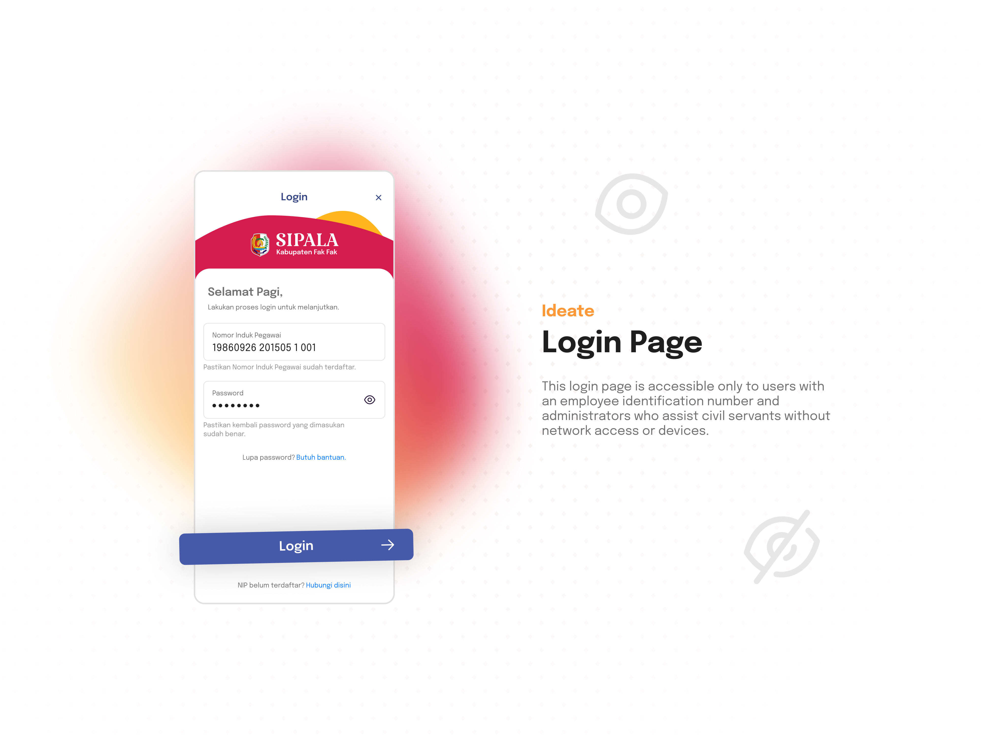
Your project feels carefully crafted: consistent spacing, clean hierarchy, and an interface that stays intuitive even without language fluency. That’s not easy to pull off, and it speaks to good judgment and a strong sense of structure.
Where you can make this even stronger is by letting us peek behind the curtain a bit more, help us understand how your research shaped each decision. You shared personas, demographics, and an empathy map; now show the “so what...” If the workforce is often on the move or under time pressure, call out how that led to fewer choices per screen, bigger tap targets, and one‑tap actions for clock‑in and approvals. If managers need multi‑site oversight, highlight why filters are persistent, charts use consistent axes, and exports are one step away.
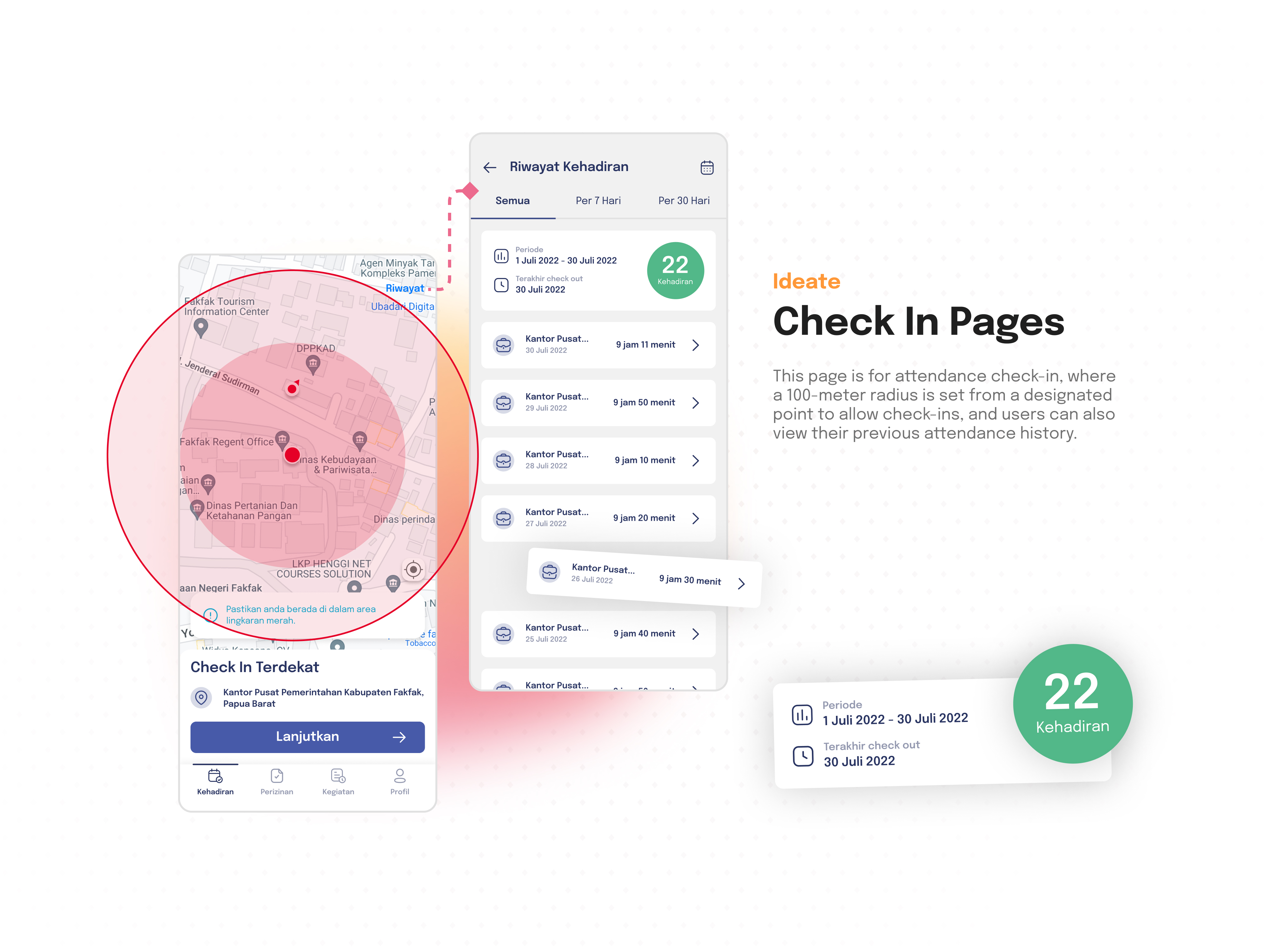
The geolocation radius is a smart starting hypothesis, but it’s one of those details that can bite in the real world. GPS drift, indoor environments, and campus edges are tricky. Consider a friendly, transparent model with confidence tiers, precise, estimated, manual override, each with a distinct visual treatment and policy note. Also, adding small touches like grace periods for poor signal, offline queueing, and a clear audit trail so employees and managers feel respected rather than policed. A couple of field test anecdotes (“warehouse floor, weak GPS, Wi‑Fi assist kicked in”) will go a long way.
For the dashboard and status UI, your system looks coherent; aim for comfort during long sessions. Keep text/background contrast reliable across light and dark themes, and pair color with icons and labels so meaning isn’t color‑only. A tiny “rules of the road” section, when to use success/warning/error/info, which text sizes never drop below minimums, and how chips/alerts scale, etc, will help teammates apply your system consistently.
Small presentation upgrades will make your case shine even more:
- A “How research changed the interface” section with quick before/after examples.
- A simple geolocation policy diagram showing those confidence tiers and what happens next.
- A few measurable targets that feel human and practical: clock‑in under 5 seconds, ≥90% leave requests completed without errors, approval turnaround reduced by a clear percentage, etc.
You’ve clearly done the hard work. Connecting the dots from insight to interface and showing how the system behaves on messy days will make this feel not just beautiful, but deeply dependable. Nicely done. Keep going!

Insanely good project Wecak, I'm impressed. From your research before starting to the final comprehensive prototype, it's clear that you put a lot of work into this. Even though I don't understand the language, playing with the prototype was pleasure. The platform is intuitive and the data easy to scan. Well done!

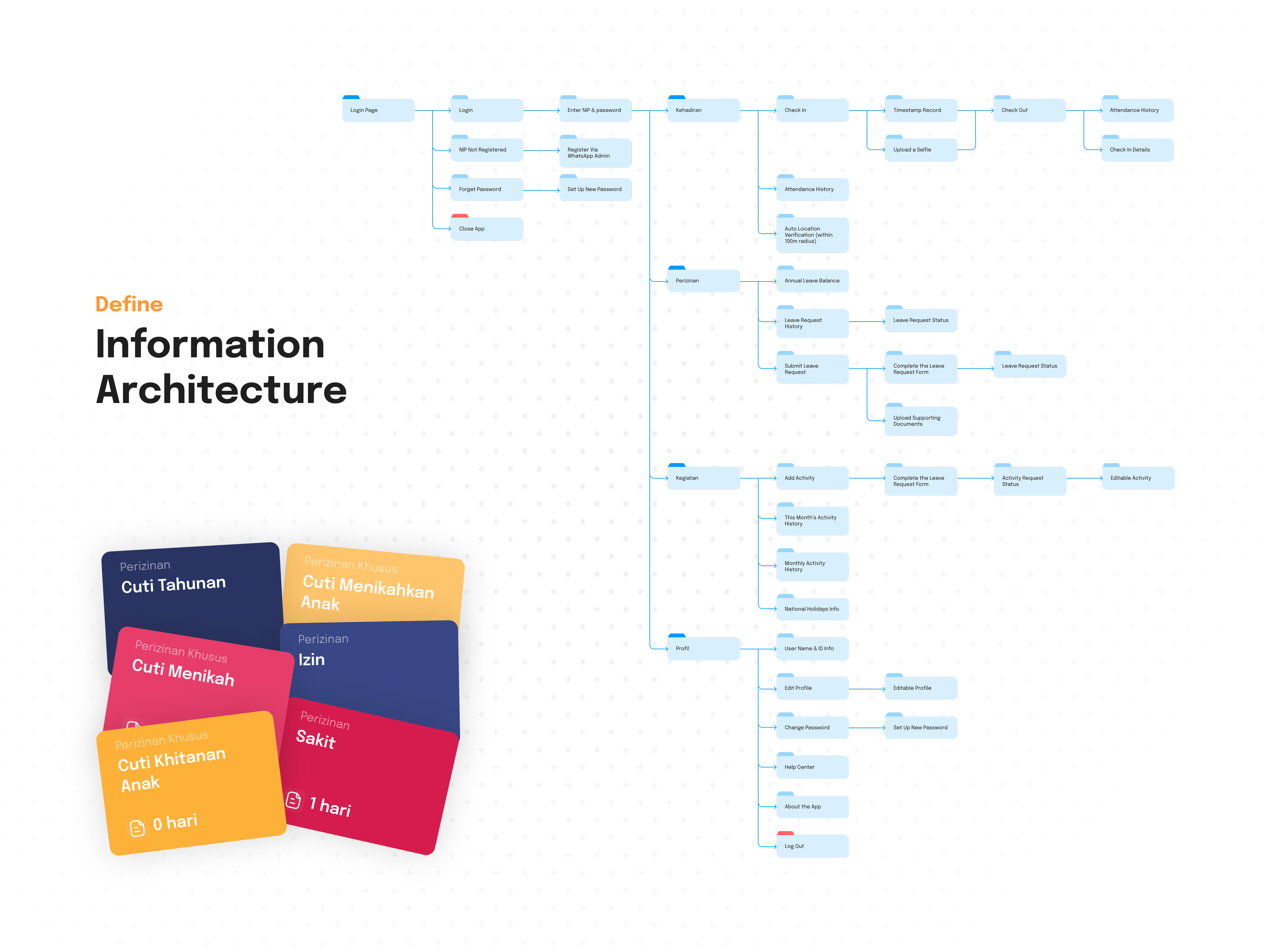
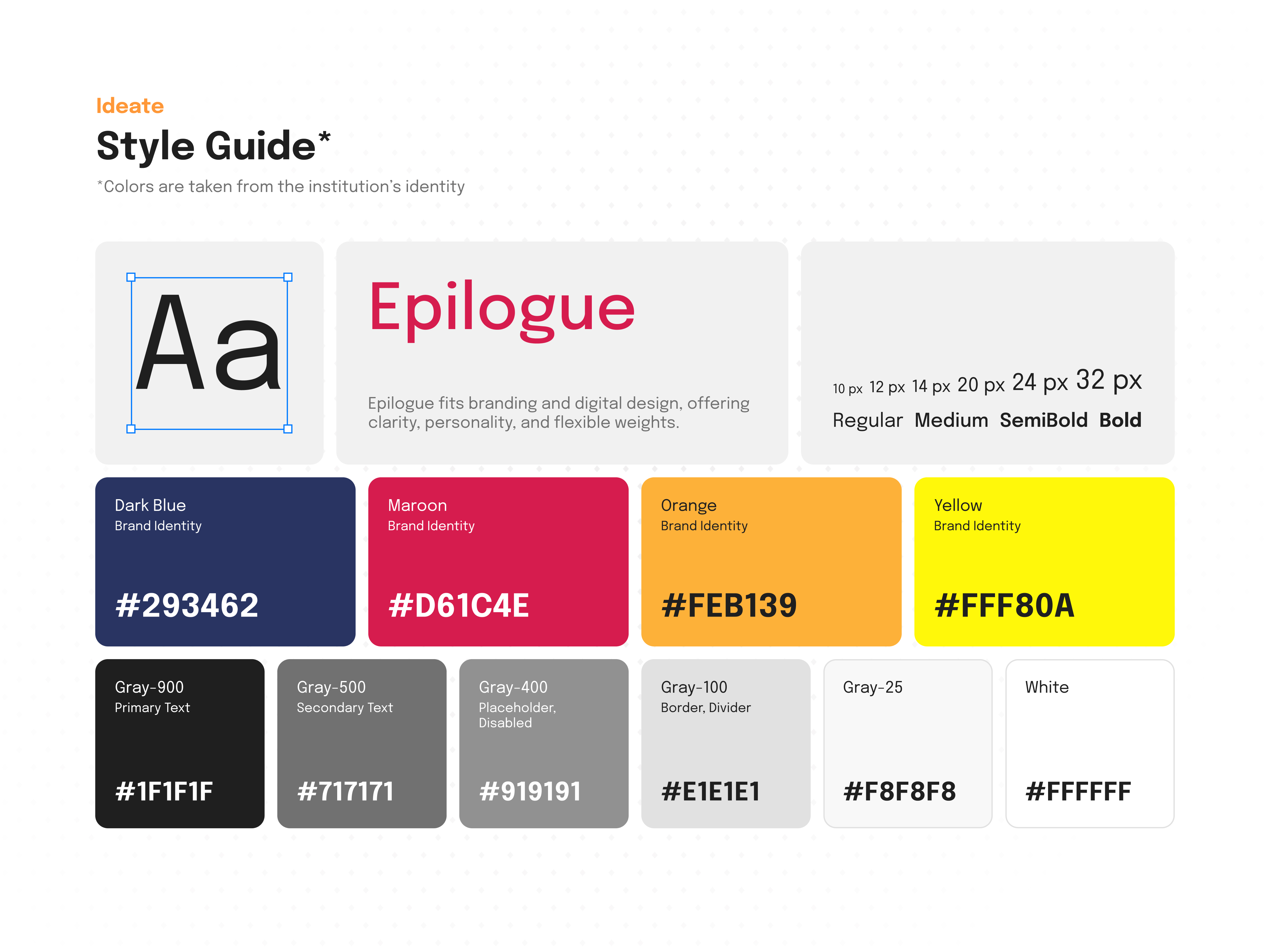
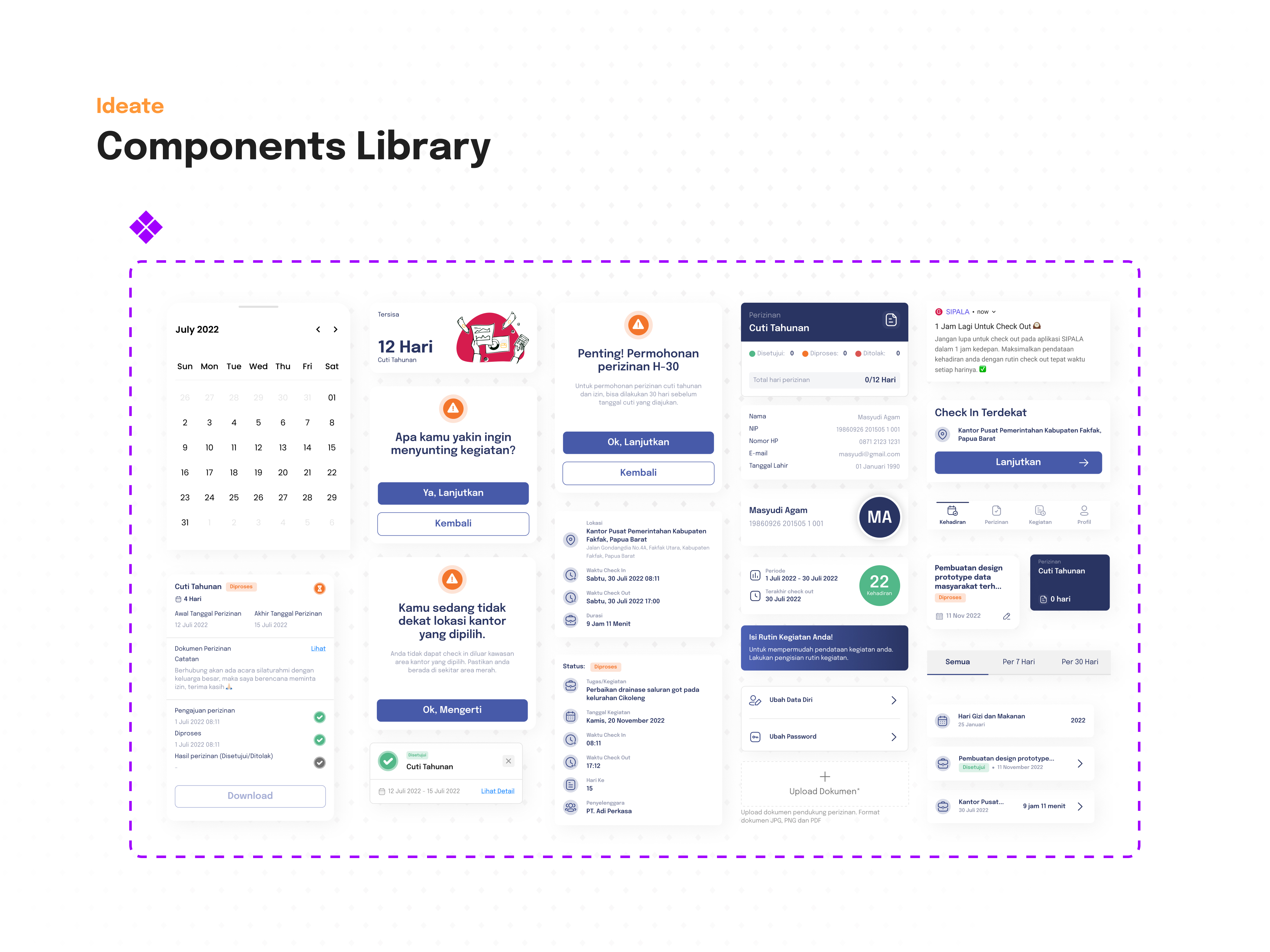
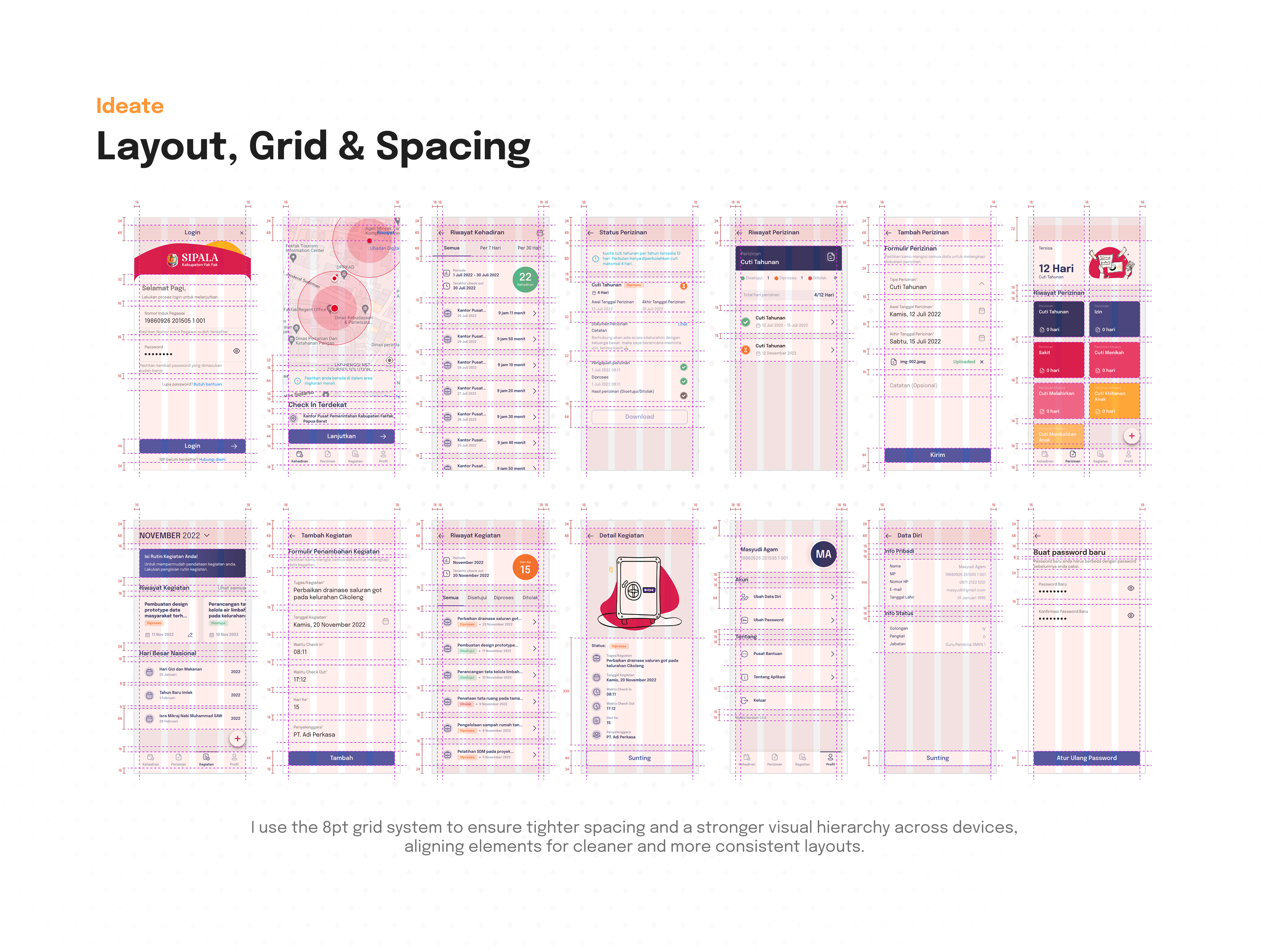
The project looks like a well-thought-out application with a clear design system and organized information architecture. Good that you applied the 8pt grid – it shows attention to consistency and a professional approach.
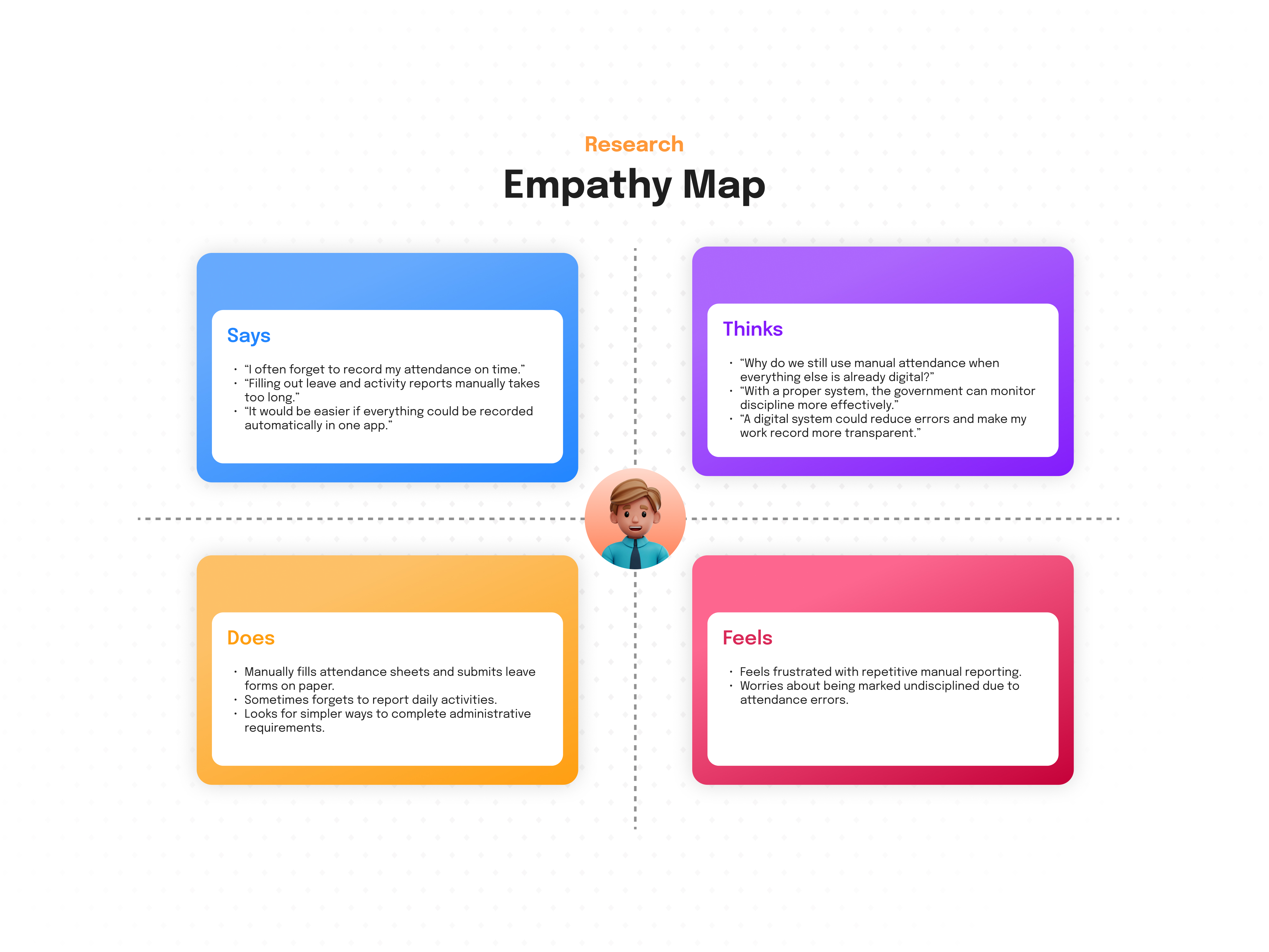
The empathy map and persona look well-developed, but I don't see how these insights translated into specific interface solutions.
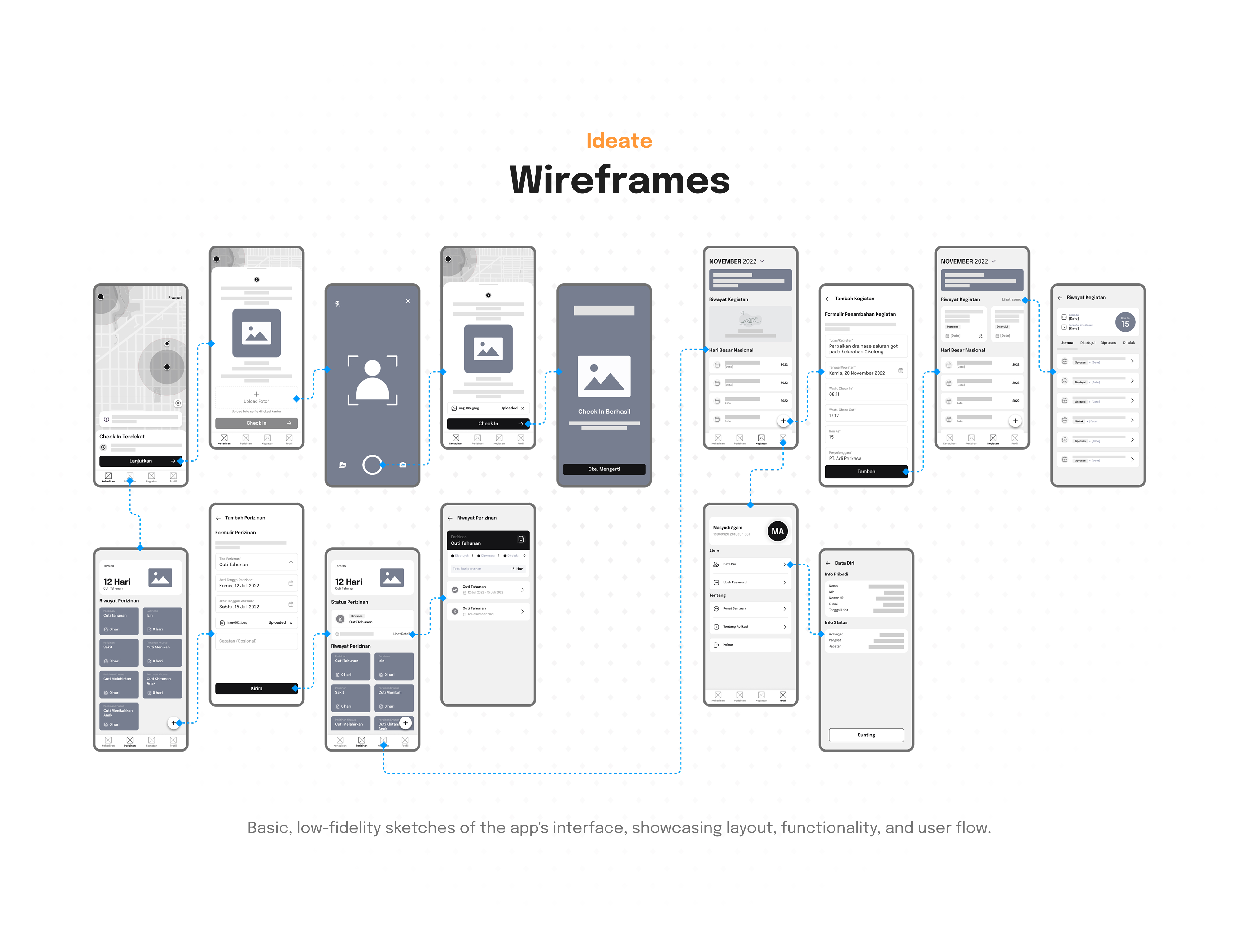
I'm not sure if geolocation with a 100-meter radius won't be problematic in the field – this requires testing in real usage conditions. (but you probably know that 😉)
Overall, the project has a solid foundation and shows a systematic approach to the problem. The color system might need refinement from a UX perspective, and the interface would benefit from user testing to ensure all functions are intuitive. Good work on the research and define stages! ❤️👏

Wecak, you presented your project really well.
Your presentation feels a level above. Including a video that showcases the app, a detailed breakdown of the different phases, and a prototype makes everything feel complete and well thought through.
It’s clear you invested time not just in the design itself, but also in how you communicate it.

i love the strucutre and the presentation that you have done.

Very Well Done Wecav - One of the Good case studies in recent days, I have reviewed. Check your LinkedIn and realised you're not a beginner, but one year experience and your level now makes sense to me.
• Check Mobin – start adding real photos and real service business mentality. That means waiting for two days and coming back and realising will you buy from this company application. Now the real question start the micro details that are missing and it will actually take more time than designing.
About ROI (Money): • Ask yourself, does this screen make money? I see a lot of information, but where is the focus? If I have to search for the "Buy" or "Subscribe" button, you have lost a customer. The flow needs to be shorter.

Great research
You might also like

SONZ - Entertainment platform


Camp & Travel Explorer - App Design


Solar system Dashboard Utility

Uxcel Halloween Icon Pack


Color System

Duolingo Halloween Icon Pack

Visual Design Courses

UX Design Foundations


Introduction to Figma

Design Terminology
