Color System for Productivity App

I have previously done this brief once before but to be frank, i wasn’t completely satisfied with how it turns out. Hence why I decided to try and re-do the project.
This colors system are used for productivity/mindfulness apps that could help user to relax and be more productive. The colors are chosen to balance emotional warmth, calmness, and intellectual stability that when combined could create focused, motivational, and accessible environment.
Feel free to give me any feedback to help me improve my skill! Thank you!

Reviews
7 reviews

Hey Raina, really love how you’ve documented everything, especially the thought process and semantics behind the colors. One thing you could explore is expanding the palette a bit and including two more fundamental colors (Black and White). Having around 8–10 shades per color category could make the system more flexible across different use cases, states, and accessibility scenarios. It’ll also help cover those edge cases where subtle tone variations can really enhance the visual balance.

Thank you for sharing this project and the story behind it. The palette feels fresh and thoughtful—the colors support the calm, productive mood you’re aiming for, and the overall result looks modern and consistent.
One small note: on the green background, the gray text reads a bit “muddy.” To keep it clean and accessible, try a darker shade taken from the same green hue for the text. This small tweak will keep your aesthetic while improving readability.
Great job—keep going, you’re on the right track!☺️

Good attempt on the colour system but a colour system application is also important plus tint, tones and shades are missing

Hi Raina, Good color for choice, complete until system color. But one thing I couldn't see is the reason you choose green? I would be better if you include some reason.

Good Job, Well defined!
Great job!! Keep going

Hey! I respect the honesty about the first attempt – it's a good sign that you want to do things properly.
✅ Color rationale makes sense – green for productivity + calm, magenta for contrast/energy, blue for focus.
✅ WCAG compliance shown concretely with AA/AAA levels.
✅ System colors (error, warning, success, info) are standard done right.
✅ UI example with the phone shows colors in action.
What needs improvement:
1. Brand principles – completely missing The brief requires "outline brand principles reflected by the color system". I don't see clearly stated brand principles that this system represents anywhere. This is a key evaluation element.
2. Color hierarchy is unclear You have 4 shades of green (P300, P500, P100, P50) and 4 magentas, but zero information on WHEN and HOW to use them. Which for buttons? Which for backgrounds? When P300 vs P500? This isn't a system, it's a palette without instructions.
3. Tertiary colors – not enough context "Dark blue for calm and reliable" – okay, but where will you use this in a productivity app? Show more UI examples with tertiary in action.
4. Typography, spacing, sizes = zero A color system isn't just colors. The brief mentions "strategic use of color, typography, and imagery". Missing typography is a big gap.
5. UI example – one screen isn't enough Show more: task list, dashboard, notifications, different states (hover, active, disabled).
What to clarify:
- Neutral colors – are there any? I don't see grays. 😐
- Accessibility – WCAG alone isn't enough, describe how you care for color blind users. 😊
You have a solid foundation, but you're missing the "comprehensive explanation" the brief requires. Good luck! 🫡👍
You might also like
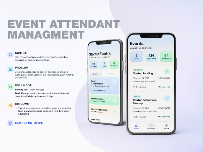
Events Managment App

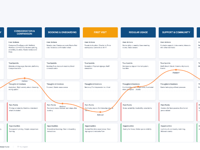
Customer Journey Map — Offsite Co-Working Experience

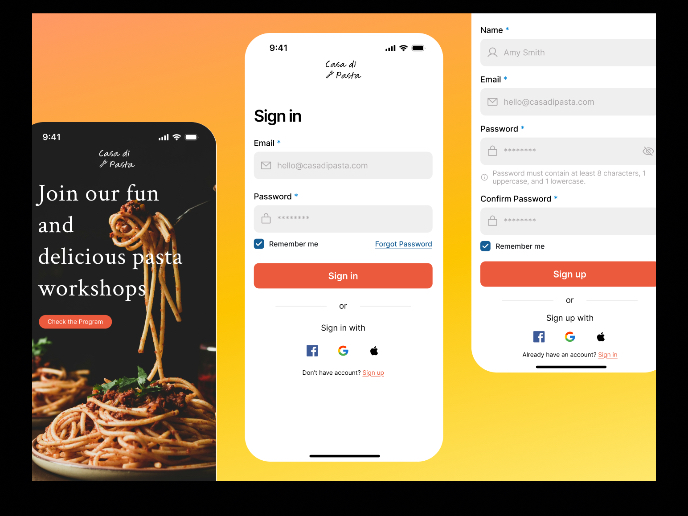
Mobile Onboarding: Casa di Pasta

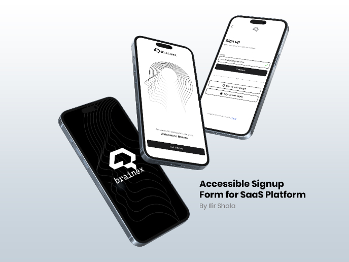
Accessible Signup & Login Experience — Brainex

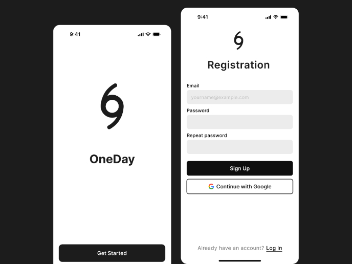
Accessible Signup Form

Accessible Signup Form

Visual Design Courses

UX Design Foundations


Introduction to Figma

Design Terminology
