Accessible Signup Form

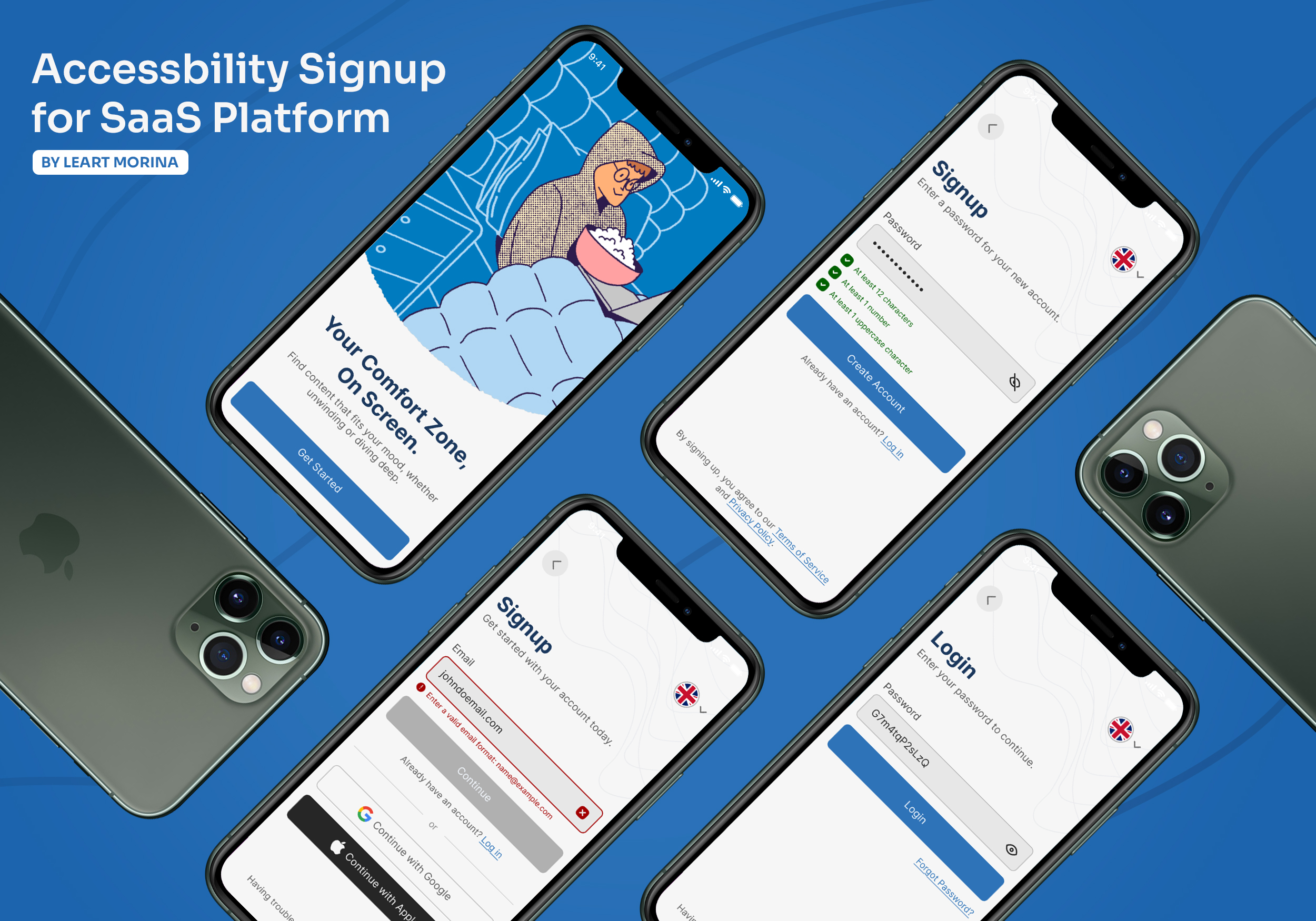
This project is an app which helps users to consume content based on their mood and it explores the design of an accessible, inclusive signup and login experience for a SaaS platform, with a strong focus on usability, clarity, and WCAG compliance.
Those are the areas I was focused the most, and thought would make an impact towards user experience:
• Visual hierarchy
• Color contrast
• Readable typography
• Descriptive error messaging
• Multilanguage support
• Multiple signup and login support
• Compliant with WCAG Accessibility Standards

Reviews
3 reviews

Great work, I really like the colors and the illustration you used for this project.
The form is simple and clearly communicates different states. It’s especially good that you’re not relying only on color, but also using icons and visual cues, that’s a solid accessibility practice.
Looks great!

Hi Leart!
Love that you’re focusing on accessibility again 👏♿ That already shows strong UX awareness.
The form looks clean and structured. It doesn’t feel crowded, and the spacing seems comfortable, which is huge for readability. I also like that it feels straightforward no unnecessary distractions, just clear input and action 👌✨
If I’d push it further, I’d want to see strong visual focus states and clear, helpful error messaging to really make the accessibility shine ⌨️💡 But overall, solid, thoughtful, and purpose-driven work.

good job
You might also like

Improving Dating App Onboarding: A/B Test Design

FORM Checkout Flow - Mobile


A/B Test for Hinge's Onboarding Flow


Accessibility Asse


The Fitness Growth Engine


The Relational Workspace

Visual Design Courses

UX Design Foundations


Introduction to Figma

Design Terminology
