Mobile Onboarding: Casa di Pasta

🍝 Project Overview: Casa di Pasta
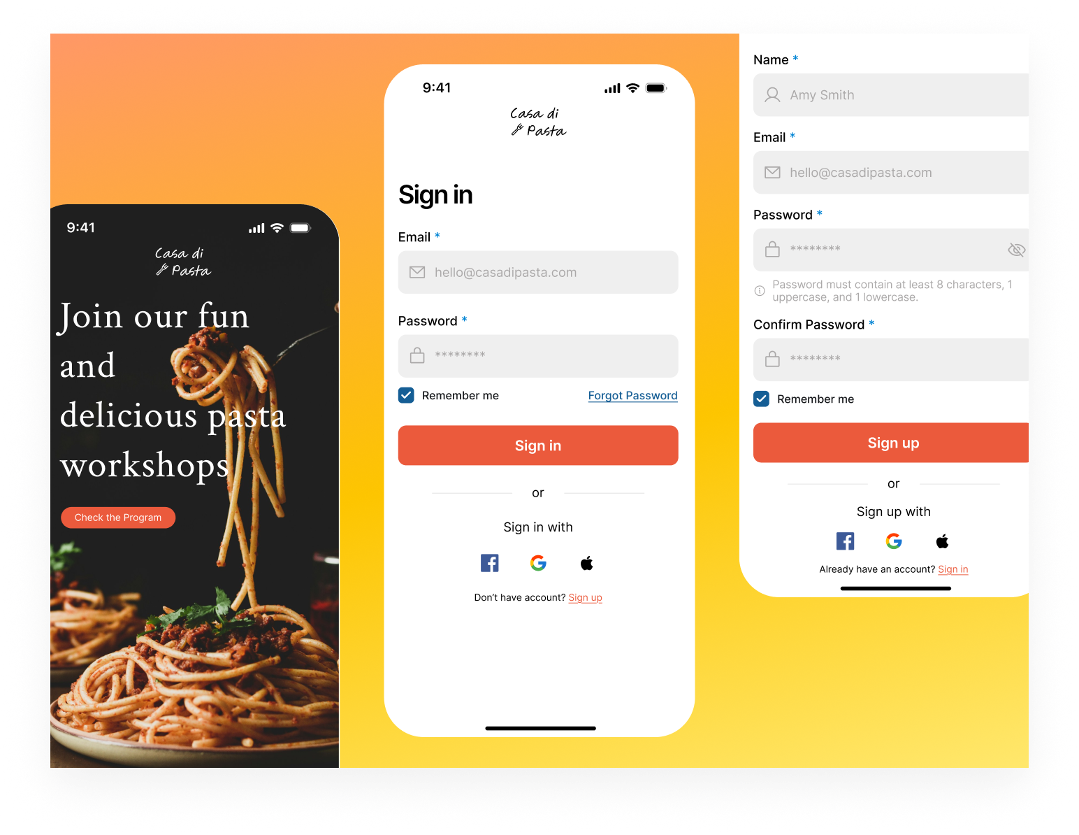
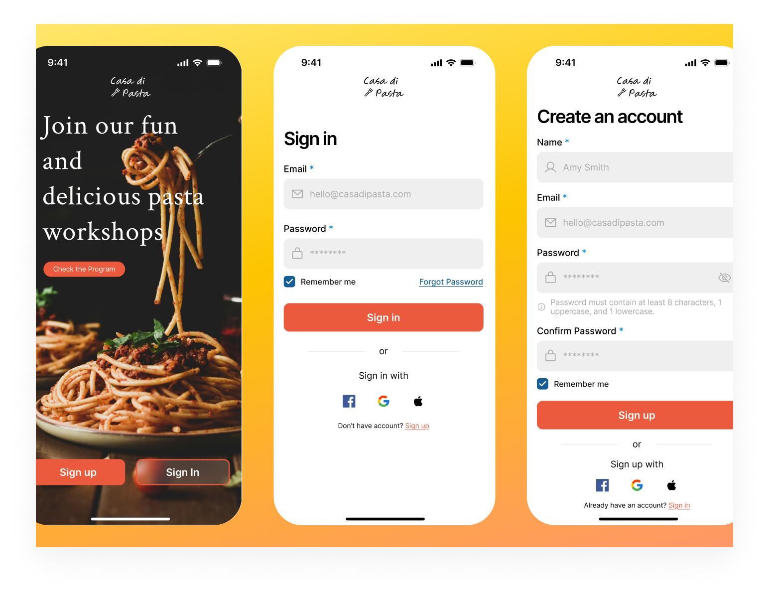
This project is a mobile registration and login flow for a pasta workshop app. My goal was to create a friendly interface that makes signing up as easy as possible.
 📝 Design Rationale
- Industry Color Choice: I used orange as the main brand color because it is warm, inviting, and fits the food industry perfectly.
- Fast Sign-In: I added Social Logins (Google, Apple, Facebook) to reduce effort and help users get into the app faster.
- Password Guidance: I included a default info text for password rules. This helps with error prevention by showing users the requirements before they start typing.
- Clear CTAs: The Sign Up and Sign In buttons use the brand color to stand out, making the main action very clear.
- Clean Layout: I used a minimalist design with plenty of white space to keep the user focused on the form.
Overall, this design balances brand aesthetics with functional UX principles to create a seamless entry point for the Casa di Pasta mobile app.
Tools used
From brief

Topics
Share
Reviews
5 reviews

Hey Elif,
I’ve had the opportunity to review your submission and wanted to share some feedback:
What you did well:
- You’ve done a great job translating the design rationale into the final screens, it’s clear you were intentional about following through on the thinking behind the work.
- The interface feels clean and spacious, which makes it easy to scan and understand without feeling overwhelming.
Areas for improvement:
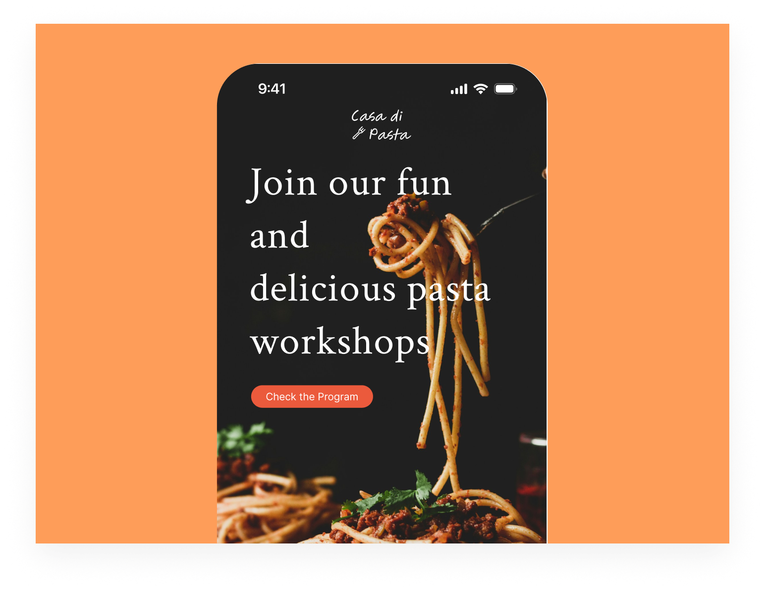
- On the first (splash) screen, the title feels slightly harder to read at a glance. Tweaking the line height and possibly constraining the width a bit could help improve readability.
- The “Check the program” element feels slightly unclear in its role, it’s not immediately obvious whether it’s meant to be a chip or a primary action. Clarifying its purpose through styling or placement could make the interaction more intuitive.
Final thoughts:
I truly enjoyed going through your project and appreciate the attention to detail you've put in. With a few refinements, this could become even stronger in terms of usability and visual consistency. Great effort overall, keep up the fantastic work and I’m excited to see what you create next. Best of luck! 😊

It's great that you thought through the color choice. Orange really works well with the culinary theme and builds an appetizing vibe. Social logins are a good decision because they genuinely shorten the user's path.
But... the splash screen has a readability issue with the headline. The text "Join our fun and delicious pasta workshops" is quite long and stretched out, making it harder to scan at a glance. I agree with the previous mentor that it's worth working on line-height and container width. The "Check the Program" button gets visually lost - it's not entirely clear whether it's a chip or a main CTA. Since you already have two clear buttons at the bottom (Sign up/Sign In), this element needs a better-defined role.
The forms are clean and tidy. It's good that you show password requirements upfront. This actually prevents errors. However, consider whether "Remember me" on the registration screen makes sense. Typically this is used for login only.
Solid work to start with! 💪 A few minor tweaks and the project will be even more cohesive. Good luck! 😊✌️

Love it. This one instantly feels warm and inviting. “Casa di Pasta” already sets a cozy mood, and the onboarding seems to match that vibe nicely.
I like that the flow looks simple and easy to follow. Food apps shouldn’t feel complicated, and this feels approachable like you’re guiding users gently into the experience instead of overwhelming them 👌📱
If I’d spice it up a bit (pun intended 😄), maybe lean more into mouth-watering visuals or stronger emotional hooks in the first screen. But overall, it feels friendly, clear, and on-theme. Nice work!

Hey Elif 😊
Nice project! Do you have a link to the full version by any chance? I was a little unsure about the onboarding title, since from the description it feels like the main focus is more on sign in and sign up.
On the first screen, the image grabs a bit more attention than the headline. That totally makes sense visually, but I’d consider giving the text a bit more weight, maybe with an overlay or stronger typography. The message itself is what helps users understand what’s going on, so it might be worth letting it shine a bit more.
I also like that you’ve thought about password validation. One thing you could explore is giving users feedback as they type, so they immediately know what’s working and what’s missing. I’m curious what made you decide to include a confirm password field? A lot of users find that step a bit frustrating, especially in shorter flows where they’re expecting something quick and easy.

Looks fantastic, spacing and hierarchy looks well. Nothing frustrate me about this app
You might also like

🖥 Desktop Checkout Flow Design


Website CRM Dashboard


Pebble Accessible SAAS Signup Flow


Create a UX Research Survey


Nestra from homepage to checkout process

QuickScan Onboarding

Visual Design Courses

UX Design Foundations


Introduction to Figma

Design Terminology
