Customer Journey Map — Offsite Co-Working Experience

Structure explanation:
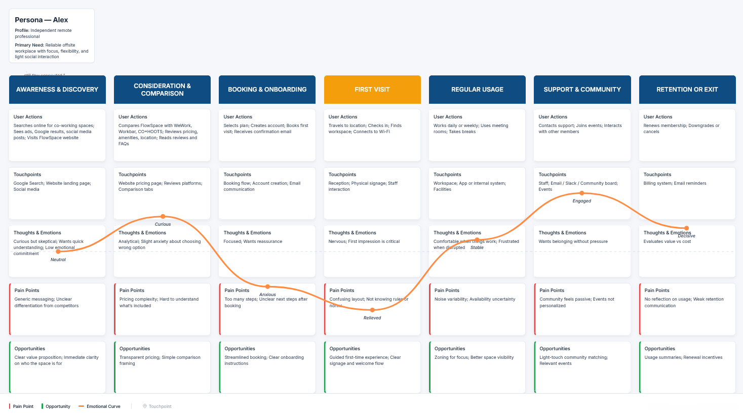
The journey map is organized horizontally by seven experience stages, moving left to right from Awareness & Discovery to Retention or Exit. Each stage is a column with a clear header, showing the chronological flow of the user experience.
Vertically, each column is divided into five consistent layers:
- User Actions – what the user does at that stage
- Touchpoints – channels and interactions involved
- Thoughts & Emotions – mindset and emotional state
- Pain Points – key frictions (highlighted in red)
- Opportunities – improvement areas (highlighted in green)
A persona card anchors the journey at the top left to keep the user context visible.
An emotional curve runs across all stages, visually showing emotional highs and lows over time, aligned with the “Thoughts & Emotions” layer.
A small legend at the bottom explains visual cues (pain points, opportunities, emotional curve), ensuring the map is easy to read and interpret at a glance.

Reviews
4 reviews

The journey is clear, and the emotional curve makes the user mindset easy to understand at each stage. Pain points and opportunities are nicely aligned with real actions. Maybe you could simplify some text to make it even faster to scan. Overall, very solid UX work.

This is amazing! Very well explained.

I just went through your Customer Journey Map for the offsite co-working experience and honestly, this is solid stuff. It doesn’t feel like a generic journey map it actually feels lived-in, like you really thought about the emotional ups and downs.
What I like is how you captured the small friction moments, not just the big milestones. Offsite experiences are super vibe-driven, and you did a good job showing where excitement builds and where things might quietly fall apart. That awareness is strong.
If I’d push you a bit, maybe amplify the opportunity areas even more like, what’s the bold move here? Where’s the “wow” moment you’d intentionally design? Overall though, this feels thoughtful and realistic. You clearly understand experience design beyond just screens.

Suren, the map is structurally solid. 7 stages arranged chronologically, five layers in each column, persona visible in the corner. This works. 💪
The emotional curve is readable and nicely shows the dip at First Visit (anxious → relieved), which makes sense for a new user in a coworking space.
A few things to refine:
- Pain points and opportunities are quite generic "generic messaging" or "transparent pricing" are more like obvious statements than actual insights.
- I'm missing a deeper understanding of why Alex feels a certain way.
- Touchpoints could be more specific "App or internal system" isn't enough to design solutions around.
Visually, the legend is there, but the map itself could use color more effectively Red for pain points and green for opportunities isn't as prominent as it could be. (but it's detail) ;)
I also don't see any data supporting these assumptions. Is this a purely hypothetical map or research-based?
Overall, good work at the framework level. Now it's worth deepening the specifics and validating with real users. That's when this map will really start working for you. ❤️😊
You might also like

🖥 Desktop Checkout Flow Design


Website CRM Dashboard


Pebble Accessible SAAS Signup Flow


Music Player UI - Light & Dark Mode


Create a UX Research Survey


Nestra from homepage to checkout process

User Research Courses

Ethical & Responsible Product Design


Introduction to Product Management


The Product Development Lifecycle & Methodologies
