Accessible Signup & Login Experience — Brainex

Accessible Signup & Login Experience — Brainex
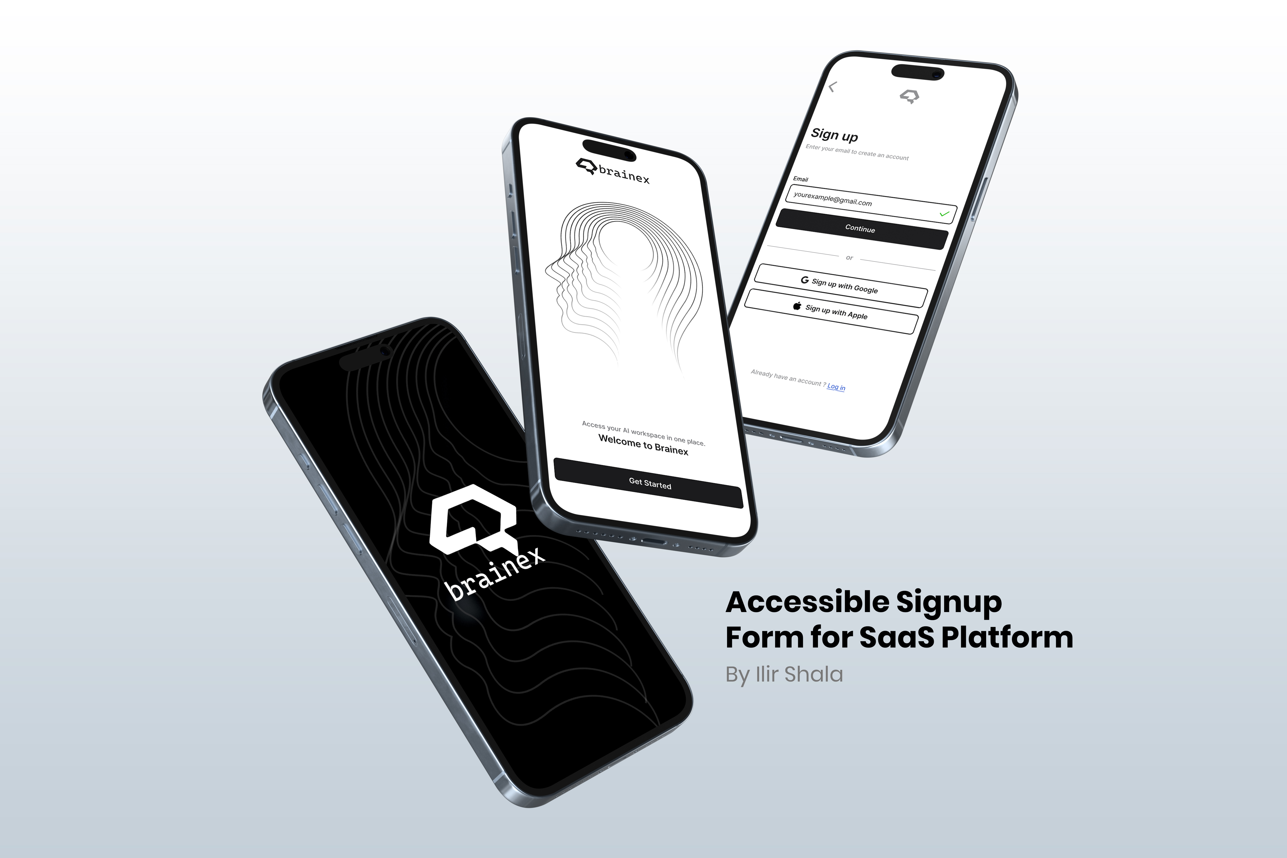
Brainex is a modern and accessible authentication experience designed for a SaaS platform.
The flow focuses on clarity, ease of use, and reducing friction during signup and login.
Accessibility and usability are at the core of the design decisions.
Areas i was focused on:
• Step-by-step signup and login flow to reduce cognitive load
• Clear separation of email and password inputs for better focus
• Error and success states for visual feedback
• High contrast and readable typography for accessibility
• Clear labels and structured validation messages
• Disabled states to guide users and prevent errors
• Google and Apple sign-in options to speed up
Tools used
From brief

Topics
Share
Reviews
4 reviews

🧠✨ First reaction I like that you’re taking accessibility seriously in an auth flow. That’s usually overlooked, so props for that right away 👏
The structure feels clear and focused. Nothing seems visually noisy, and that’s important for sign-up / login screens where users just want to get in fast. It looks like you prioritized readability and hierarchy, which builds trust 👌🔐
If I’d level it up, I’d love to see even more detail around error states, focus outlines, and assistive cues especially for screen readers or keyboard navigation ⌨️♿ That would make the accessibility story even stronger. Overall though, thoughtful and responsible UX work.

Hey Ilir,
You’ve created a really clean project and included some great practices, like using symbols for valid and invalid inputs instead of relying only on color.
I’m curious about your decision to validate the password on the login screen. It makes sense for the registration flow, but I haven’t really seen the same kind of validation on login before. What was the reasoning behind that choice?
Also, even though the Google and Apple login buttons look minimal and fit nicely with the rest of the form, I don’t think they can be used in this exact format. Both Google and Apple have specific brand and design guidelines for their sign-in buttons that shouldn’t be modified.

Starting with positives: splitting the flow into separate screens for email and password genuinely reduces cognitive load, that's a good decision. Error and success states are clear, and password validation with a requirements checklist is a solid UX solution. 👍
However, I have doubts about the declared accessibility. At this contrast level (gray text on white background in form fields and placeholders) there may be WCAG compliance issues. I can't say 100% without testing, but visually it looks borderline. 🤔
Overall the project is clean and well thought out in terms of flow structure. It would be worth verifying contrast with accessibility tools and considering adding visible labels above fields. Solid foundation for further iteration! 💪😊

Great showcase, It looks minimalistic and to the point.
You might also like

Improving Dating App Onboarding: A/B Test Design

FORM Checkout Flow - Mobile


A/B Test for Hinge's Onboarding Flow


Accessibility Asse


The Fitness Growth Engine


The Relational Workspace

Visual Design Courses

UX Design Foundations


Introduction to Figma

Design Terminology
