Events Managment App

🔹 Project Overview
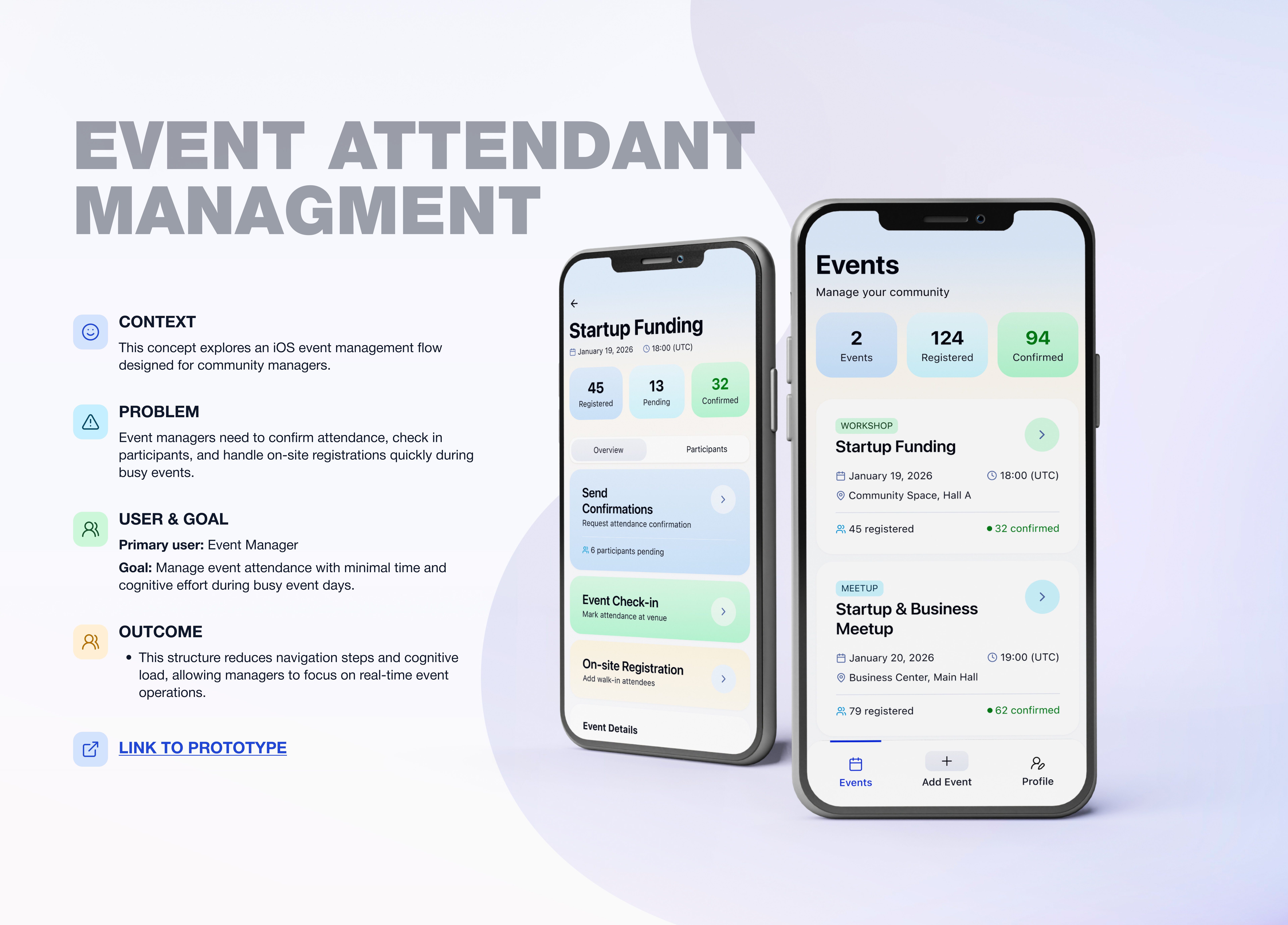
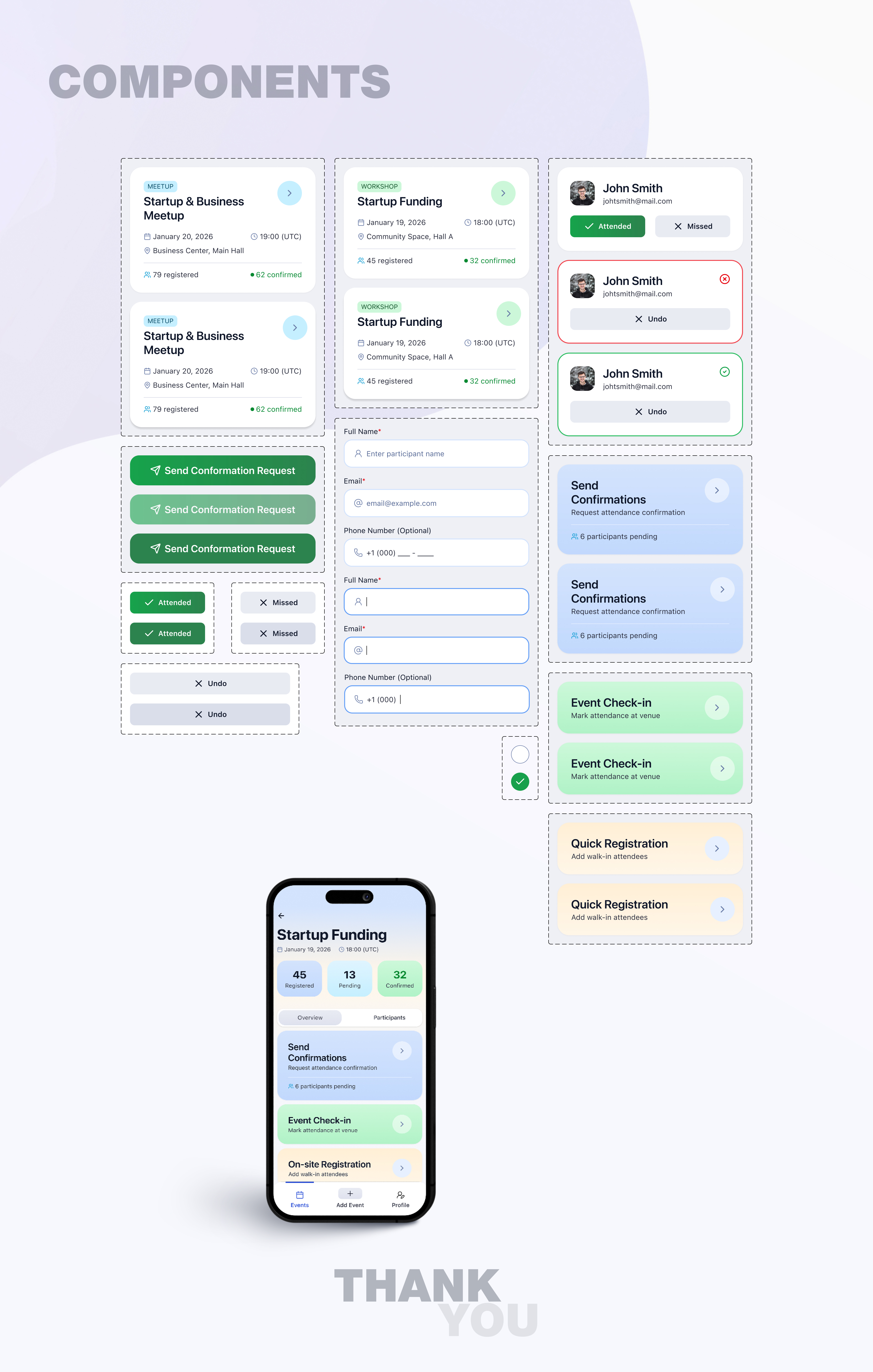
Event Management Tool (iOS)
UX/UI concept for business community event managers
This project focuses on designing functionality for an iOS application used by a business community that regularly organizes events, masterclasses, and meetups.
The main goal was to simplify and optimize routine event management tasks for community managers.
🔹 Problem
Event managers face repetitive and inefficient processes during event preparation and execution:
- the need to manually confirm attendance with each registered participant
- slow and inconvenient event check-in at the venue
- lack of a clear solution for on-site registration of participants who arrive without prior sign-up
These issues increase workload, create stress during events, and raise the risk of errors at critical moments.
🔹 Goal
Design a clear and efficient UX flow that allows managers to:
- see an up-to-date list of events
- manage participant confirmations easily
- perform fast and accurate check-in
- register new participants directly on-site
🔹 UX Approach
I focused on real-life usage scenarios, especially situations where managers have limited time and need to act quickly.
Key principles:
- minimum number of actions for key tasks
- clear separation of features by scenario
- visible and understandable participant statuses
- focus on speed and usability in high-pressure situations
🔹 Key UX Decisions
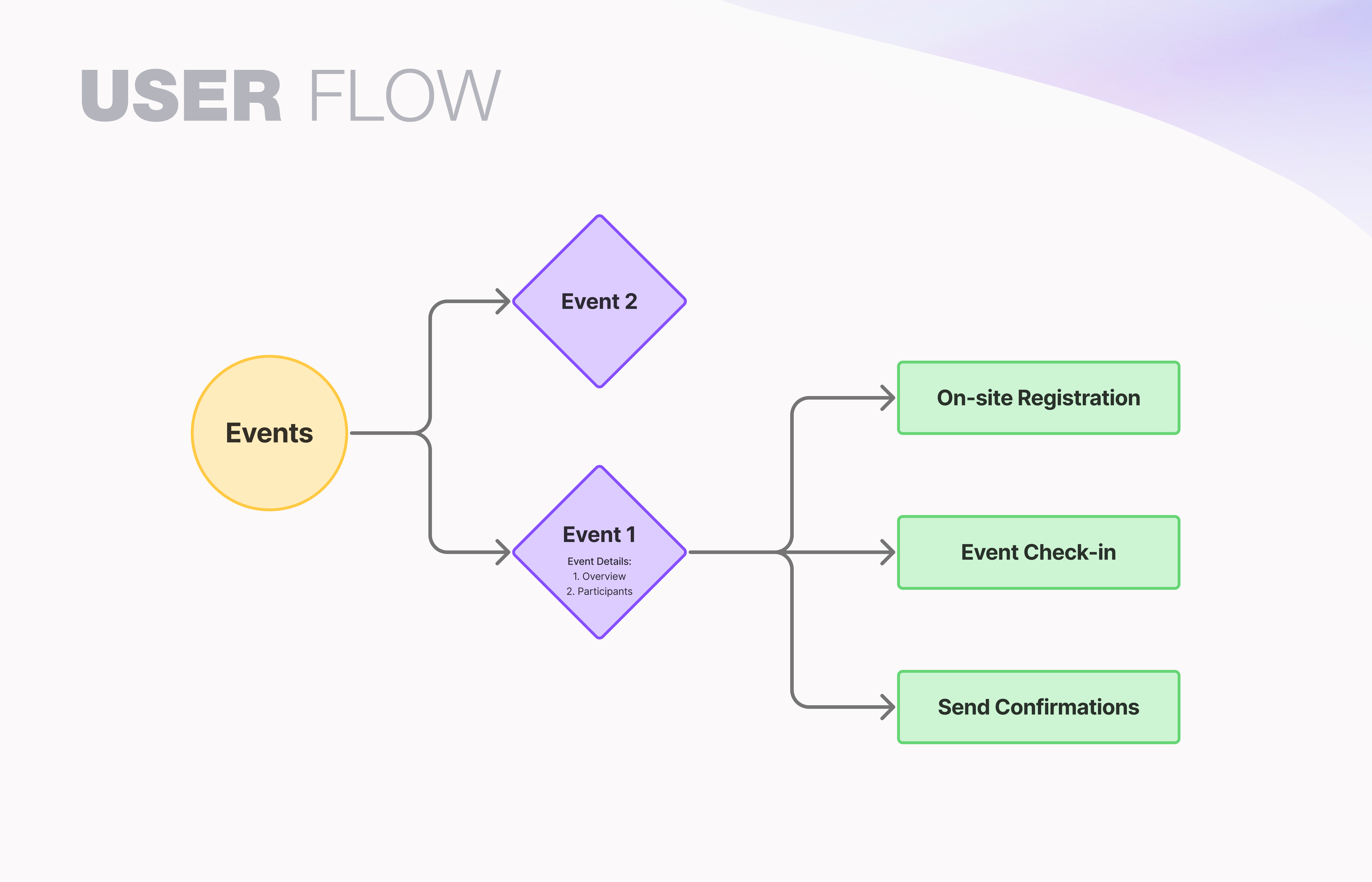
1. Event List as the Entry Point
The first screen for managers is the event list, where the nearest upcoming event is shown at the top.
This allows quick access to the most relevant task without unnecessary navigation.
2. Participant Status Visibility
Each participant has a clear status:
- Confirmed — attendance is confirmed
- Pending — confirmation is still required
This helps managers instantly understand the current situation and take action.
3. Send Confirmations Flow
The Send Confirmations feature allows managers to:
- select all participants with one action
- send a pre-written reminder message
This significantly reduces the time spent on pre-event communication.
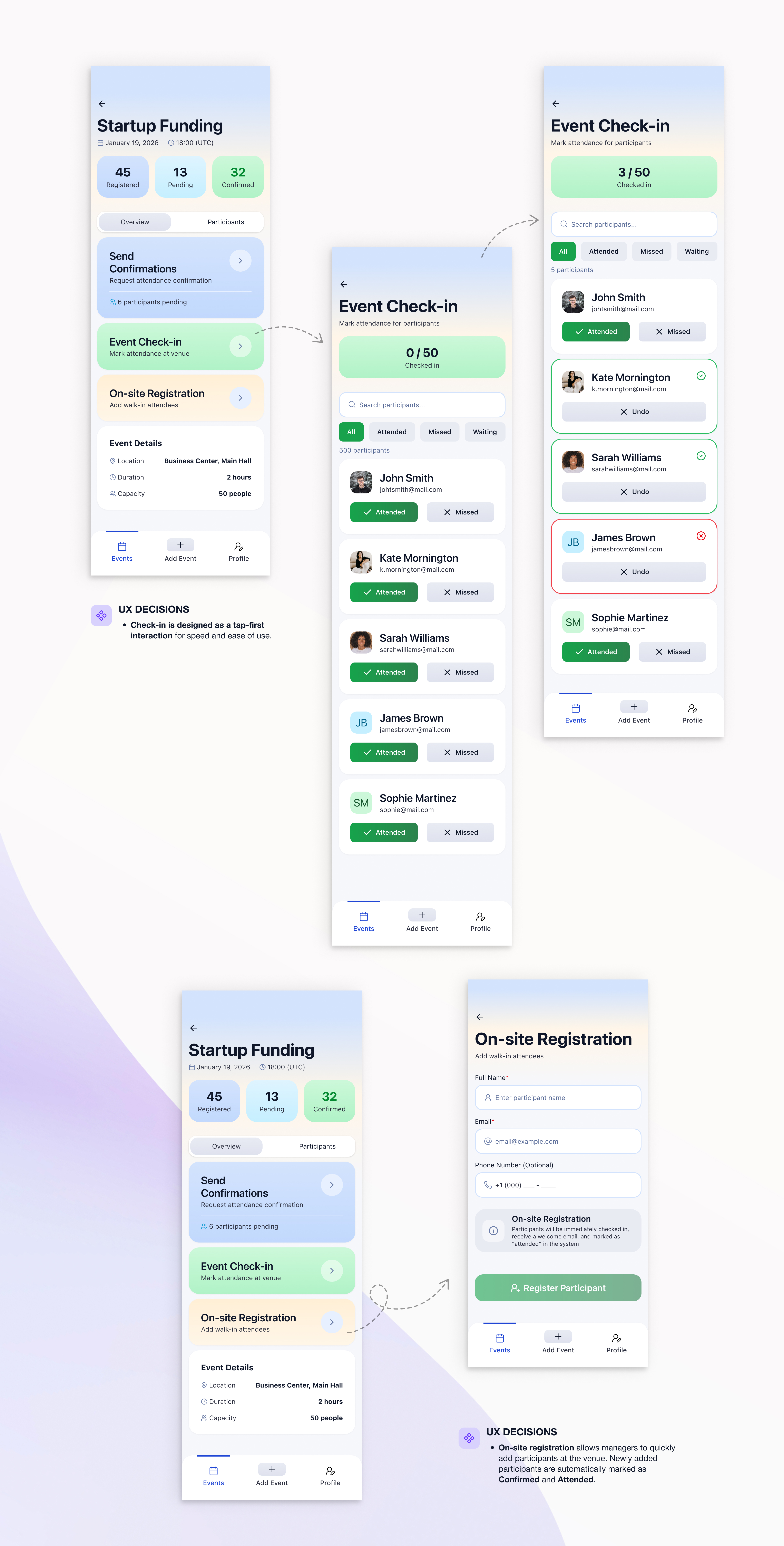
4. Event Check-in
The check-in flow is designed as a simple participant list where managers can:
- quickly mark attendees as present
- automatically track those who did not attend
The main focus is speed and accuracy at the event entrance.
5. On-site Registration
When registering a participant on-site:
- the participant is instantly added to the list
- the status is automatically set to Confirmed
- the participant is immediately marked as present
This prevents duplicate actions and data loss during busy moments.
🔹 Result
The proposed UX flow:
- reduces manual work for event managers
- improves efficiency during event preparation and execution
- lowers cognitive load in stressful situations
- creates a more predictable and controlled event management process
Reviews
5 reviews

Hey Anastasia, 👋
The project makes a really solid impression. It's clear you understood the real problems event managers face and translated them into concrete solutions.
The flow is logical and well thought out for stressful situations when every second counts. I especially like the decision to automatically mark on-site registration as "Confirmed" and "Attended" simultaneously this eliminates unnecessary steps during the most chaotic moments. ❤️
Participant statuses are clear and you can immediately see who confirmed attendance. The dashboard with numbers (Registered / Pending / Confirmed) gives a quick overview without diving into details.
What I'd consider? In the check-in flow I'm missing a quick search by name option (I can see a search field, but I'm not sure how it performs with large lists). With 50+ participants, scrolling might become problematic. 🤔
Overall I agree with other mentors. The interface is clean, and the project documentation is very well prepared. There's a conscious approach to UX visible throughout. (+1)
Great work and a solid portfolio piece. Best of luck with your next projects! 💪😊

Hey! I just checked out your Events Management App project and I think you did a really solid job overall.
I really like how clearly you framed the problem. It feels grounded in real operational pain points, especially around check-ins and managing participants under time pressure. The flow from event list to confirmations and check-in is logical and easy to follow. It shows you’re thinking in systems, not just screens.
One thing I’d encourage you to explore further is scalability. For example, how would this experience hold up with 1,000+ attendees? Adding smart search, filters, or bulk actions could strengthen it even more. You could also enhance the experience with subtle micro-interactions or clearer error-prevention patterns during fast check-ins.
Overall, this feels like a thoughtful, practical solution not just a UI exercise. Great work 👏

Hey Anastasia,
Really solid work overall. The problems are clearly understood and the solution feels very practical and grounded in real event-day scenarios.
The focus on speed, clear statuses and reducing manual effort really shows, especially in the check-in and on-site registration flows. Everything feels intentional and easy to use under pressure.
Great effort overall, keep up the fantastic work and I’m excited to see what you create next. Best of luck! 😊
Hi Anastasia,
Awesome design.
Your solutions answer well to the framed problems that event managers face.
The UI flows for the key features: onsite registration, event check-in, and send confirmation are well-illustrated.
Above all, the document is beautifully created for ease of reading.
Only curious: if you have used AI support in the design process.
In any case, your design result is superb.

I really like this project. The confirmation flow is a strong idea, and the way participant statuses are visualized makes it very easy to understand the current situation at a glance.
The flow feels well thought out and clearly designed for real-life event scenarios, especially when managers need to act quickly. The interface highlights the most important information and supports fast decision-making without overloading the screen.
Great job!
You might also like

SONZ - Entertainment platform


Camp & Travel Explorer - App Design


Solar system Dashboard Utility


Signup page for a SaaS website

Uxcel Halloween Icon Pack


PLANTIST

Popular Courses

UX Design Foundations


User Psychology


Introduction to Figma