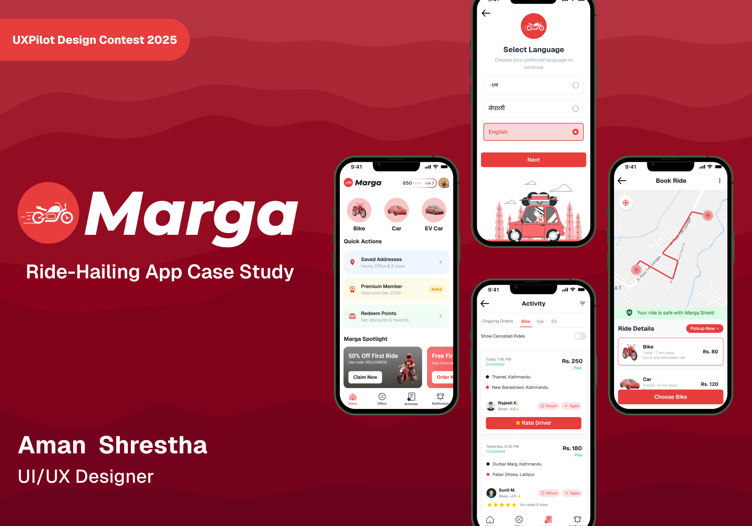
Marga

Overview
Marga is a modern ride-sharing app created to make daily commuting in Nepal easier, faster, and more reliable. The idea behind Marga was to blend cutting-edge technology with a deep understanding of local needs focusing on accessibility, trust, and keeping things simple for users.The design challenge was to craft a clean, intuitive experience that removes any friction from booking rides while making users feel confident and comfortable every step of the way.
With Marga, you can instantly book a ride, see nearby drivers, track your trip in real time, and take advantage of features like loyalty points and ride history — all within a friendly and consistent design.This project was never about building just another ride-sharing app. It was about rethinking how design can bridge technology and the everyday lives of Nepali commuters, creating an experience that feels personal, thoughtful, and truly user-focused.
The Problem
Most ride-sharing apps in Nepal today face similar problems inconsistent fares, confusing layouts, slow confirmations, and a lack of trust between riders and drivers. Many of these platforms don’t fully adapt to local needs or understand how people commute daily in Nepal’s cities and towns.
From early research and user feedback, we learned that riders want:
- Faster bookings without unnecessary steps
- Clear pricing and dependable trip tracking
- A loyalty or rewards system to encourage repeat use
- An app that feels local and relatable, not foreign
- A modern, simple design that avoids clutter
The challenge was to turn these insights into a smooth, easy-to-use experience that works well on any device while keeping a strong connection to local culture and identity.
Goal
The main objective was to design a ride-sharing platform that feels trustworthy, intuitive, and uniquely Nepali. Marga aims to simplify the booking process, ensure transparent fare estimation, and create a rewarding experience for loyal users through an elegant, minimal, and consistent UI.
In short, the goal was to blend simplicity with reliability giving users a sense of control and confidence at every step of their journey.
Design Process
The project followed an iterative, AI-assisted design process combining human creativity with artificial intelligence for faster ideation. The workflow was divided into four key stages:
1. Research and Insight Gathering
A quick competitor analysis and informal interviews helped identify key frustrations with existing ride apps. Insights were drawn around visual hierarchy, interaction flow, and perceived trust indicators.
2. Ideation through AI (UXPilot)
Using UXPilot, several core screens were generated through structured prompts. These AI-assisted outputs provided layout inspiration, component ideas, and visual direction that accelerated the concept phase.
3. Refinement and Detailing in Figma
The generated designs were refined manually in Figma to enhance spacing, hierarchy, and usability. Components were standardized and grouped into a minimal design system for consistent application across all screens.
4. Prototyping and Interaction Mapping
Interactive flows were created in Figma, simulating booking, trip tracking, and user navigation. Each interaction was tested to ensure a smooth and predictable user experience.
This combined approach allowed the project to evolve quickly while maintaining a clear design rationale at every stage.
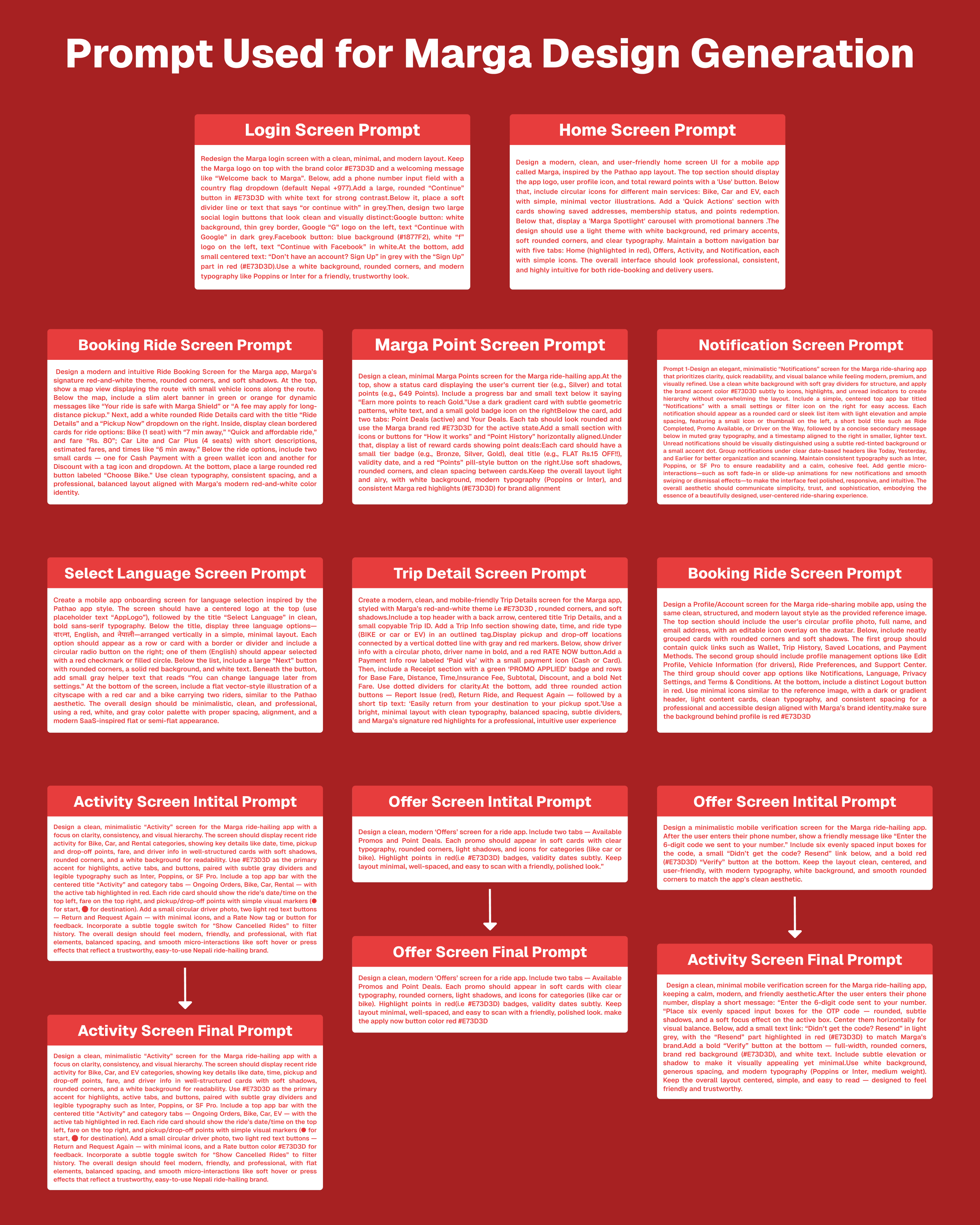
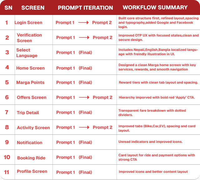
AI Workflow and Prompts
A total of 11 screens were generated using UXPilot’s AI design feature. Each prompt was intentionally descriptive to control visual style, component placement, and tone. Example of a detailed prompt used:
The AI generated strong layout foundations that significantly reduced wireframing time. Each iteration refined button placements, typography sizes, and component grouping. Screens were later adjusted in Figma to ensure accessibility compliance, proper alignment, and visual consistency.
From AI to Figma: Refinement
The AI-generated screens provided an excellent starting point but lacked visual finesse and user-friendly consistency. Through multiple refinement sessions in Figma, every screen was polished to align with Marga’s brand essence.
Select Language Screen Refinement:
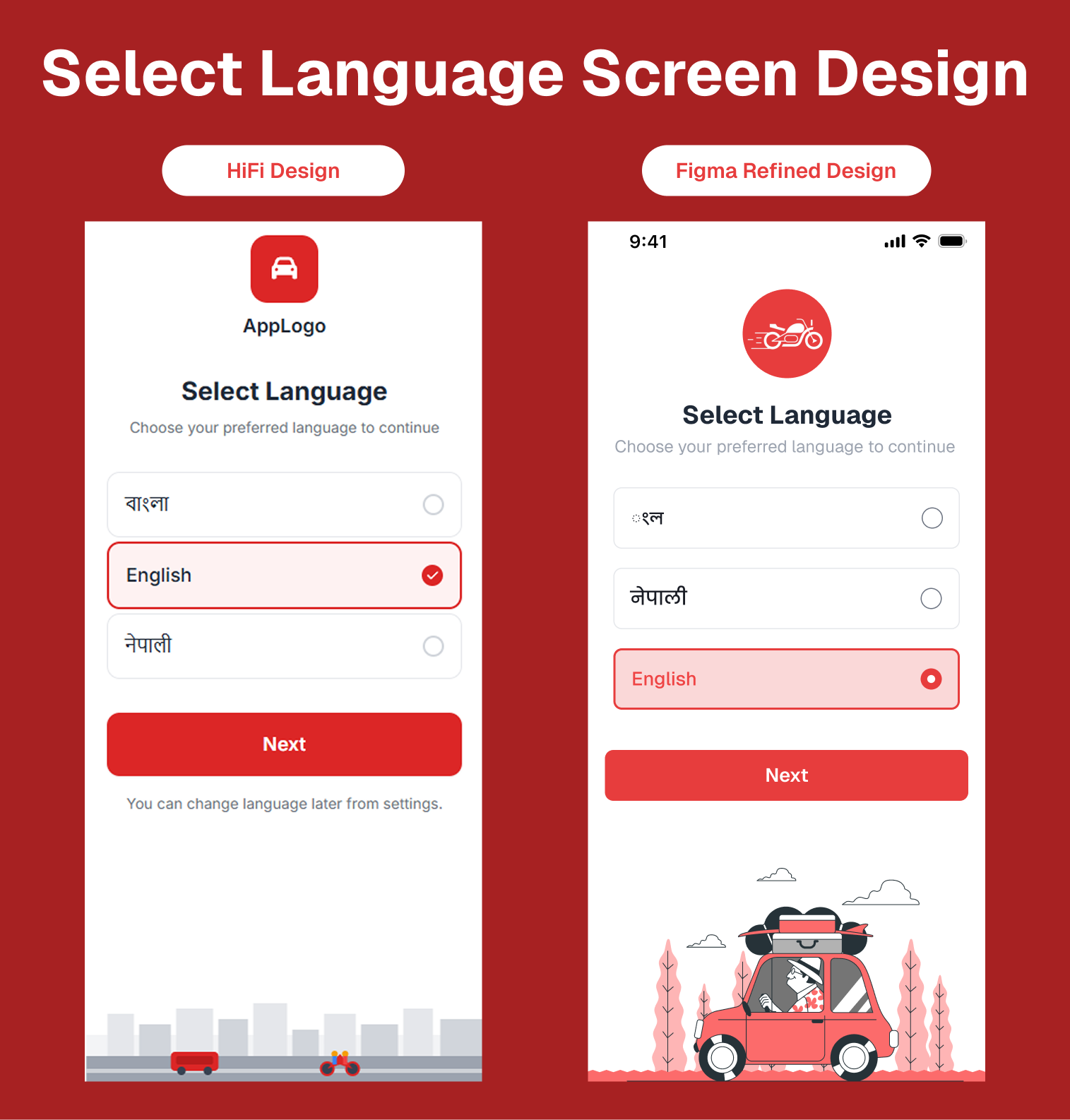
Refined for clarity and minimal interaction steps, this screen adopts intuitive iconography and soft color accents to make language selection feel friendly and straightforward for first-time users.
Login Screen Refinement:
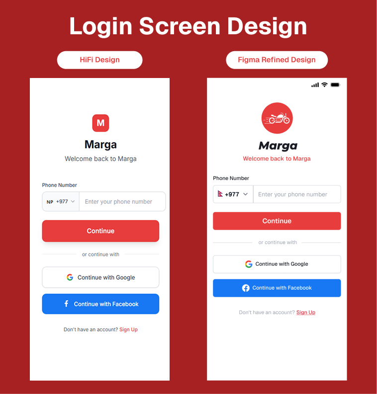
The login screen evolved from a simple AI-generated layout to a more welcoming and structured design. The refined version enhances visual hierarchy, introduces clearer call-to-actions, and applies balanced spacing aligned with Marga’s brand style.
Verification Screen Refinement:
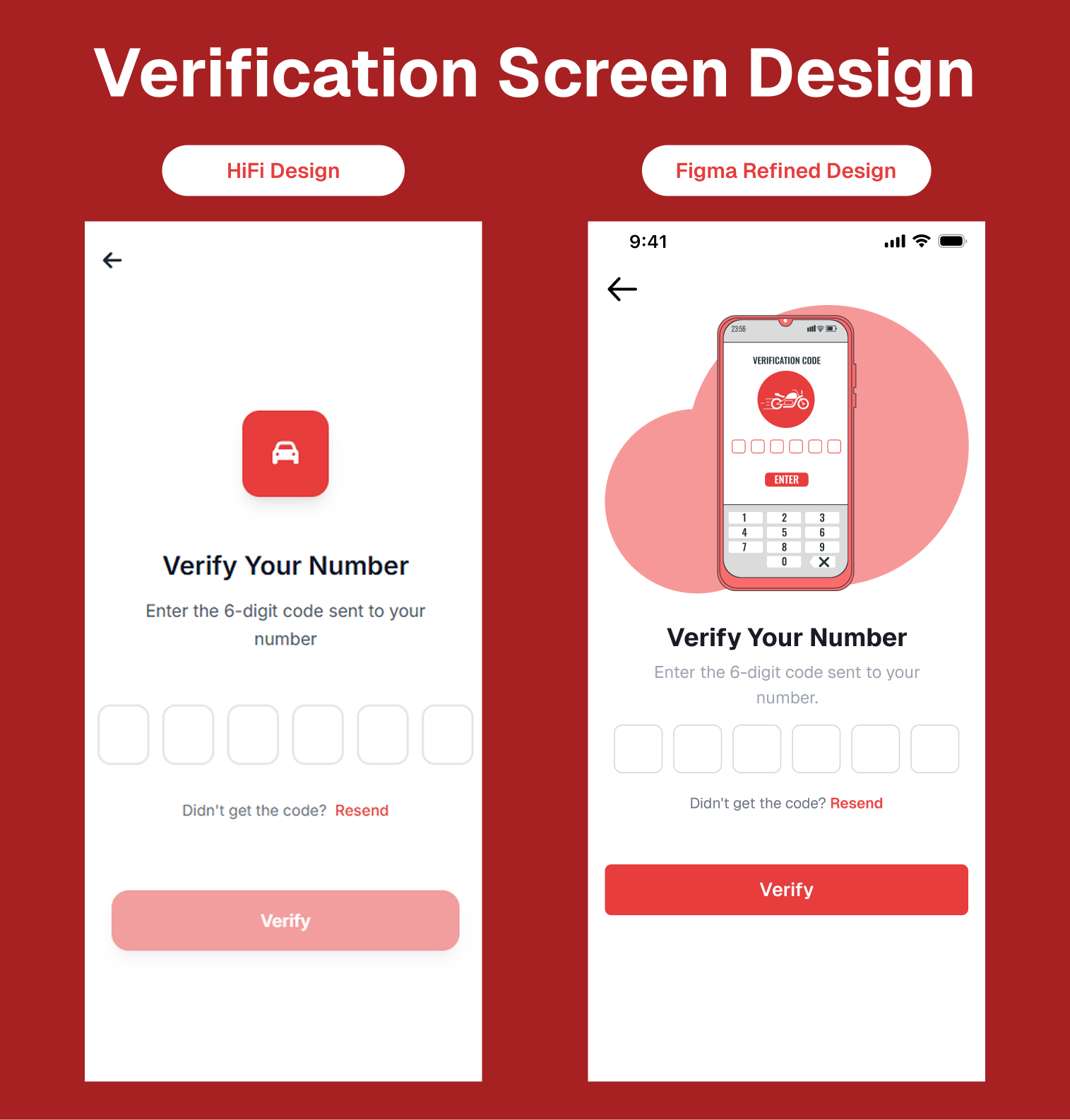
The login screen evolved from a simple AI-generated layout to a more welcoming and structured design. The refined version enhances visual hierarchy, introduces clearer call-to-actions, and applies balanced spacing aligned with Marga’s brand style.
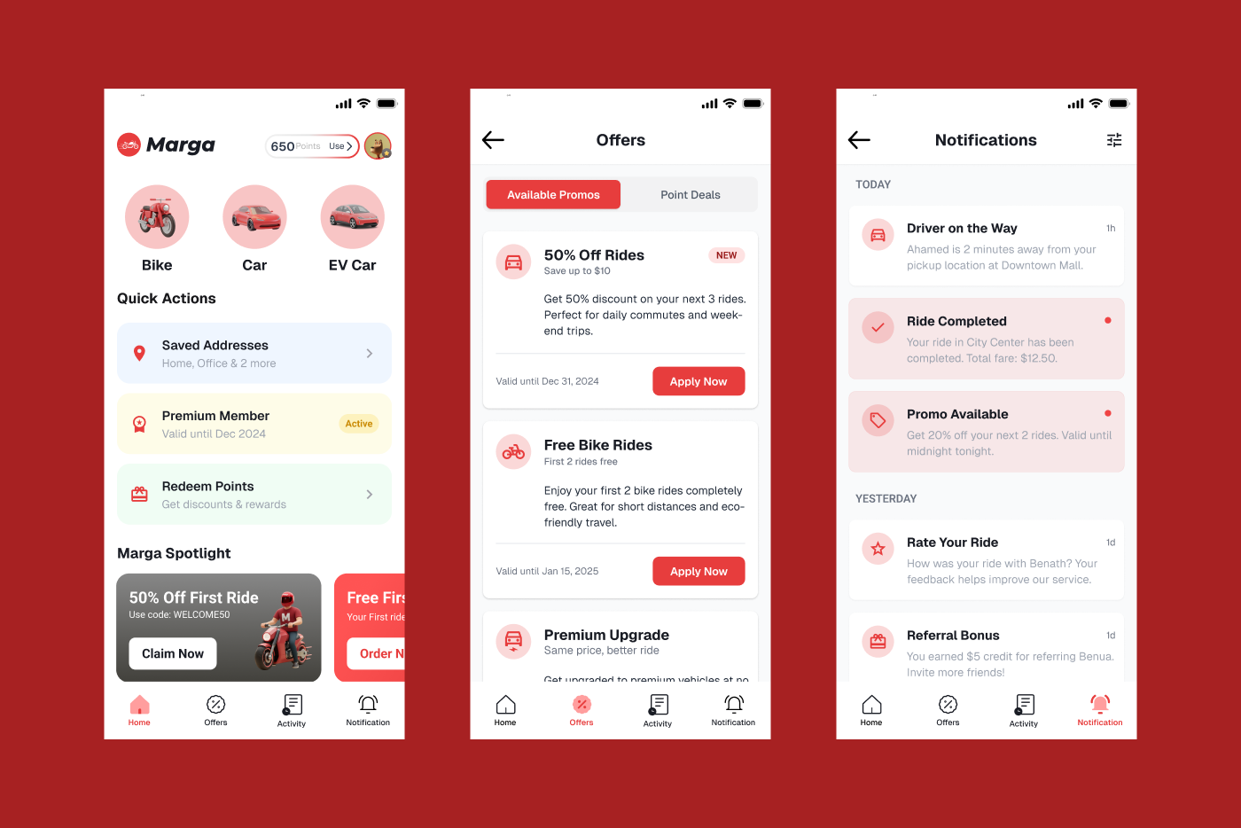
Home Screen Refinement:
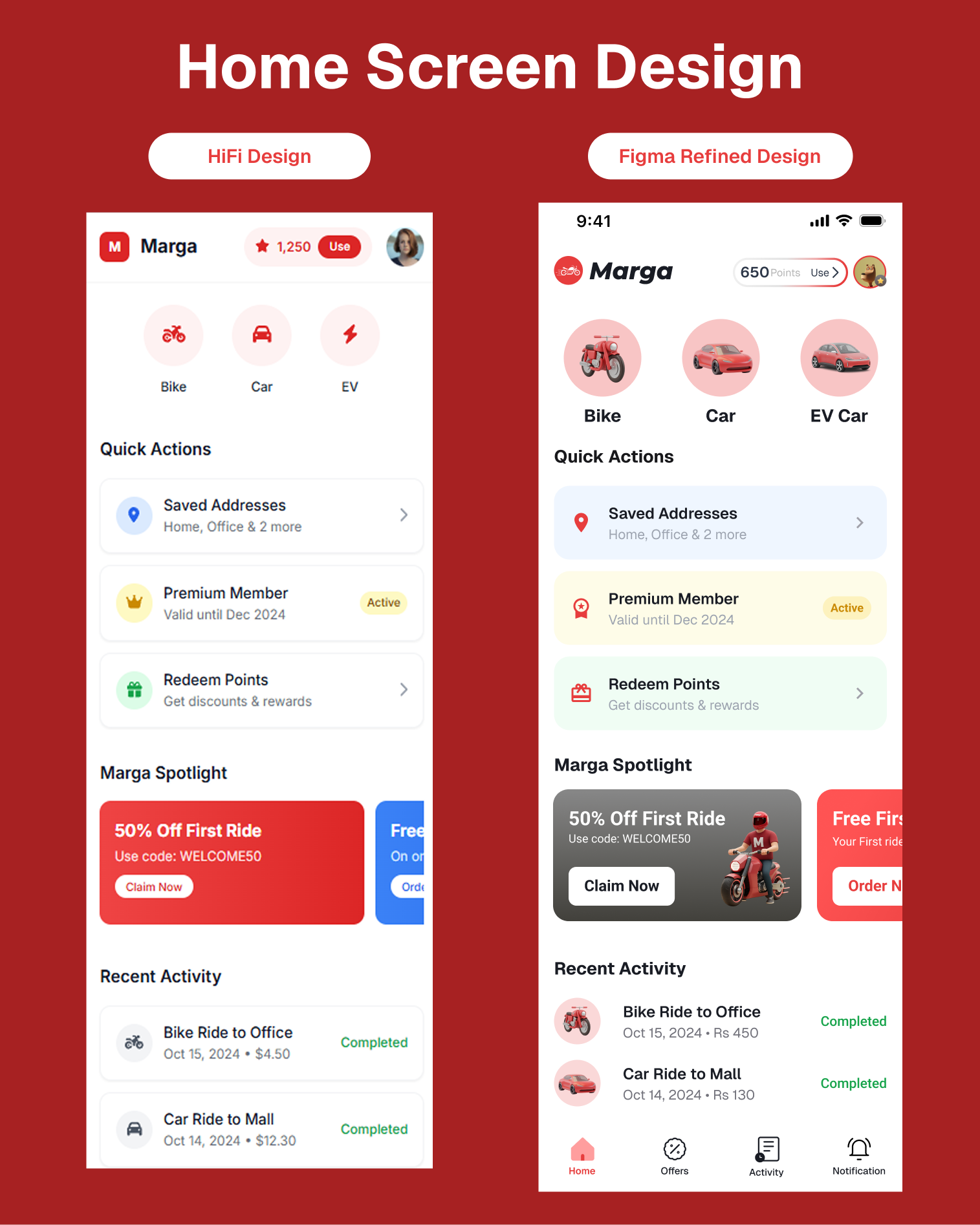
The refined home screen improves visual rhythm and balance, with better use of color, spacing, and iconography. Cards and quick actions are restructured with better illustrations for easier scanning and enhanced accessibility.
Offer Screen Refinement:
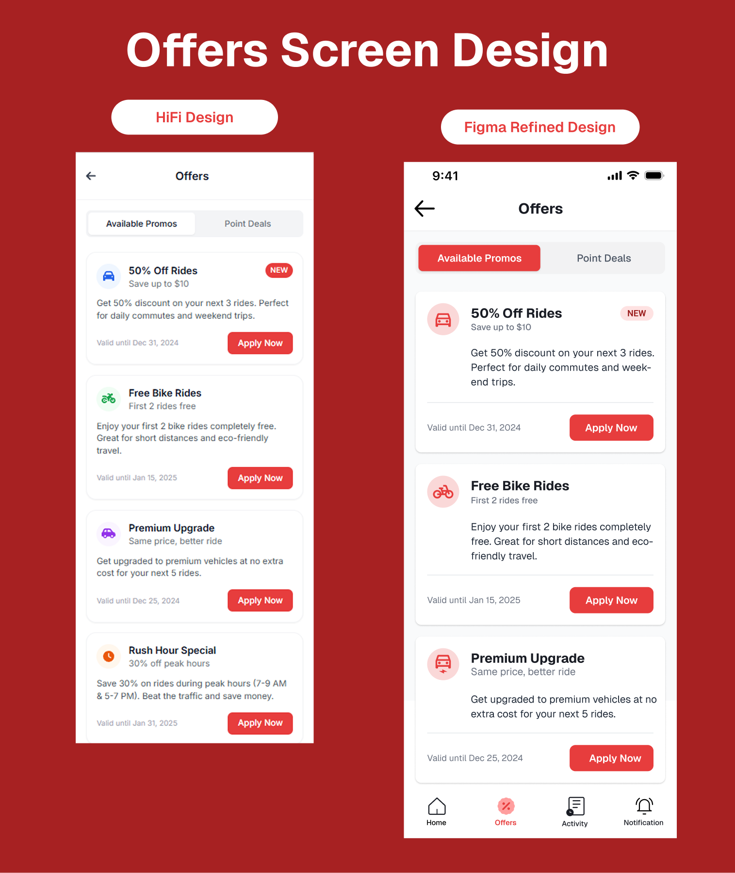
The new design highlights offers through bold icons, stronger contrast, and better visual grouping. The improved layout encourages user engagement while maintaining clean brand consistency with better call-to-action.
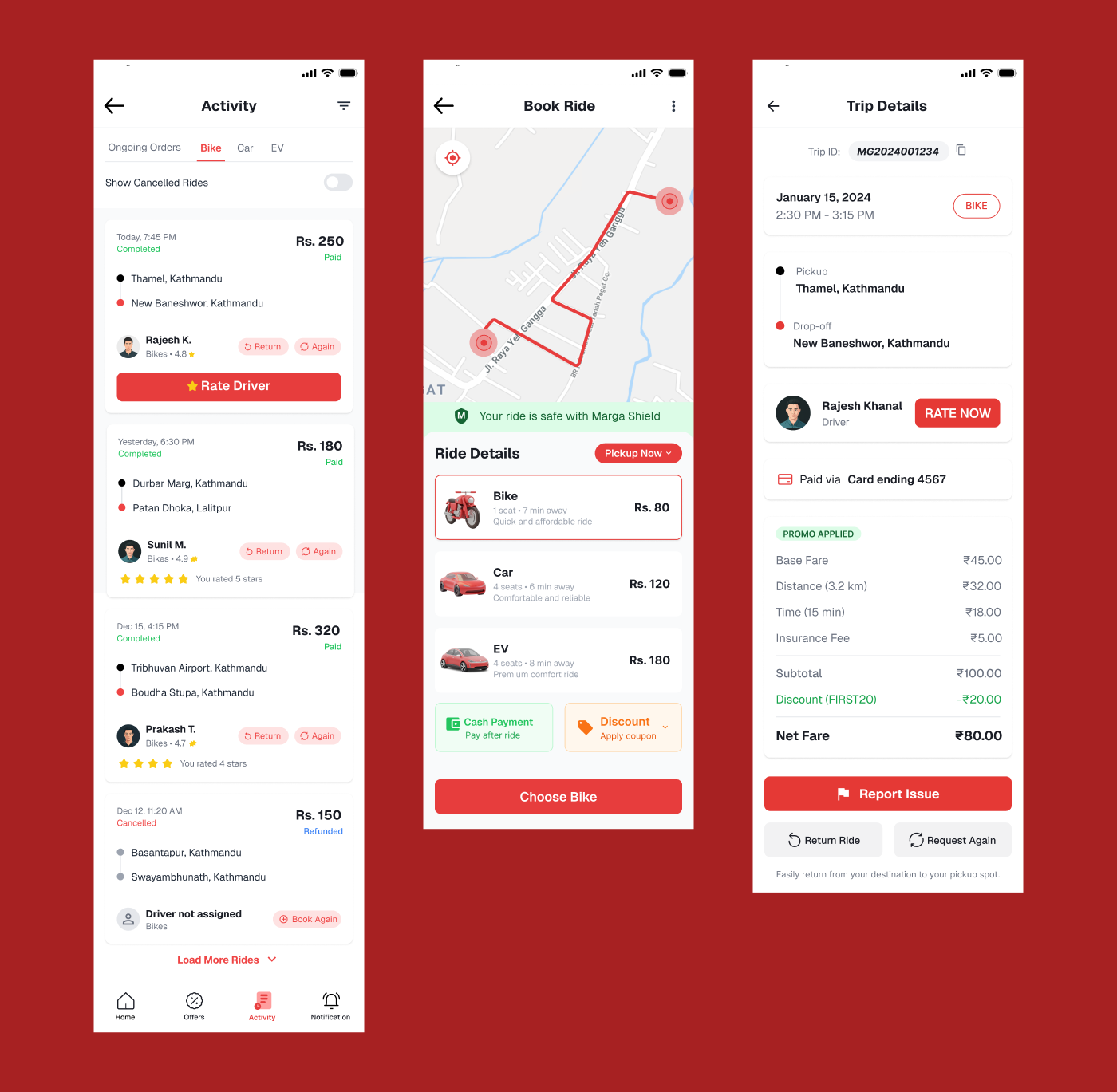
Activity Screen Refinement:
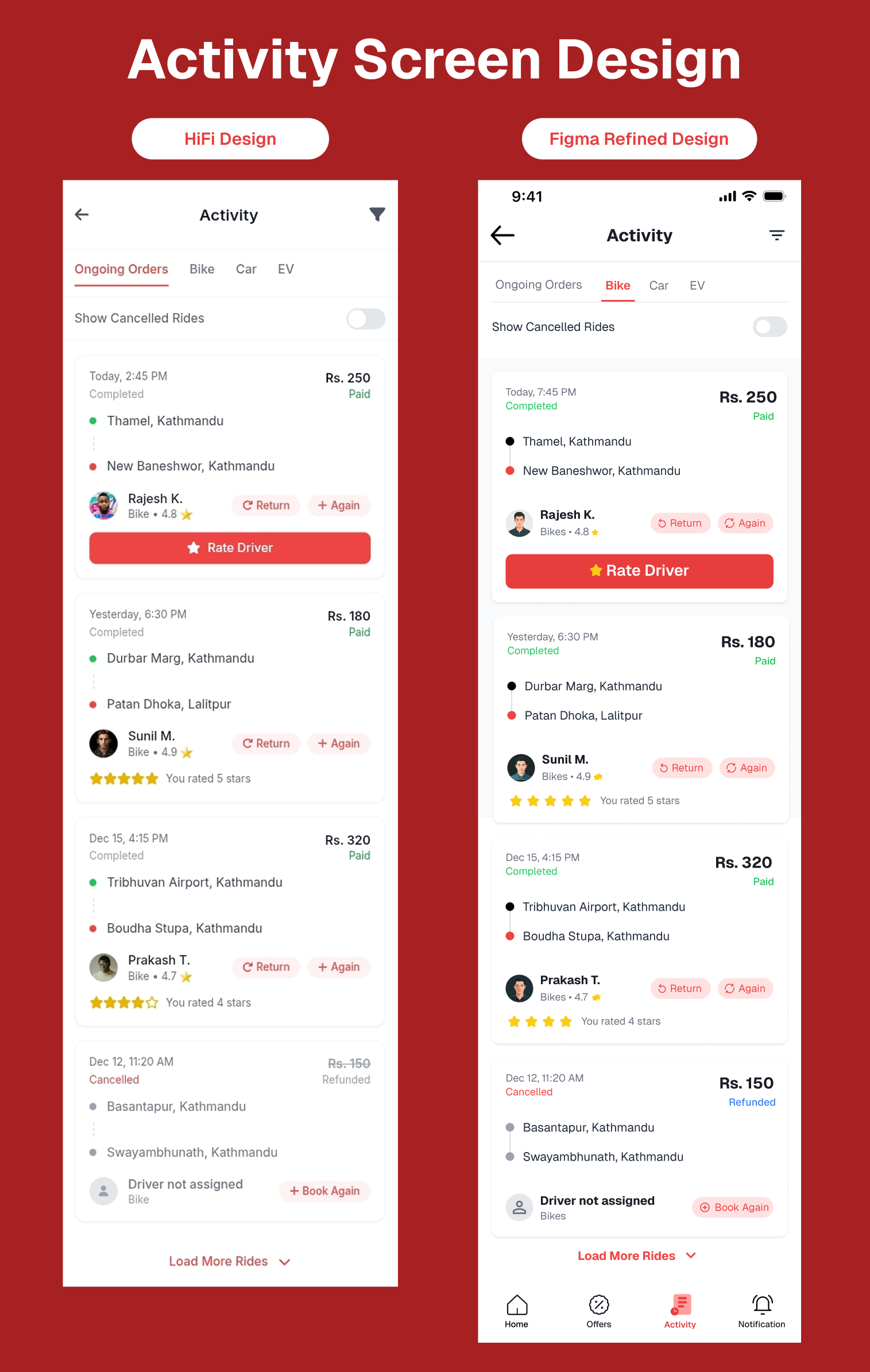
The refined activity screen improves information hierarchy by grouping ride records logically, adding status indicators, and applying modern card layouts for a clear summary of recent trips.
Notification Screen Refinement:
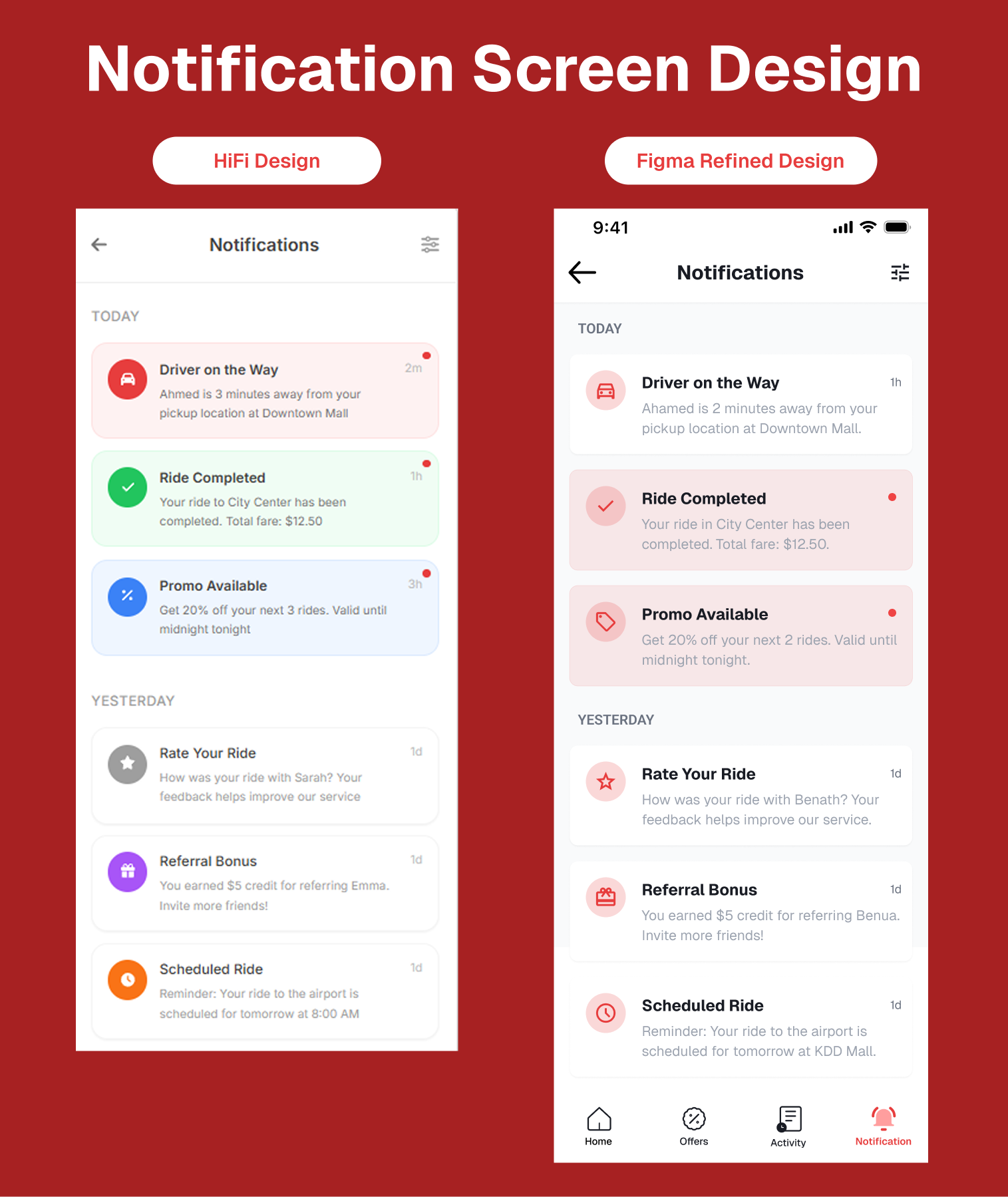
The refined Figma design enhances the original HiFi concept with a cleaner, more cohesive layout and consistent use of brand colors. It introduces better spacing, subtle shadows, and refined typography for improved readability and hierarchy. The updated version also aligns with modern UI principles, offering a polished and professional notification experience.
Booking Ride Screen Refinement:
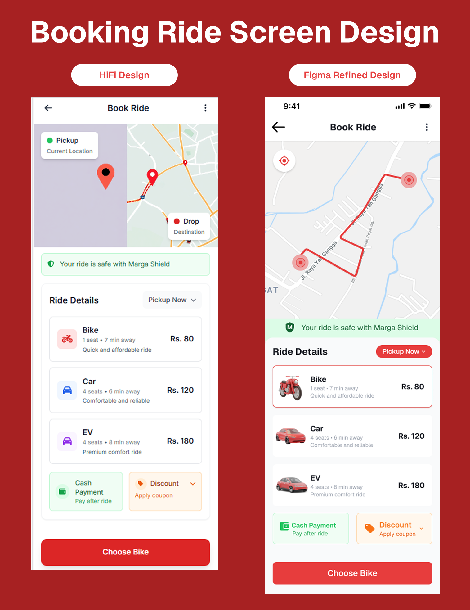
The refined Booking ride design improves the HiFi version with a more immersive map view and a balanced visual hierarchy. It introduces realistic vehicle illustrations, consistent iconography, and cleaner spacing for better readability. The updated interface feels modern and intuitive, enhancing the overall booking experience with a polished and professional look.
Trip Detail Screen Refinement:
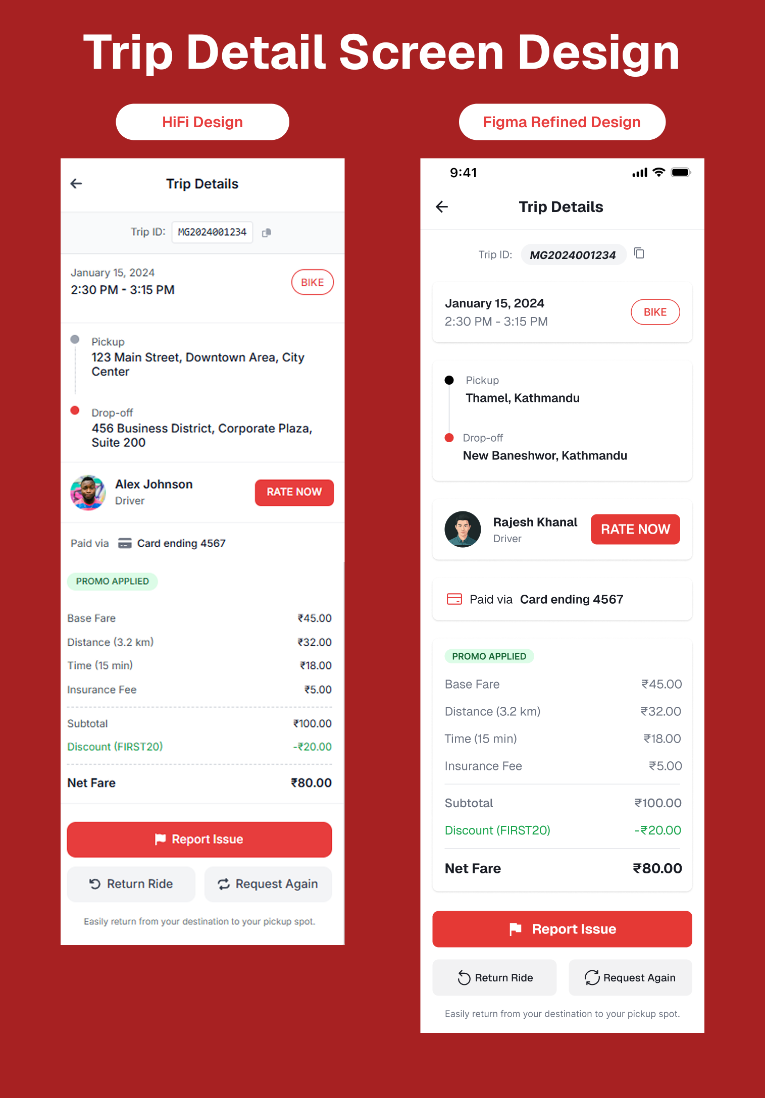
The refined Figma design gives the Trip Detail screen a cleaner and more modern look. It improves spacing, alignment, and typography to make everything easier to read and more organized. The overall layout feels more polished and user-friendly, creating a smoother and more professional experience for users.
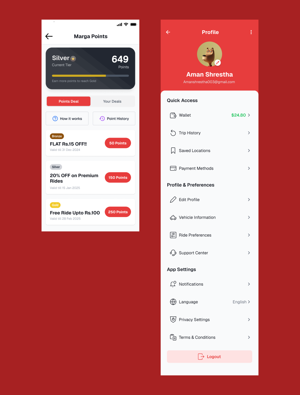
Marga Points Screen Refinement:
The refined Marga Points screen look more organized and visually appealing. It improves spacing, button alignment, and typography for a cleaner, more modern feel. The layout is more balanced and easy to navigate, giving users a smoother and more rewarding experience while tracking their points and rewards.
Profile Screen Refinement:
The refined Profile screen is cleaner and more structured layout. It simplifies icons, improves spacing, and enhances readability for a smoother user experience. The updated version feels more modern and professional, making navigation easier and the overall design more visually balanced.
Design System:
The design system was created to maintain visual consistency and a strong brand identity across the product. It uses the Geist typeface in multiple weights Regular, Medium, SemiBold, Bold, and ExtraBold to establish clear hierarchy and readability. The color palette is built around a bold primary red (#E73D3D) that represents energy and confidence, complemented by neutral grays (#9CA3AF), deep black (#191C24), and a soft pink accent (#FF9E9E) for balance. Together, these elements ensure a clean, modern, and cohesive design language throughout the interface.
User Testing & Validation:
To validate the usability and overall experience of the refined Marga prototype a series of remote usability tests using Maze was conducted. The goal was to ensure the key user flows were intuitive, efficient, and reflective of real-world commuting behaviors. Testing was performed on mobile devices (both Android and iOS) with 11 participants experienced in local ride-sharing apps such as Pathao, Tootle, and InDrive.
The interactive prototype, linked directly from Figma to Maze, allowed for seamless testing and detailed data collection. The focuse was on four core user journeys: Book a Ride, Check Activities, View Trip Details, and Access Marga Points. Each scenario started from the login screen to mimic a complete user session and evaluate the end-to-end experience.
Booking Ride:
In the Book a Ride flow, users were prompted to log in, navigate to the booking page, select a destination, and confirm a ride. Most participants completed the task smoothly, describing the process as simple and straightforward. This flow achieved a 100.0% success rate with 0.0% drop-off and a 39.6% misclick rate.
Check Activities:
During the Check Activities task, users logged in and accessed the Activities screen to view recent rides. All participants found this section easily and appreciated its clear layout and structured presentation. This task recorded a 100.0% success rate, 0.0% drop-off, and a 17.4% misclick rate.
Trip Detail:
For the Trip Detail flow, users viewed detailed trip information by selecting a trip card on the Activities page. The process was perceived as intuitive, with users praising the clean layout and logical content grouping. The success rate was 100.0%, with 0.0% drop-off and a 31.0% misclick rate.
Marga Points:
Finally, in the Marga Points task, users were asked to open the rewards screen from the login page to view or redeem points. Participants found the experience visually engaging and easy to understand. This flow also reached a 100.0% success rate with 0.0% drop-off and a low 6.0% misclick rate.
Overall, the Maze testing phase confirmed that Marga’s interface provides a clear, consistent, and user-friendly experience across all key tasks. The prototype achieved an impressive 100% average task completion rate and a 4.6 out of 5 satisfaction score, highlighting a strong balance between simplicity, usability, and user trust. Insights from testing also guided refinements to minor interaction details, ensuring each screen in Marga not only looks polished but performs seamlessly in real-world scenarios.
Key Learnings :
This project revealed how AI can be a valuable creative collaborator in the design process, helping to balance AI's efficiency with human creativity.
Some key insights I gained include:
- AI speeds up the ideation phase significantly but still relies on the designer’s expertise to ensure emotional depth and contextual relevance.
- Writing precise and thoughtful prompts is a crucial skill; the clearer the guidance, the more aligned the AI-generated results.
- Accessibility and cultural context are essential foundations of usability that go beyond surface-level aesthetics.
- Establishing a mini design system early on helps maintain consistency and reduces the need for extensive redesign later.
- Leveraging AI allows designers to focus more on human-centered aspects like empathy and storytelling, rather than repetitive layout tasks.
Overall, this work demonstrated that AI enhances creativity rather than replacing it. It reinforced the idea that human intention and insight remain at the core of meaningful design.
Final Showcase :
The final screens reflect a harmonious fusion of AI-driven ideation and careful, hands-on refinement. Every element is thoughtfully crafted to embody Marga’s essence confident, rooted in local culture, and elegantly minimal.
The visual style features clean layouts, subtle shadows, and bold accent colors that together convey a sense of energy and clarity. The completed prototype delivers a seamless user experience centered on trust, simplicity, and efficiency.
Conclusion :
Marga isn’t just another ride-sharing idea it’s a glimpse into how new design tools like UXpilot can simplify the creative process without taking away the designer’s touch. It shows how thoughtful design that considers context, accessibility, and simplicity can truly change how we experience everyday mobility.
This project also highlighted the power of collaboration between designers and AI, proving that technology can enhance creativity rather than replace it.
Through this journey, Marga reimagines what it means to create digital experiences that feel local and authentic, yet ready to compete globally. It’s a reminder that great design begins with empathy, clarity, and a clear sense of purpose.
Tools used
From brief

Topics
Share
Reviews
5 reviews

Thank you for the prototype—I happily explored it and really felt like a user. The flow is simple, clear, and consistent, and the visuals support trust and speed. One note: on the code verification screen, the red-bordered inputs may suggest an error state. Consider neutral borders by default, and use red only for validation errors.
Overall, great work—keep it up, and thanks for sharing your process!😊

Very detailed. Great job!

Alex Sanchez
The Marga app design really stands out for its clean and thoughtful approach to ride-sharing. Every screen feels smooth and easy to navigate, with a layout that just makes sense. The bold red accent adds the perfect touch of energy and brand personality. From booking rides to earning Marga Points, everything flows so naturally and feels user-focused. You can tell a lot of care went into the details both visually and in the overall experience. Amazing job Aman capturing the essence of modern, local mobility in a simple yet powerful way.

I like how you have taken an extra step and went ahead with working on figma for the final look and feel.
It is a good way to integrate AI into your workflow.
One doubt that I had: In UI mostly red is used for error or alert states, since red seems to be the primary color here, how do you intend to solve it.

Good work!
You might also like

SONZ - Entertainment platform


Camp & Travel Explorer - App Design


Solar system Dashboard Utility

Uxcel Halloween Icon Pack


Signup page for a SaaS website


Color System

Product Thinking Courses

Go-to-Market Strategy Fundamentals


Ethical & Responsible Product Design

Product Vision & Strategy