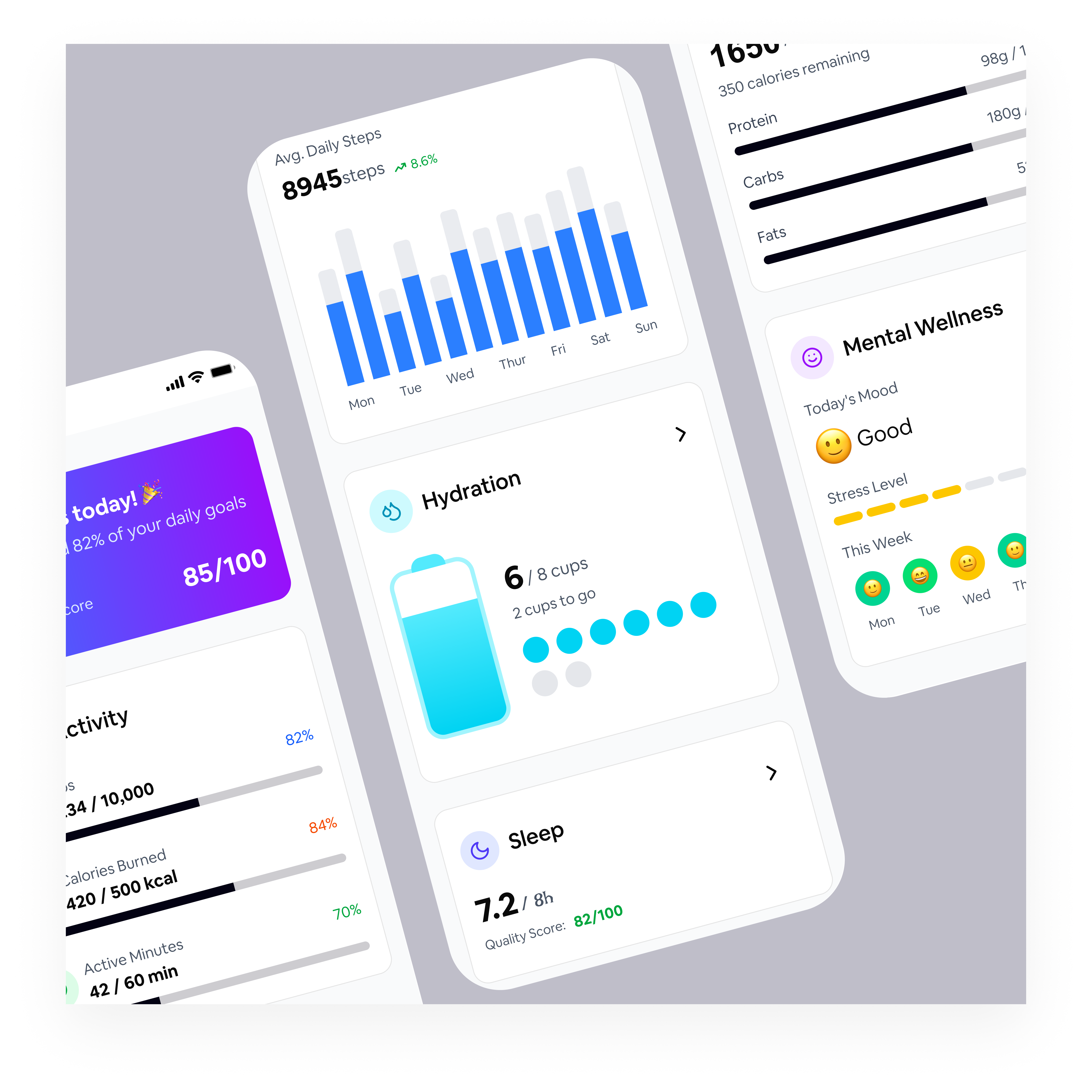
WellNest

The WellNest dashboard is designed to give users a clear, encouraging overview of their health at a glance. A high-level wellness score and progress summary appear first to reinforce achievement and motivate continued engagement. Daily activity metrics use visual progress indicators to emphasize consistency over perfection. Weekly trends highlight long-term patterns without overemphasizing daily fluctuations. Health categories are presented as modular cards for easy scanning and scalability. Calm colors, generous spacing, and intuitive visuals create a friendly, non-clinical experience that supports informed, stress-free decision-making.

Reviews
2 reviews

Hi Seun!
This feels calm and welcoming 🌿✨ The name “Wellnest” already sets a tone, and the design seems to support that soft, comforting energy.
I like how it doesn’t feel overwhelming. Wellness products can sometimes overload users with features, but this feels balanced and breathable. The layout looks intentional, not crowded, which helps build trust and emotional safety 💚👌
If I’d elevate it a bit, maybe push one stronger standout moment like a bold hero message or a more distinct visual element to make it more memorable 🚀 But overall, it feels thoughtful, soothing, and aligned with the concept. Nice direction!

Hi Seun! Nice concept for the wellness dashboard. I was looking for a link to explore the full project, but it seems only the cover is available right now. It would be great to see the complete flow or additional screens to better understand the design decisions.
You might also like

Smartwatch Design for Messenger App


Bridge: UI/UX Rebrand of a Blockchain SCM Product


Pulse Music App - Light/Dark Mode


Monetization Strategy


Designing A Better Co-Working Experience Through CJM


Design a Settings Page for Mobile
Visual Design Courses

UX Design Foundations


Introduction to Figma

Design Terminology
