Asana - Color System Redesign

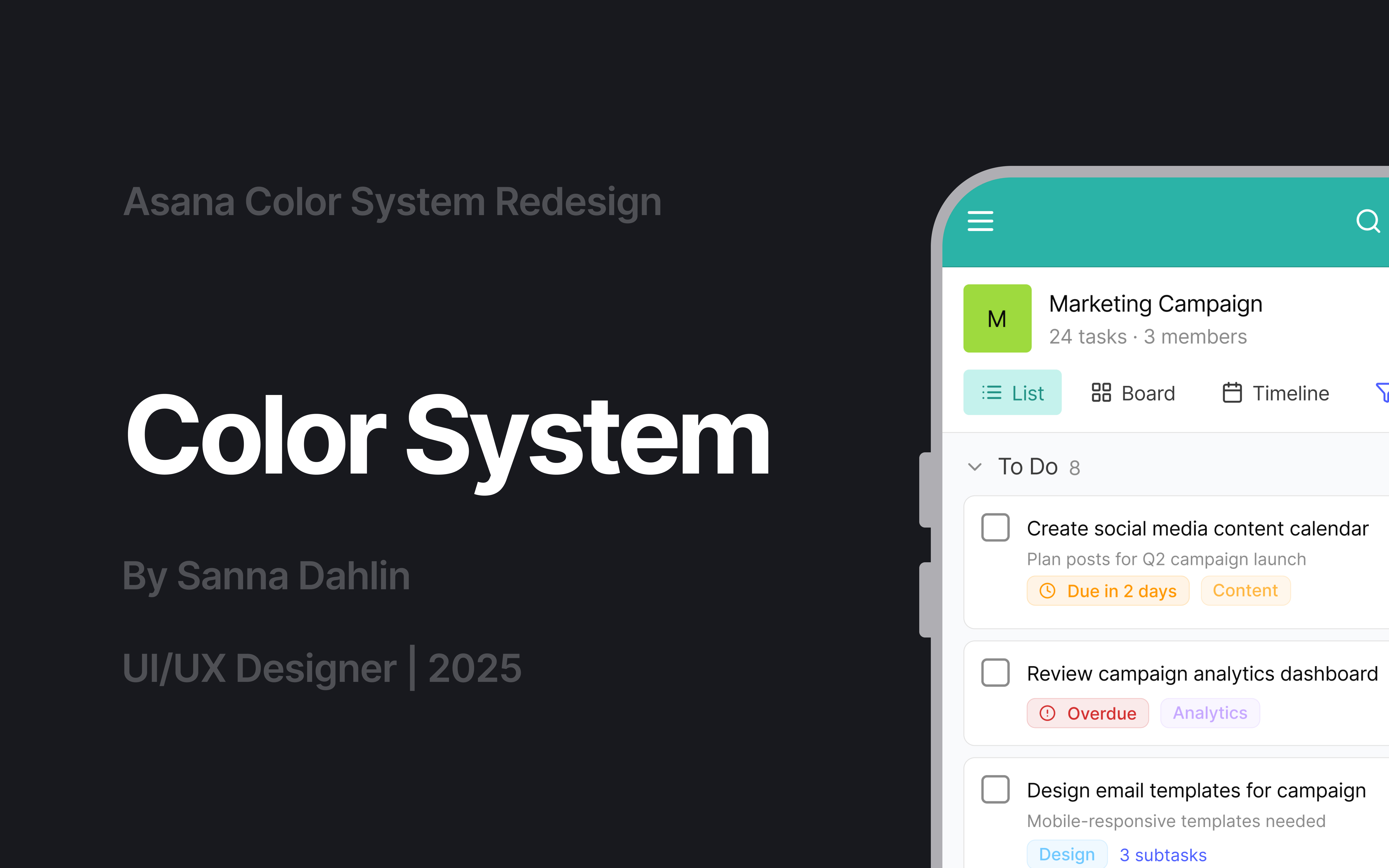
I redesigned the color system for Asana, a digital work management platform, to create a calmer and more focused visual experience while keeping the brand modern and recognizable.
The original interface relied on many bright colors, playful but visually overwhelming.
I simplified the palette, strengthened hierarchy and improved readability through a system built on clarity, balance and accessibility.
Centered around teal as the main brand color, supported by coral, indigo, and calm neutrals, all tones were refined to meet WCAG contrast standards.
The result is a cohesive and emotionally balanced palette that enhances focus, usability, and brand consistency.
Explore the full color palette and UI applications in the presentation slides.

Reviews
2 reviews

Thank you for the project—you did a huge job and the palette feels balanced and harmonious. One important note: white text on the light green background (#91CF35) has very low contrast—about 1.87:1—which does not meet accessibility standards for body text. To fix this, switch the text to near‑black or a much darker shade of the same green hue so the contrast reaches at least 4.5:1 for normal text (or 3:1 for large headings). This small change will keep your style while making the content easier to read for everyone.
Great work overall—keep going!

- Solid research and justification - You've accurately identified the problem with Asana's current UI – this rainbow of colors can be truly overwhelming. Your reasoning regarding the need to simplify and strengthen the visual hierarchy is spot on.
- Clear color structure - The system is logically divided (primary / secondary / tertiary / system / neutral) and well-described. It's clear you've considered various use cases – from the main navigation to system feedback.
- Accessibility - A plus for the WCAG compliance mark. You demonstrate AAA with examples, which is great.
- Emotive justification - You've described not only the "what" but also the "why" – the aspect of calm, trust, and clarity with teal is a good direction.
To sum up, really good job. :)
You might also like
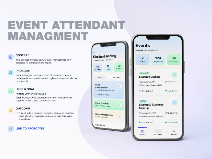
Events Managment App

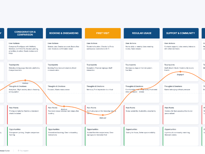
Customer Journey Map — Offsite Co-Working Experience

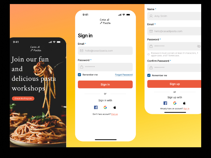
Mobile Onboarding: Casa di Pasta

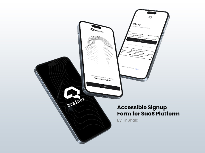
Accessible Signup & Login Experience — Brainex

Accessible Signup Form

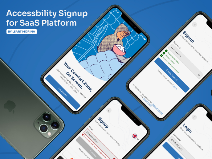
Accessible Signup Form

Visual Design Courses

UX Design Foundations


Introduction to Figma

Design Terminology
