Findings Presentation
Transform audit findings into compelling visual narratives that drive stakeholder action.
Turning design audit insights into compelling presentations is both an art and a science. After collecting all that valuable data, the real challenge begins: how do you make others care about your findings? The presentation phase bridges the gap between your analytical work and the changes that need to happen. Stakeholders from different backgrounds need different levels of detail. Executives want the bottom line, while design teams need the specifics. Great audit presentations tell a story, connecting design issues to real user experiences and business results. Rather than drowning your audience in data, well-crafted visualizations and annotated screenshots make complex problems instantly understandable. Documentation matters too; your findings need to live beyond the presentation itself through executive summaries and comprehensive reports. Remember that your goal isn't just pointing out problems—it's highlighting opportunities. A thoughtfully constructed presentation transforms technical findings into a compelling case for change, setting the stage for meaningful improvements that everyone can get behind.
When organizing design audit results, the structure makes the difference between actionable insights and overwhelming data dumps. A clear findings framework helps stakeholders quickly grasp key issues and their implications. Start by categorizing issues under consistent themes — usability problems, visual inconsistencies, accessibility gaps, or performance issues.
Here are some tips on how to present findings in the most effective way:
- Evidence and context: For each finding, include screenshots, videos, analytics data, affected user segments, and business impact assessment. Where applicable, add links to updated or suggested design files so stakeholders can compare and make informed decisions.
- Severity classification: Assign clear ratings (Critical/High/Medium/Low) with defined criteria for each level.
- Neutral tone: The description should be factual without blame assignment or subjective judgment.
- Standardized format: Consider using templates that standardize how information is presented across different sections.
- Strategic organization: Organize findings from critical to minor, making prioritization visible at a glance.
- Accessible language: Avoid technical jargon that might alienate non-designer stakeholders.
- Flexible depth: The structure should accommodate both high-level summaries and detailed examinations of specific issues.
Different stakeholders need different ways to understand your audit findings. Choosing the right format can mean the difference between action and inaction on your recommendations.
Here are key considerations when selecting presentation formats:
- Executive leadership: Provide concise executive summaries focusing on business impact, ROI, and strategic implications.
- Design teams: Deliver detailed breakdowns with specific examples, screenshots, screen videos, and technical specifications.
- Product managers: Balance business metrics with user experience impacts, highlighting
prioritization frameworks. - Developers: Include implementation-focused
documentation with clear technical requirements and constraints. - Cross-functional stakeholders: Create modular presentations where sections can be emphasized or minimized based on audience composition.
Use dashboards for data-oriented stakeholders, journey maps for customer experience teams, and before/after mockups for visually-oriented audiences.
Consider which deliverables best serve your audience: slide decks, interactive prototypes, written reports, or facilitated workshops.
Executive summaries turn complex design problems into straightforward business insights. They're often your only chance to grab attention from busy decision-makers who control resources for implementing your recommendations.
Here are a few more recommendations to consider:
- Problem-solution pairs: Pair each critical problem with a clear, actionable recommendation. Support your points with 2-3 compelling visual examples that instantly communicate significant issues.
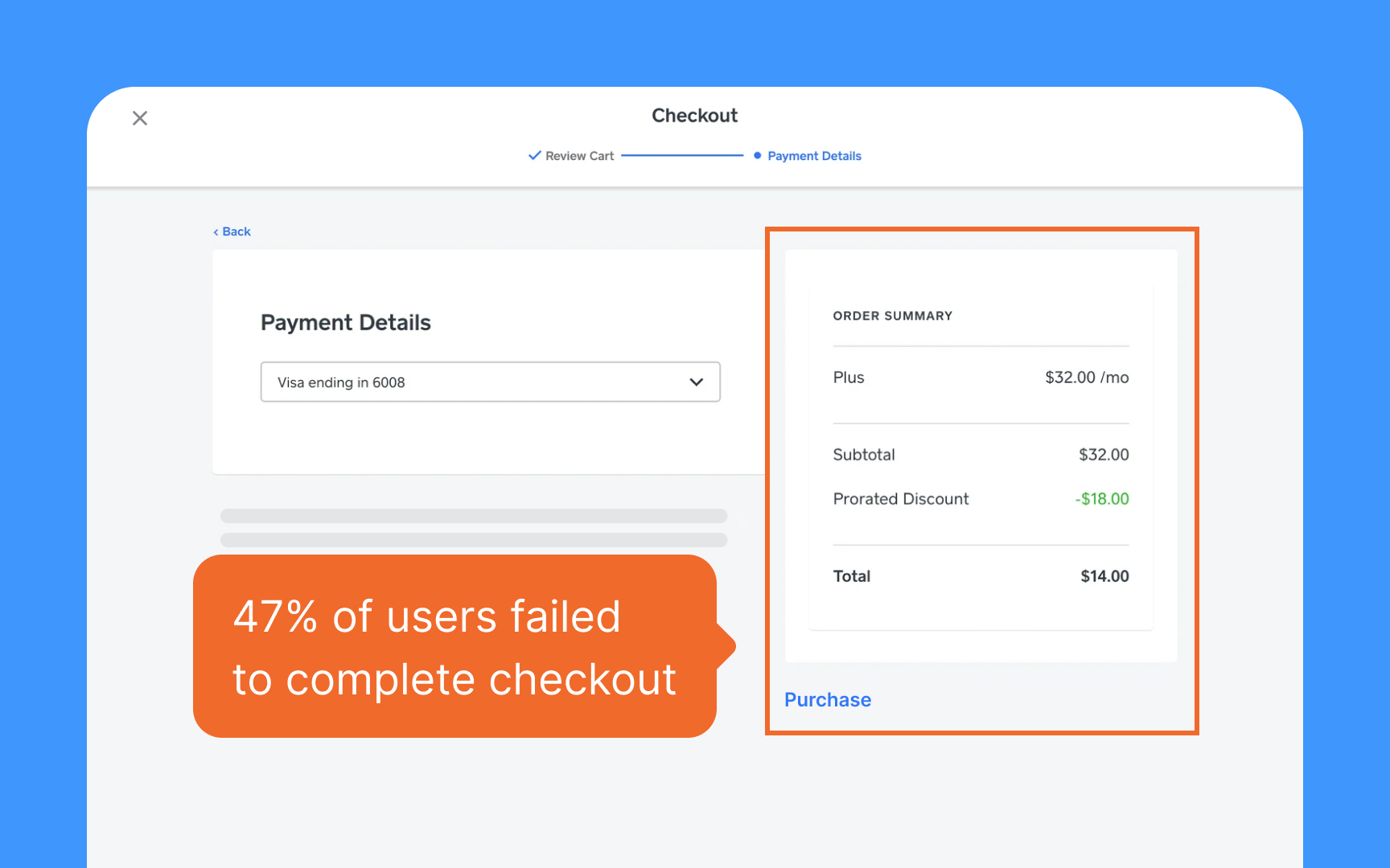
- Hard numbers: Quantify the impact. "47% of users failed to complete checkout" resonates more than "users struggled with checkout."
- Strategic alignment: Place your findings within a strategic context by connecting them to existing business goals and initiatives.
Conclude with clear next steps, outlining immediate actions and longer-term recommendations with associated resource requirements. Remember that executives often share these summaries with others, so they should stand alone as comprehensible documents.
Good visuals make complicated design problems easy to understand. When stakeholders can see issues clearly, they're more likely to care about fixing them.
When creating visualizations for design audit findings:
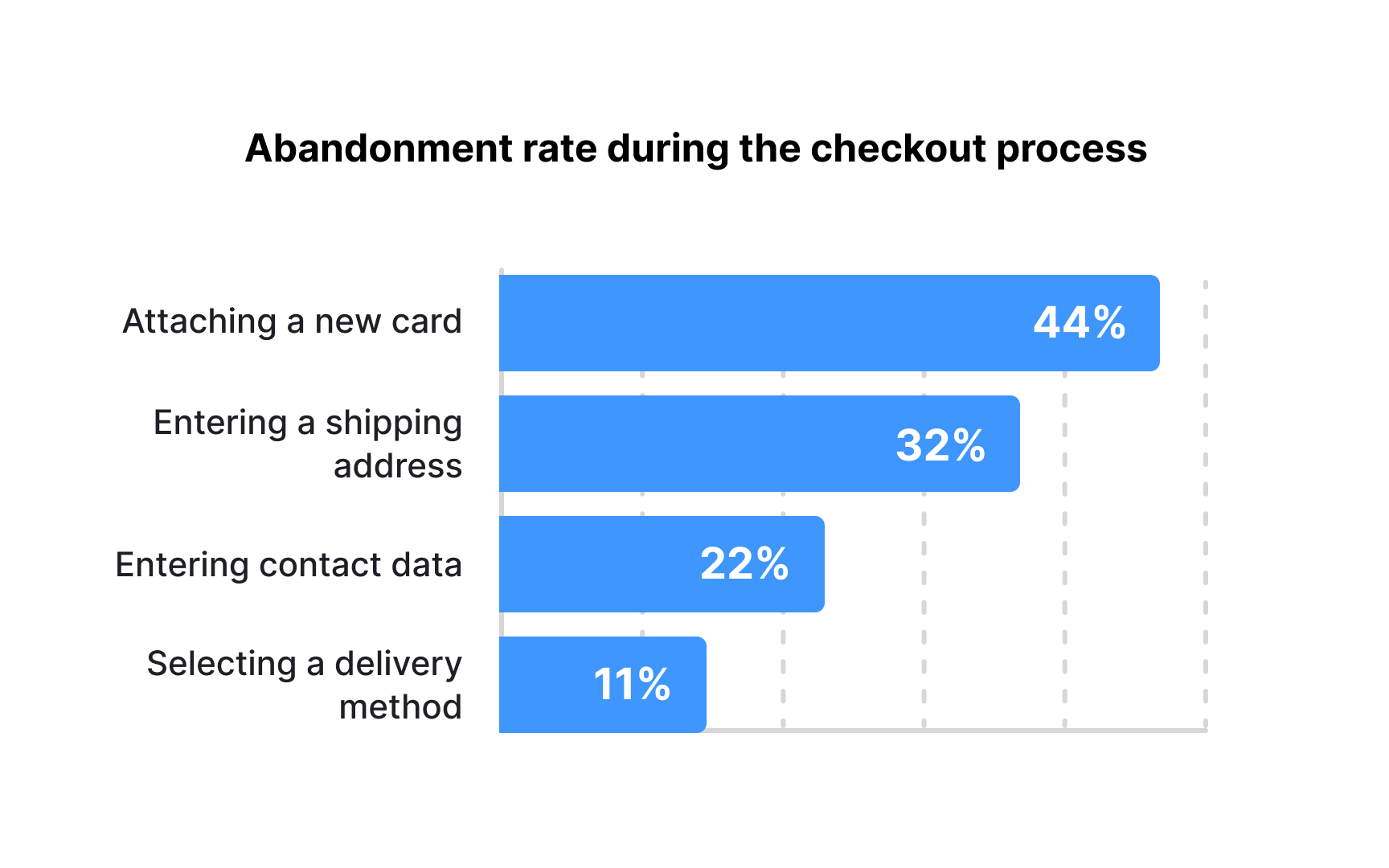
- Focus on clarity over complexity: Choose chart types that best represent your specific data: bar charts for comparisons, heat maps for user interaction patterns, and line graphs for trends over time. Use consistent color coding to indicate severity levels across different visualizations.
- Determine the key story each chart should tell: Avoid the temptation to include every data point; instead, highlight the patterns and outliers that matter most. Label charts clearly with descriptive titles that state the conclusion, not just the contents ("
Checkout abandonment spikes at payment entry" rather than "Checkout flow analysis").
For
Pro Tip: For each visualization, create a single-sentence takeaway that captures the most important insight to help stakeholders remember and act on your findings.
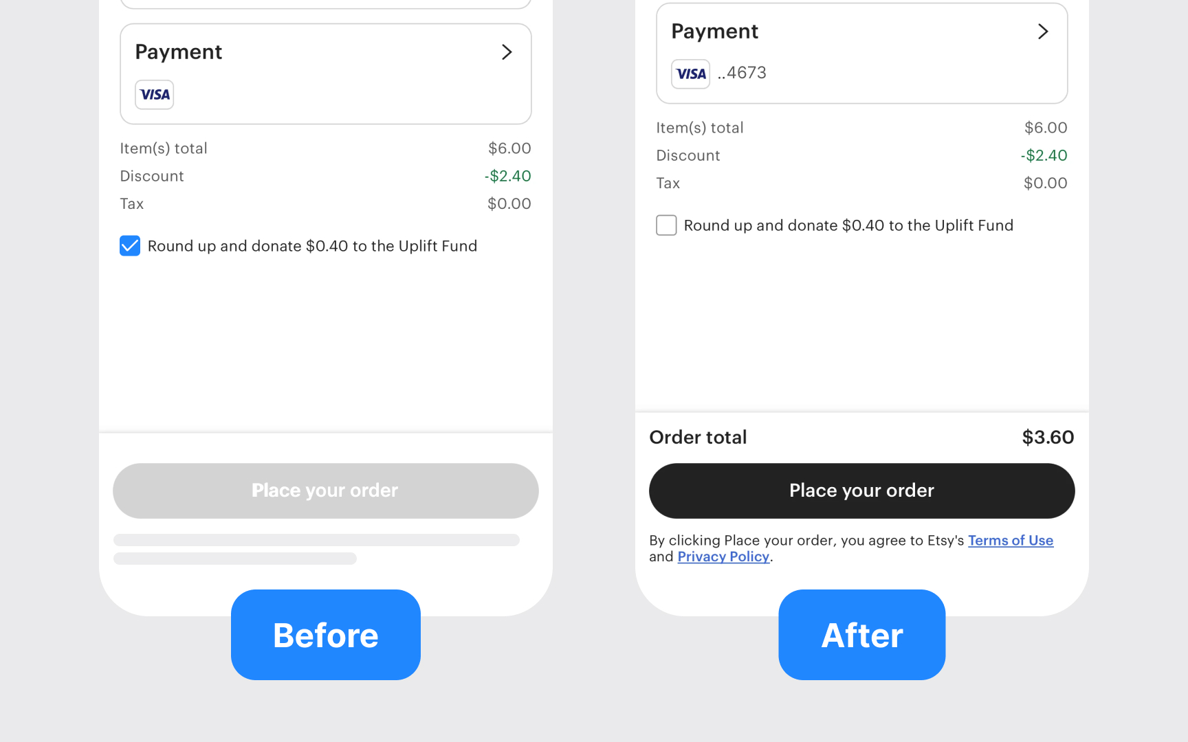
Before and after comparisons create compelling visual evidence of design problems and their potential solutions. These comparisons help stakeholders quickly understand both the issues and the proposed improvements.
When creating effective before/after comparisons:
- Focus on impact: Select examples that demonstrate significant
usability or aesthetic improvements rather than minor tweaks. - Use consistent formats: Present before/after examples with identical dimensions, viewport sizes, and content to ensure fair comparison.
- Add explanatory annotations: Include brief callouts highlighting specific changes and their expected benefits.
- Show realistic implementations: Ensure "after" versions represent feasible solutions, not idealized designs that can't be implemented.
- Include context: Add key metrics or user quotes that reinforce why these changes matter.
For maximum impact, organize comparisons from highest to lowest business value. This helps stakeholders focus on changes that will deliver the greatest return on investment. When possible, include real user testing data showing improvement in task completion or satisfaction between the versions.
Raw design data rarely speaks for itself. Transforming audit findings into compelling narratives helps stakeholders understand not just what's broken, but why it matters and how fixing it creates value.
When crafting impact-focused narratives:
- Connect to business goals: Frame design issues in terms of their impact on key performance indicators and strategic objectives.
- Tell user stories: Illustrate problems through specific user journeys, showing how design issues create frustration, confusion, or abandonment.
- Quantify whenever possible: Include metrics that demonstrate the scale of problems — conversion rates, time-on-task, error frequency, or support tickets.
- Balance problems with opportunities: For each issue identified, describe the potential benefit of addressing it in concrete terms.
- Use a consistent structure: Present each narrative with a clear problem statement, supporting evidence, business impact, and recommended solution.
Effective narratives go beyond technical descriptions to create emotional engagement with the audience. They help stakeholders empathize with user pain points and understand how design improvements directly benefit both users and the business.
Pro Tip: Craft a 30-second "elevator pitch" for each major finding that connects the design issue directly to business performance. This helps stakeholders remember and prioritize key issues.
When communicating accessibility findings:
- Connect to broader impact: Frame accessibility not as a checkbox for compliance but as an essential part of serving all users effectively.
- Categorize by WCAG levels: Organize findings according to WCAG 2.1 levels (A, AA, AAA) to help stakeholders understand both compliance requirements and priority.
- Show real-world implications: Demonstrate how specific accessibility issues affect users with disabilities through video demonstrations or narrative examples.
- Provide clear solutions: For each accessibility issue, include specific remediation steps that development teams can implement.
- Highlight legal considerations: Without using scare tactics, educate stakeholders about relevant accessibility laws and potential legal exposure.
Avoid framing accessibility as a burden or cost center. Instead, highlight the expanded market reach, improved SEO, and enhanced user experience for all users that comes with proper accessibility implementation.
Pro Tip: Show a quick demo of screen readers struggling with your site's problems. Seeing and hearing these issues helps everyone understand why accessibility matters.
Good
When developing supporting documentation:
- Create layered information: Structure documents with executive summaries followed by increasingly detailed sections for different audience needs.
- Use standardized templates: Establish consistent formats for issue reporting, including severity ratings, affected user journeys, and recommended solutions.
- Include visual evidence: Incorporate screenshots, recordings, and analytics visualizations that support your findings and recommendations.
- Provide implementation resources: Include code snippets, design specifications, or component library references to facilitate faster implementation.
- Organize for searchability: Use clear headings, tags, and indexing to help teams quickly locate specific findings and recommendations.
At a minimum, ensure you have:
- A master list of all findings with severity ratings
- Basic screenshots documenting key issues
- Clear ownership assignments for fixing each problem

When you present design audit findings, stakeholders often push back. They might question your recommendations or resist making changes. How you handle these objections matters. Responding well builds trust and makes it more likely your suggestions will actually happen.
Common objections you might encounter include:
- Resource constraints: "We don't have the budget or time to fix these issues."
- Scope concerns: "These changes are too extensive for our current roadmap."
- Priority questions: "How do we know these issues are actually impacting users?"
- Technical limitations: "Our platform can't support these recommendations."
- Brand identity concerns: "These changes don't match our established brand."
When addressing objections:
- Listen actively: Acknowledge concerns without becoming defensive and seek to understand underlying issues.
- Prioritize strategically: Be prepared to identify which findings are most critical versus which could be addressed in later phases.
- Come with data: Support your responses with evidence from analytics,
user testing , or industry benchmarks. - Offer scaled solutions: Present tiered implementation options ranging from minimum viable improvements to ideal scenarios.
Remember that objections often reveal important constraints or considerations you may have missed in your analysis.
Pro Tip: Prepare a "frequently asked objections" document with thoughtful responses to common pushback, and share it after the presentation as a follow-up resource.
Design audit findings gain significance when directly linked to business performance metrics. This connection helps stakeholders understand the tangible value of addressing identified issues.
When connecting design findings to business metrics:
- Identify relevant KPIs: Match design issues to specific business metrics they impact, such as
conversion rates , average order value, customer lifetime value, support ticket volume, or churn rates. - Establish baselines: Document current performance metrics before implementing recommendations to enable before/after comparisons.
- Calculate potential impact: Estimate the business value of improvements based on industry benchmarks or previous optimizations.
- Set measurement timelines: Create specific timeframes for measuring changes after implementations to demonstrate ROI.
- Use attribution modeling: When possible, develop models that show how design improvements contribute to overall business performance.
The most compelling business cases combine hard metrics (revenue, conversion) with soft metrics (satisfaction scores,


Similar lessons

How to Design Dashboards for Better Analytics

When & How to Use Tables in UIs
