Color Fusion: Revitalizing ClickUp's Interface

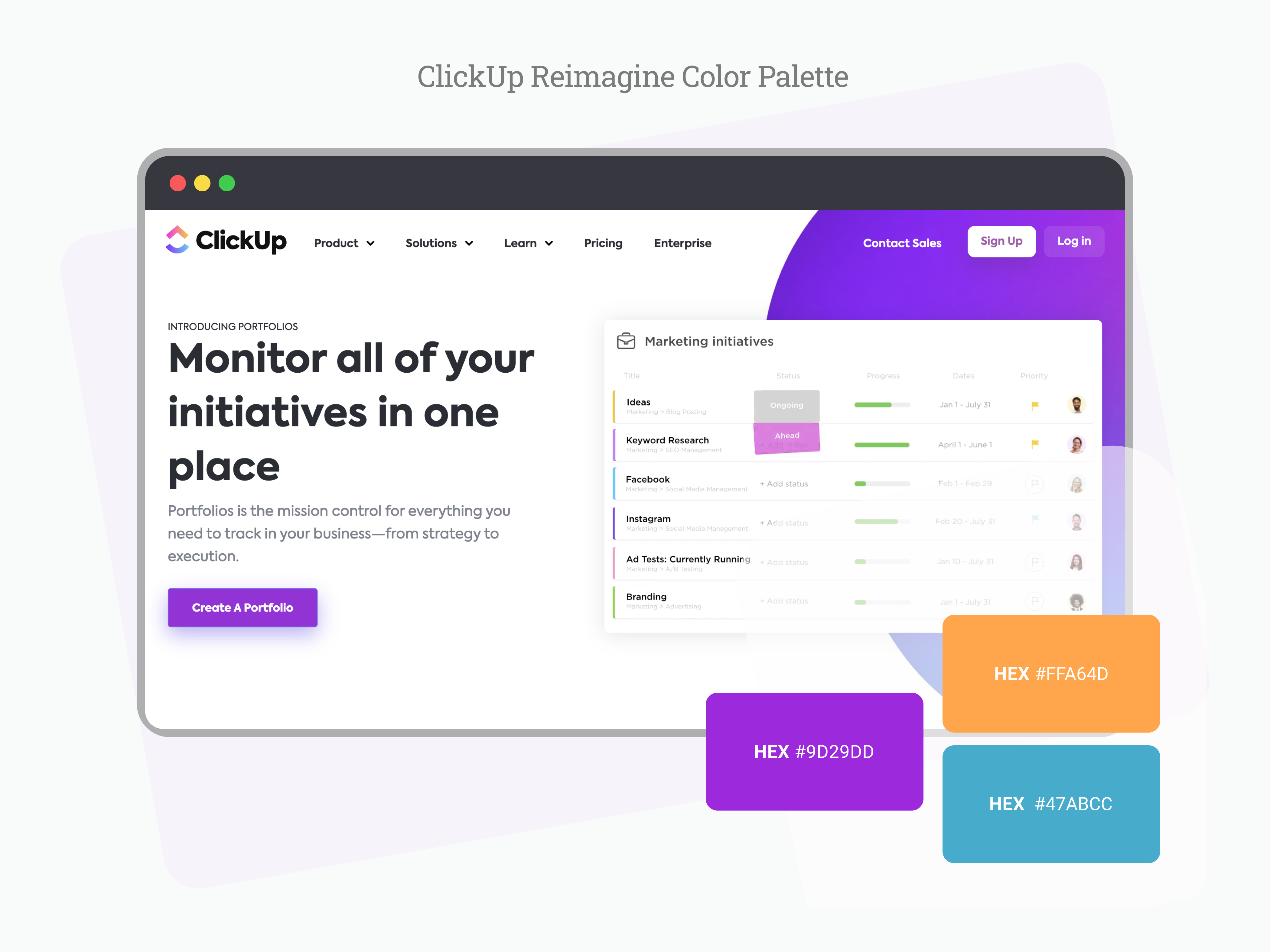
When expanding ClickUp's color palette to include high-saturation, cool-toned magenta, the goal was to boost emotional impact and visual contrast in the interface. By introducing these lively shades, I aimed to inject more energy, vibrancy, and passion into the design, elevating the overall user experience.
This update empowered users to navigate the platform smoothly, ensuring comfort and a sense of motivation while completing tasks. The inclusion of magenta and other carefully chosen colors not only elevated visual appeal but also harmonized with the style guide, providing fresh opportunities for creative expression and adaptable design choices.

Reviews
2 reviews
I really enjoyed reviewing your color system! Conducting a competitor analysis to understand the industry standards is commendable. I appreciate the bold and vibrant colors you've selected—they truly stand out among competitors.
You've successfully proved that the colors meet the contrast ratio requirements. The only shortcoming is that the screens intended to showcase UI components using the updated color system are empty. However, your work is impressive! Adding the UI components to demonstrate how the colors integrate within an interface will truly make your work shine.

This color system creates a bold yet functional aesthetic that enhances clarity, focus, and engagement, setting the tool apart from dull, traditional enterprise solutions. 🚀
You might also like
QuickScan Onboarding


Nestra from homepage to checkout process


Islamic E-Learning Platfrom Dashboard


Pulse — Music Streaming App with Accessible Light & Dark Mode

SiteScope - Progress Tracking App


Mobile Button System

Visual Design Courses

UX Design Foundations


Introduction to Figma

Design Terminology
