Style Guide
A style guide is a reference document that defines rules for visual, written, and interaction design, ensuring consistency across products and communication.


TL;DR
- Defines rules for design and communication.
- Covers visuals, writing, and interactions.
- Ensures brand and product consistency.
- Guides teams to align on standards.
Definition
A style guide is a documented set of standards for design and communication, outlining rules for elements like typography, color, tone, and interaction to maintain consistency across products and content.
Detailed Overview
A style guide is essential for teams that want their products, branding, and communication to feel unified. It provides clear rules for visual design, written content, and even interaction patterns. Without a style guide, products risk inconsistency, which weakens credibility and creates friction for users.
One common question is how style guides differ from design systems. Style guides focus primarily on rules and documentation, like which fonts to use or how to write error messages. A design system, in contrast, is more operational, including coded components and reusable assets. Many organizations use both: style guides for rules and systems for implementation.
Another frequent query is about scope. Some style guides focus only on visual design, colors, typography, and spacing, while others expand to include voice, tone, iconography, and even accessibility standards. The broader the scope, the more alignment it provides across all forms of communication. For example, a marketing team and a product team using the same tone-of-voice guidelines can ensure brand coherence in both ad copy and in-app messages.
Teams often ask how style guides support collaboration. By documenting standards, style guides reduce ambiguity and disagreements. Designers and developers can make decisions quickly without needing repeated approvals, while new team members can onboard faster. Style guides are especially useful in distributed teams, where direct oversight is limited.
Another important aspect is evolution. A style guide is not static; it grows as the product and brand evolve. Companies often revisit their guides during rebrands or after scaling to new markets. A good guide includes a process for updates so it remains relevant rather than outdated.
Finally, style guides contribute strategically to accessibility and inclusivity. By including standards for contrast, typography, and tone, style guides ensure products are usable by a wider audience. This not only improves compliance but also broadens reach and strengthens brand reputation.
Learn more about this in the Style Guides Exercise, taken from the Technical UI Terms Lesson, a part of the Design Terminology Course.
A style guide documents rules for design and communication, like fonts, colors, and tone. A design system provides coded components and practical assets for implementation.
Both work together: style guides establish standards, and design systems apply them.
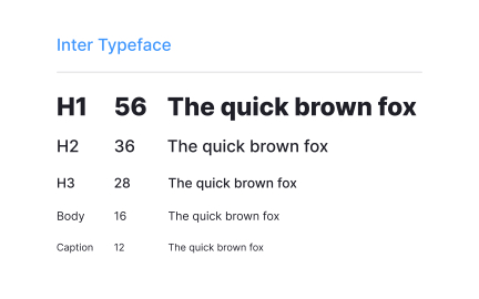
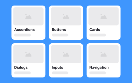
At minimum, it should cover typography, color palettes, imagery, and logo use. Many also include voice, tone, interaction rules, and accessibility guidelines.
The scope depends on team needs and the level of brand consistency required.
Designers, developers, marketers, and content writers all rely on style guides. They provide shared standards, ensuring outputs feel cohesive across teams and platforms.
This shared resource reduces confusion and accelerates workflows.
Style guides should evolve with products and brands. Teams often review them during rebrands, product redesigns, or expansions into new markets.
A living guide ensures standards stay relevant and effective.
They can set rules for minimum contrast, font size, and tone to ensure inclusivity. By embedding these standards, teams prevent accessibility issues before they arise.
This makes products more usable for all audiences, not just those with specific needs.
Recommended resources
Courses

UX Design Foundations


Core UI Components


Design Terminology

Lessons

UI Design Deliverables

Technical UI Terms

Design in Marketing
Exercises
Tutorials

How to Create Realistic Shadows in Creatie: A Step-by-Step Guide


Creating Reusable Components in Figma: A Step-by-Step Tutorial

Projects

Placid Plastic Typography System Challange


404 Error Page for Fintech Platform Bankr💸


Bento Grid - SaaS Website Design