UI Design Deliverables
Find out what exactly UI designers are expected to create and deliver
When the stage in the development process comes, it's common for designers to hand off UI design deliverables to stakeholders, developers, or other team members to get feedback and implement designs into a real product.
UI design deliverables may include layouts, grids, colors, typography, interactions, illustrations, UI animations, and other assets required for releasing a product. Ideally, designers should start compiling them into shareable documents early in the process. Firstly, it helps keep designs consistent and more accessible for users. Secondly, it saves time and reduces misconceptions for all team members who work on a product and refer to designs. Design deliverables are excellent tools for collaboration and ensuring the whole team is on board.
Mood boards are one of the first deliverables you might create during the design process. Mood boards are often created to present to a client, to make sure you’re on the same page about what the general look and feel of the product should be.
Mood boards can be physical or digital boards, and generally include things like logos,
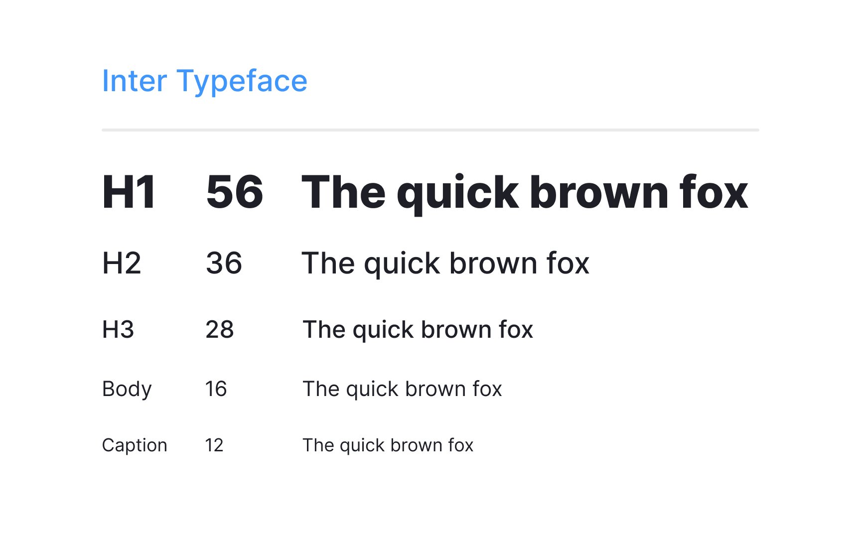
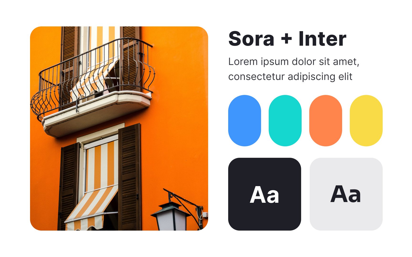
Type systems are key in design, shaping elements like typefaces, font sizes, and spacing. It ensures consistency and guides user attention. To craft an effective type system, consider these principles:
- Align with brand and audience: Match the brand voice and user expectations.
- Select fewer typefaces: 2-3 diverse typefaces often suffice.
- Build a hierarchy: Create roles for text elements to guide users through content.
- Prioritize readability: Check legibility across contexts and devices.
- Maintain consistent spacing: Consistency in line height and spacing adds visual balance.
- Coordinate with design system: Integrate the type system with other design elements like
color and grids.
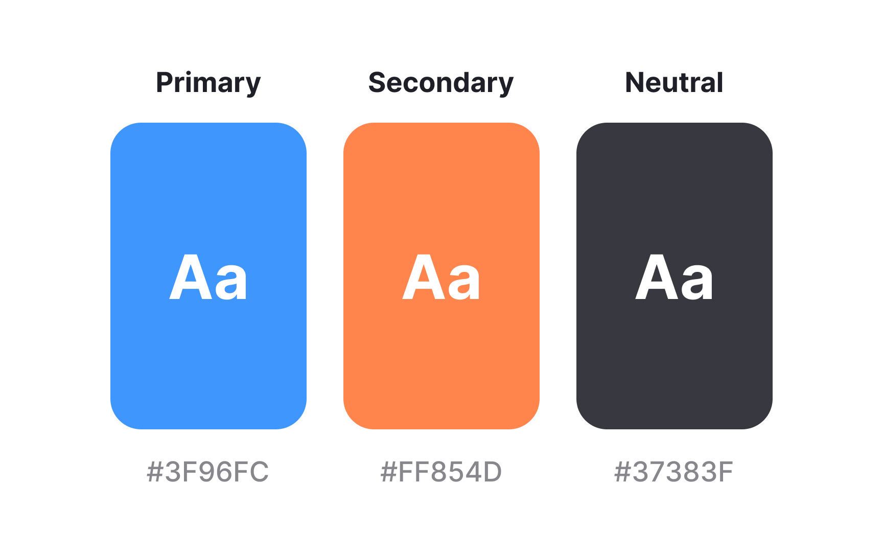
A
For example, specific colors may be used for primary actions, warnings, or background elements. By establishing rules for how and when to use each color, designers ensure that the product not only looks good but also aids in usability and comprehension.
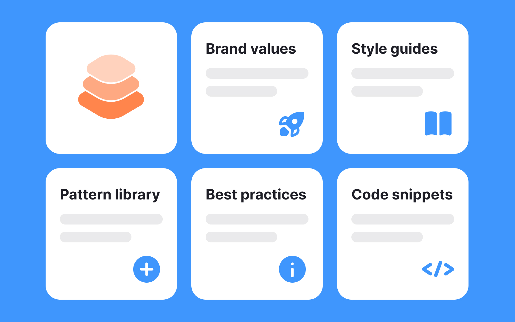
A design system is a cohesive collection of design patterns, best practices, code snippets, and style guides, interwoven with
Among other functions of design systems are:
- Ensuring consistency: By using standardized components, design systems help maintain a uniform look and feel across all parts of a product.
- Enhancing collaboration: Facilitating a shared language and understanding among designers, developers, and other stakeholders, making teamwork more efficient.
- Increasing efficiency: Saving time and resources by reusing existing components instead of creating each element from scratch.
- Aligning with brand identity: Reflecting the core values, mindsets, and beliefs of the brand, thereby reinforcing its identity through design.
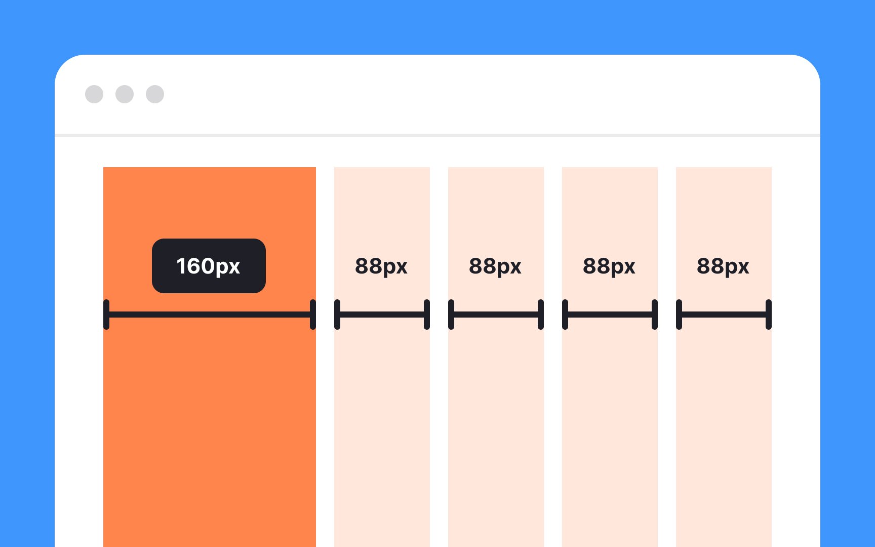
Grid systems are essential for creating organized, human-oriented designs. They include a network of straight lines (both vertical and horizontal) that help designers align
Grids enhance visual hierarchy and can make even super complex designs appear logical and uncluttered. They also give designers a guide for how to lay out components without having to calculate spacing for every single element.
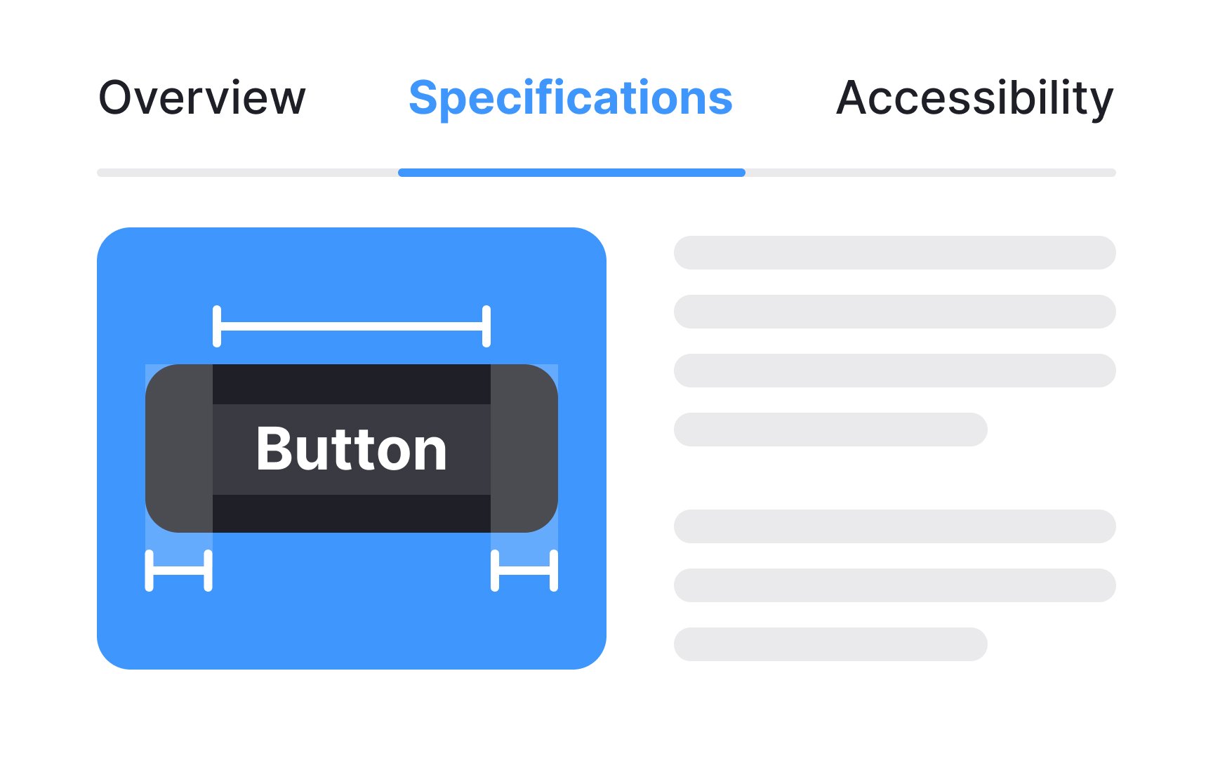
When a designer is ready to hand off the finished design to the development team, they create a design handoff. It's a document that includes mockups,
Ideally, designers should consult with developers during the
Pro Tip: Clearly name your screens and provide comments on each one, explaining your design decisions.
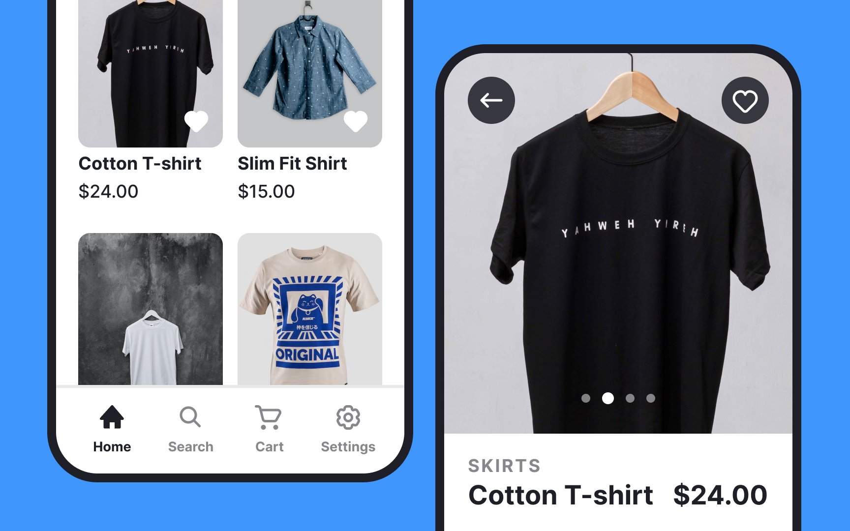
Mockups are also used for showing other stakeholders the design before it’s handed off to developers. They can be shared with clients and other stakeholders, and even be used for user testing. A bonus use for mockups is in your portfolio, where they can make your designs look more professional and illustrative.
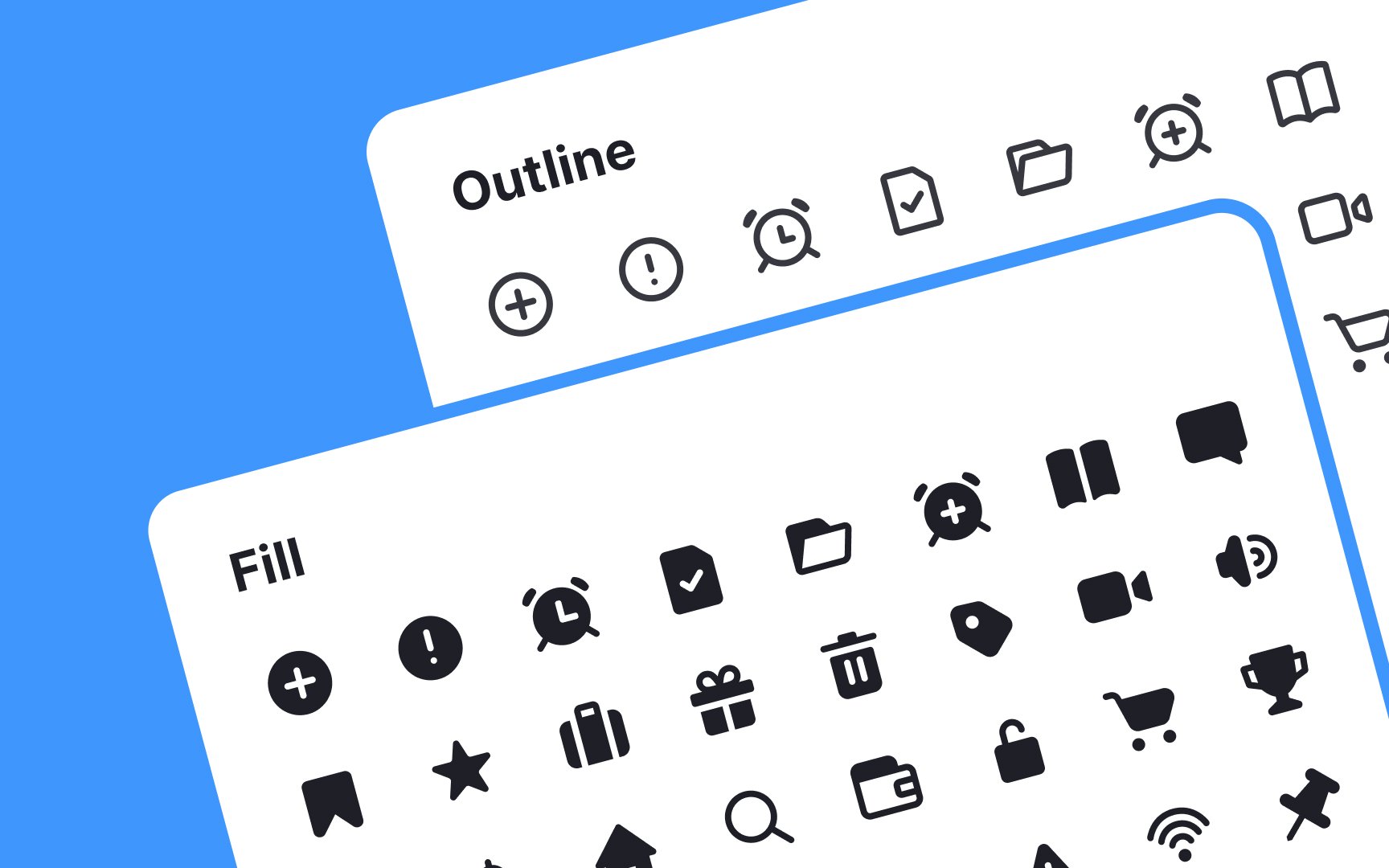
Icon sets are collections of symbols or
By transcending language barriers, they quickly convey information, making the interface more intuitive. A well-designed icon set ensures that each symbol complements others in style,
Top contributors


Topics
From Course

Share


Similar lessons

Anatomy of UI Components

Atomic Design by Brad Frost
