Color Properties & Perception
Decode the various properties that make up a color
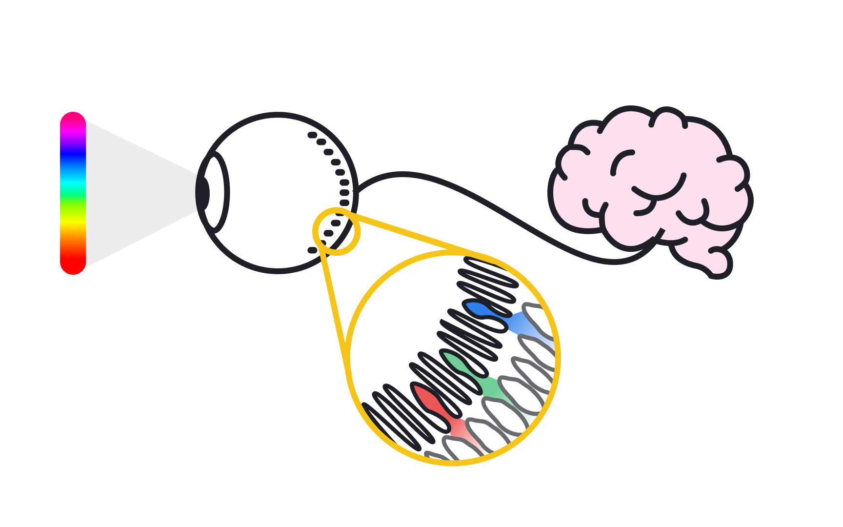
The human eye, second only to the brain in complexity, contains specialized receptors that detect specific wavelengths of light, enabling us to perceive up to 10 million distinct colors.[1] Understanding the properties of color—such as hue, saturation, and brightness—unlocks the ability to recognize subtle variations that might otherwise go unnoticed. Mastering these properties not only sharpens color perception but also enhances the ability to create harmonious and visually appealing designs for any project.
We are able to see
- Rods work at very low levels of light. We use these for night vision because even a few bits of light can activate them. Rods don't help with color vision, which is why we see everything in shades of gray at night. Animals that see well in the dark have many more rods than humans.
- Cones need a lot more light, and they can see color. We have 3 types of cones: blue, green, and red. The brain integrates the signals sent from these cones to allow us to see millions of colors. For example, we see yellow when green and red cones are stimulated, but the blue cones aren't. When all the cones are stimulated equally, the brain perceives the color as white.[2]

The light spectrum is like a rainbow that shows all the colors of light. Each
Designers can use this knowledge to create color combinations that are visually appealing and communicate the right mood or message. For example, colors with longer wavelengths, like red and orange, are often seen as warm and energetic, while colors with shorter wavelengths, like blue and violet, are perceived as calm and cool. By understanding how wavelengths affect color perception, designers can choose colors that enhance the user experience and evoke the desired emotional response.
Isaac Newton was the first to organize colors into what we now call an additive
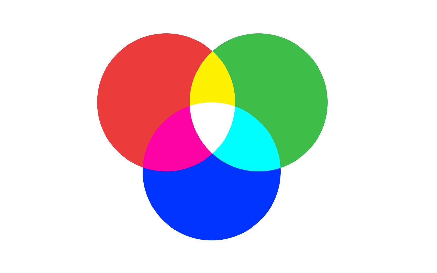
There are other color systems too, like the RYB system used by artists for painting and the CMYK system used in printing. In this lesson, we'll focus on the RGB color system, which is used for digital displays. This system is how cameras, TVs, and computer screens show colors. It's also how our eyes perceive color.
In the RGB system, screens use light to create colors by mixing red, green, and blue light at different levels, a process known as additive mixing. All colors start as black, meaning no light is shown. By adding red, green, and blue light, the screen creates various colors, adjusting the intensity of each color to produce different
A
A hue is determined by the dominant wavelength of light that we see. For example, when we see red, the light hitting our eyes has a dominant wavelength that makes us perceive it as red.
Even though we say a hue is a single wavelength, it doesn't mean other wavelengths aren't there. Blue isn't just blue because other wavelengths are gone. Each hue contains all the wavelengths of visible light, but one particular wavelength stands out and makes the color appear distinct to us. This dominant wavelength is what gives each hue its unique identity.
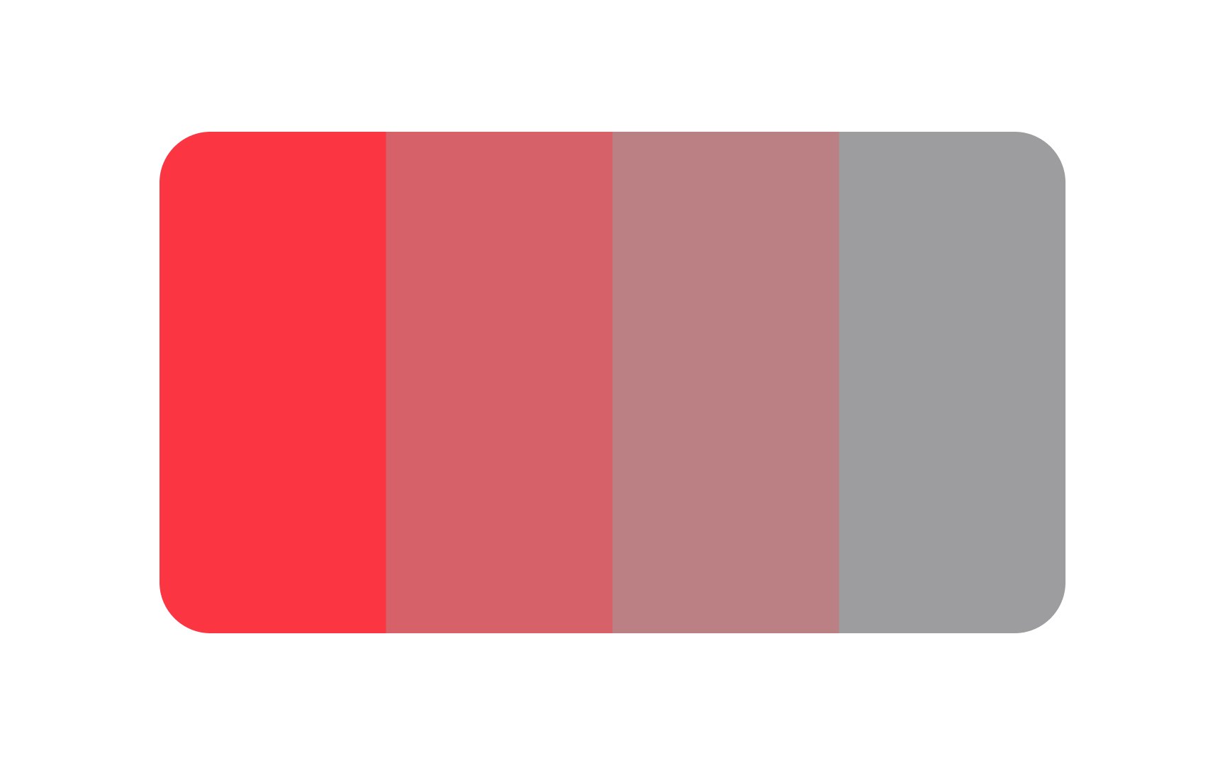
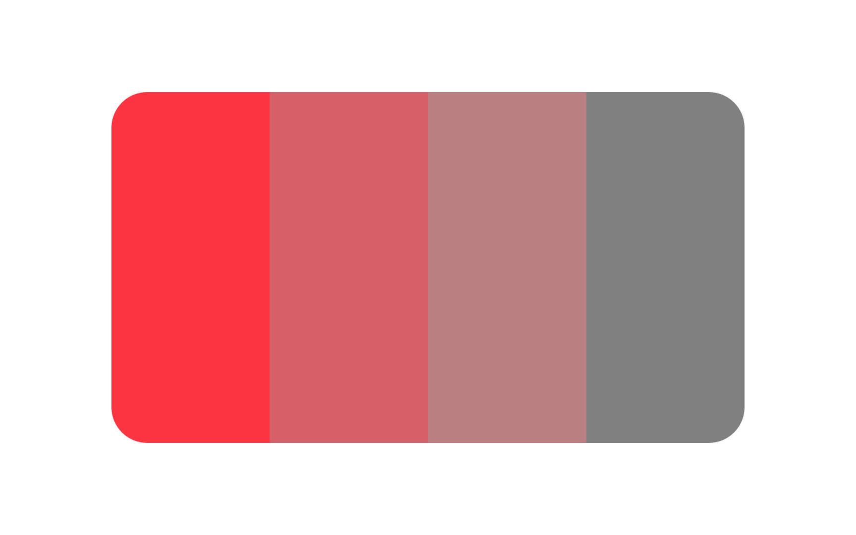
Chroma is the measure of color's purity, intensity, or
You can decrease the intensity of a
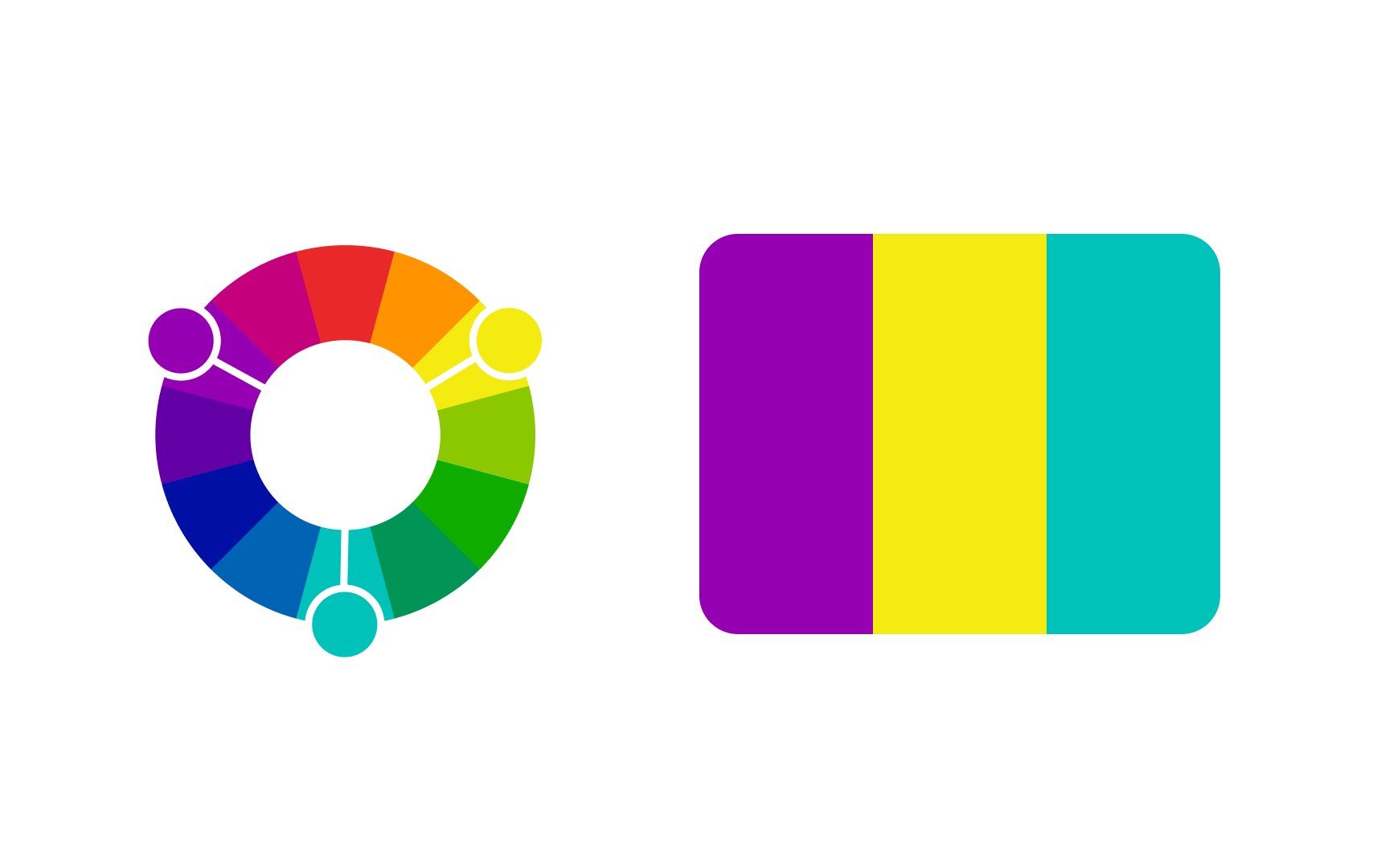
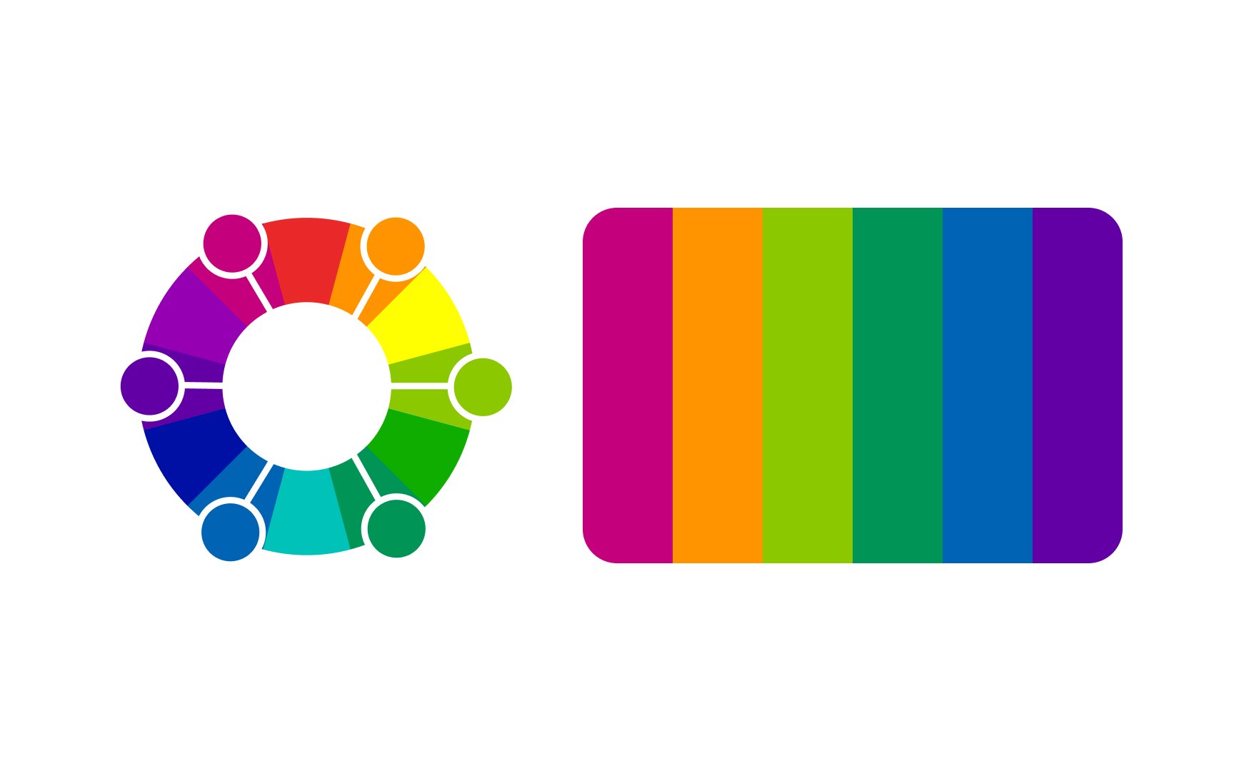
Another way to reduce chroma is by adding a hue’s complementary color. For example, red and cyan are complementary colors. If you add cyan to red, the red becomes less intense and grayer. When you mix equal amounts of red and cyan, they cancel each other out, leaving no trace of either color. Instead, you get a neutral gray.
Value refers to how light or dark a
Keep in mind that value only describes the visual lightness of a color, not the method used to change it, such as adding white or black.
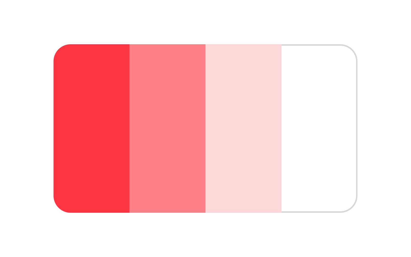
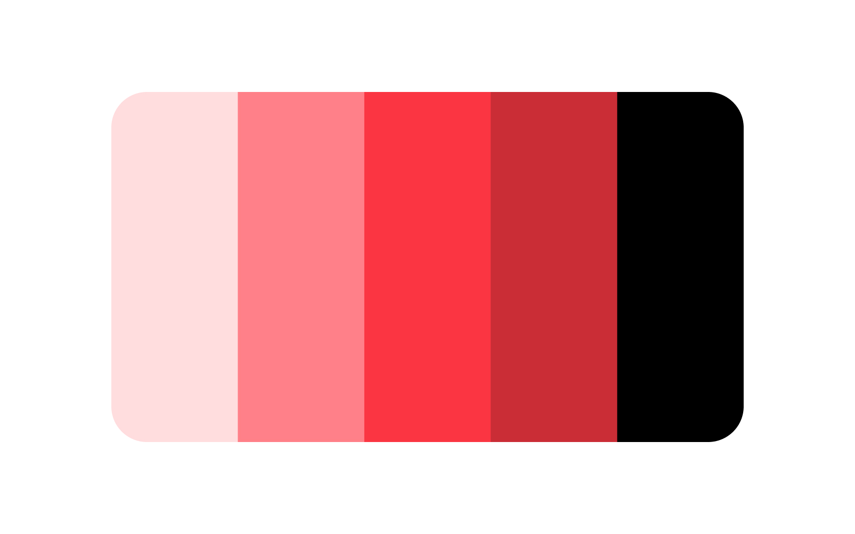
A tint is created by adding white to a

A
Tones are created by mixing a pure
Tones are often softer and less vibrant than the original color, making them useful for adding subtlety and depth to designs. When you adjust the amount of gray added to a hue, you create different tones that can vary from slightly muted to significantly softened.
In design and branding, tones are valuable for creating variation without straying too far from a color scheme. They allow you to maintain consistency while adding interest and balance.
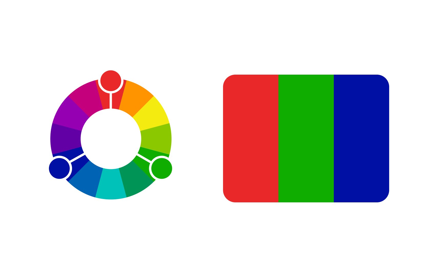
Primary colors are the building blocks of all other colors. In the RGB additive
These colors are called "primary" because they cannot be created by mixing any other colors together. Instead, they are used to create all other colors when combined in different ways. For example, mixing red and blue makes purple, red and green make yellow, and green and blue make cyan.
In the RGB
- Cyan: Made by mixing green and blue
- Magenta: Made by mixing red and blue
- Yellow: Made by mixing red and green
Secondary colors in the RGB model are essential for creating the full spectrum of colors you see on digital devices. They play a crucial role in designing images, graphics, and videos because they help achieve more vibrant and accurate color representations.
In the RGB
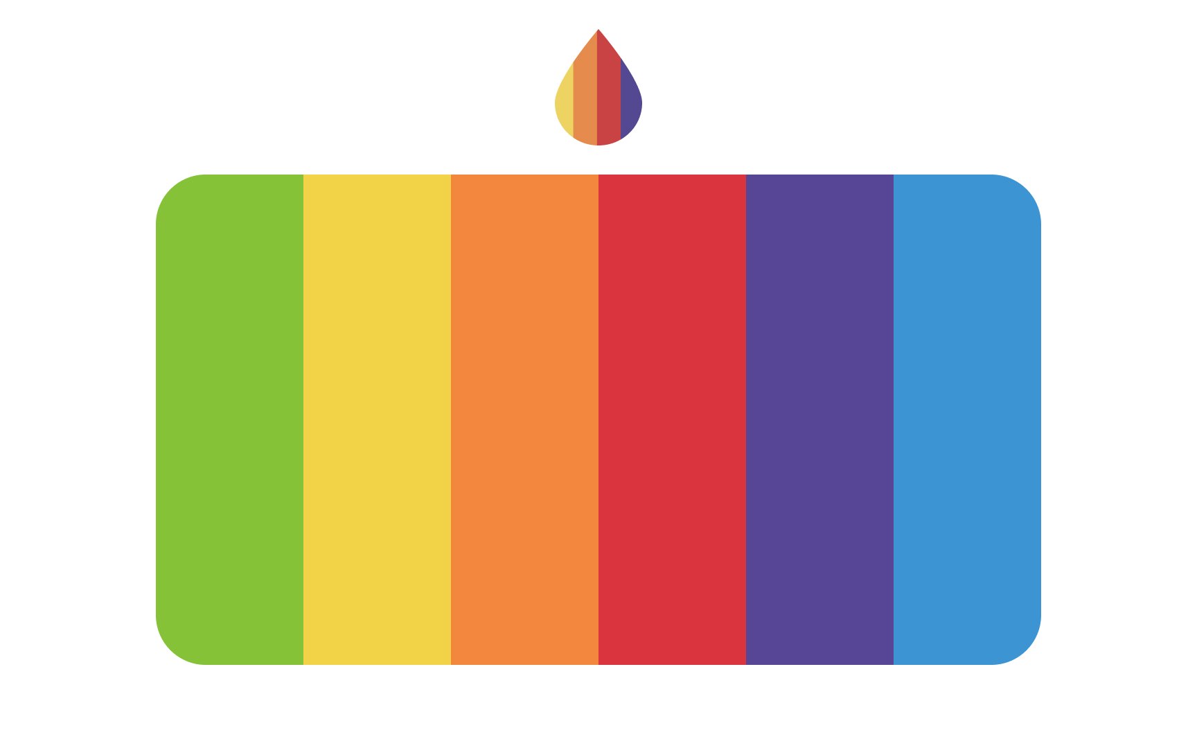
Tertiary colors include hues like:
- Amber, a warm, golden color created by mixing red and yellow, which gives a reddish-orange
hue - Vermilion, a bright reddish-orange color achieved by combining more red with yellow
- Chartreuse, a vibrant yellow-green color made by mixing yellow and green
- Spring green is a fresh, bright green color created by mixing green and cyan
These colors offer subtle variations that enhance the richness and depth of digital visuals.

Perceived
Colors with longer wavelengths, like red, orange, and yellow, are perceived as warmer. On the other hand, colors with shorter wavelengths, like blue, green, and purple, are perceived as cooler.
References
- Color in Business, Science, and Industry | Google Books
- The Basic Properties of Color | The Beat: A Blog by PremiumBeat
Top contributors


Topics
From Course

Share


Similar lessons

Intro to Color Theory

Color Properties
