Dopamine randomizer

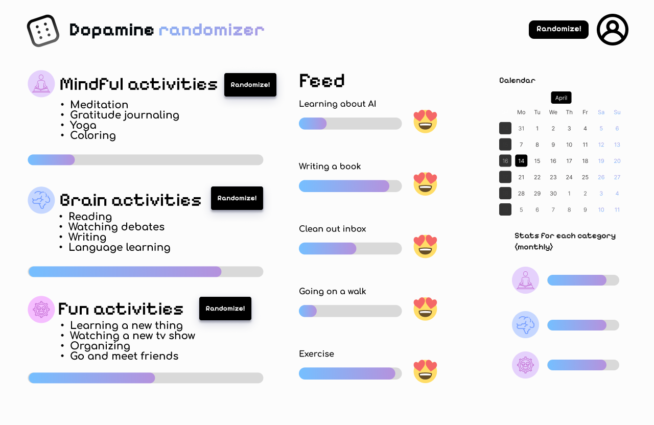
This is my first UI design project. I want it to be a system where you can randomize different things to do instead of mindless scrolling. I choose the pixelated font because I wanted it to have some game UI elements to make it seem more enjoyable. I also wanted stats so you could track your progress on achieving certain tasks. The randomize buttons beside the elements would only give you things from that element while the randomize button at the top would give you an activity from all of the categories. Any feedback will be much appreciated as I am trying to learn UI design :)
Reviews
1 review

I'm in dire need of many random activities 😄 I'll definitely use this app!
I also still remember the first time I created my first UI design ages ago. It was nothing like today, where you have access to an abundance of resources and information on how to make a good UI. I had to read across disciplines many times in order to create something and stay inspired. Using the same approach, let's break this review down into two:
ESSENCE
It looks like you've learned a lot about design principles by the way you divided the design elements into several parts. The hierarchy is there, the spacing is enough, and the overall layout is nice and tidy. You could unify the border radius for the “randomize” button to keep it in line with brand continuity, but this will do for now.
The design industry keeps changing rapidly, we have to keep up! You and I are alike. Knowledge that was usually received after internships or the first design job is now being taught as something fundamental. That's why when you say “I want…”, “I choose…”, “I also wanted…”, it should also be accompanied by “they want…”, “they think…”, “they feel…”. This means, if possible, also research it firsthand when you're doing design exploration: “If I design it like this, will it solve the user problems?”, “Will it align with stakeholders and business needs?”, “Will the chosen pixelated typeface be suitable for my audience? Who's my audience anyway?” Try not to lose yourself in the process; you can still add your personal signature, but there's always some trade-off
SENSES
I'm still learning to this day, but I think I can say that I can see if a design uses a “good” font/color pairing. The word “good” here might be too broad, so let's just stick to visual. You can take your design up a notch using a lighter shade of black or warmer and cooler backgrounds, depending on the dopamine system theme. But what I really want to say is you should play around a little bit more to sharpen your design senses. Recreate UI dashboards, browse around curated websites, and read from various sources about what makes a good design. Experimentation is key, the more you explore different styles and techniques, the more you'll develop your unique design voice. Design is an evolving journey, and every project is an opportunity to learn and grow. You're halfway there.
I look forward to seeing your next progress and how your designs evolve!
You might also like

Pulse — Music Streaming App with Accessible Light & Dark Mode


Islamic E-Learning Platfrom Dashboard

SiteScope - Progress Tracking App


Mobile Button System


FlexPay


CJM for Co-Working Space - WeWork

Popular Courses

Design Terminology


Core UI Components


Enhancing UX Workflow with AI