Barbiie Girl Health App

General health app that tracks basic fitness elements like sleep, hydration, exercise, steps, etc. Cute clean girly aesthetic.

Reviews
3 reviews

Nice exploration. I believe you can improve more regarding the color palette and typography.

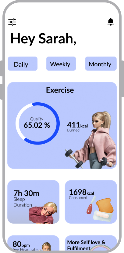
Hi Njeri! I like the idea and the overall aesthetic direction. Tracking core health metrics is valuable, and the visual style is consistent.
However, many metrics are hard to interpret (for example, “Quality 65%”), and it’s unclear how they’re calculated or what action users should take. Adding explanations, comparisons, or progress indicators would improve usability.
The Daily / Weekly / Monthly tabs need clearer active states, and the layout would benefit from better grouping, spacing, and less cropped illustrations.
The concept has potential, but it needs more focus on data clarity and hierarchy to become truly user-friendly.

Hey Njeri,
First, a quick heads-up, the prototype link doesn’t seem to work on my side. It takes me somewhere else. You might want to double-check that so people can properly explore your work.
I’m also really curious about your choice of the Barbie theme. It’s a bold and specific direction, and I’d love to hear more about what drew you to it and how it connects to what you wanted this project to say or achieve. Adding a bit more context about the project and your decisions would really help others understand your thinking.
From what you’ve shared, the design itself feels more like mid-fidelity than high-fidelity at the moment. For example, you have “daily”, “weekly”, and “monthly” at the top, but it’s not clear what they refer to. Are these time filters, goals, stats, something else? It’s also not obvious which one is currently active, so the user doesn’t get feedback about what they’re looking at.
The overall information architecture feels clear. It looks like users can quickly scan and understand the main pieces of information. Where it starts to feel a bit weaker is in consistency. The images all seem to be in different styles, which makes the UI feel less cohesive, and the spacing between cards feels a bit too generous, so the layout looks more spread out than it needs to be.
You might also like

Smartwatch Design for Messenger App


Bridge: UI/UX Rebrand of a Blockchain SCM Product


Pulse Music App - Light/Dark Mode


Monetization Strategy


Designing A Better Co-Working Experience Through CJM


Design a Settings Page for Mobile
Visual Design Courses

UX Design Foundations


Introduction to Figma

Design Terminology
