UX Rationale for Sign Up & Log In Flow

UX Rationale for Sign Up & Log In Flow – EMENTRA Project
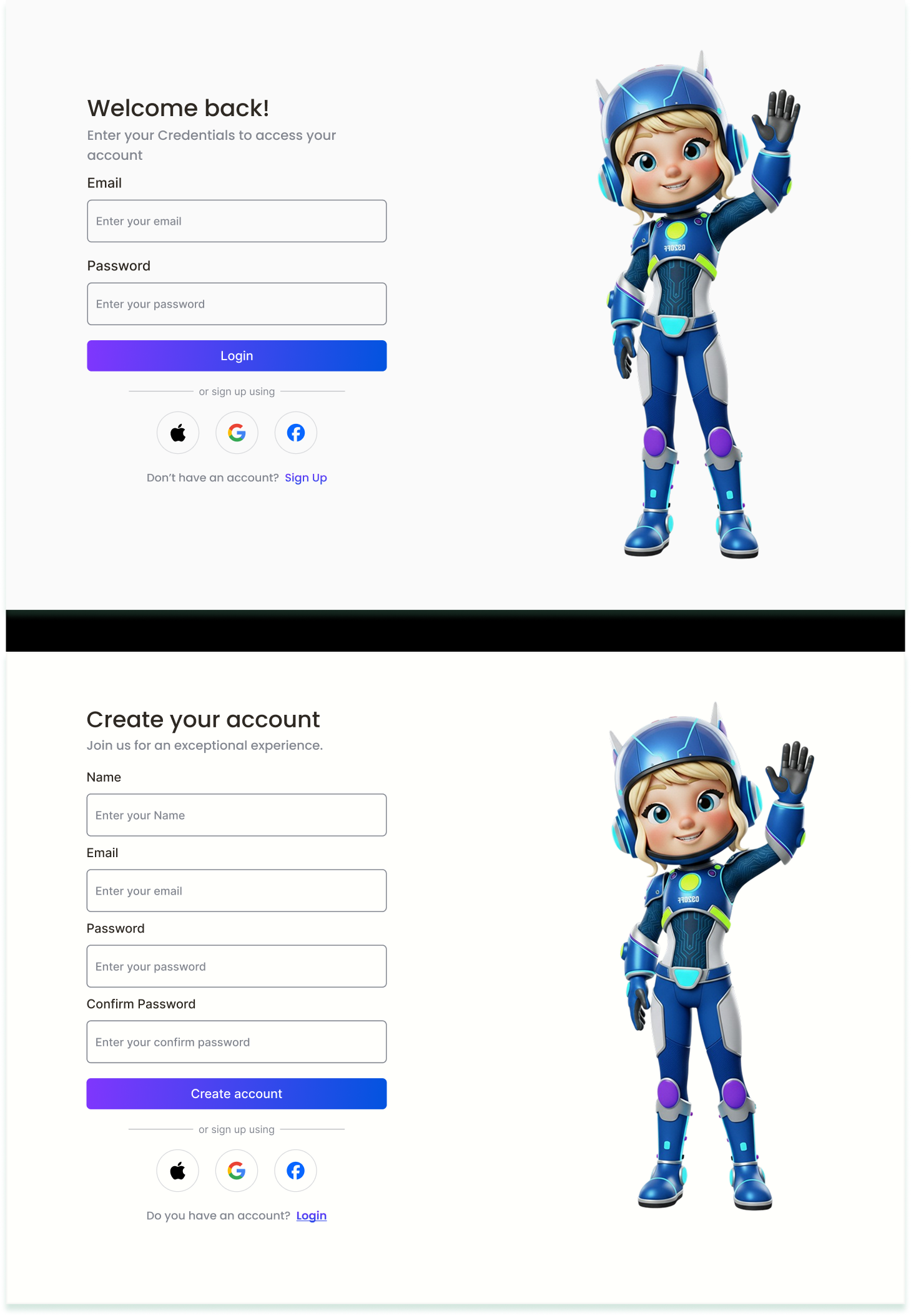
In designing the Sign Up and Log In flow for EMENTRA, the main considerations were user convenience, clarity, and security. The goal was to ensure a smooth onboarding process while minimizing friction for new users and providing a seamless access experience for returning users.
Key UX Decisions:
- Simplified Sign Up: The Sign Up flow was designed to be short and straightforward, reducing the steps needed to create an account. This helps improve conversion rates and reduces drop-offs.
- Clear Input Feedback: Validation messages and input prompts guide the user in real-time, preventing errors and enhancing confidence in the process.
- Consistent Log In Experience: Returning users can quickly log in using familiar credentials. Optional features like “Remember Me” were added to speed up access.
- Security Considerations: Password requirements and optional two-factor authentication ensure that user accounts remain secure without adding unnecessary complexity.
- Visual Clarity: Buttons, fields, and labels were designed with clear hierarchy and spacing to make the process intuitive on all devices.
Overall, the Sign Up and Log In flows aim to balance simplicity, usability, and security, providing users with a positive first impression and consistent experience.

Reviews
5 reviews

Hey Salwa,
Your design feels clean and easy to scan, which is a great starting point. It already gives off a sense of simplicity and clarity.
A couple of things I’d invite you to think about:
Right now, I’m not seeing a way for users to recover their account if they forget their password. On a login screen, a simple “Forgot password?” link is a small thing, but it makes a big difference for trust and usability.
I’d also strongly consider adding a “show password” option. This is especially helpful during sign-up, where users have to be extra careful with what they type. It reduces frustration and cuts down on simple typing mistakes.
You mentioned that one of your goals was to simplify sign-up and reduce friction. With that in mind, I’m curious about the choice to ask for the password twice. That extra step is one of the most common reasons people drop off during registration. An alternative could be a single password field combined with clear, real-time validation rules like one uppercase letter, a number, a minimum length, and so on, plus the option to reveal the password.

Hi Salwa, thank you for sharing your project. 🙂
The layout is clean, easy to scan, and the form structure feels straightforward. The persistent labels above inputs are implemented well, which supports clarity and accessibility. That said, when reviewing it against the accessibility-focused brief, there are still a few areas that could be strengthened.
Accessibility
- The project mentions validation, password requirements, and optional two-factor authentication in the rationale, but these are not visibly demonstrated in the screens. Since the brief emphasizes WCAG compliance, it would be helpful to show error states, focus states, and documented contrast ratios.
- A “Forgot password” option is not visible on the login screen, which is a key usability and accessibility element.
Usability
- The flows are simple and clean, but they feel static. Showing password visibility toggles, required field indicators, disabled button states, or real-time validation feedback would make the experience more complete.
- “Remember Me” is mentioned in the rationale but not shown in the UI.
- The confirm password field would benefit from visible match or mismatch feedback.
Visual Design
- The hierarchy is clear, and the gradient CTA buttons stand out nicely.
- The illustration is friendly and engaging, though you may want to evaluate whether it aligns with the tone of the chosen SaaS platform.
Overall, this is a clean foundation. With more visible accessibility demonstrations and deeper interaction detail, it would more fully meet the expectations of the brief!

Hey Salwa!
I just reviewed your UX Rationale for the Sign Up / Log In Flow and I really appreciate how clearly you explained your thinking behind each decision.
What stood out to me is that you didn’t just design the screens you justified why certain patterns were chosen. The separation between sign-up and log-in feels clean, and the hierarchy makes it easy for users to understand what action they’re supposed to take. The rationale shows you’re thinking about cognitive load and friction, not just layout.
One thing you could strengthen is edge-case thinking. For example, how does the flow handle errors, password recovery anxiety, or users who accidentally start the wrong path? Adding microcopy examples or failure-state screens would make your reasoning even more robust.
Overall, this feels thoughtful and intentional. Strong UX fundamentals and clear articulation of your design logic great work 👏

Hey Salwa! 👋
I can see the project is visually clean and pleasant to the eye. That's a solid foundation. I agree with Petar that the lack of a "Forgot password?" option is a significant problem in terms of trust and usability. It's one of those elements that's almost a standard, and its absence is immediately noticeable.
I'd also like to raise the issue of double password confirmation during registration. I understand it's a common practice, but if your goal was to reduce friction and simplify the process. Tthis extra step is often responsible for form abandonment. It's worth considering a "show password" option, which actually eliminates errors without adding another field. 🤔
One more thing... Social login (Apple, Google, Facebook) is a great direction, but think about the order and hierarchy of these options. Check the analytics (if you have access) to see which ones users actually log in with. It might be worth giving them greater visual priority.
The project has potential and it's clear you were thinking about users. Refining these few key elements could significantly improve conversion and reduce frustration during login! 😊

Excellent foundation, Salwa! Strong UX thinking and articulation of design decisions. You justified choices—not just executed. Here's my feedback:
Strengths:
- Clear rationale: Simplified sign-up, input feedback, consistent log-in, security, and visual clarity. Exactly what mentors want
- Design fundamentals: Clean, scannable, strong hierarchy. Visually pleasant
- Cognitive load awareness: Thinking about friction and user convenience
- Visual hierarchy: Well-organized buttons, fields, labels. Intuitive on all devices
- Mentor recognition: All three mentors gave "Bravo."
Critical Gaps (All Three Mentors Flagged):
- Missing "Forgot Password?" Link — Standard pattern. Absence damages trust. Critical omission
- Double Password Confirmation — Contradicts "reduce friction" goal. Better: single field + real-time validation + "show password" toggle
- No "Show Password" Toggle — Reduces typing errors and frustration. Table-stakes for modern forms
- Missing Edge Cases — Insan asked: How to handle errors? Password recovery anxiety? Wrong path? Add failure-state screens and error microcopy
- Social Login Hierarchy — Which do users actually use? Check analytics. Prioritize accordingly. Right now, equally weighted
- No Success Metrics — Conversion rate? Drop-off points? Time to completion? Shows strategic thinking
Strategic Questions:
- Target user (B2B SaaS, consumer, enterprise)?
- Primary goal (reduce sign-up friction, increase log-in speed)?
- User testing done? Main pain points?
- Compare to Slack, Figma, and Notion?
- Onboarding experience after log-in?
Overall: Strong fundamentals and excellent thinking. Clean design, thoughtful rationale. But missed critical patterns: forgot password, double confirmation, show password, and edge cases.
Next: Add forgot password, simplify confirmation, add show password, error states, prioritize social login, and add metrics. You're at 70% of a strong case study.
You might also like

Smartwatch Design for Messenger App


Bridge: UI/UX Rebrand of a Blockchain SCM Product


Pulse Music App - Light/Dark Mode


Monetization Strategy


Designing A Better Co-Working Experience Through CJM


Design a Settings Page for Mobile
Visual Design Courses

UX Design Foundations


Introduction to Figma

Design Terminology
