Fitness Challenges App

Mobile App for fitness and habits build on gamification and competition between users
Tools used
From brief

Topics
Share
Reviews
8 reviews

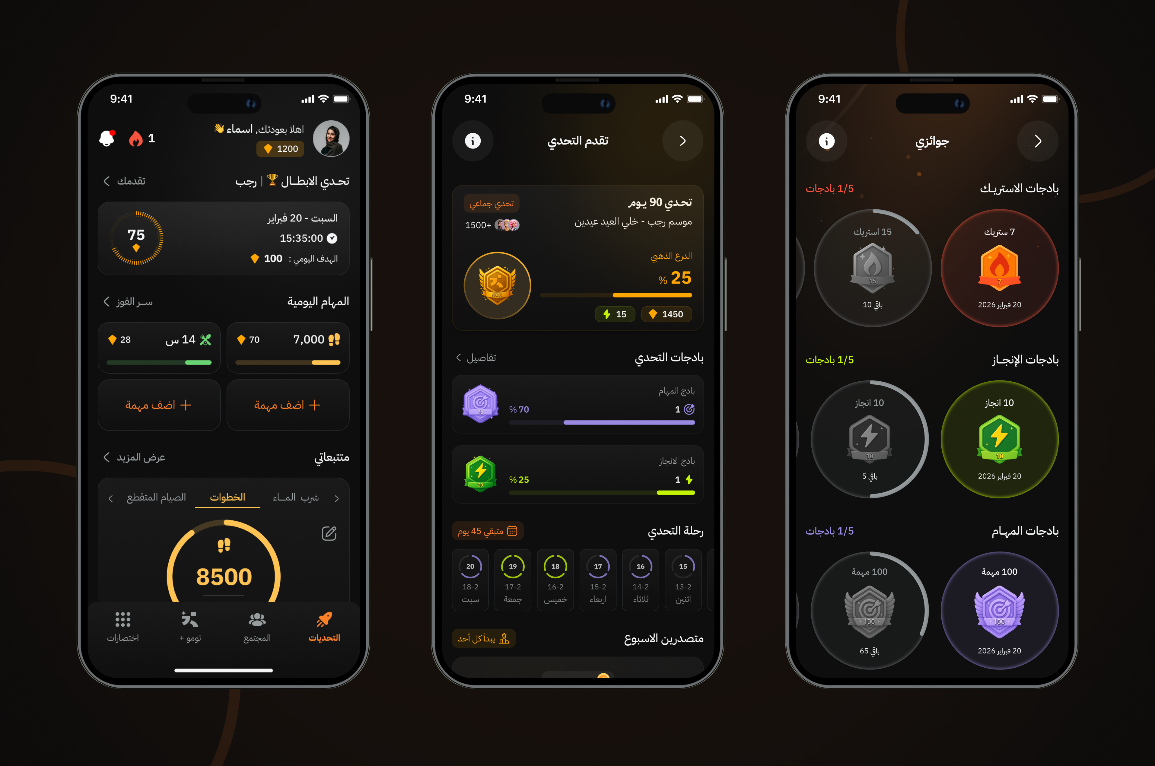
Strong concept here. The gamification layer feels purposeful, not decorative, and the dark mode aligns well with the fitness/energy vibe. Progress visibility is clear, which is critical for habit-based products.
To push it further, I’d suggest slightly reducing cognitive load on the home screen so the primary action is unmistakable. Also, a quick usability test on some icons (like the first one and the rocket) could validate clarity at first glance.
Overall, this is solid product thinking with good visual execution. Keep building — you’re on the right track 🚀

Clean work @Reda 🔥
The gamification is clear and motivating, and the dark theme fits the fitness vibe really well. Progress and rewards are easy to understand at a glance.
I’d maybe simplify the home screen a bit so the main action stands out more. Overall, solid design keep going 💪

i love that the screens feel really cohesive and clearly part of the same app!
I’d consider simplifying the home screen slightly so it scales better on smaller screens. I also wasn’t sure what a couple of the icons represented at first glance (the first one and the rocket), so those could be worth testing.
Awesome job! :)

Hey Reda!
I just explored your Fitness Challenges App project, and I like the direction you took with it.
What stood out to me is the sense of momentum in the UI. It feels like the product is encouraging action rather than just tracking data. The challenge framing gives it energy, and that’s important in fitness motivation is everything.
I also appreciate how you structured the progress elements. They seem clear and rewarding without being overwhelming. It feels balanced not too gamified, not too serious.
If I were to push it further, I’d look at long-term engagement. What keeps users coming back after the first challenge? Is there a social layer, streak system, or adaptive difficulty? Showing that lifecycle thinking would make the concept feel more sustainable.
Overall, this feels like a strong foundation with a good understanding of user motivation. You’re designing for behavior, not just visuals and that’s a solid instinct.

Hey Reda,
The Interface looks good! Colors and typography has been used efficiently.

Replace all in-app copy with English to ensure evaluation clarity and global usability.
Improve first-glance scannability by reducing information density on the home screen and prioritizing key actions and metrics.
The visual execution is strong and engaging. To elevate this work to a top-tier submission, the designer should improve language standardization, accessibility validation, color system discipline, and narrative clarity around dark mode decisions.

Hi Reda! 👋
I can see solid gamification foundations here. 😊 The badge system, challenge progress, and streaks are clear and motivating. Dark mode fits the fitness vibe well, I agree with other mentors on that.
The home screen its seems overloaded. There's a lot happening at once and it's hard to spot the main action. I'd try simplifying the visual hierarchy so users immediately know what to do. The Arabic (RTL) interface looks consistent, but I can't assess whether all elements are correctly translated.
I'm missing a view of the actual habit tracker in action. How does adding, editing, and daily check-offs look? That's the core feature, yet I mainly see dashboard and achievement screens.
Overall, the project has character and cohesive aesthetics. Refine the prioritization on the home screen and test icon comprehension. The rest holds up strong! 💪 ❤️

Really nice work. The dark mode looks great and feels very polished, it gives the whole interface a premium, confident vibe. The gamification elements are strong and well thought through, you can clearly feel the progress, rewards, and motivation baked into the experience. The use of color accents on a dark background works very well and helps important elements stand out without feeling chaotic. Overall it feels cohesive, engaging, and carefully designed. Great job.
You might also like

Smartwatch Design for Messenger App


Bridge: UI/UX Rebrand of a Blockchain SCM Product


Pulse Music App - Light/Dark Mode


Monetization Strategy


Designing A Better Co-Working Experience Through CJM


Design a Settings Page for Mobile
Visual Design Courses

UX Design Foundations


Introduction to Figma

Design Terminology
