Best Practices for Designing Forms
Apply proven guidelines for labels, inputs, errors, and buttons to make forms users actually complete
Users don't want to fill out forms. They want whatever comes after. Every extra field, confusing label, or unclear error message gives them a reason to leave. Good form design removes those reasons one by one. It means asking only for what's necessary, showing the right keyboard at the right time, and placing errors where users will actually see them. It means making inputs easy to tap, marking required fields clearly, and being careful with placeholders that disappear. None of these details seem significant on their own, but together they determine whether someone finishes a form or abandons it. Following established best practices takes the guesswork out of these decisions.

From the users' perspective, the shorter the better, especially when it comes to mobile forms. One
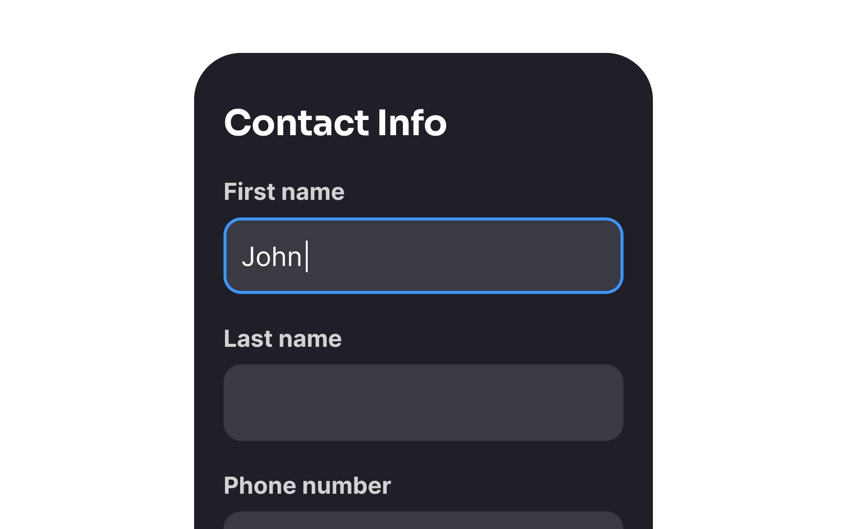
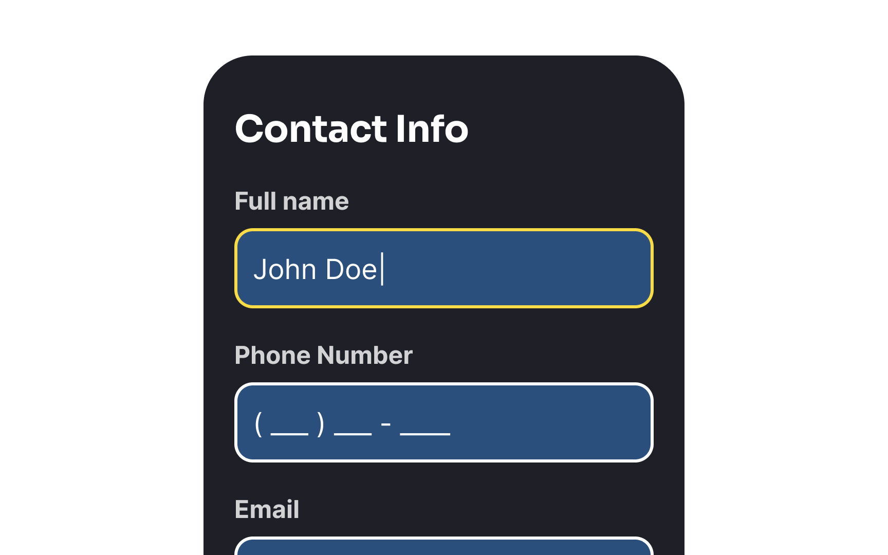
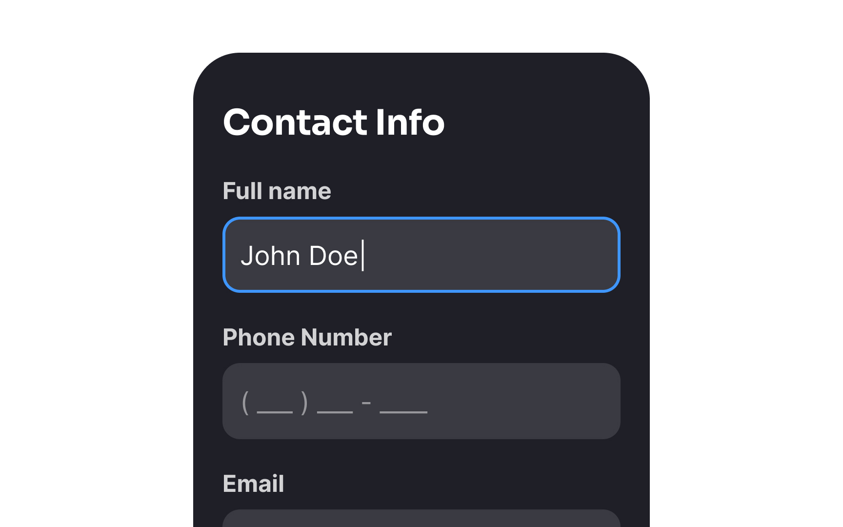
However, keep in mind that most people care about their names, so using them wrong can ruin the impression and break trust. If you decide to leave only one name input, make sure you know how to identify the first and last name and use it under the given context.
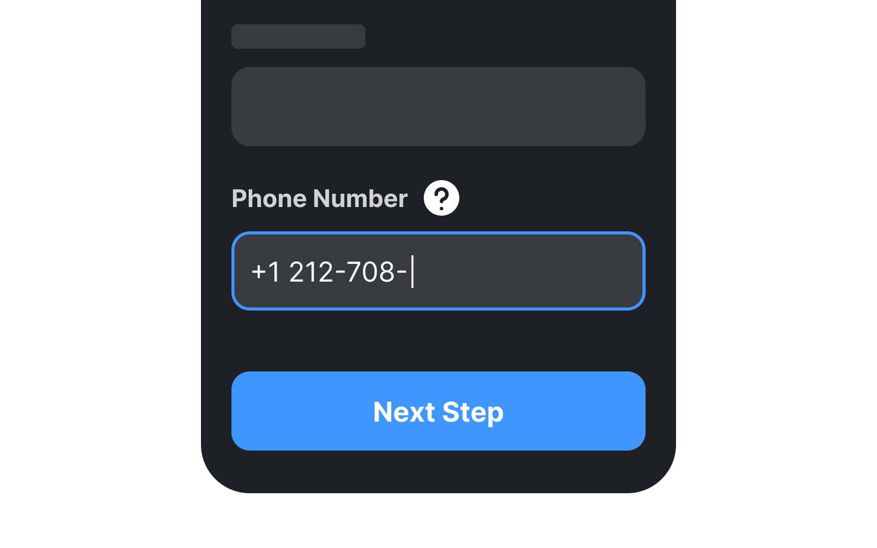
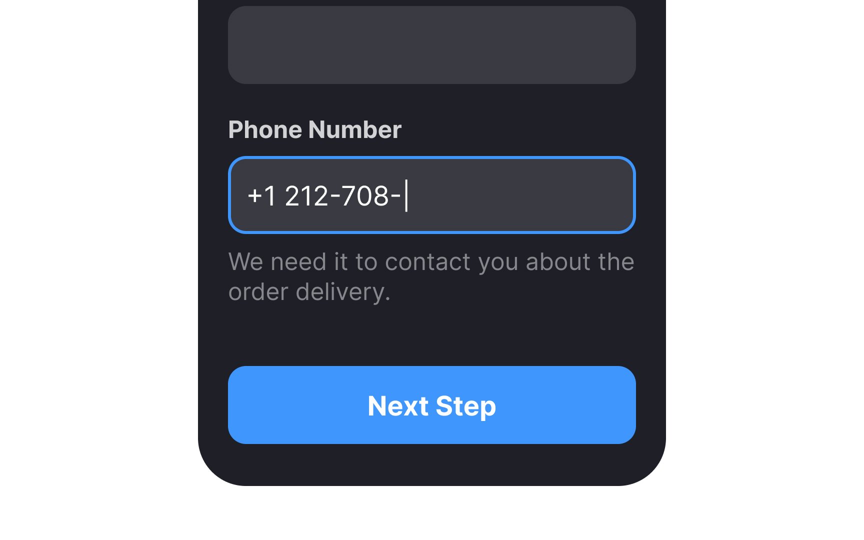
If your form asks users for private information like their phone number, they may question why it's needed. Users may also need more details when performing tasks like creating a new password. Here, using a helper text — a quick note below the
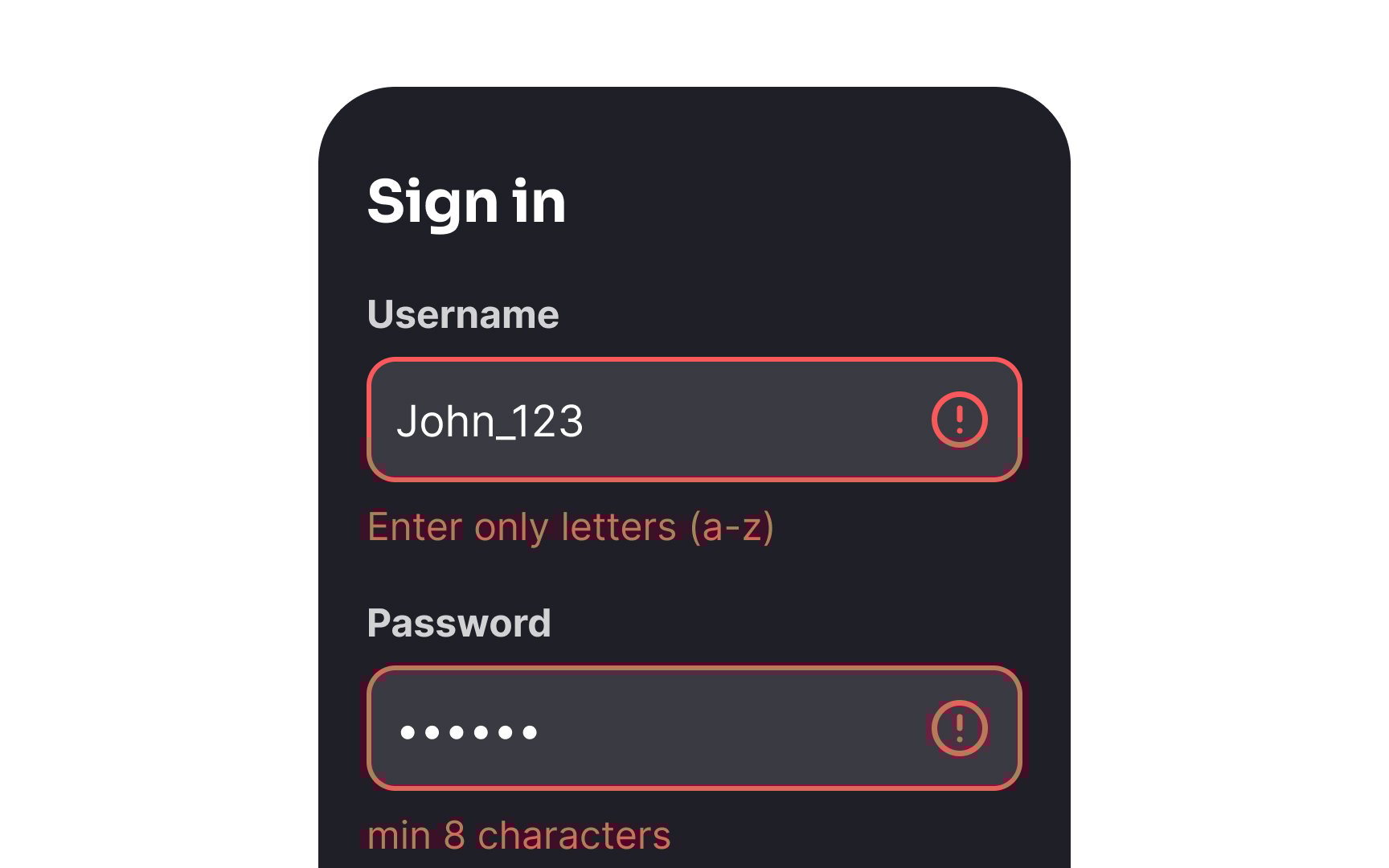
When there's a validation
Pro Tip: Don't hide helper text in tooltips as it requires extra actions from users.
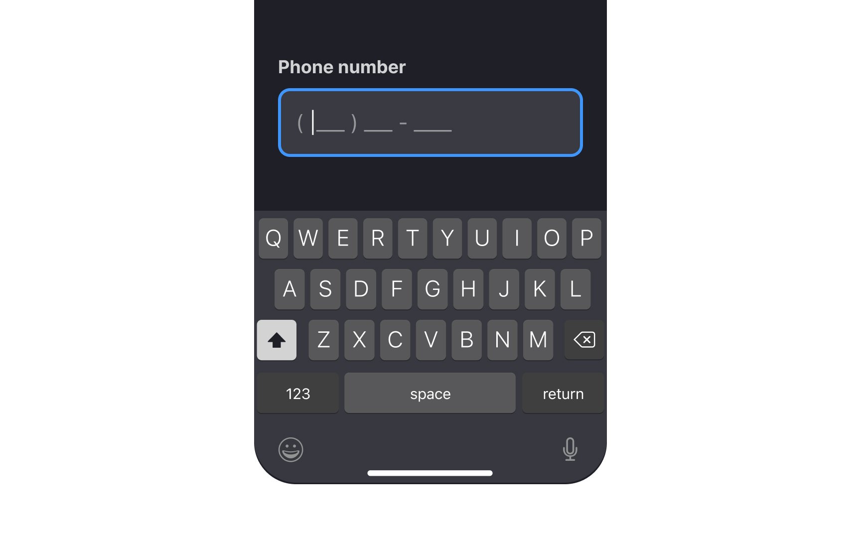
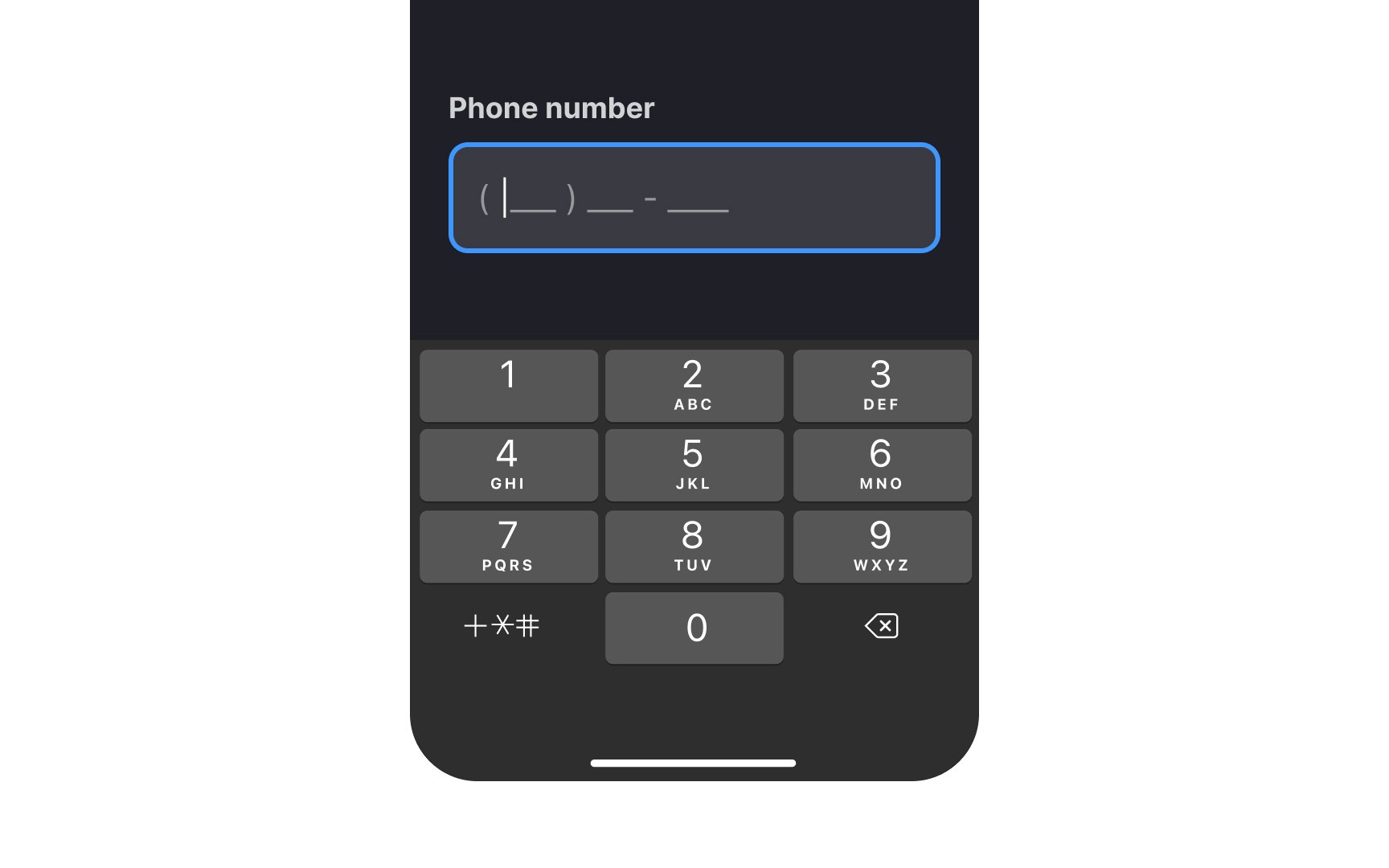
Providing the right keypad for the active
Pro Tip: Use contextual keypads along with input masks to eliminate any risk of accidentally typing a wrong symbol or using the incorrect format.
Nielsen's heuristic on the visibility of the system's status states that a good system should inform users about what's happening and provide immediate feedback on their
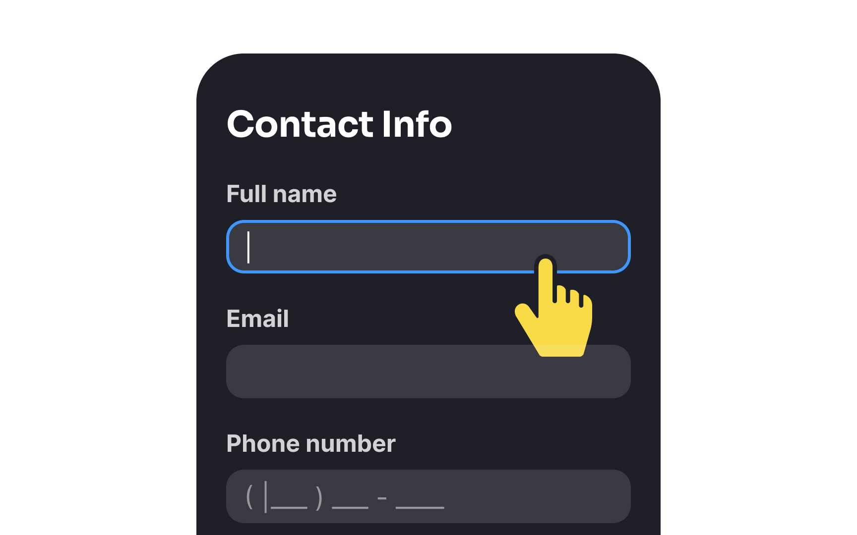
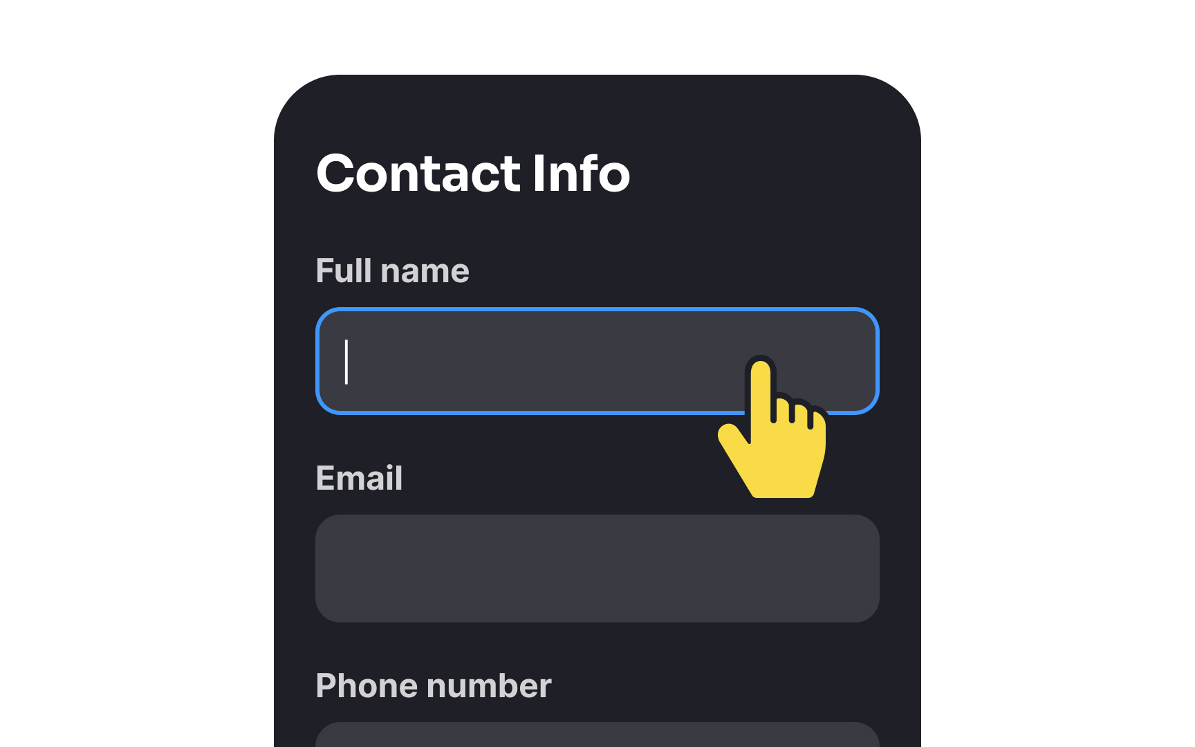
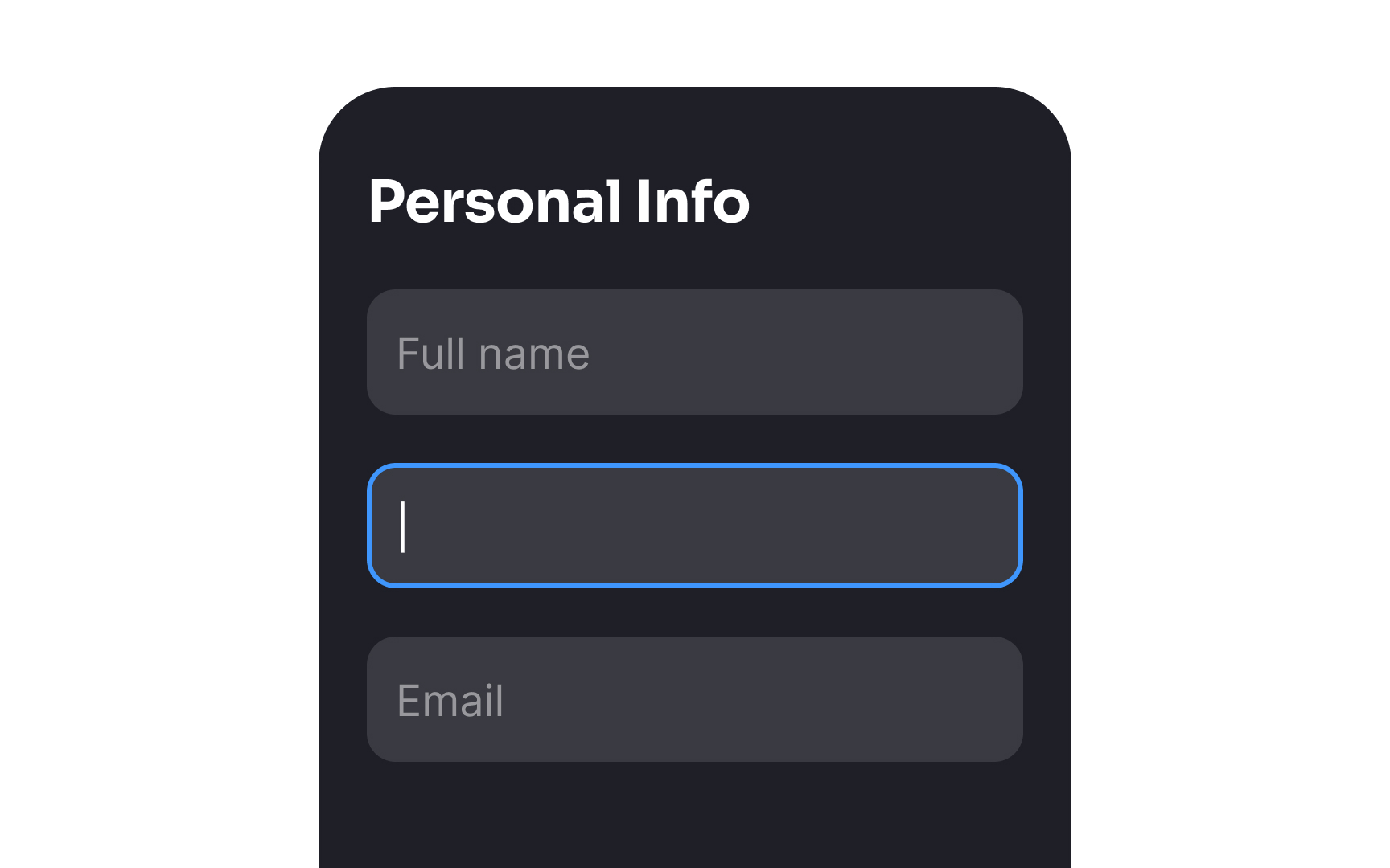
When users fill in a form, it's crucial to add a visual indication for all input states (active, focused, disabled,
This provides feedback on users' actions, indicating that the input is active and users can enter information. Moreover, some forms contain lots of
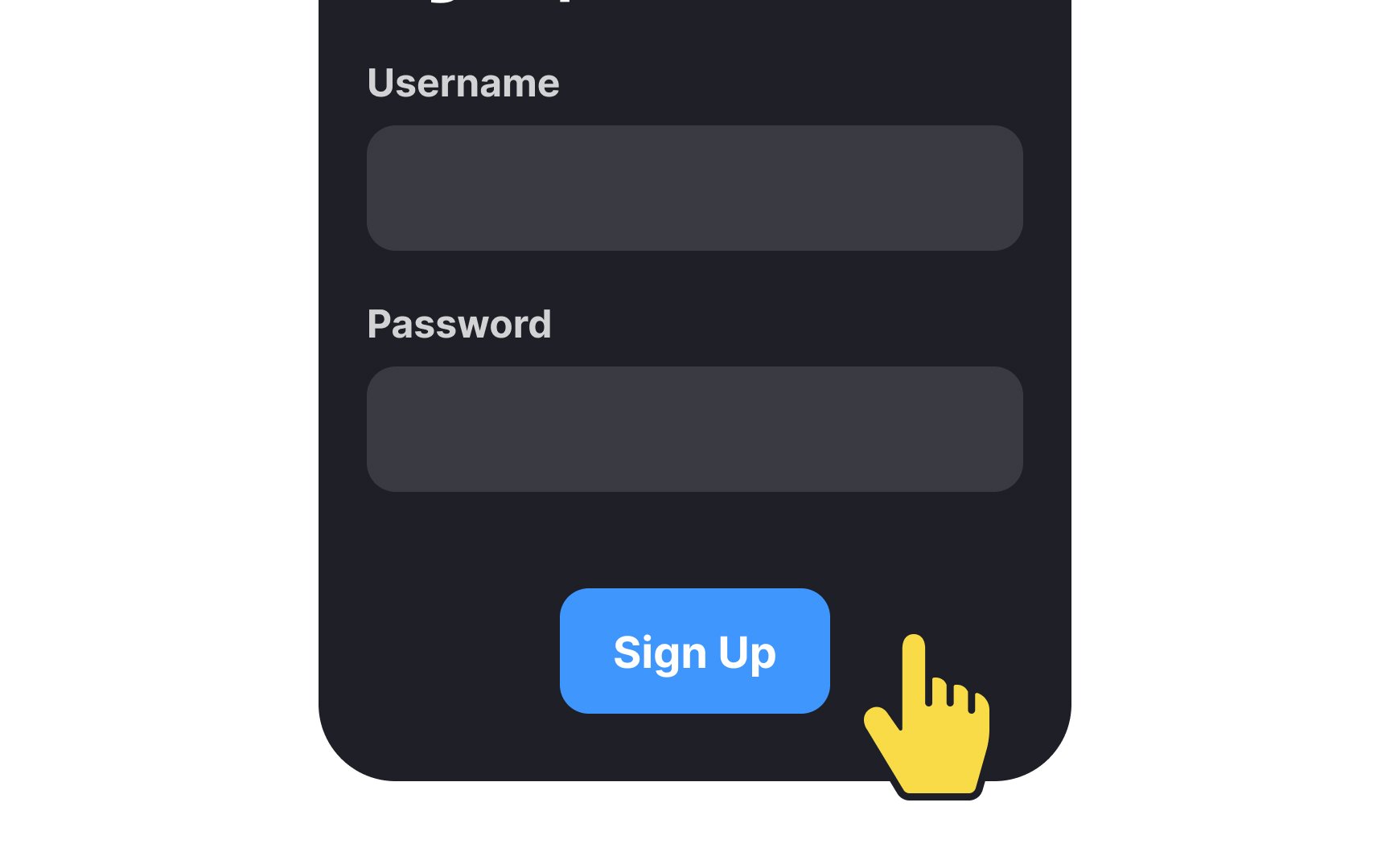
Primary buttons should lure users in and encourage them to interact. For that purpose, buttons with large touch areas are easier to catch user attention, look more engaging, and seem less error-prone.
The minimum touch target area is 1x1 cm (approximately 38px).[2] It leaves some room for
Having the same button width as the form
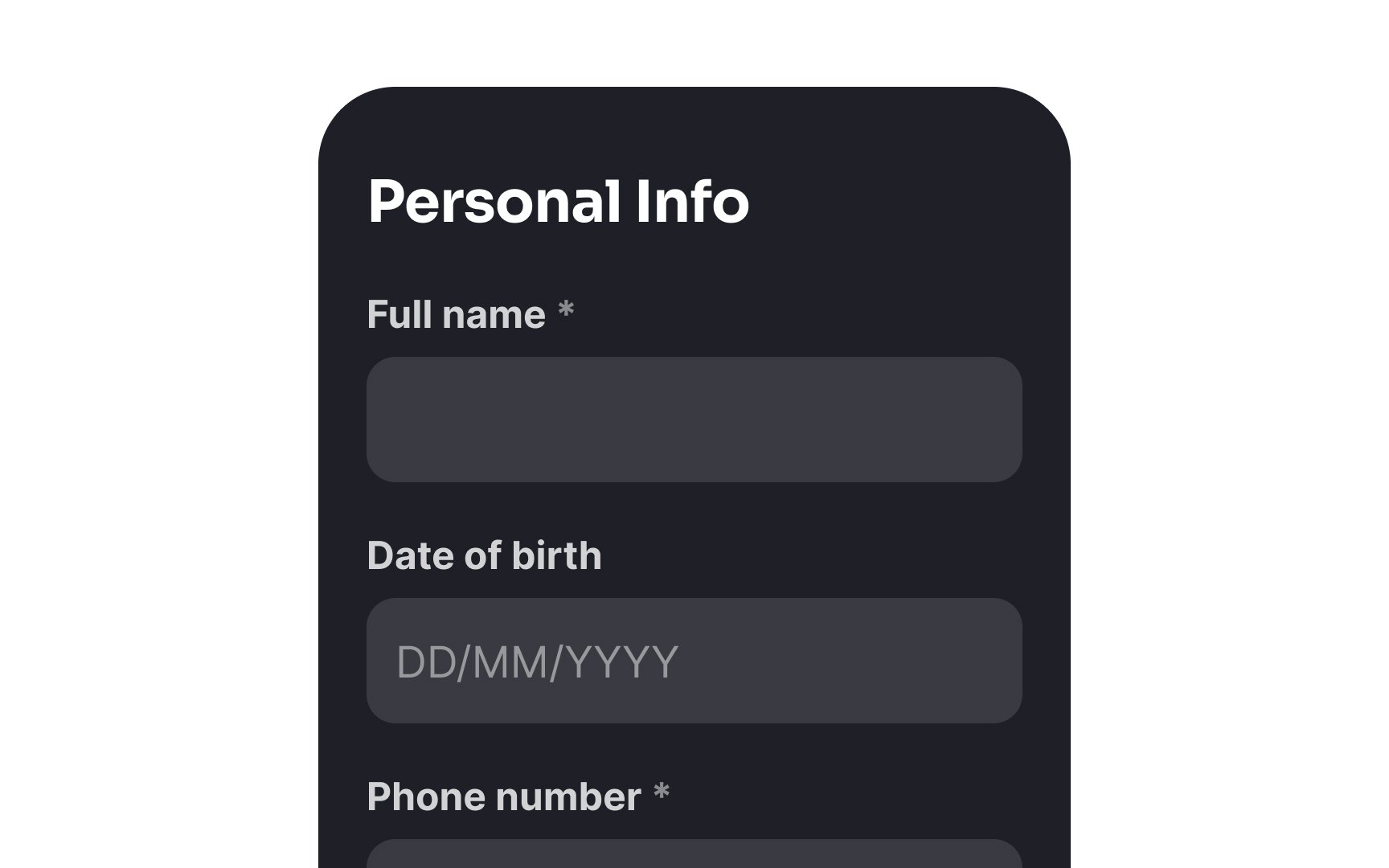
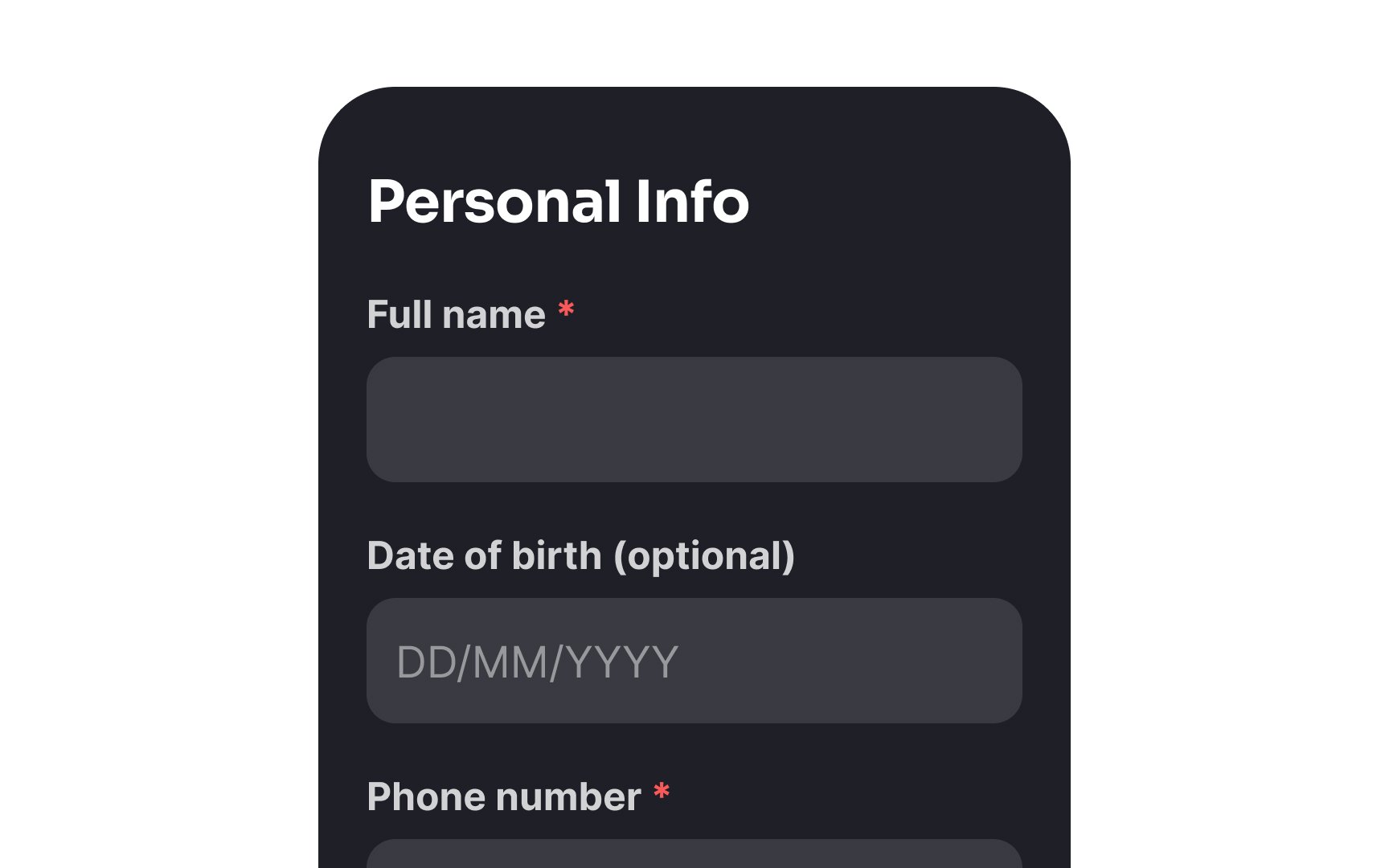
According to the Nielsen-Norman Group, marking both required and optional
The most common way of indicating a required field is by using an asterisk — the universal symbol to mark a mandatory input. Another way is to put the word "required" near the
To indicate that a field is optional, simply include a note in the input label within brackets with the word “optional.”
Using smaller-sized
If you're afraid the form may become too lengthy and require users to scroll, break it into logical steps. The only caution is to keep the number of steps up to 5-6. Otherwise, the form may look too overwhelming.
Placeholders often hurt usability, especially when designers try to reduce clutter on the page by replacing
There are two possible solutions to this problem. You can use floating labels — they save space and, in contrast to traditional placeholders, don't disappear, moving above the input.
Another option is using visible labels and hints placed outside empty form
When it comes to placing error messages in a form, there are various options to choose from, such as left, right, above, or below the
According to an online study involving 303 participants, the most preferred and expected placement for error messages is on the right side of the erroneous input. Although this placement takes up more horizontal space on the form, it is still the favored choice among users. The second most popular option is to place the error message below the input because it follows the natural reading order, helps users identify errors quickly, and takes up less space. This is especially important for mobile forms.
Surprisingly, placing error messages at the top or bottom of the form can result in a higher rate of consecutive errors because users may overlook them.[5]
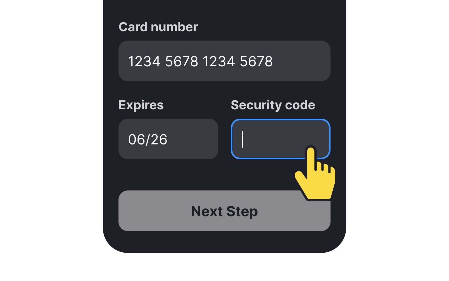
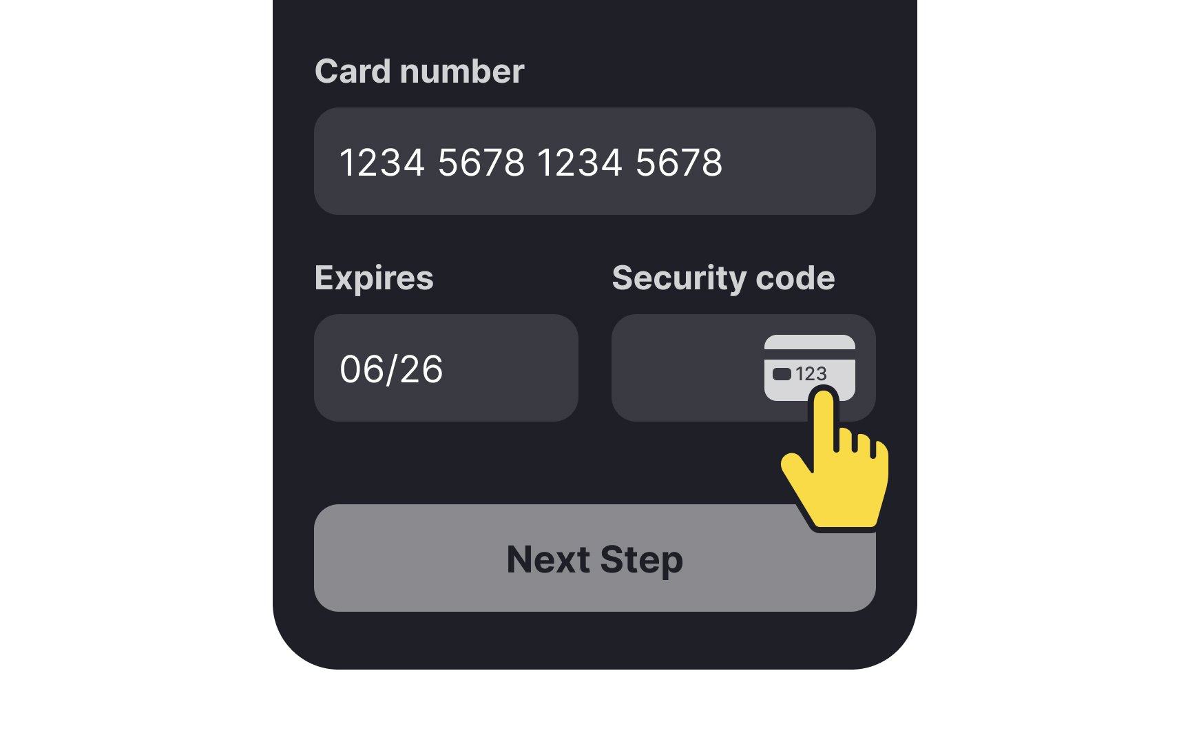
Icons can be more intuitive than text for quick visual guidance, especially in forms where users might not know certain information, like the CVV/CVC code on a credit card. Tooltips can be helpful but require an extra mouse action and may not work smoothly on mobile devices. Using an icon—a graphic of a credit card showing the code location, for example—can immediately clarify what's needed. If there's still potential for confusion among your audience, consider pairing the icon with a tooltip for extra clarification.[6]
Pro Tip: Don't include information that is vital for task completion (like password requirements) in tooltips.
Also, don't forget accessibility when choosing
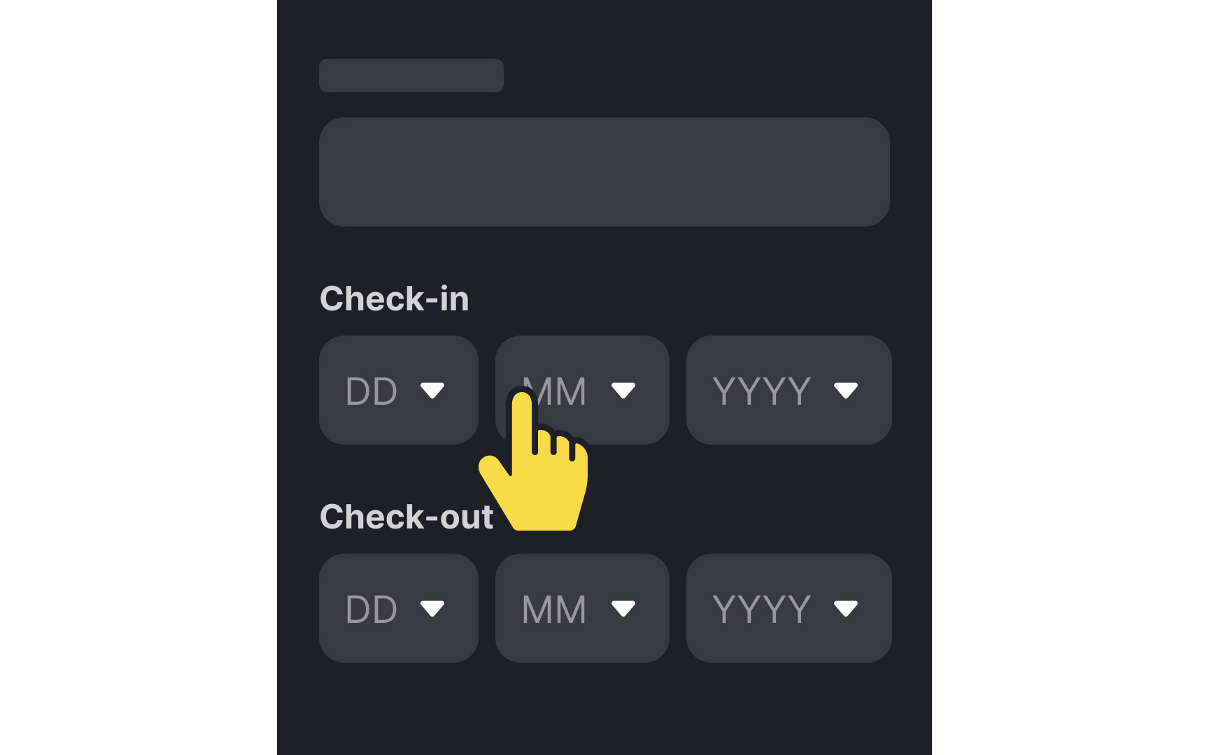
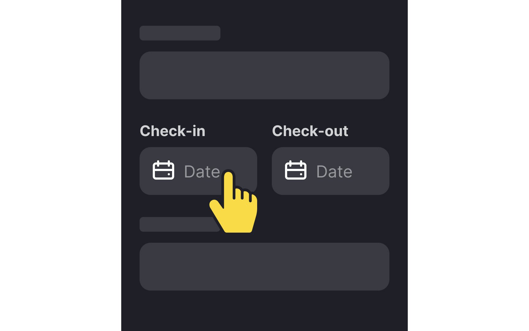
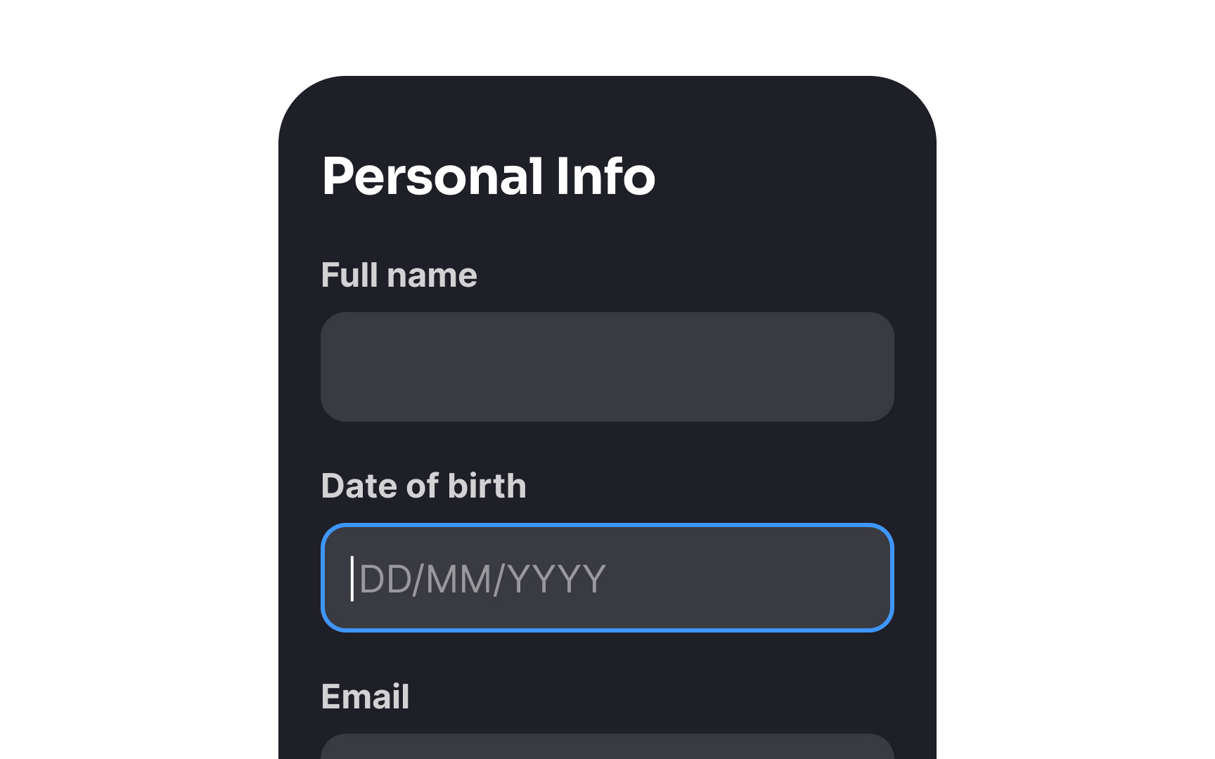
The selection of date pickers for a form depends on your purpose. For example, separate dropdowns to select the day, month, and year can require an unreasonable number of
For actions like booking a flight or making a reservation in a hotel, text
According to Dr. Susan Weinschenk, a behavioral scientist, users hate when systems ask them to do more than they have to. Many forms unnecessarily prompt users for information that the system can easily obtain by itself. Implementing features like smart defaults or auto-detection, which can automatically identify geolocation and pre-select options like country or city, can significantly enhance user experience. This streamlines the process for users, minimizing their efforts and ultimately leading to a more seamless
References
- Visibility of System Status | Nielsen Norman Group
- Touch Targets on Touchscreens | Nielsen Norman Group
- Marking Required Fields in Forms | Nielsen Norman Group
- Placeholders in Form Fields Are Harmful | Nielsen Norman Group
- Tooltip Guidelines | Nielsen Norman Group
Top contributors


Topics
From Course

Share


Similar lessons

Best Practices for Designing Login & Signup Flows

Best Practices for User Onboarding Flow Design
