Intro to UI Lists
Explore the fundamentals of lists, including their purpose, structure, and the different types used in UI design
Lists in UI design are essential for organizing information clearly and efficiently. Unordered lists offer simplicity for non-sequential items, while ordered lists provide structure for steps or ranked elements. Rich lists add interactivity, enhancing user engagement.
The main advantage of lists is their ability to make content easily scannable, helping users find information quickly. They also improve readability by breaking down complex data into manageable pieces. However, overusing lists or presenting too much information at once can overwhelm users and reduce the interface's effectiveness.
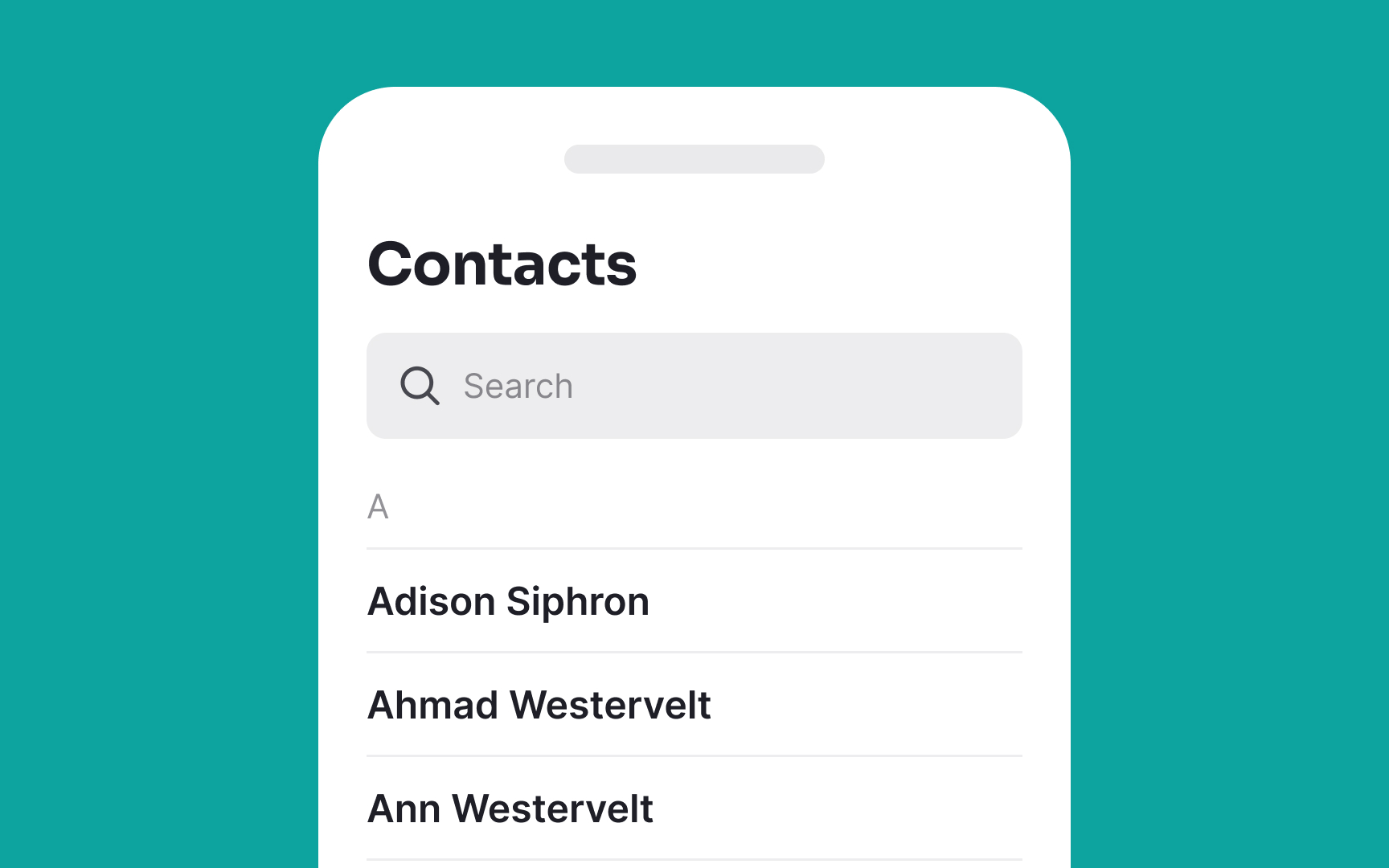
Single-line lists are a sleek and efficient way to display concise information in
When designing single-line lists, it's crucial to ensure readability by maintaining a consistent font size and style across all items. Adequate spacing between list items is also key, as it prevents visual clutter and enhances user interaction.[1]

Multi-line lists in
When designing multi-line lists, differentiate the primary and secondary information through varying
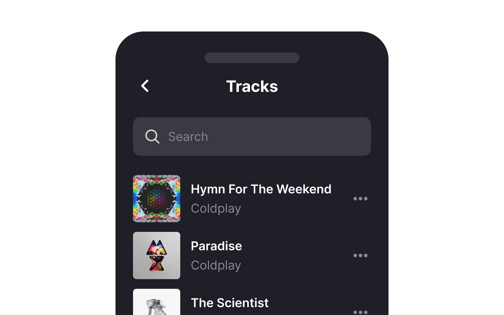
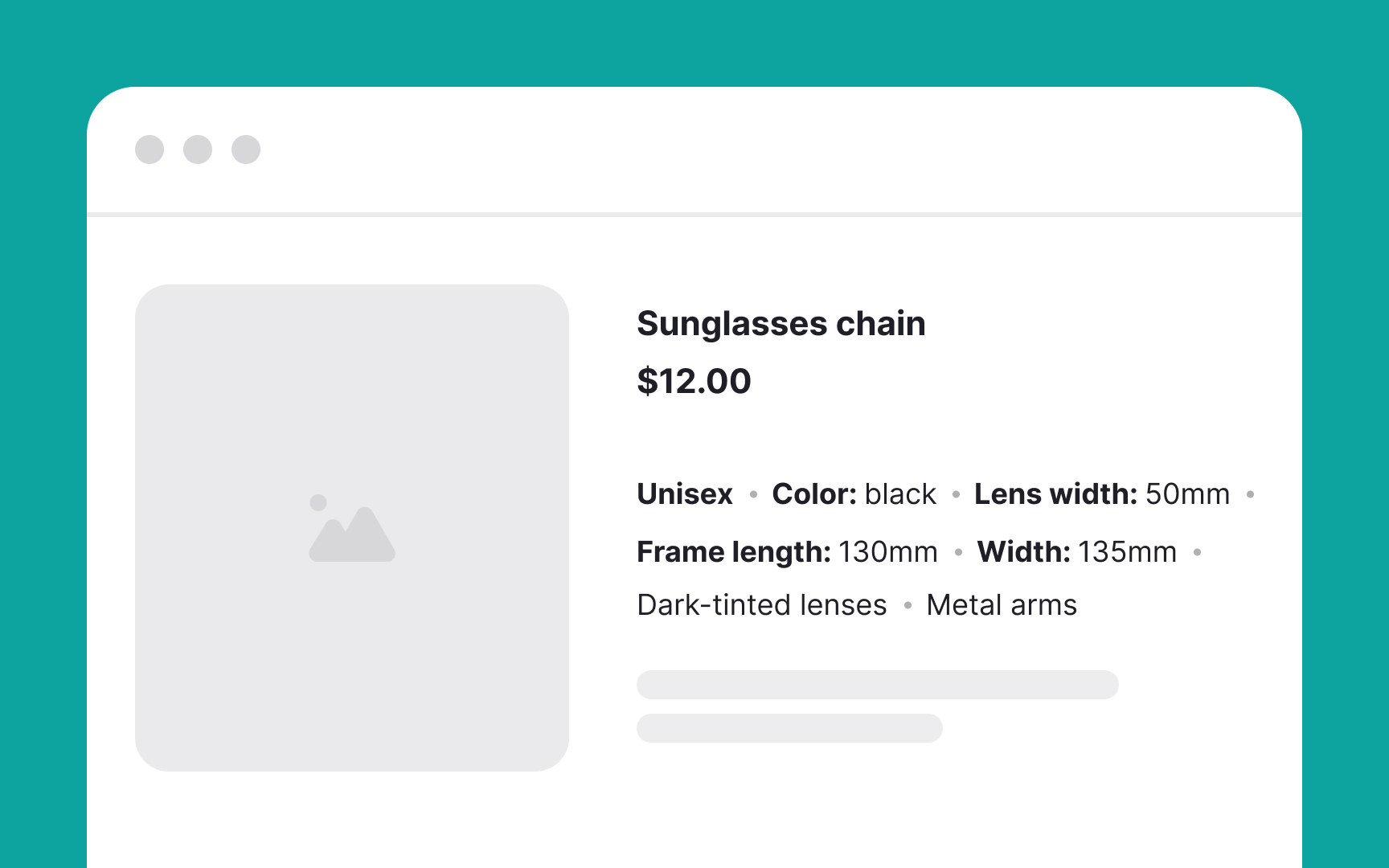
A rich list is an advanced type of list that goes beyond displaying basic text. It incorporates various elements like images, icons, interactive buttons, or secondary actions. This type of list is used when a more dynamic and engaging
While rich lists allow for the inclusion of multiple elements, it's crucial to maintain a visual balance. Overloading a list item with too many visuals or buttons can lead to a cluttered interface.
If the list includes interactive elements like buttons or links, these should be clearly distinguishable and easily accessible. Their function should be obvious to avoid user confusion.
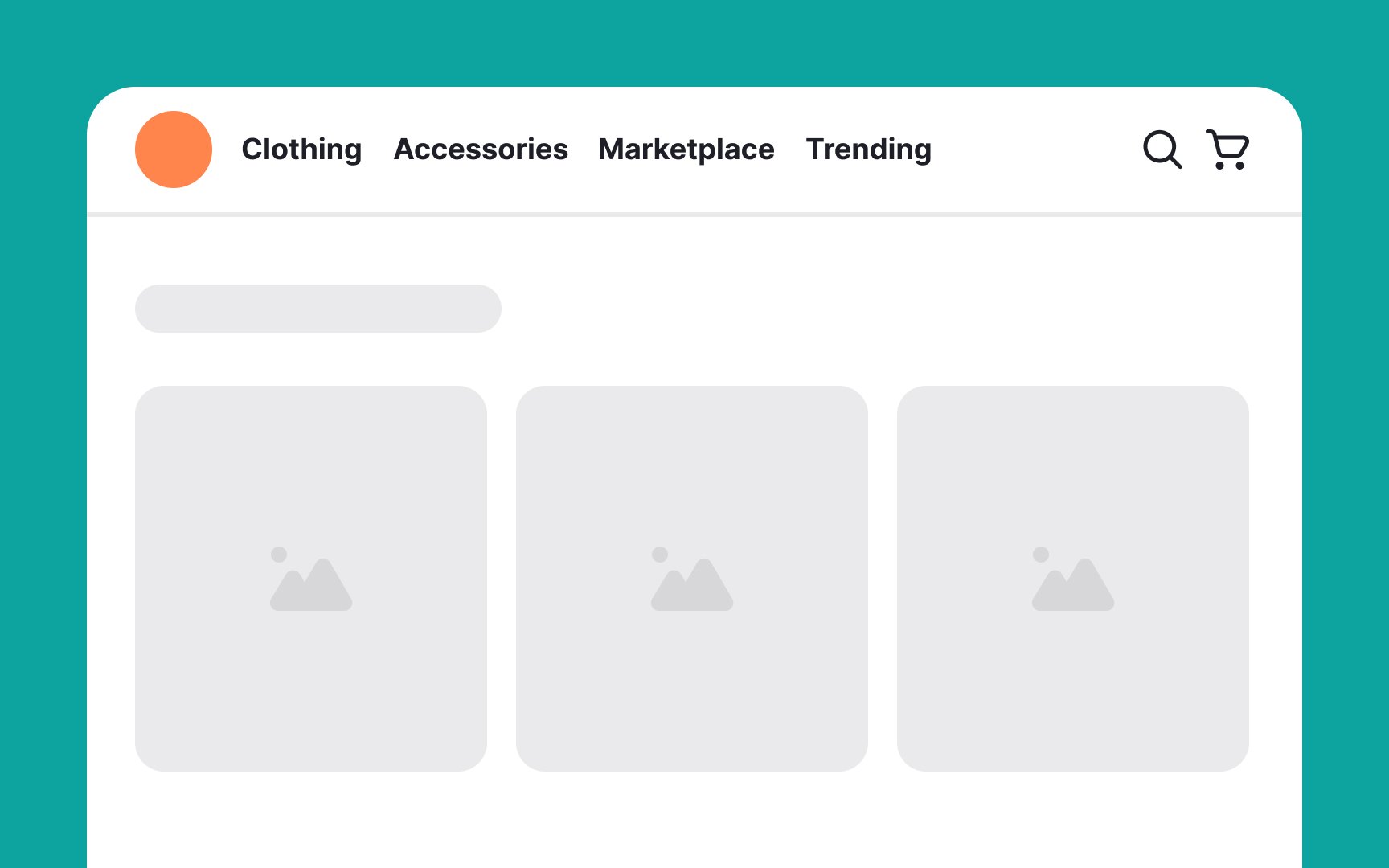
An image list is a collection of items primarily represented through
Ensure that all images in the list have a consistent quality. This uniformity helps in creating a cohesive and professional look, making the list more visually appealing and easier to navigate.
Also, provide sufficient spacing between images and consider using borders or shadows. This spacing helps each image stand out and improves the overall readability of the list, especially on crowded or complex backgrounds.
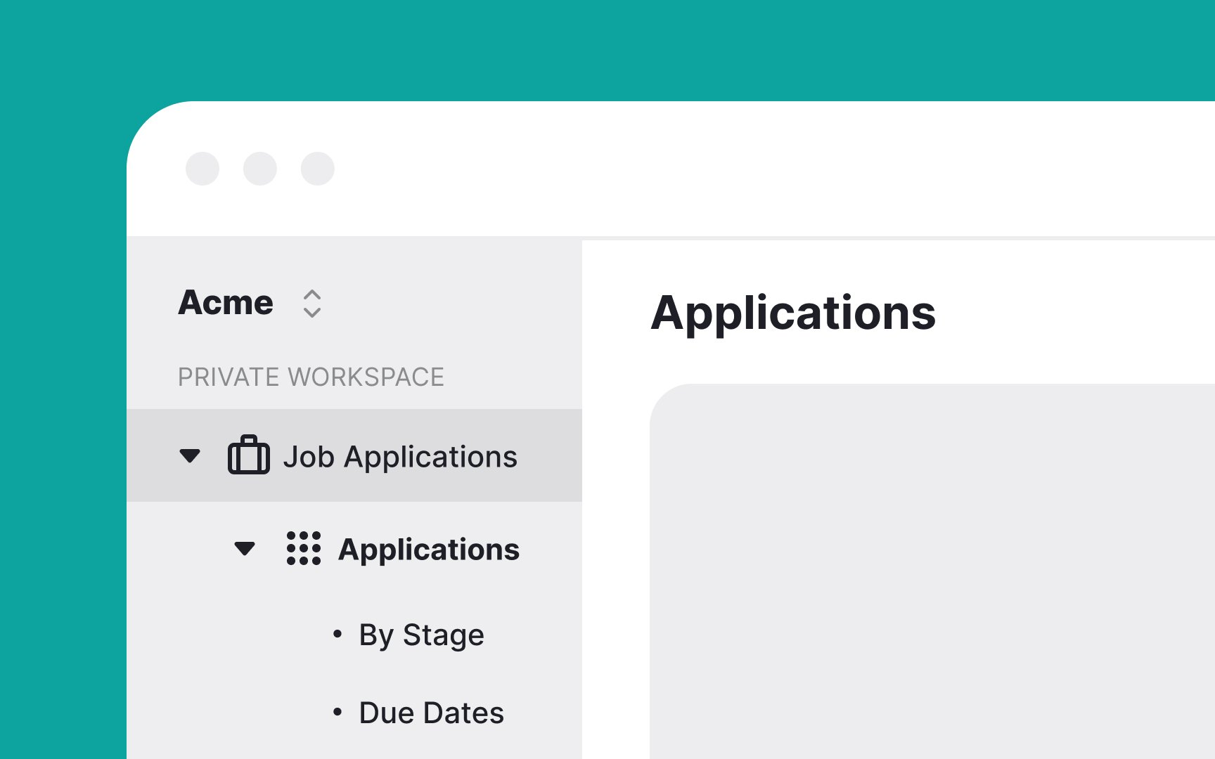
A nested list is a list within another list, used to display hierarchical information with multiple levels of detail. It's particularly useful in scenarios like file directories, organizational charts, or complex menu structures, where information needs to be broken down into subcategories for clarity and ease of
When designing nested lists, use visual cues such as indentation, different bullet styles, or varying text styles to clearly indicate different levels within the hierarchy.
For lists with several layers, implementing collapsible sections can greatly enhance usability. It allows users to expand or collapse sections as needed, preventing information overload and making the list more manageable.

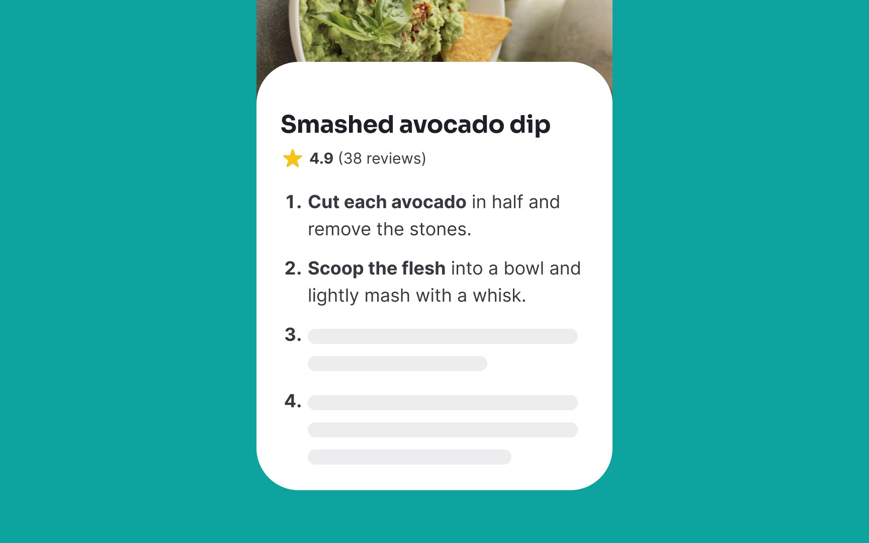
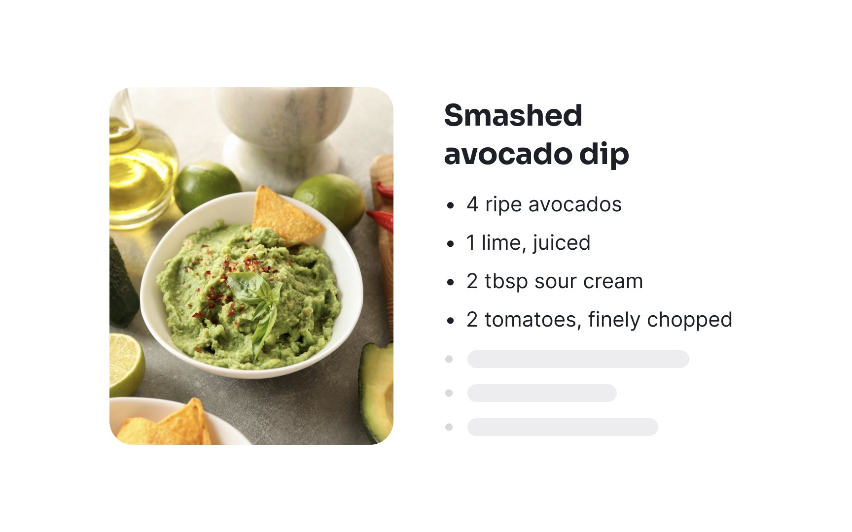
An ordered list is used to display a sequence of items in a specific, intentional order, often numbered or lettered. This format is ideal for presenting steps in a procedure, ranking items, or any scenario where the order of items is crucial, such as in recipes, instructional
Use clear and consistent numbering or lettering to indicate the order of items. The sequence should be immediately apparent to users, aiding in understanding the progression or hierarchy of the information.
A bulleted list is used for non-sequential, unordered information where the arrangement of items is not critical. It's ideal for listing features, benefits, or any set of items where each point holds equal weight, such as a product's features, ingredients in a recipe, skills in a resume, or tasks in a to-do list.
Bulleted lists are most effective when they're easy to scan and understand. Overly long or complex items can detract from the list's readability and purpose.

Vertical lists are a common feature in
Research shows that vertical lists are more efficient for visual searches than horizontal ones. Users can find items with fewer eye movements because they gather more information at a glance. For example, in an
Vertical lists are especially useful for mobile interfaces with limited screen width.
Horizontal lists align items — what a shocker — horizontally. However, avoid long lists containing more options than a screen can take without scrolling, as it can cause difficulties for older people and users with motor disabilities.


Similar lessons

Common UI Component Definitions I

Image Terminology
