How to Design Helpful Empty States
Transform blank screens into moments that onboard, guide, and encourage users
Empty states are overlooked because they seem like edge cases. No data yet. No results found. Nothing to display. Easy to fill with a generic illustration and move on. But empty states catch users at pivotal moments. First-time users see them before they've experienced any value. Searchers see them when what they wanted isn't there. Completionists see them after finishing everything.
Each moment carries emotional weight that a thoughtful response can shape. An empty inbox can feel like accomplishment or loneliness depending on how it's framed. A no-results page can feel like a dead end or an invitation to try something different. Empty states are some of the few moments where interface copy directly addresses the user's emotional state. Treating them as opportunities rather than edge cases changes how users feel about your product.
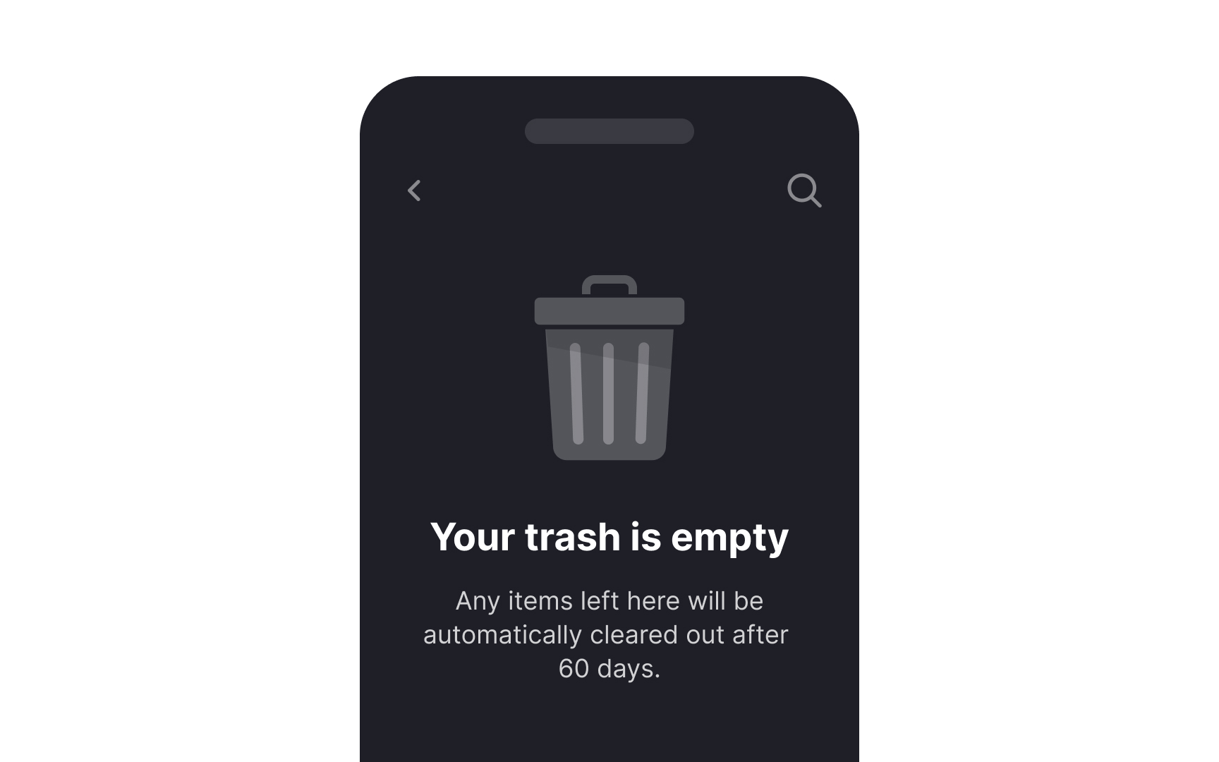
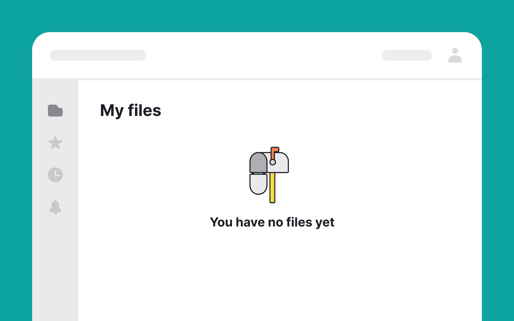
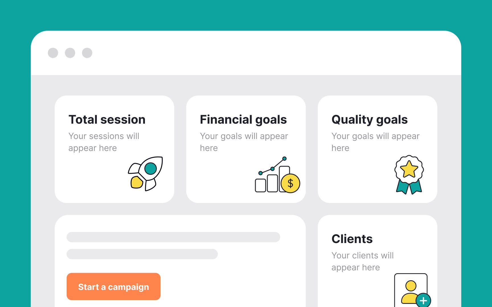
This type of empty state is informational. It simply notifies users that there is currently no content to display. However, it's important to remember that even in this scenario, you can provide a hint or suggestion on what users can do next to continue their journey. For example, if it's an empty inbox, you might say, "Your inbox is empty. Start by composing a new message." Even without a CTA button, the text itself can guide users.
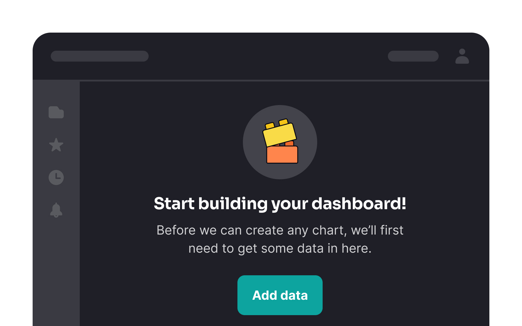
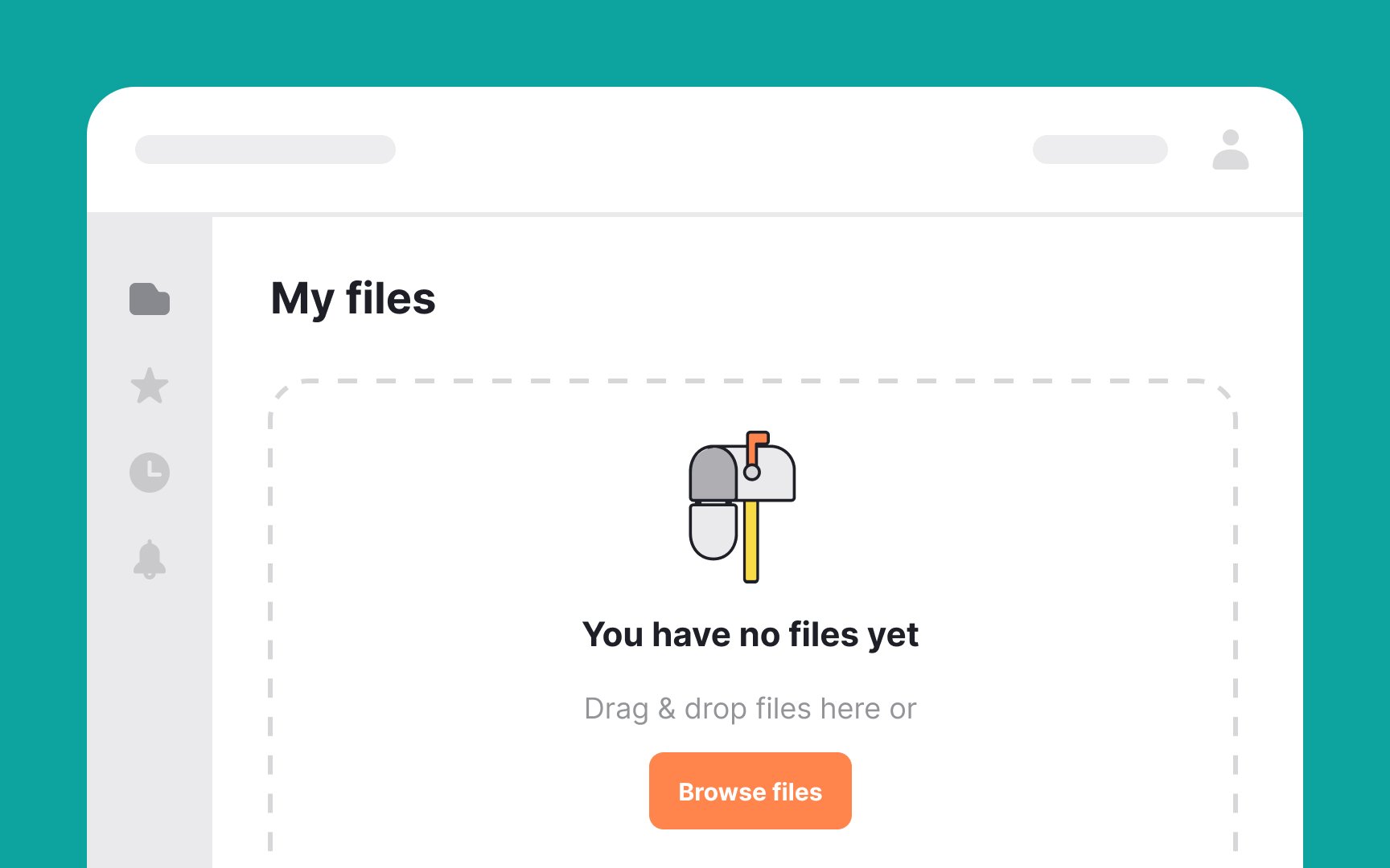
This type of empty state is more proactive. It not only informs users that there's no
If you want to offer users additional options, like reading documentation, you can include a link in the copy. For example, in an empty settings
When designing empty state
This not only informs users that they have no pending tasks but also guides them on what to do next. The goal is to blend clarity with encouragement, guiding users through an intuitive and positive interaction with your app or website.[1]
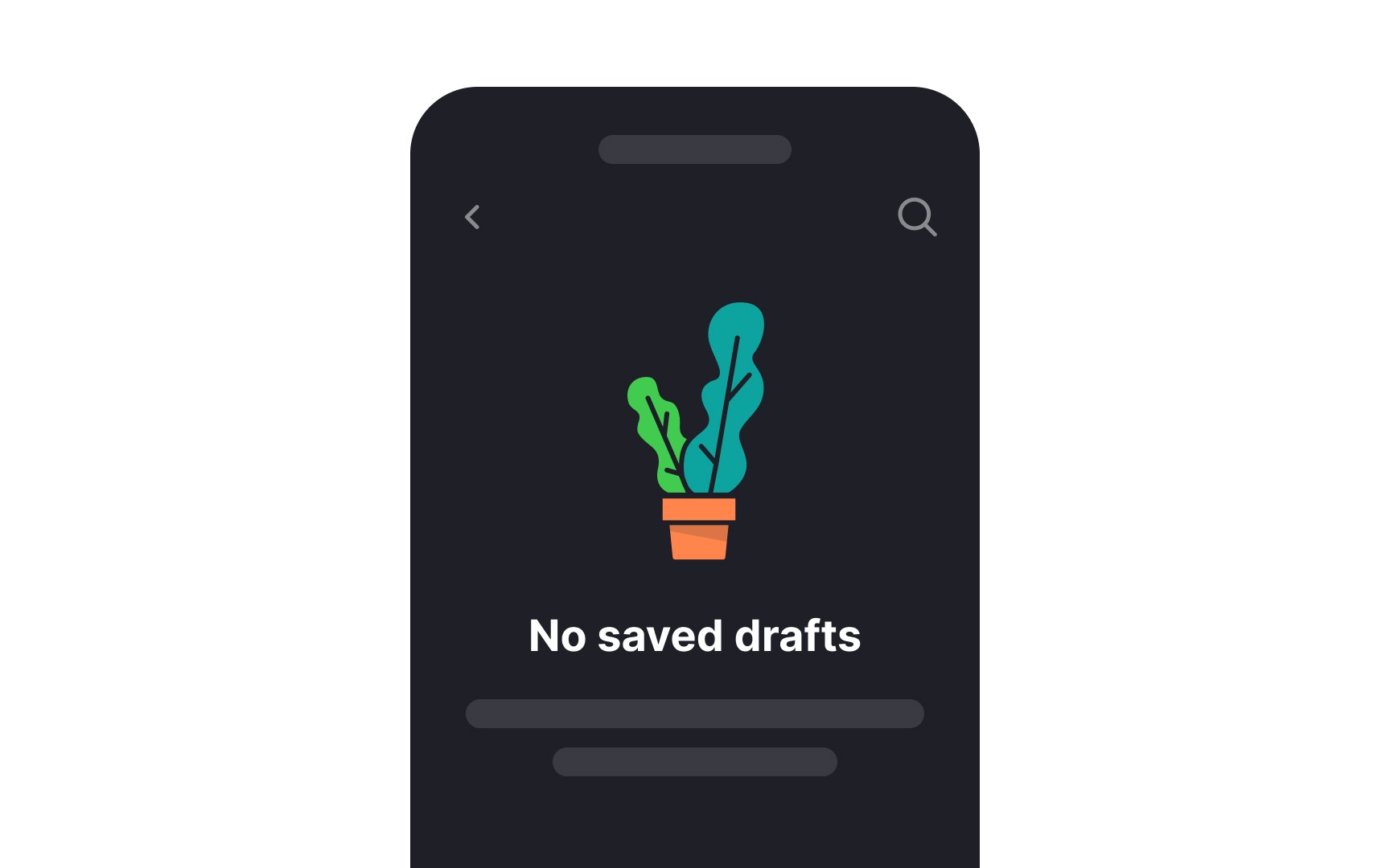
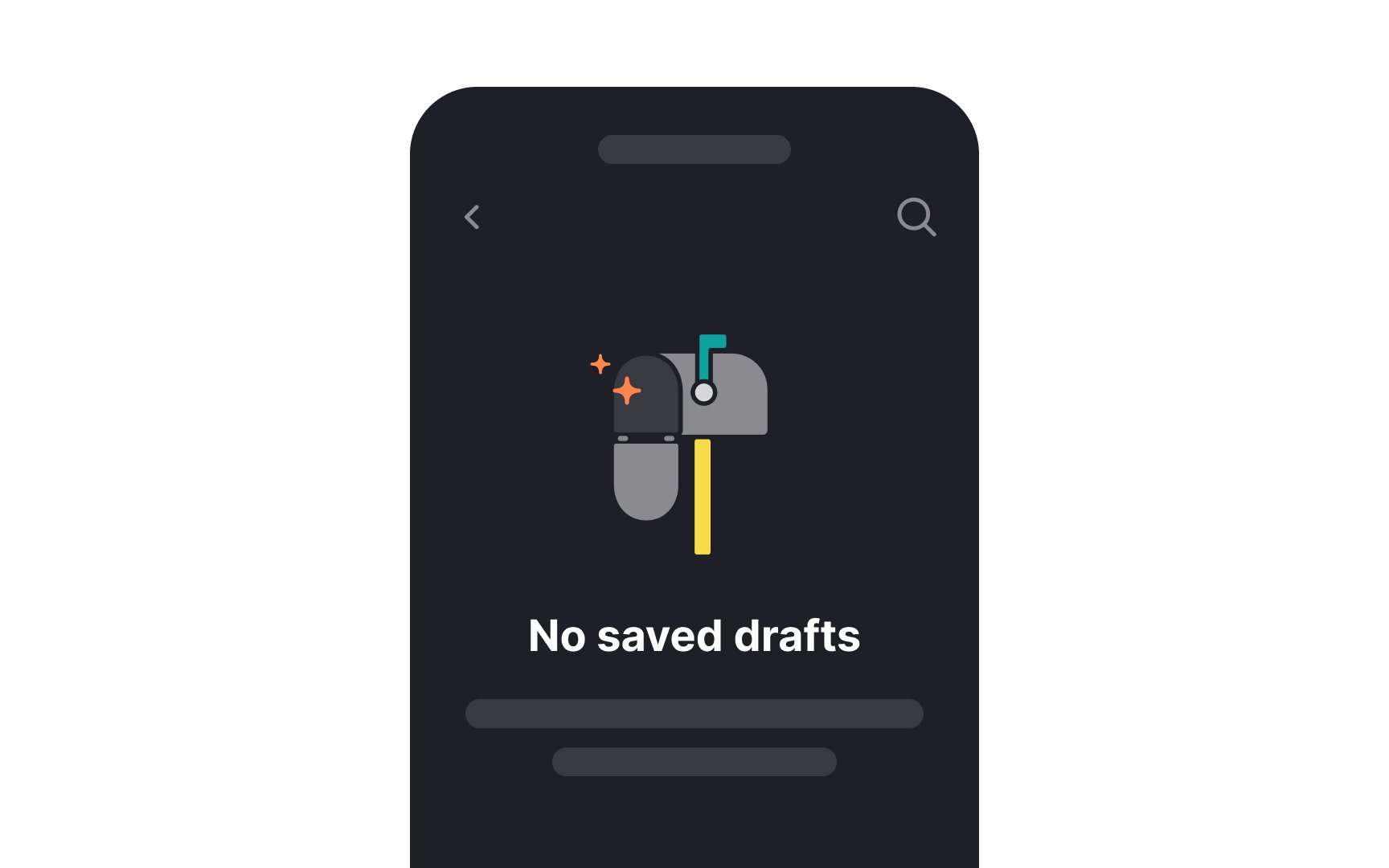
When designing empty states, incorporate relevant
Relevant illustrations not only fill empty spaces but also convey information intuitively, making the interface more engaging and user-friendly. Remember to make sure your illustrations are consistent with your brand personality.[2]
Pro Tip: These accompanying illustrations don't need to be overly complex or extravagant. Often, straightforward and pleasant visuals are enough to enhance the user experience.
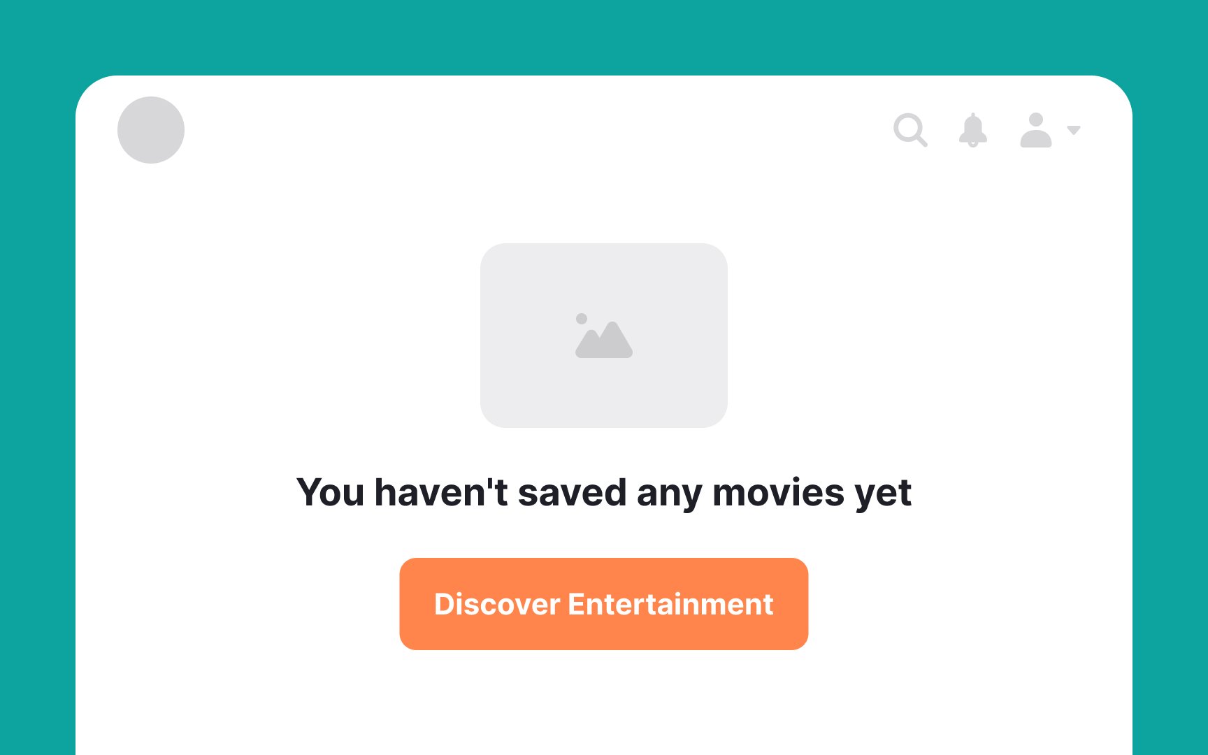
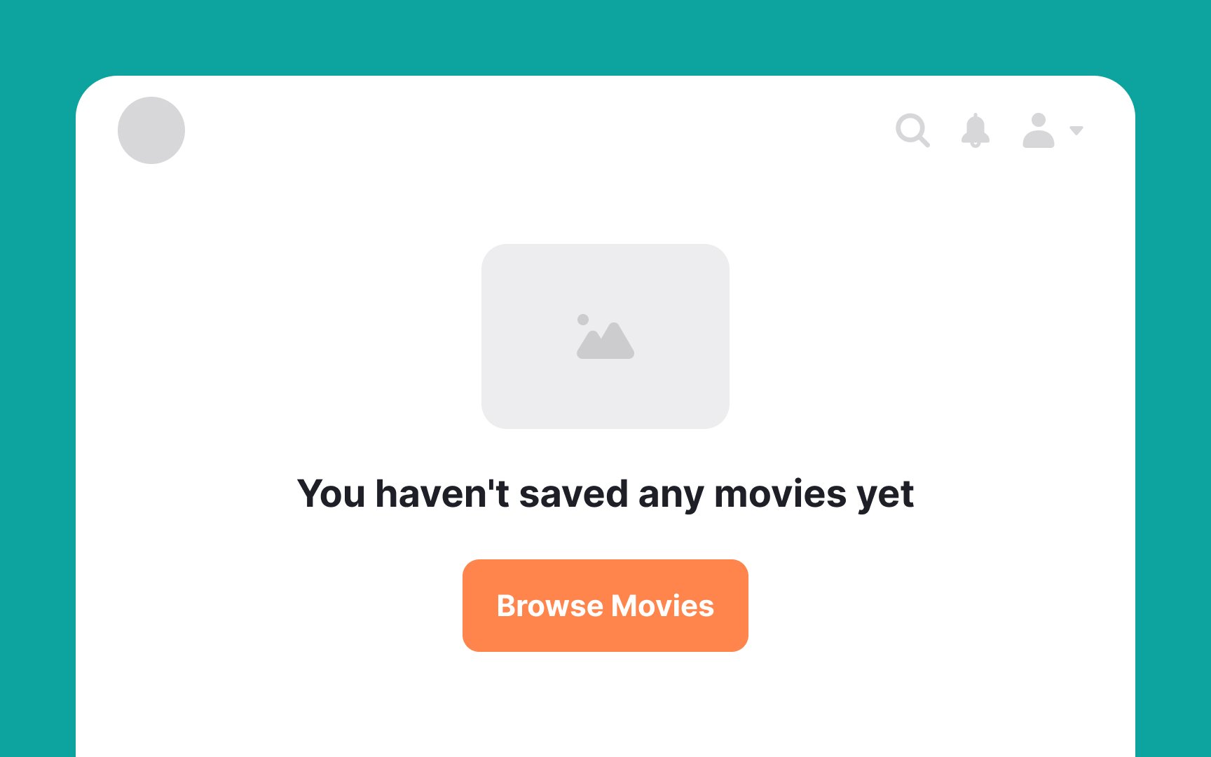
CTAs on empty state
It's also effective to add a touch of personality or encouragement. Phrases like "Let's Get Started" or "Create Your First Entry" can make CTAs more engaging and inviting. This approach balances informativeness with a friendly tone, enhancing user engagement.
Remember, CTAs on empty state pages are more than placeholders — they're vital tools for improving
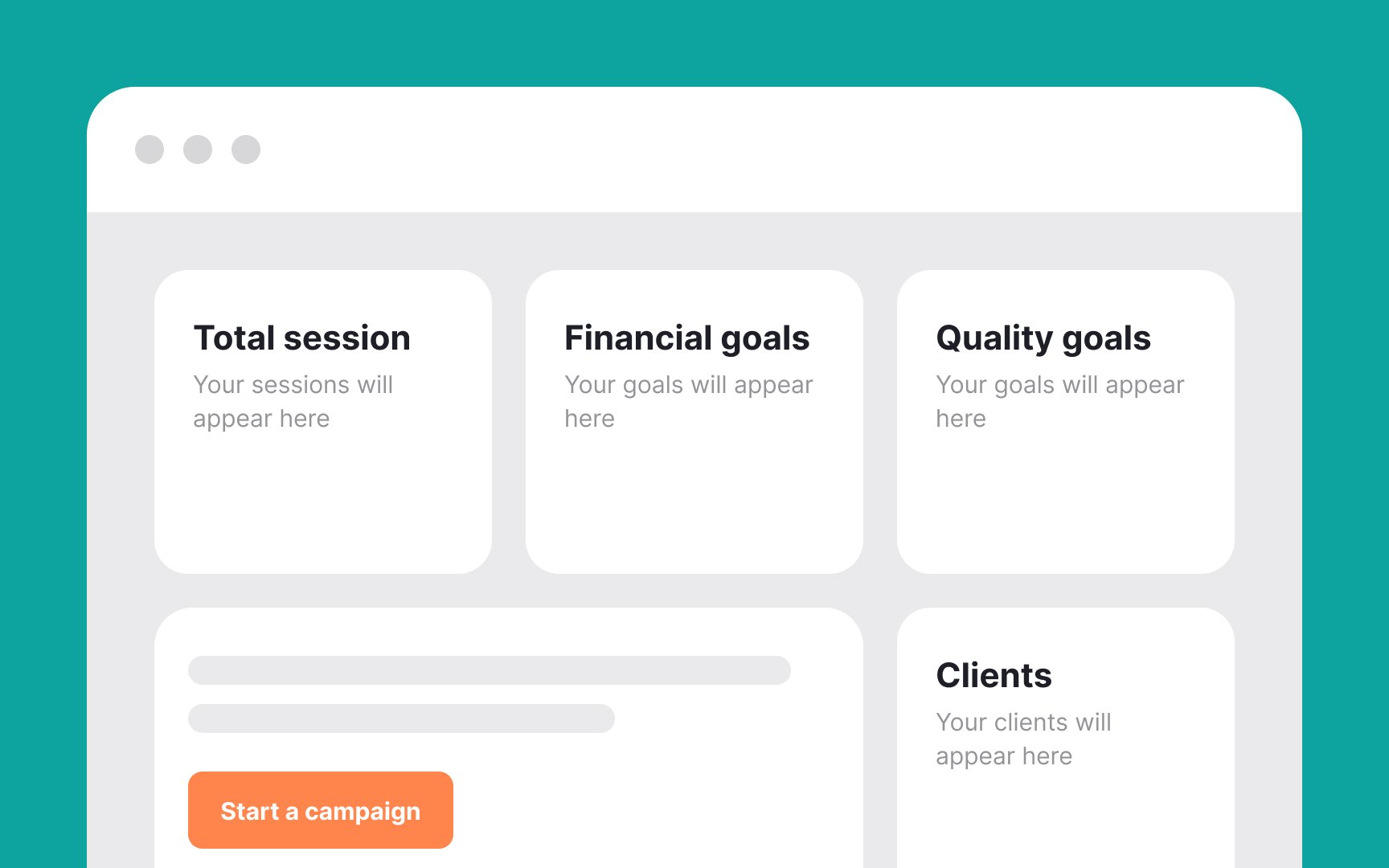
In designing empty dashboards for new users, it's crucial to avoid information overload. The goal is to guide users without overwhelming them. Here are some go-to tips:
- Use clear microcopy: Opt for a concise, clear microcopy that directly assists users. This approach is often more effective than overloading the
page with text. - Incorporate minimalistic visuals: Employ subtle visual elements or minimal graphics. These should guide users subtly, complementing the microcopy rather than overwhelming it.
- Focus on user goals: Every element on the empty page should aim to nudge users towards their primary objectives in a user-friendly manner.
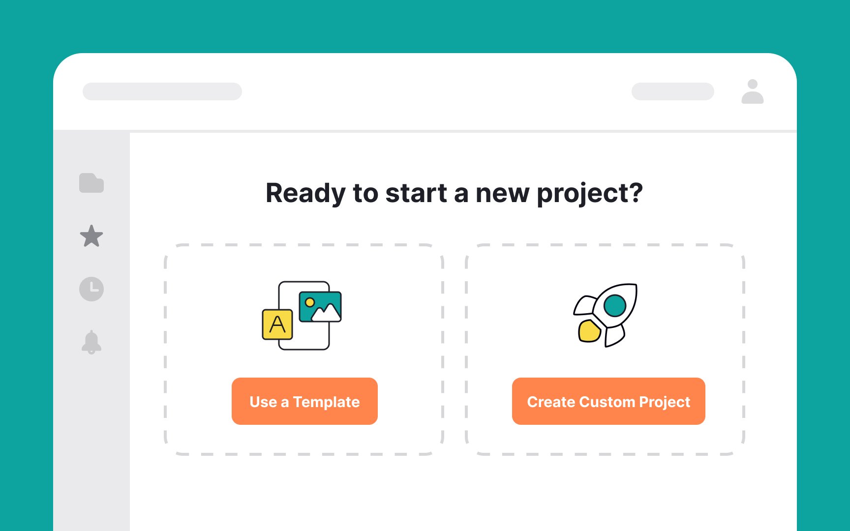
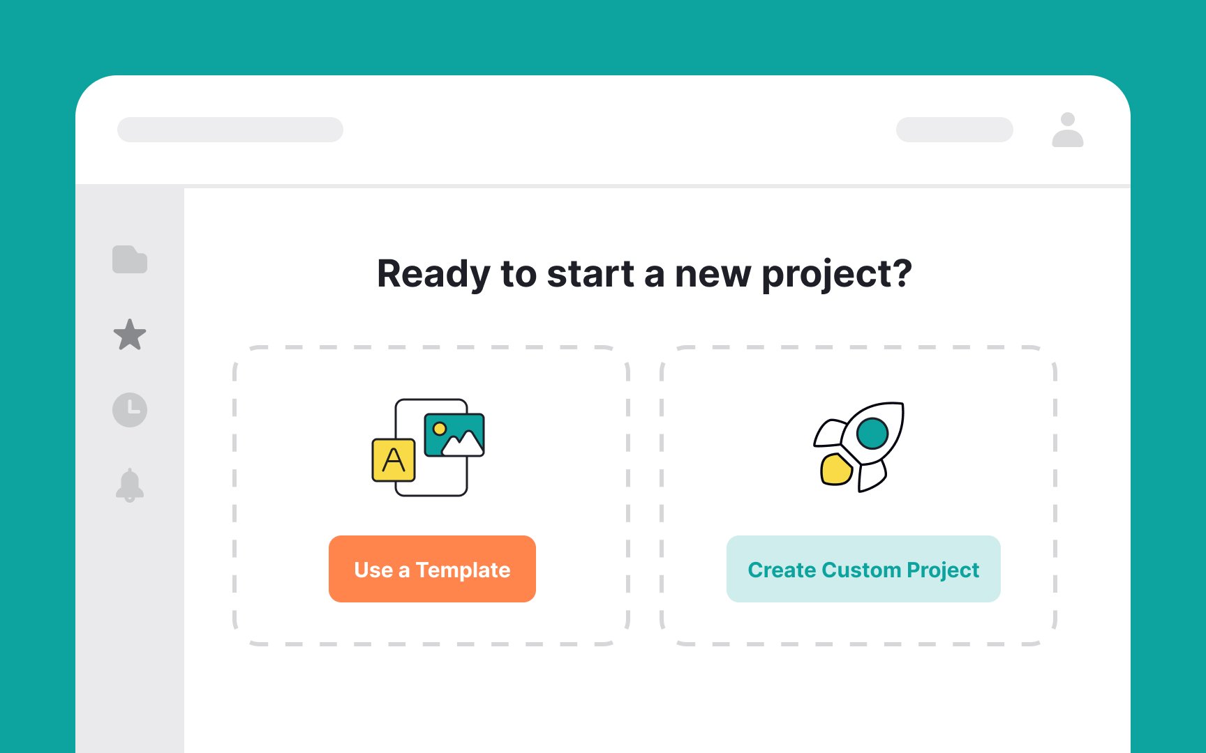
When presenting CTAs on an empty state
Imagine you're working on a website-building platform. When users encounter an empty state, presenting them with two clear options can streamline their experience. The primary action,
This method of prioritizing and distinguishing between primary and secondary actions helps users make more informed, stress-free decisions in their website-building journey.
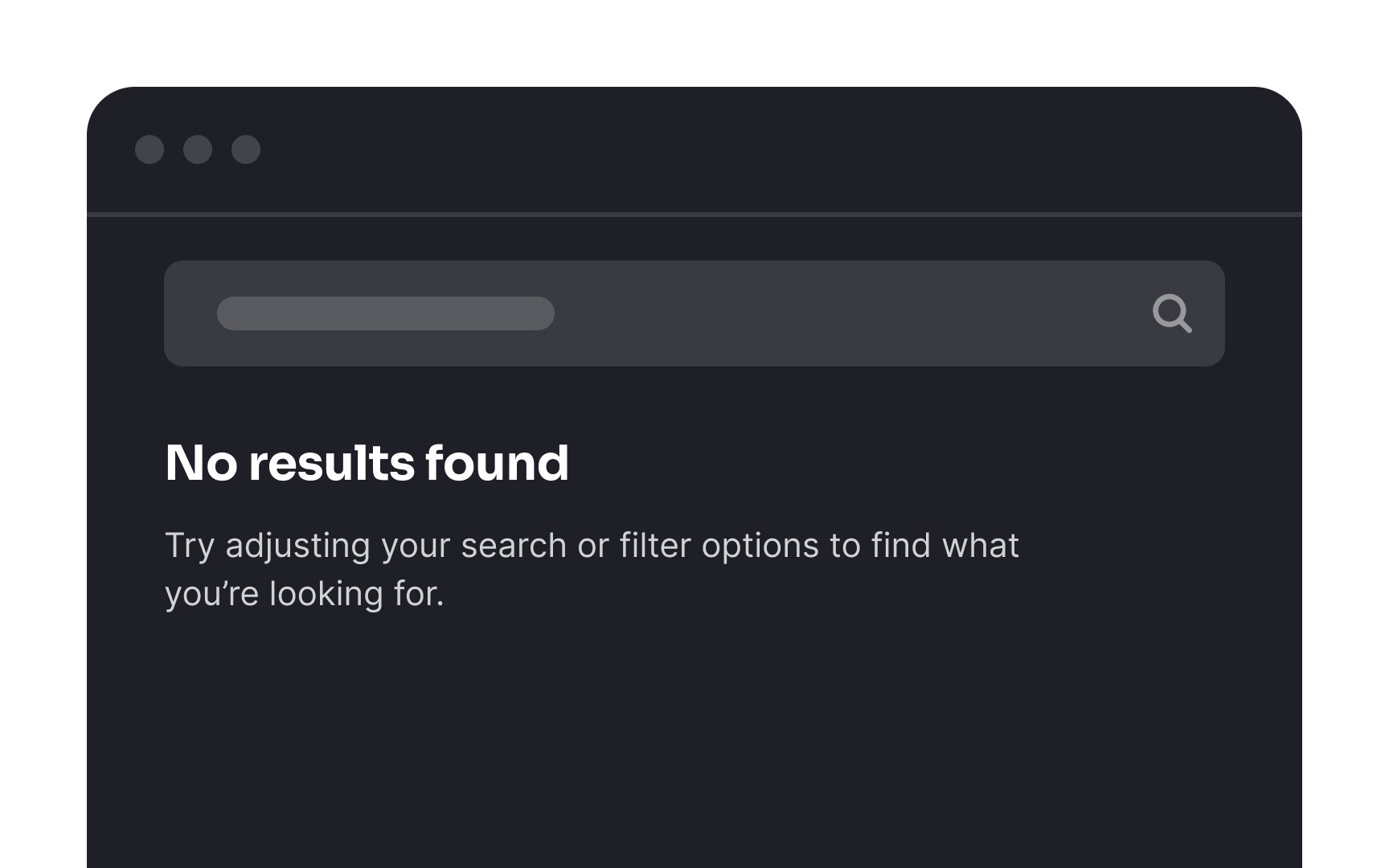
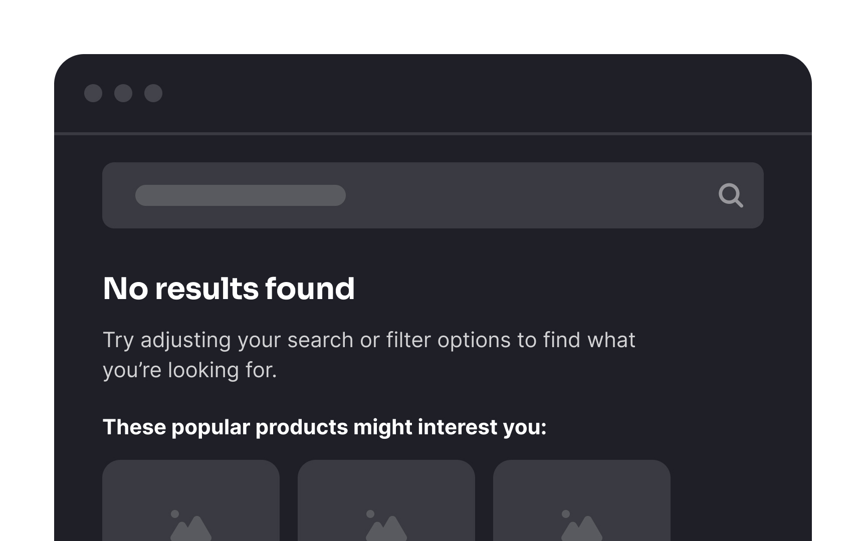
A No Results
Here’s how to optimize a No Results page:
- Encourage users to check their spelling.
- Offer helpful
search tips. - Suggest popular categories or items.
- List recent search requests for easy revisiting.
Ultimately, the No Results page should guide users towards alternative paths, ensuring they don't feel lost or inclined to leave.
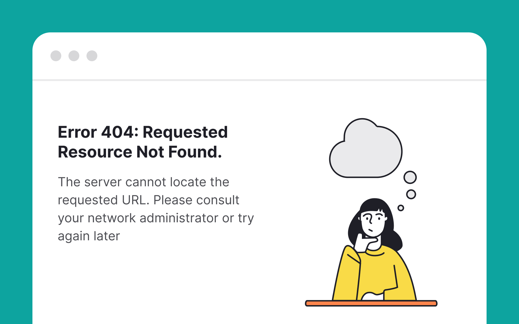
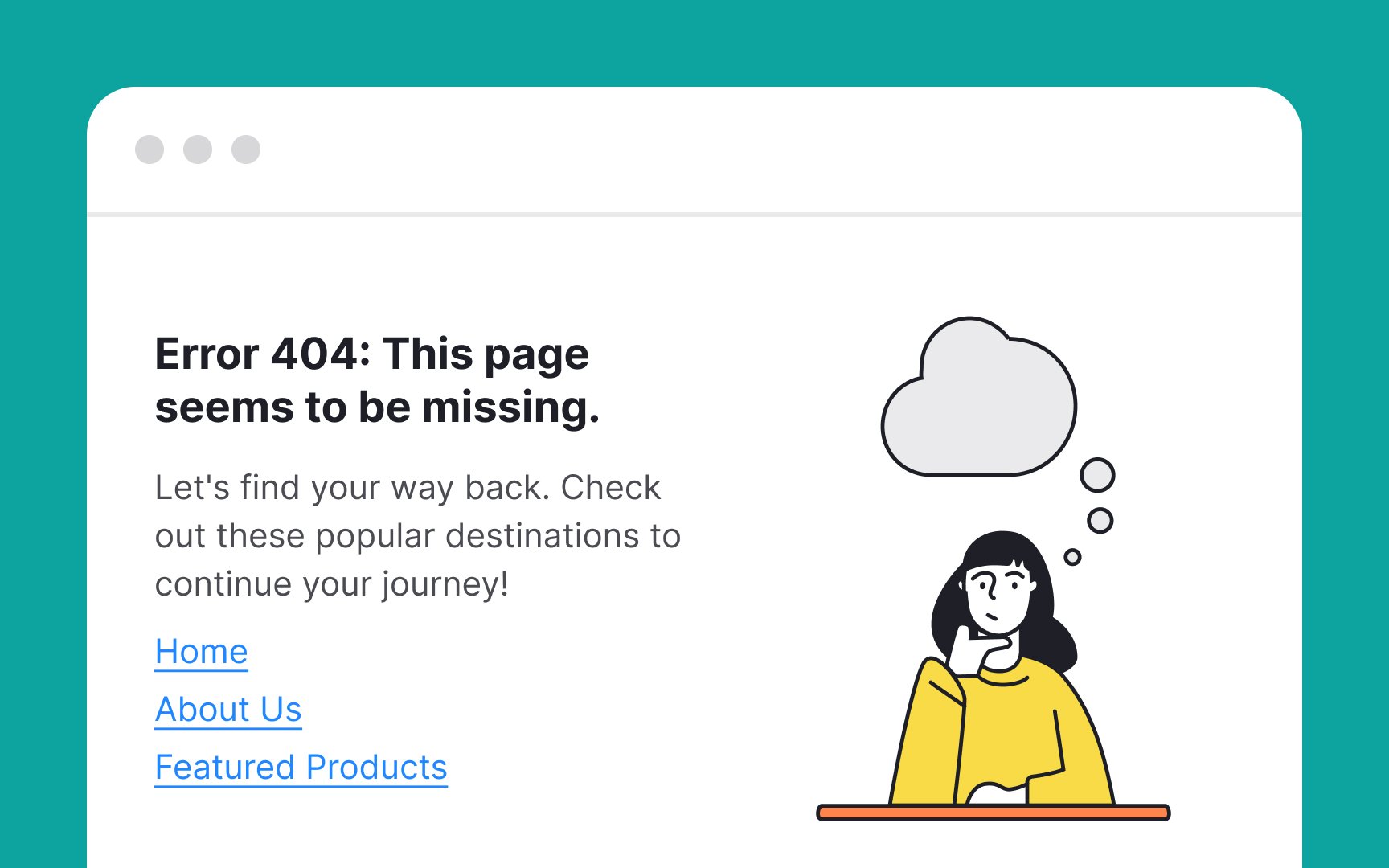
Encountering a 404 error
- Add an engaging
illustration to grab attention and soften the impact of the error. - Use simple, jargon-free language to explain that the page cannot be found.
- Be concise yet informative, guiding users on what happened and what they can do next.
- Include easy navigation options, such as links to popular
content or the homepage, encouraging users to continue their journey on your site. - If it suits your
brand , a touch of humor can make the experience more pleasant.
These strategies help in maintaining user engagement even in the face of
References
- Designing Empty States in Complex Applications: 3 Guidelines | Nielsen Norman Group
- Material Design | Material Design
Top contributors


Topics
From Course

Share


Similar lessons

Common UI Components Part I

Image Terminology
