Status
Status is a representation of the current state of a task, project, or user activity in digital systems, providing clarity, tracking, and accountability.


TL;DR
- Shows current progress or state.
- Used in tasks, projects, or user activity.
- Improves tracking and transparency.
- Essential for communication and accountability.
Definition
Status is a label or indicator that communicates the present condition of an item, task, project, or user state within a system, helping teams and users monitor progress.
Detailed Overview
Status is one of the simplest yet most powerful mechanisms in digital systems, because it communicates progress and context at a glance. Whether it’s a project marked “in progress,” a user showing as “online,” or a feature flagged as “released,” status provides immediate clarity. Without status indicators, coordination becomes difficult, and both teams and users lack visibility into where things stand.
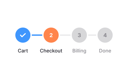
A frequent question is how status differs from progress. Progress is often quantitative, such as a percentage, while status is qualitative, providing categorical information like “not started,” “in progress,” or “completed.” This distinction helps systems communicate both measurable advancement and situational context, each serving complementary purposes.
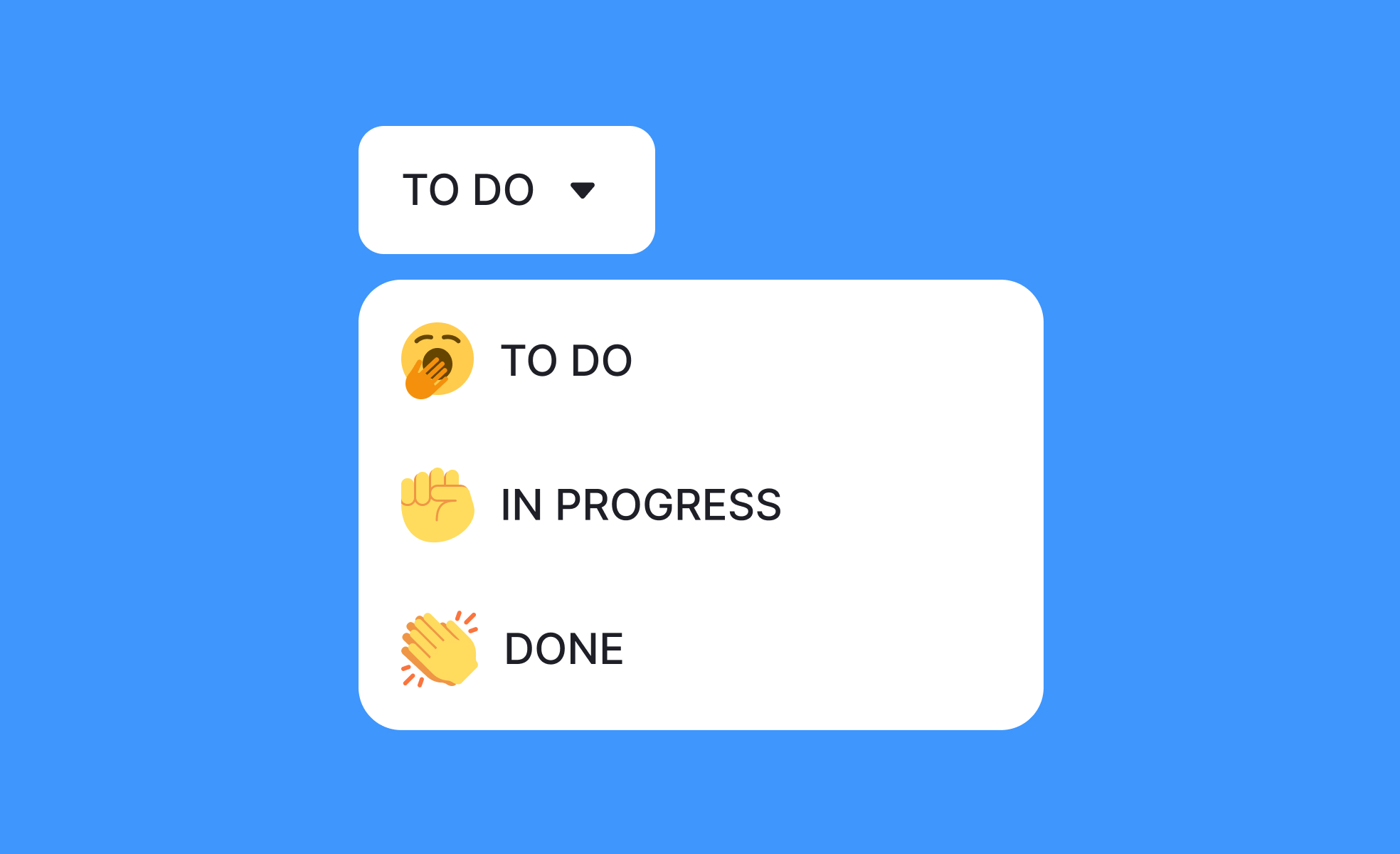
Another common query involves the standardization of status labels. Teams often struggle when statuses are ambiguous or inconsistent. For example, “done,” “closed,” and “resolved” might all indicate completion but create confusion if not clearly defined. Establishing consistent, agreed-upon status terms ensures everyone interprets them the same way, improving collaboration.
Status is also crucial for prioritization. In project management tools, clear status indicators allow managers to see what is stalled, blocked, or awaiting approval. This visibility directs attention where it’s needed most, ensuring resources are used effectively. Without status tracking, bottlenecks often go unnoticed until deadlines are missed.
Another frequent topic is visibility across stakeholders. Status updates provide non-technical team members or external clients with insight into progress. This reduces unnecessary meetings, improves communication, and builds trust, since stakeholders feel informed without needing constant explanations.
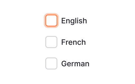
Accessibility is also relevant when designing status indicators. Using only color to represent status can exclude users with vision impairments. Pairing text labels, icons, or patterns with color ensures everyone can interpret statuses correctly. Good status design respects inclusivity as much as it respects clarity.
Learn more about this in the Status Indicators Exercise, taken from the Mental Models & User Control Lesson, a part of the Apple Human Interface Guidelines Course.
Status is qualitative, describing the state of an item, like “in progress” or “blocked.” Progress is quantitative, often shown as a percentage or metric. Both together provide a fuller picture.
By combining them, teams see not only how far something has advanced but also what condition it is currently in.
Inconsistent labels create confusion and miscommunication. If “done” and “resolved” are used interchangeably, teams may interpret them differently.
Standardization ensures everyone understands status the same way, improving collaboration and efficiency.
Clear statuses highlight stalled or blocked items, enabling managers to act quickly. They also help allocate resources to the most urgent work.
Without visible status tracking, bottlenecks remain hidden until they cause delays.
Relying only on color creates barriers for users with vision impairments. Combining colors with text, icons, or shapes ensures statuses are universally understandable.
Accessible status design improves usability for all users, not just those with specific needs.
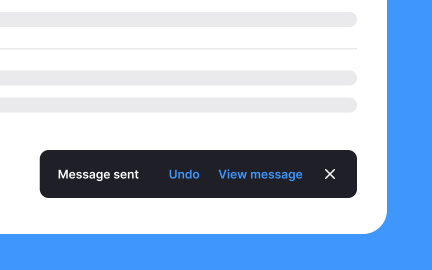
Visible status updates create accountability. A “blocked” status signals urgency for resolution, while “in review” makes responsibilities clear for reviewers.
These cues shape workflow, helping teams stay aligned and responsive throughout projects.
Recommended resources
Courses

HTML Foundations


Mentorship Mastery


Design Thinking