UI Component States
Design hover, focus, disabled, and error states for UI components that tell users exactly what's happening at every step
UI components don't just sit there waiting to be used. They respond. They change. They communicate. When a user hovers over a button, it should look different. When they click, it should react. When something's unavailable, it should be obvious without guessing. These shifts between states are how an interface talks back to users.
Enabled tells them something's ready. Disabled says not yet. Hover confirms they're in the right place. Pressed acknowledges their action. Focused helps keyboard users navigate. Selected shows what they've chosen. Activated indicates where they are. Error flags what went wrong. Each state carries meaning, and when they're designed well, users move through an interface without second-guessing. When they're missing or inconsistent, things feel broken even when they're not. Getting states right is one of the quietest but most impactful parts of UI design.
When a
This state is crucial for providing feedback and guidance to users, as it visually communicates which elements are currently accessible and functional. Following Material Design guidelines, selection controls appear the same in both enabled and selected states.[1]

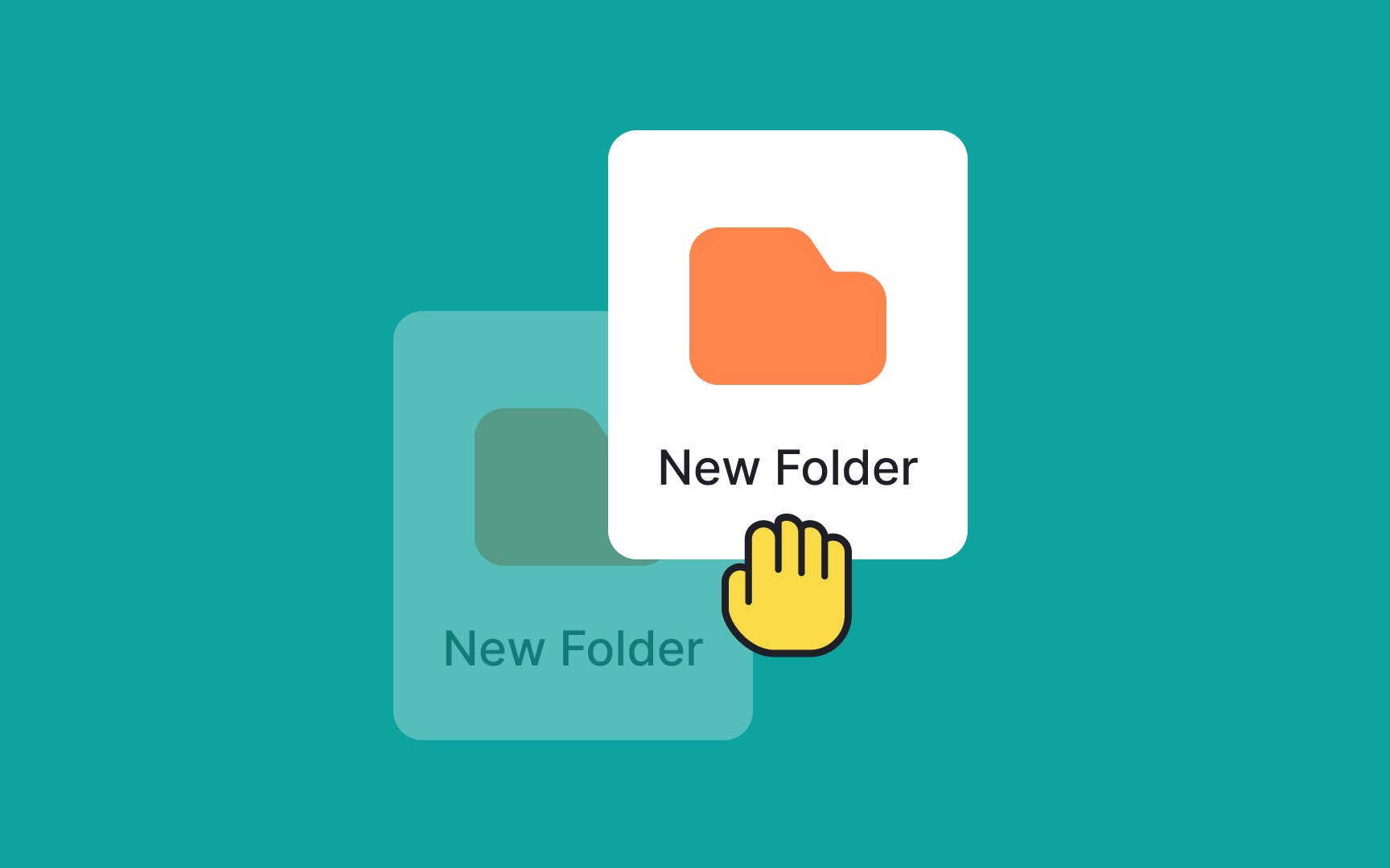
Elements in disabled states are not ready to be interacted with. Think of them as a “Sorry, we’re closed” sign on a business. When a
When an element is hovered over by a user’s cursor, it should change to its hover state. It gives users a visual cue that they can take some kind of action with the element.
Common hover state behaviors include changing the element's color, size, or appearance, such as highlighting a
Pro Tip: Including both “hover on” and “hover off” animations can provide further positive interaction for users.
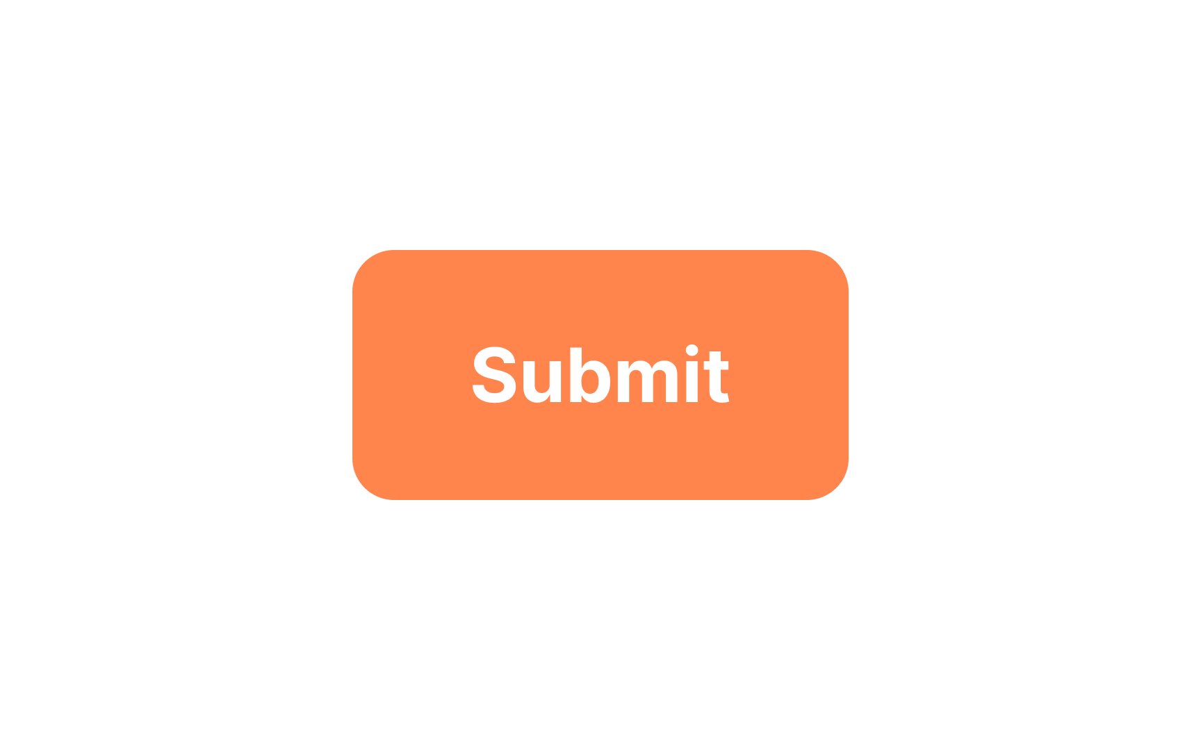
Along with the hover state, the pressed state also helps create a well-rounded element. Because the pressed state usually only appears briefly — when a
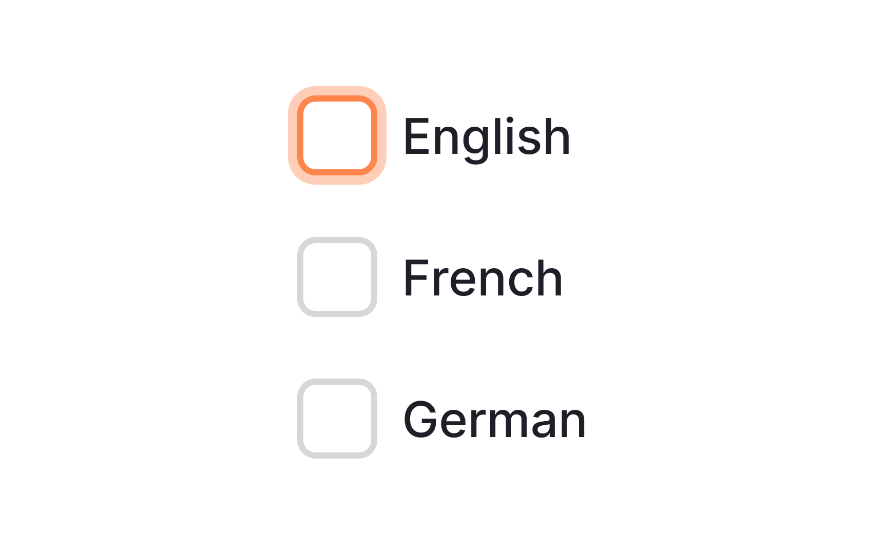
The focused state is vital for accessibility. While some users will never see the focused state, those who use their voice or the Tab ↹ key to navigate an interface benefit from a visual cue that tells them which element is currently in focus.
Focused states are often shown with either a border around the element, an overlay, or a change to the element’s fill
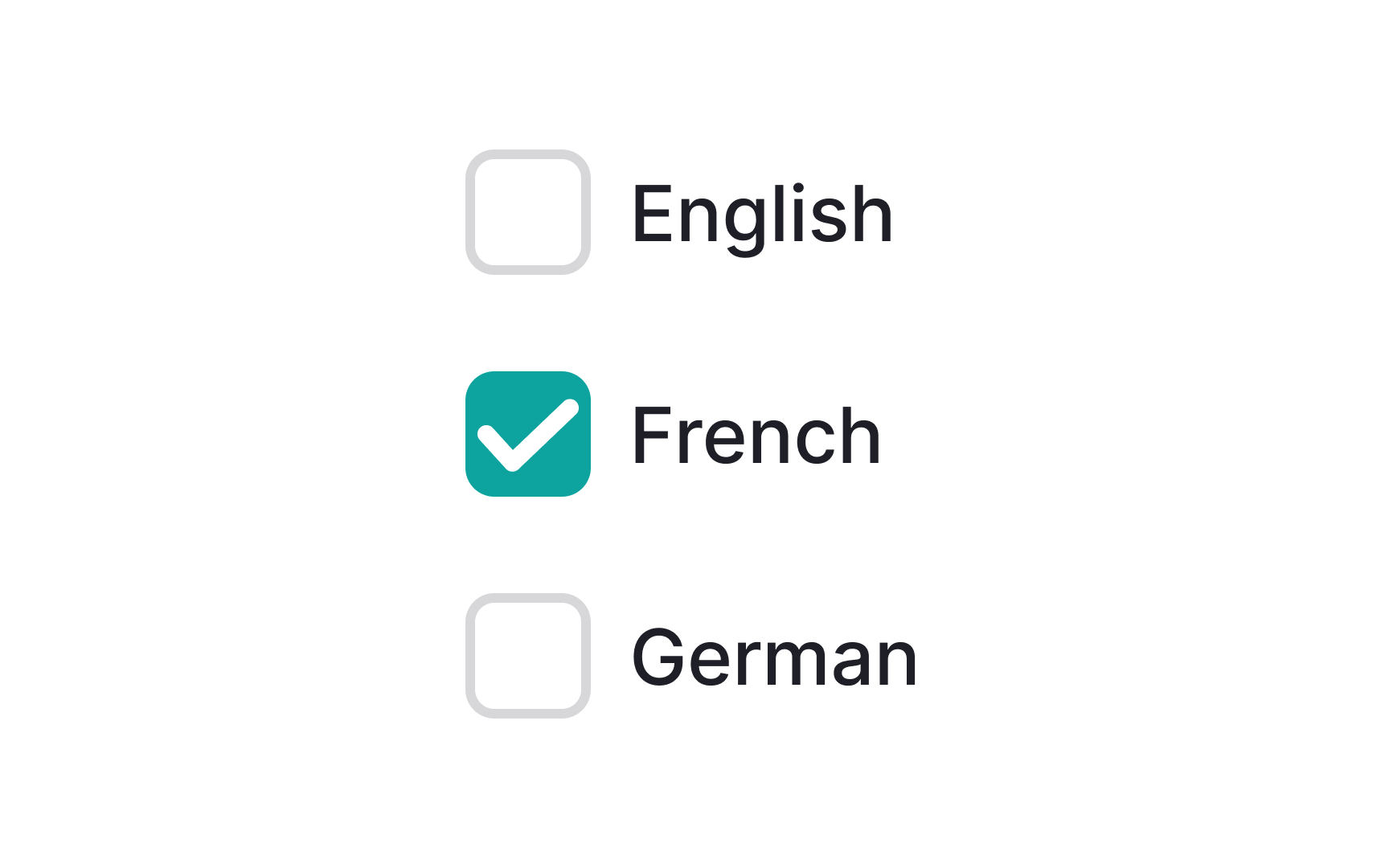
The selected state indicates a user’s choice and is most commonly seen around elements like checkboxes or radio buttons. This state appears regardless of how a user made their choice, whether it was by tapping, clicking, using their voice, or with their keyboard.
Selected states should be made clear but not too prominently. Otherwise, they can distract users from surrounding elements. A simple border or
Elements such as radio buttons or checkboxes should follow standard
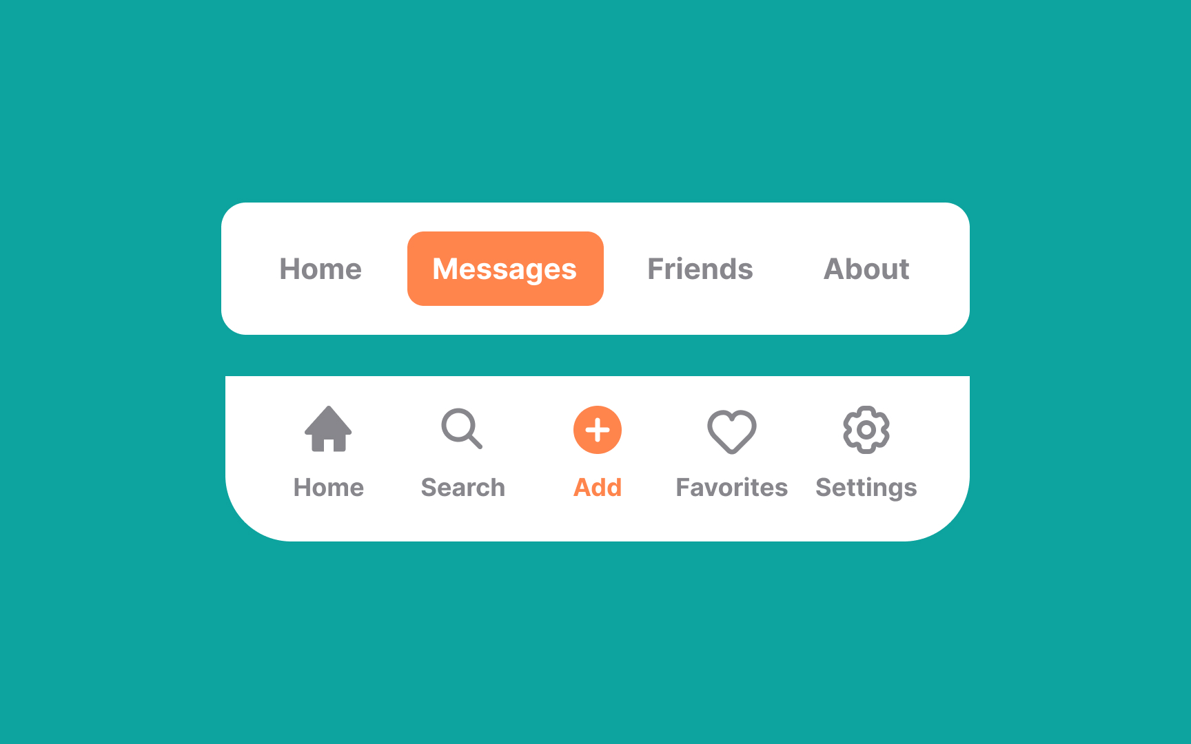
Activated states show what users are currently viewing or interacting with — like a selected
Activated states help users stay oriented by showing where they are in the interface. They’re often highlighted with overlays or
When an interface includes draggable elements (such as being able to reorder a playlist), it’s essential to create a dragged state.[3] When an element is held and moved from one place to another, it enters this state.
One of the most effective ways to indicate a dragged state is with a smooth shadow that indicates elevation as if the element was being lifted. Lowering the opacity of surrounding elements can also assist in this state. Be sure to include some visual cue for where the dragged element will be placed when it is released.
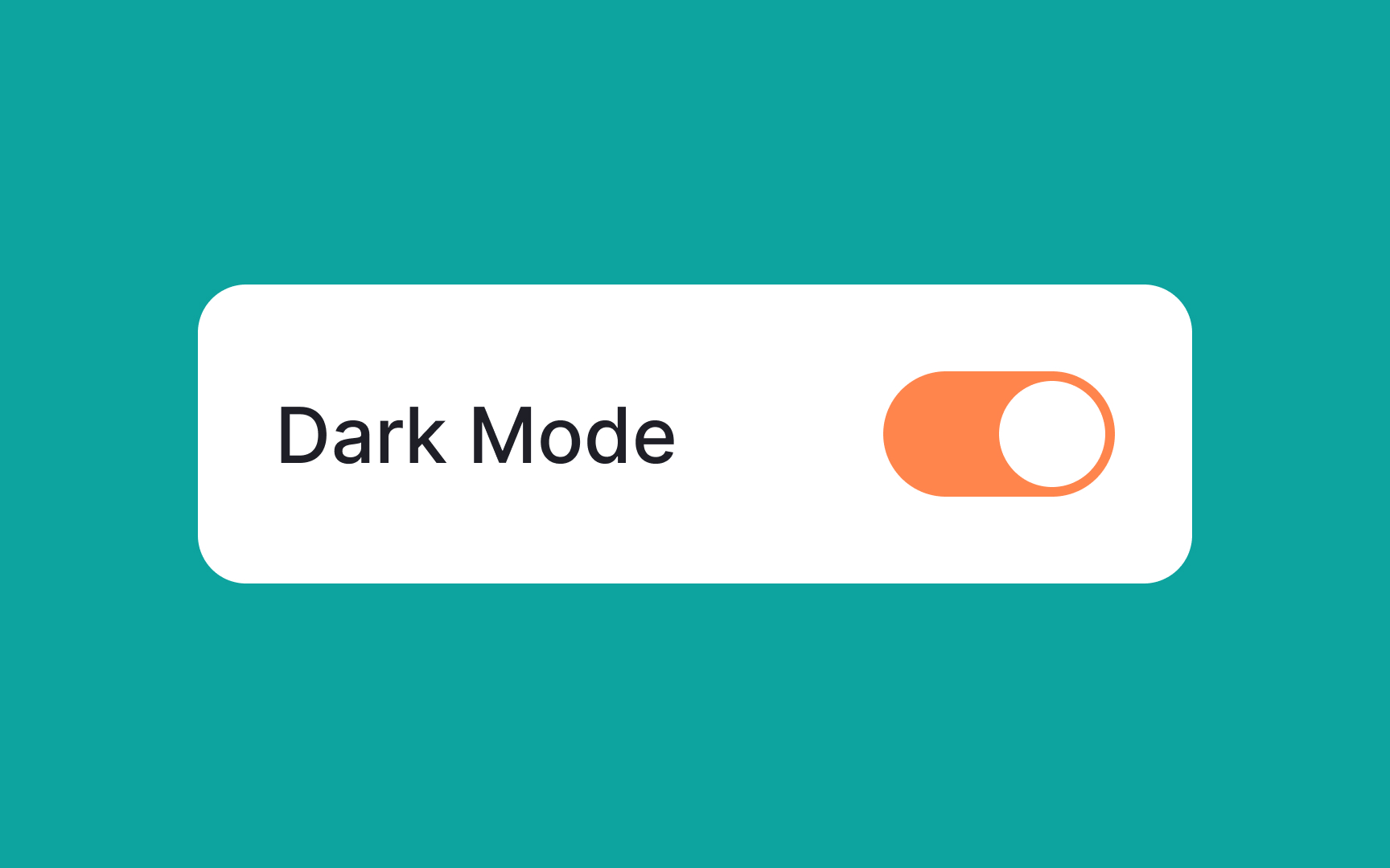
Like physical switches, interface switches can have both on and off states. The on state is immediate, taking effect right away.
In the off state, the change should be immediate and the opposite of whatever the on state is. Think of how a switch can activate or turn off dark mode for example.
Regardless of what the switch does, it should be clear and explicit which direction is on and which direction is off. Note that on states (and off states) are sometimes used on
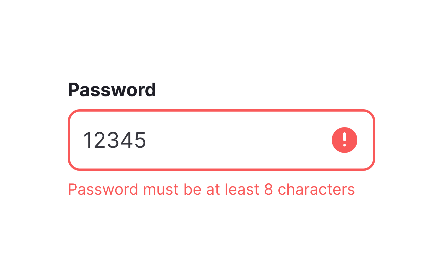
Include inline error messages in real-time rather than error messages only triggered when the user submits a form. It’s less frustrating for the user and saves them time and effort.
Pro Tip: Use success states to provide positive feedback to users when they successfully complete a task or action within the interface. Consider using a soothing color palette, such as shades of green, to evoke a positive response.
References
- Material Design | Material Design
- Material Design | Material Design
- Drag and Drop for Design Systems | Medium
- State-Switch Controls: The Infamous Case of the "Mute" Button | Nielsen Norman Group
Top contributors


Topics
From Course

Share


Similar lessons

Common UI Components Part I

Image Terminology
