Mental Models & User Control
Master the principles of matching user expectations with system behavior while maintaining a sense of user agency and control.
Mental models shape how users perceive and interact with digital interfaces, forming the cognitive framework for understanding system behavior. These internal representations guide expectations about how interface elements should work based on real-world experiences and learned patterns. Strong alignment between users’ mental models and the actual system behavior creates intuitive, predictable experiences that feel natural and reduce cognitive load. User control builds upon these mental models by providing clear feedback, reversible actions, and predictable outcomes that maintain a sense of agency and confidence.
Apple's platforms excel at implementing these principles through consistent behaviors, familiar patterns, and thoughtful default states while avoiding unnecessary complexity. This psychological foundation of interface design ensures users feel empowered rather than constrained, leading to more engaging and satisfying experiences across Apple's ecosystem.
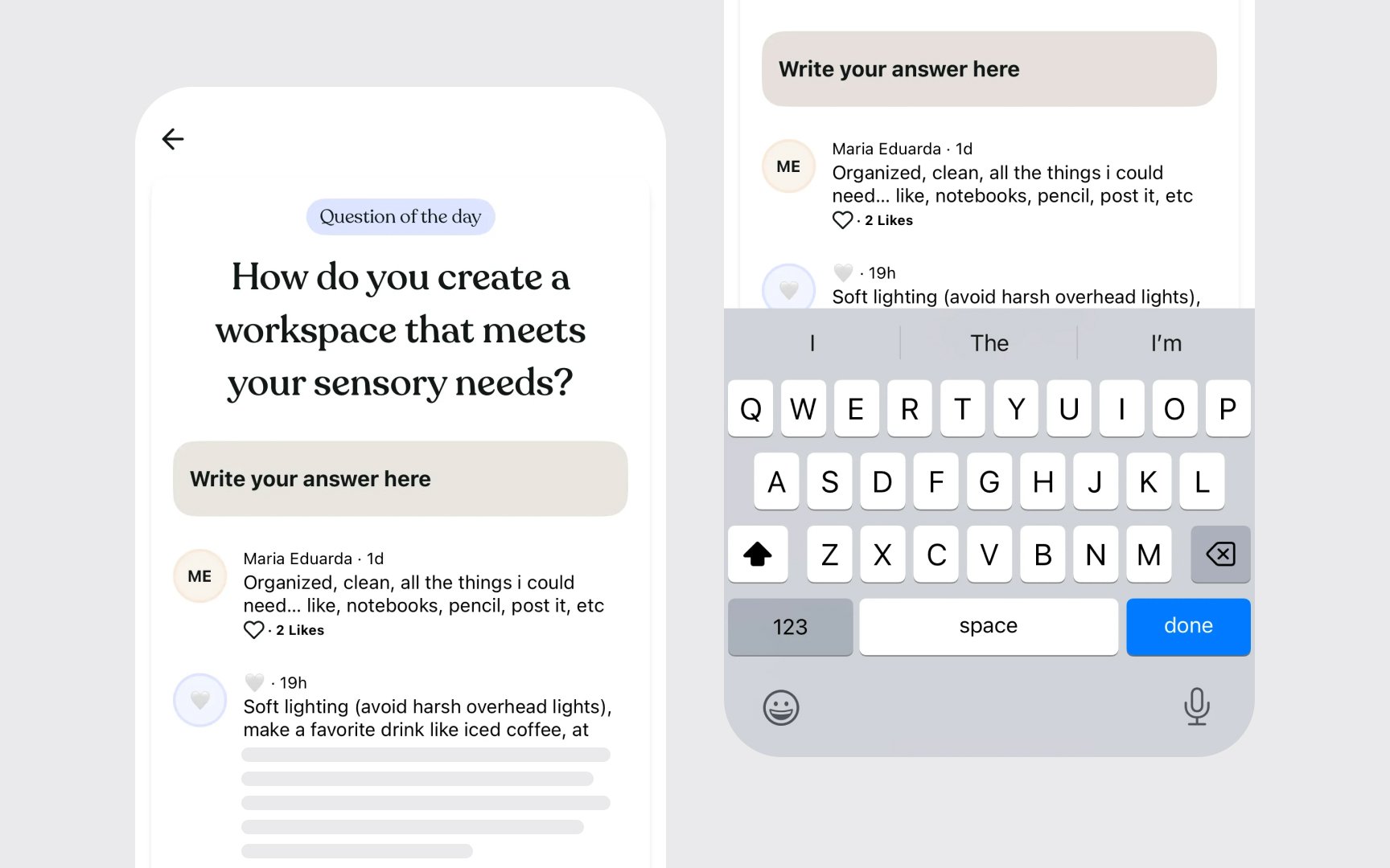
Interface elements in Apple’s platform ecosystem should align with users' existing knowledge and expectations. When digital controls reflect familiar patterns — like swipeable cards, pull-to-refresh, or pinch-to-zoom — interactions feel natural and predictable. These established patterns create a foundation of trust and efficiency.
System-wide consistency reinforces mental models across different contexts and devices. Research shows users transfer their expectations from one app to another, anticipating similar behaviors for similar elements. Understanding these shared expectations helps create interfaces that feel like a natural extension of the platform.
Mapping expectations involves identifying core interaction patterns that users already know. Focus on system-standard behaviors, universal gestures, and familiar navigation models. These insights inform design decisions that maintain Apple’s platform consistency while reducing learning curves:
- Document common platform interaction patterns
- Identify core gestures and behaviors users expect
- Map standard control types to user needs
- Compare expectations across app categories
- Test assumptions using platform guidelines[1]
Pro Tip: Notice which interactions users perform without thinking — these intuitive behaviors indicate strongly established platform patterns.
Apple's ecosystem is built on reframing how people think about technology. From treating apps as focused experiences to making complex operations feel natural, the platform shapes how users expect technology to behave. This foundation creates intuitive experiences that feel inevitable rather than designed. The platform's mental models emphasize direct manipulation and immediate feedback. Rather than explaining how things work, interfaces invite discovery through clear affordances and responsive behaviors. When users interact with elements, the system responds in ways that feel natural and predictable, building confidence through experience.
Each new interface pattern introduced by Apple becomes part of users' expectations. From pinch-to-zoom to Face ID, these
Pro Tip: Watch Apple's product introduction videos to see how they establish new mental models through clear, focused demonstrations.

Watch how the system communicates context through motion and layout. Navigation bars adapt as users move deeper into content, views slide to indicate hierarchy, and animations preserve spatial relationships. These subtle cues help users maintain their sense of place and direction.
Pro Tip: Pay attention to subtle animation timing and direction as you navigate — these reinforce your mental model of the interface structure.

Feedback is the conversation between the system and users. Every tap, swipe, or click triggers an immediate visual, haptic, or audio response. This constant dialogue assures users their actions are registered and understood, building confidence through predictability. State changes communicate through multiple channels. Buttons highlight on touch, switches animate smoothly, haptics provide physical confirmation, and sound effects reinforce actions. This layered feedback creates a rich, intuitive experience that feels responsive and trustworthy.
System feedback maintains consistency across the ecosystem. Loading indicators pulse with a familiar rhythm, progress bars advance predictably, and status messages follow standard patterns. These reliable responses help users develop accurate expectations about system behavior.[3]
Pro Tip: Close your eyes during interactions to notice how haptic and audio feedback work together to communicate system responses.

The ability to undo helps users feel confident when using apps. When people know they can reverse mistakes, they're more comfortable exploring and trying new features. This safety net is a key part of how Apple gives users control over their actions.
Apps offer consistent ways to undo actions:
- Shake
gesture on iOS devices - Edit menus in apps
- Keyboard shortcuts on Mac
Each undo method works similarly while fitting its specific use. The system automatically tracks changes, so users don't need to do anything special to enable undo. As shown in the WhatsApp example, when users delete a message, they can immediately undo this action through a clear "Undo"
Pro Tip: Practice using the shake-to-undo gesture in different apps to understand how it adapts to various contexts while maintaining consistency.
Every significant action should have a clear path back. Whether deleting a message, sending an email, or modifying a document, users should trust they can reverse course. This principle extends beyond simple undo to encompass a broader philosophy of user control.
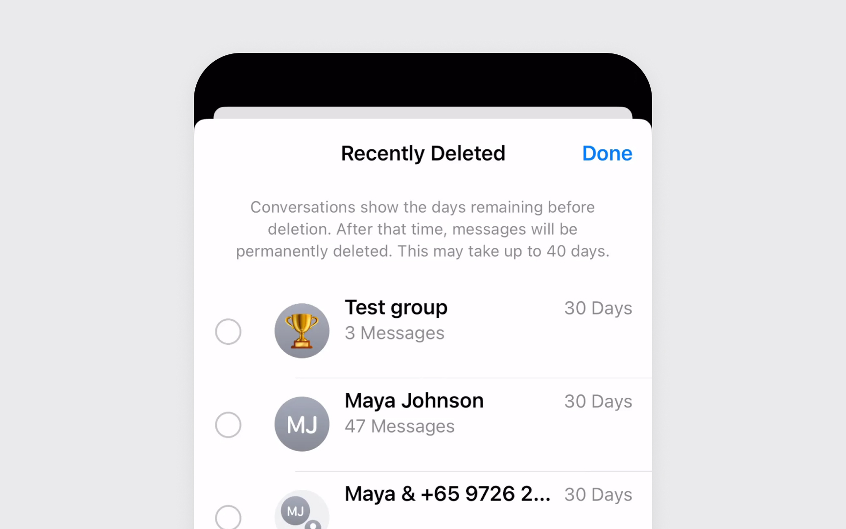
Look for patterns that prevent accidental actions. As shown in the Messages app example, deleted conversations remain recoverable for 30 days before permanent deletion, giving users a generous window to restore important chats.
Think about how important and how often users perform each action. Critical actions like deleting files need clear ways to recover, while common actions shouldn't ask for confirmation too much. Make it easy to fix mistakes without disrupting the experience.[5]
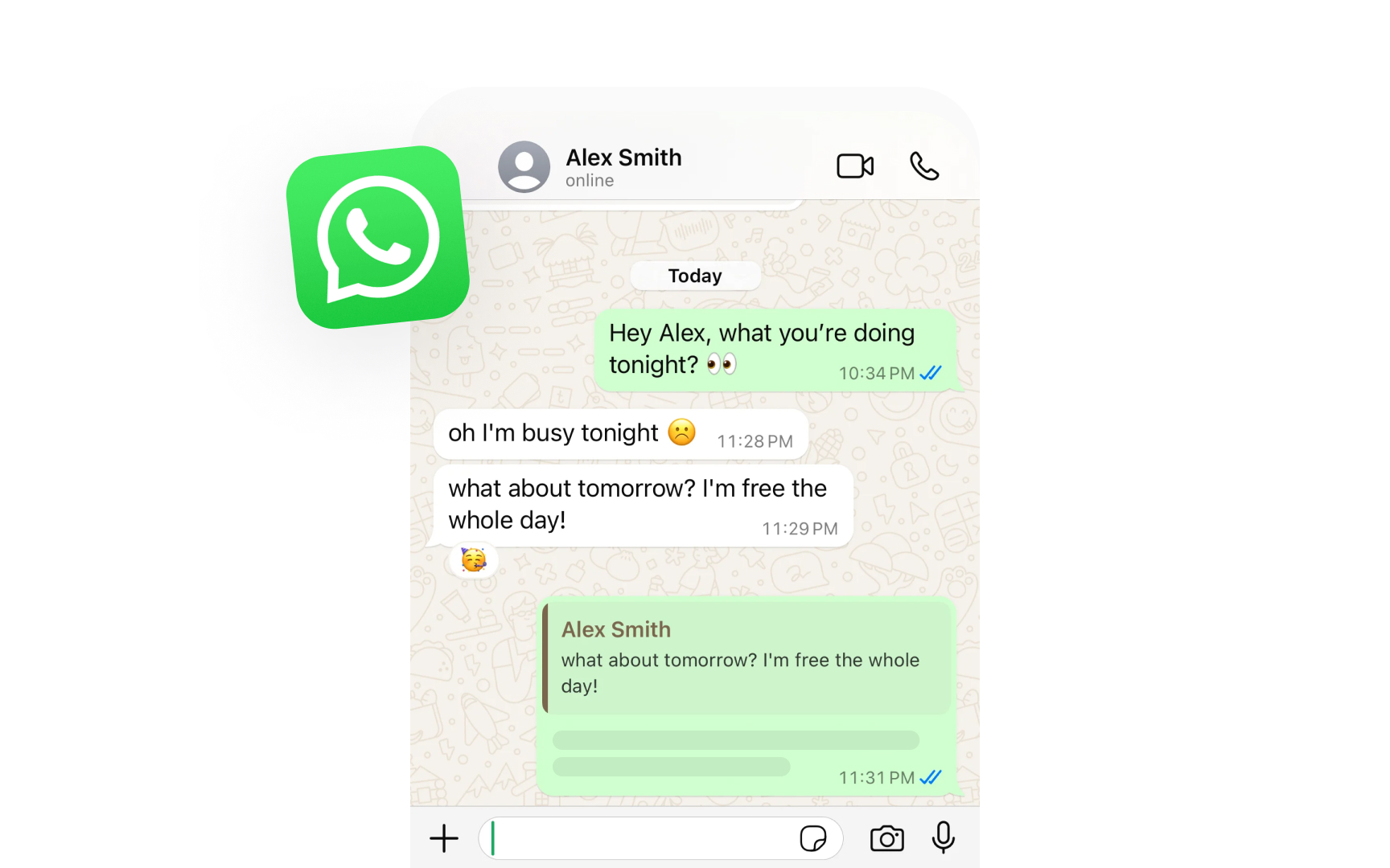
Actions in Apple's interfaces have clear, logical outcomes. When you tap Edit in Notes, related tools appear and text becomes selectable. In WhatsApp, as shown above, when you start typing, the interface shows "online" and indicates you're "typing..." to your
Each action triggers a coherent chain of interface changes. System changes show clear relationships. Switching to Silent Mode changes relevant indicators and enables Do Not Disturb updates across devices. These connected responses help users understand how different parts of the system work together.
Every state change should make sense to users. If an app needs location access, the request appears when location features are used. If storage is full, warnings appear when trying to download. These logical connections help users understand why things happen and how to address them.
Pro Tip: When something changes in the interface, look for other elements that should update in response.
Default settings shape the first-time experience. When you open a new iPhone, features like tap to wake, raise to wake, and auto-brightness are pre-enabled. These sensible defaults let users start using their device immediately while discovering additional options naturally. Good defaults balance convenience with privacy.
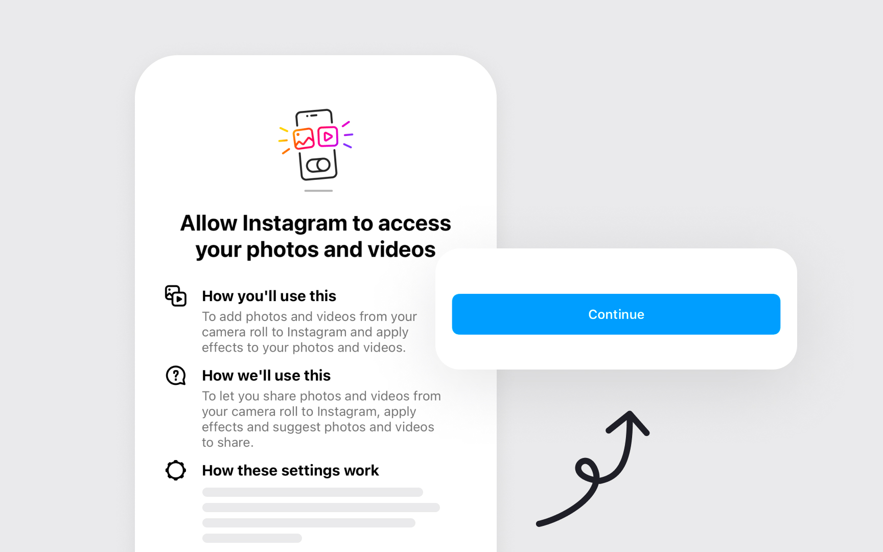
Instagram requests camera access only when you tap the "+" to create a story with clear context: "Allow camera access to create photos and videos.” These choices respect user control while guiding toward beneficial features.
System defaults adapt to user behavior. Face ID learns alternate appearances over time, text replacement adds frequently-used phrases, and keyboard suggestions improve with use. These smart defaults become more helpful while remaining predictable and adjustable.[6]
Pro Tip: Choose default settings that help most users start using your app immediately, rather than making them configure everything first.
Progressive disclosure shows the right information at the right time. Instead of overwhelming users with all options at once, interfaces reveal features gradually as users need them. This keeps the experience simple for beginners while still offering power to advanced users.
The principle works through layers of
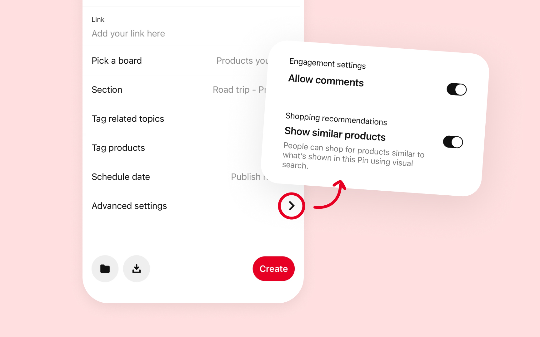
As shown in Pinterest's pin creation interface, it starts with basic fields like link and board selection, while keeping engagement
Pro Tip: Show only what's essential first, then reveal features as users demonstrate readiness for them.
Smart features should help without taking control. The Gmail app suggests words as you type, but lets you choose whether to use them. Photos can identify people in images but ask you to confirm their names.
This balance maintains
These checkpoints keep users in control of important decisions. Give users clear ways to adjust or disable automation. Photos allow you to turn off memory creation and keyboard suggestions can be fine-tuned or disabled. This control helps users trust automated features.
Status indicators keep users informed about the system state. A spinning progress wheel shows background activity, network bars indicate connection strength, and battery icon displays the charge level. These consistent signals help users understand what's happening without explanation.
Good status design balances visibility with distraction. Important states like low battery demand attention, while routine processes like
Download progress shows actual speed, upload indicators reflect current status, and network changes display immediately. This immediacy helps users make informed decisions about their actions.[8]
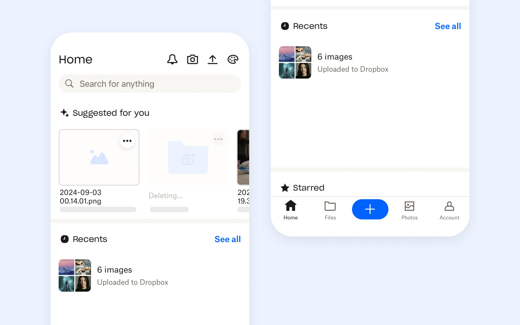
Control hierarchy guides users to the right actions at the right time. Primary actions like the plus button in Dropbox appear prominent and easily reachable. Secondary options remain accessible but don't compete for attention. This visual and functional organization helps users focus on key tasks. Important controls maintain consistent placement.
Controls adapt to context while maintaining the hierarchy. A prominent "Reply" button might be minimized when composing, or a "Done" button could replace "Edit" when task context changes. These transitions preserve clarity while adapting to user needs.
References
- Steve Jobs and the Art of Mental Model Innovation - Ivey Business Journal | Ivey Business Journal
- Feedback | Apple Developer Documentation | Apple Developer Documentation
- Undo and redo | Apple Developer Documentation | Apple Developer Documentation
- Visibility of System Status | Nielsen Norman Group
Top contributors

Topics
From Course

Images provided by

Share


Similar lessons

Cognitive Biases

UX Laws
