UX Laws
Explore the UX laws on how the human brain processes information to create intuitive and effective interfaces
The laws of UX refer to a set of guiding principles created by scientists and pioneers in fields like psychology and user experience design. They reveal fundamental patterns about how the human brain processes information, helping designers create intuitive and effective interfaces.
In this lesson, we will explore how these laws provide groundbreaking insights into human behavior, such as how familiarity facilitates navigation and repetition strengthens memory. However, keep in mind that they don't replace the need for UX research. Instead, they provide a framework for understanding user behavior that can guide designers in crafting experiences that resonate deeply with users while allowing research to refine and validate their decisions.

The aesthetic-usability effect highlights how good design can make users more forgiving of small usability issues. Essentially, when users like the look of a product, they tend to overlook minor problems, enjoying the overall experience more. This shows that a product’s success isn’t just about how it works — its appearance is equally important.
Both design and functionality need to be balanced. If a product looks good but is hard to use, users will eventually get frustrated. During usability tests, the initial appeal of a well-designed product can sometimes overshadow more significant usability issues. This visual appeal might cause users to overlook deeper problems, complicating the testing process.
To counteract this, test facilitators should:
- Maintain neutrality and encourage genuine feedback by controlling their emotional reactions
- Disclose to the participants whether they (the facilitators) designed the interface or not to promote more open and honest responses
- Prompt participants to look beyond just the aesthetics[1]
Fitt's Law states that the closer and larger a target, the quicker and easier it is to interact with it. If targets are hard to interact with, users may feel reluctant to engage and potentially drop off. This principle is crucial in designing user interfaces where speed, accuracy, and user retention are important.
To optimize interfaces using Fitt's Law, consider the following recommendations:
- Enlarge targets: Larger buttons, icons, and clickable areas reduce errors and speed up interactions. This is especially useful in mobile interfaces where fingertip accuracy is less precise.
- Use icons with labels: Combining icons with text labels not only clarifies meaning but also increases the target size, making it easier for users to select the correct option quickly.
- Place important targets strategically: Position frequently used controls at easily reachable locations. For instance, placing essential menus at the screen edges, as seen in MacOS and older Windows versions, utilizes screen boundaries to stop the pointer, facilitating faster access.
- Avoid crowding: Ensure there is ample space between targets to prevent misclicks and enhance
usability , especially on smaller or more densely packed interfaces.
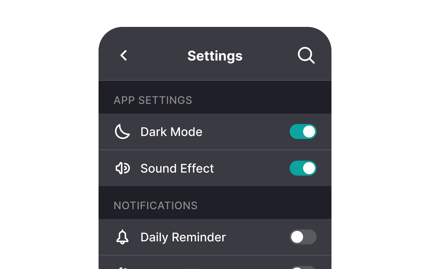
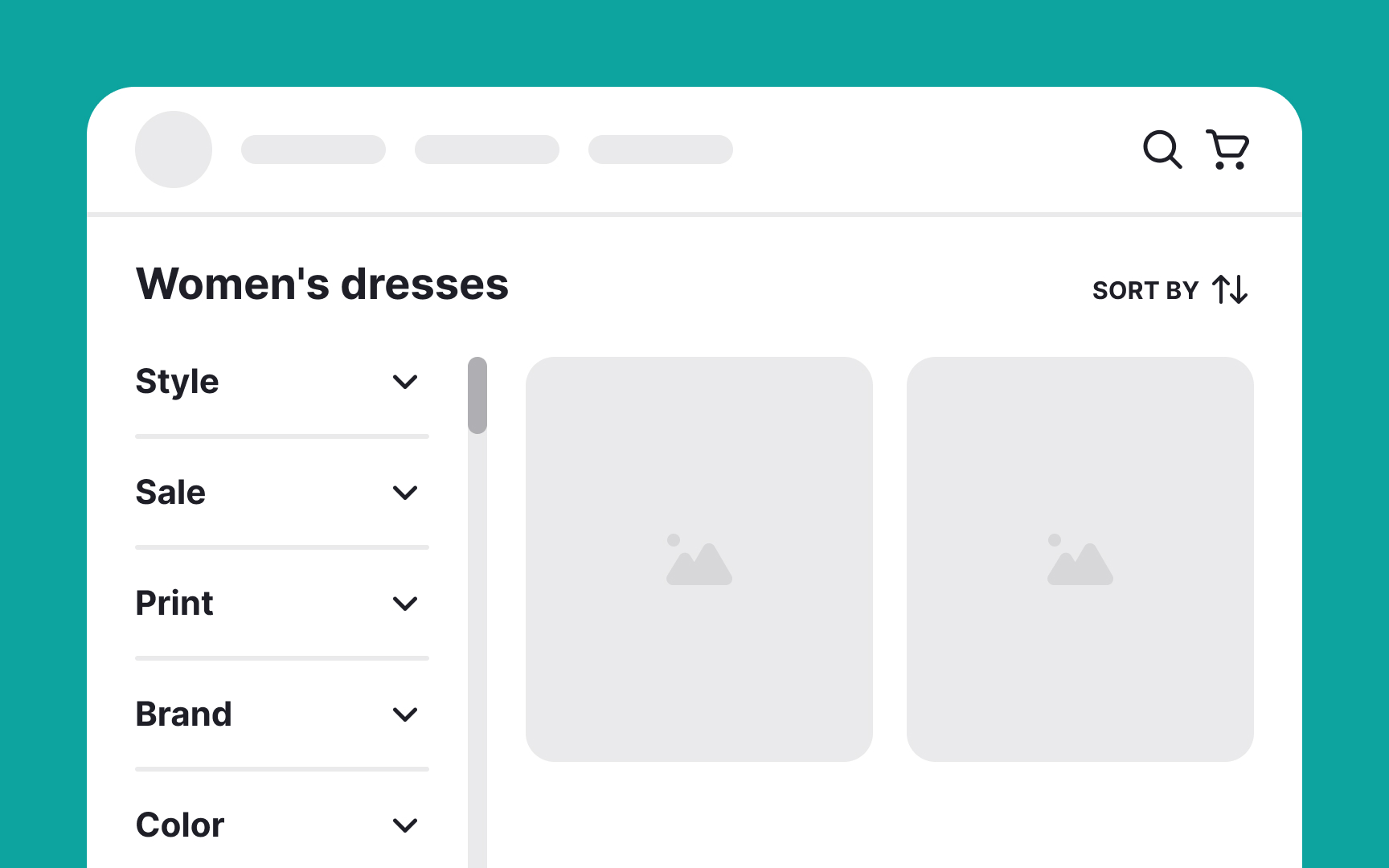
Hick's Law suggests that the more choices presented to users, the longer it takes for them to make a decision. This law is vital for designing user interfaces, aiming to streamline decision-making without necessarily cutting down on functionality.
Here are some strategies to apply Hick’s Law effectively:
- Limit choices: Reduce the number of options visible at any one time. Too many choices can overwhelm users, causing them to disengage or abandon tasks. Simplify interfaces where possible to enhance
user experience . - Use categories: Organize options into clear, logical categories to avoid long, unsorted lists. This not only speeds up the decision-making process but also makes the interface cleaner and more navigable.
- Display essential options: Keep only the most necessary options visible, and hide less frequently used ones. This helps users make quicker decisions without removing functionality. Provide access to additional settings or features upon request.

Jakob's Law emphasizes that users often prefer interfaces similar to those they already know from other sites and apps. This familiarity breeds comfort, reducing the time and effort needed to learn new interfaces.
Here are some recommendations for applying Jakob’s Law to enhance UI design:
- Prioritize consistency: Align your design with common user expectations and industry standards. This consistency helps users feel at ease, making the interface intuitive and easy to navigate.
- Innovate carefully: While innovation is valuable, it should be implemented wisely. If a new design approach is too complex or unfamiliar, it might lead to user frustration and abandonment. Innovate only where it adds significant value and ensure to provide tips and tutorials.
- Balance familiarity with novelty: Maintain a balance between familiar design elements and new concepts. For example, you might keep
navigation elements consistent with user expectations while introducing fresh colors and typography to distinguish your brand.
By focusing on what users find familiar, you can create interfaces that are easy to use and still showcase creativity where it matters most.

Miller's Law suggests that the average person can hold about 7 (±2) items in their working memory at once. However, this law shouldn't be taken too literally in interface design. It's not so much about remembering items as it is about managing them effectively. The key takeaway is the benefit of chunking — grouping information into manageable units. This approach helps users scan, comprehend, and navigate content more easily, without the burden of keeping multiple items in memory.
Here are some practical tips to apply this law effectively:
- Maintain visual hierarchy: Use
design elements like headers, bullet points, and spacing to organize content clearly. This helps prevent the interface from becoming a wall of text, making it easier for users to find information. - Adapt to context: Recognize that the ideal number of chunks may vary based on the user’s familiarity with the content and the specific context of use. Tailor the interface accordingly to optimize
user experience .


The Zeigarnik Effect observes that people tend to remember unfinished tasks better than those they've completed. This psychological phenomenon can create a mental urge to return and complete these tasks. When thoughtfully applied, this effect can enhance user engagement without resorting to manipulative tactics.
Here are some recommendations for using the Zeigarnik Effect in interfaces:
- Progress indicators: Break complex processes into smaller steps, showing progress through visual indicators. This not only motivates users to continue but also makes the interface more user-friendly and less overwhelming.
- Gamification: Incorporate elements like points, badges, or leaderboards to foster a sense of incompleteness and competition. This can motivate users to return and engage further with the app.
- Save user progress: Features like saving abandoned shopping carts or partially filled forms help users pick up where they left off, reducing frustration and encouraging completion of tasks.
- Freemium models: Offer basic features for free while showcasing premium options. This can entice users to upgrade for a more complete experience, driving both engagement and revenue.
- Timely reminders: Send reminders or notifications about incomplete tasks. These should be well-timed and focused to avoid overwhelming users and to keep the
interaction positive.[2]


The Von Restorff Effect, also known as the isolation effect, indicates that the human brain is more likely to remember unusual elements. When something stands out significantly, like a red apple among green ones, it captures attention and sticks in memory. This principle can be effectively applied in
Here are some ways to utilize this effect:
- Color and contrast: Use bold colors or stark contrasts to draw attention to key elements like call-to-action
buttons . Employcolor psychology to evoke the desired emotional response, helping users focus on the most important actions. - Typography: Differentiate important text using size, style, or weight. Highlighting keywords or phrases can enhance readability and make critical information more memorable.
- White space: Skillfully use white space to isolate important
content , creating visual breathing room that focuses user attention on specific elements without distractions. - Visuals and icons: Use well-chosen imagery not only to aid comprehension but also to make the content more memorable.
- Animation and motion: Integrate subtle animations to direct users’ attention to important changes or actions within the interface.[3]

Tesler's Law, or the law of conservation of complexity, indicates that every system has some inherent complexity that can't be completely removed. Here are some recommendations on applying Tesler's Law to optimize interfaces without overwhelming users:
- Balance complexity: Distribute complexity thoughtfully between the system and users. Over-simplifying the
user experience by shifting too much complexity onto the development side can make the system unsustainable. Assess whether the benefits to users justify the increased developmental complexity. - Analyze necessity: Before simplifying features, thoroughly evaluate whether they are essential. Removing crucial functionalities to simplify can inadvertently increase operational complexity for users.
- Operational simplicity: Prioritize making tasks easy to complete. This operational simplicity is often more important than perceived simplicity, which concerns how simple a product looks rather than how it operates.
- Avoid oversimplification: Acknowledge the need for some complexity to retain full functionality. For example, security steps in banking apps add complexity but are necessary to ensure safety and user trust.

The peak-end rule is a cognitive bias that explains how people remember experiences based on their most intense moments (peaks) and their final moments (ends). In
- Positive peaks: When designing interfaces, pay attention to creating positive peaks through moments of delight, such as ease of use, quick accomplishments, or visually pleasing feedback during important interactions. For example, a colorful
animation after completing a form or a cheerful sound when a task is finished can leave a lasting impression of efficiency and reliability. - Negative peaks: However, beware of negative peaks caused by frustration or confusion, such as difficult
navigation or slow loading times. These negative experiences are memorable and can overshadow positive aspects, pushing users towards alternatives.
The final moments of user

The serial position effect highlights how the position of items in a sequence impacts recall accuracy. It consists of two main parts:
- Primacy effect: Items at the beginning of a list are remembered better.
- Recency effect: Items at the end of a list are also recalled more accurately.
For instance, in restaurant menus, popular dishes are often placed at the top and bottom, leveraging the serial position effect to influence diners’ choices. For interfaces, this means that presenting lengthy lists strains attention and memory.
To optimize information presentation:
- Prioritize important info: Place crucial details at the beginning or end of sequences, such as calls to action or product essentials.
- Use visual cues: Employ
colors , contrast, or highlighting to draw attention to key elements. - Minimize cognitive load: Reduce the amount of information users need to remember by displaying only the most relevant
content . - Position key actions: Place essential
buttons or features on the far left or right for easier recall.


Postel's Law advises, "Be strict in what you produce, and liberal in what you accept." In design, this principle means being rigorous with the consistency and clarity of output while remaining flexible with user input. Essentially, the aim is to handle user
Here are some ways to apply Postel's Law to design:
- Form validation: Accept diverse data formats (like dates and phone numbers) and guide users through corrections with helpful error messages.
- Password security: Offer immediate feedback on password complexity, encouraging users to create secure yet memorable passwords.
The power law of learning states that the time it takes to perform a task decreases with repetition, following a predictable pattern. As users repeat actions, they become more efficient at them. For instance, regularly using a familiar
Here are some ways to implement this law:
- Keep it consistent: Stick to widely recognized patterns to give users additional repetitions of familiar elements, such as clickable logos for homepages or search bars in the top-right corner.
- Change thoughtfully: Innovation can be risky. If you're introducing a novel design pattern, ensure it greatly improves
usability , speed, or satisfaction compared to familiar patterns. - Facilitate learning: Speed up the learning curve by providing tooltips, onboarding guides, or contextual hints, helping users adapt to new patterns quickly.[5]
References
- The Aesthetic-Usability Effect | Nielsen Norman Group
- Zeigarnik Effect in UX Design - GeeksforGeeks | GeeksforGeeks
- Von Restorff Effect in UX Design - GeeksforGeeks | GeeksforGeeks
- The Peak–End Rule: How Impressions Become Memories | Nielsen Norman Group
- The Power Law of Learning: Consistency vs. Innovation in User Interfaces | Nielsen Norman Group
Top contributors

Topics
From Course

Share


Similar lessons

Cognitive Biases

Fundamental User Needs
