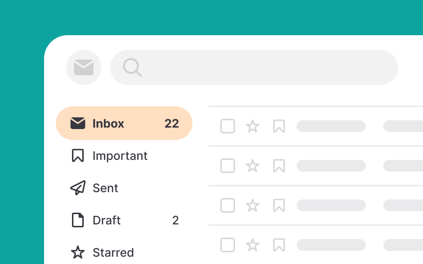
How Human Memory Works
Learn how human memory works and how to apply this knowledge to enhance UX
Human memory is a dynamic and complex system that allows us to encode, store, and retrieve information. Understanding memory is crucial for UX design because it affects how users remember and interact with interfaces. Designing with memory considerations helps create more intuitive and efficient user experiences, ensuring that products are accessible and easy to navigate. In this lesson, we’ll break down the different types of memory and how they work together. You’ll also learn practical strategies that leverage this knowledge to improve user interactions and elevate user experience.
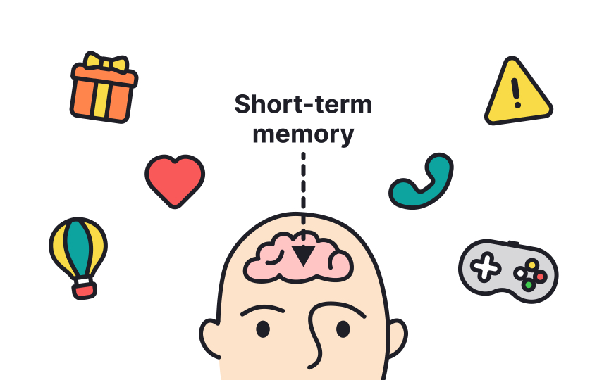
Short-term memory, also known as active memory, is the part of our memory where we jot down quick notes that we need to keep handy for just a short while. We use it for everyday tasks, such as keeping a phone number in mind until we dial it. If we don't actively review or repeat this information, it tends to fade quickly. Typically, short-term memory can hold information for about 20-30 seconds, and according to psychologist George Miller, it can store around 7 items, plus or minus two.[1]
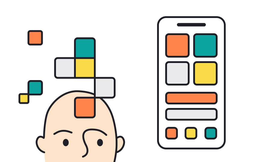
Working memory is a bit like a mental workspace that allows us to hold and manipulate information temporarily. Think of it as the brain's sticky notes, where we jot down and shuffle information needed for tasks we’re currently doing, like solving a math problem in our heads or planning what to say next in a conversation. It’s more complex than short-term memory because it doesn’t just store information — it actively works with it.
If a task has a high cognitive load, it means it's putting a lot of pressure on working memory, making tasks seem difficult. Since everyone's working memory capacity can differ based on factors like education, IQ, and age, it varies widely among individuals. However, interfaces should be designed in a way that doesn’t overload users' working memory, irrespective of individual capacities.[2]
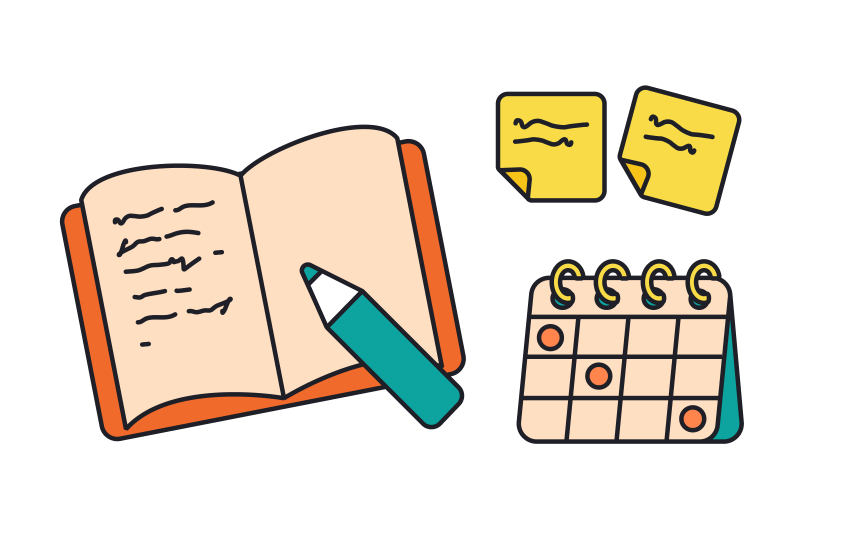
External memory refers to tools or aids that help us store and access information outside our own brain. Think of it like using a notepad to keep track of information you don't want to forget. This kind of memory allows us to save mental energy for other tasks and reduces the load on our working memory.
In the context of
Spatial memory is our ability to remember where things are located in our environment. It works by creating mental maps of spaces we're familiar with, like our homes or favorite stores. When we navigate these spaces, our brains use landmarks and patterns to recall where things are.
In
Recognition and recall are two ways we retrieve information from memory. Recognition involves identifying information when it is presented to us. For example, recognizing a friend's face in a crowd. Recall, on the other hand, requires us to retrieve information from memory without as many cues. For example, remembering a friend's phone number without looking at it.
In
Reminding users of previously visited content is a great way to promote recognition and recall. Here are some ways to do so:
- Provide a history feature that allows users to recall recently visited pages. This can help them continue incomplete tasks that they have difficulty recalling.
- Implement “Recently Viewed” sections or personalized recommendations based on past
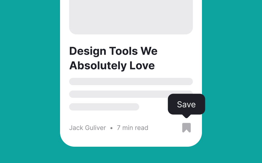
interactions to remind users of content they've engaged with previously. - Provide features like favorites, wish lists, and shopping lists that allow users to save information and easily access it when needed. These features promote recognition and eliminate the need for users to remember every piece of interesting content they come across or like.[3]
To ensure your interface is user-friendly, avoid overwhelming users' memory, make recognition and recall easier by providing:
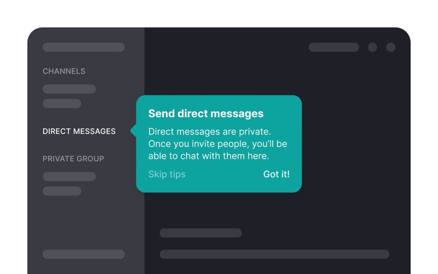
- Contextual help: Use tooltips to offer on-the-spot assistance, when users hover over a feature. For example, during checkout, a tooltip next to the CVV field can clarify what CVV is and where to find it on their credit card. Ensure tooltips are concise and relevant, offering clear instructions without cluttering the interface.
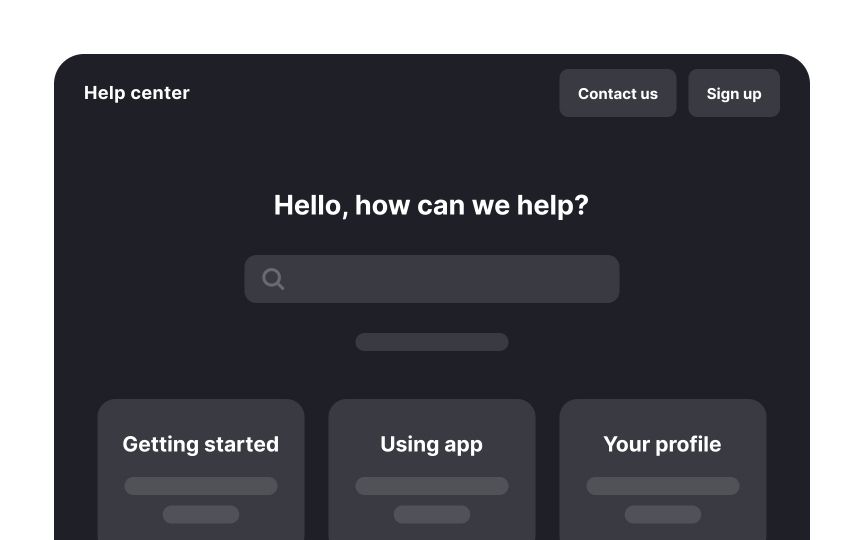
- Accessible tutorials: For complex tasks like returning or replacing a purchased item, offer tutorials that can be accessed at any time. These tutorials should be easy to find and navigate, providing clear instructions and visuals to guide users. For instance, a "Help" section with video tutorials or step-by-step guides can assist users in learning without feeling overwhelmed.
Progressive disclosure is a design strategy that shows users only the essential information first, and reveals more details as needed. This prevents users from feeling overwhelmed by too much information at once, especially in complex interfaces.
You can use progressive disclosure in various settings like:
- Menus: Start with basic
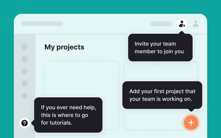
menu options and reveal more as users dig deeper. - Onboarding flows: Show the most basic or important features one at a time and reveal more as users progress through the flow.
- Tutorials and help guides: Give simple overviews initially, then provide detailed steps when users click for more info.
- Forms and surveys: Show initial questions and display additional fields based on previous answers.
Progressive disclosure helps manage user
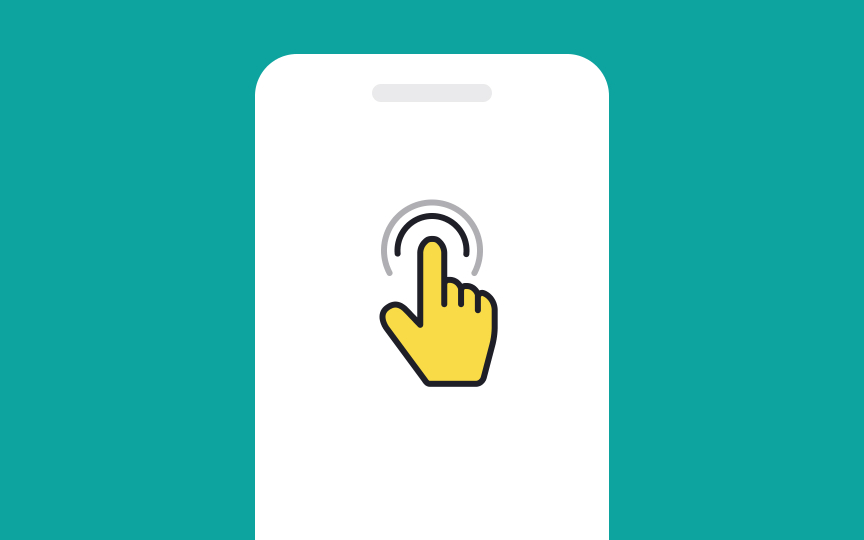
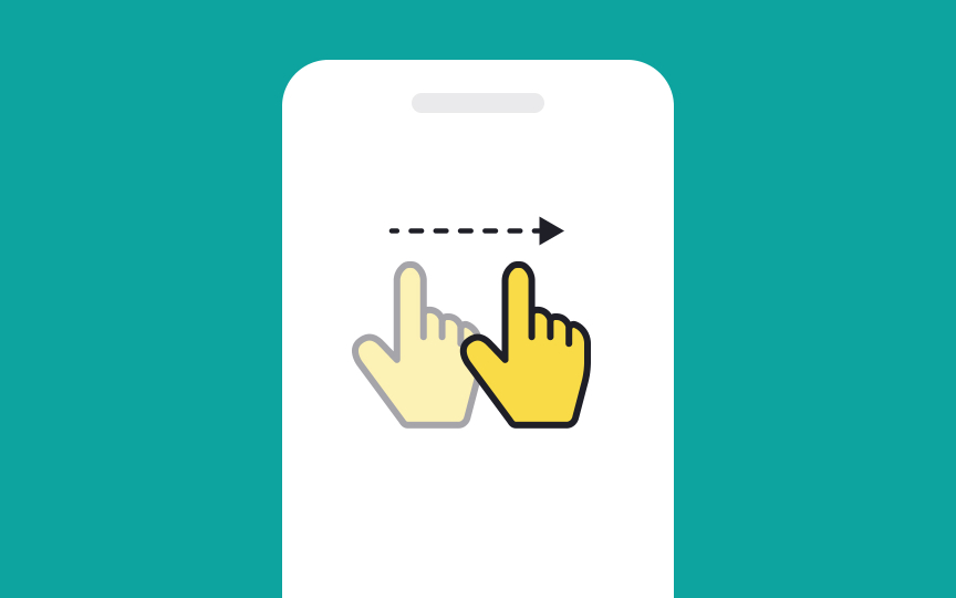
Gestural interfaces, like those on smartphones and touchscreens, rely on users recalling specific hand movements to interact with the device. Since these gestures aren't always obvious, make use of gestural signifiers — visual cues that help users remember what to do. These cues guide the user, making
Best practices for using gestural signifiers include:
- Keep gestures and their signifiers consistent across the interface to strengthen memory.
- Make sure signifiers are clearly visible where gestures are needed.
- Use simple and natural gestures that align with common human actions.
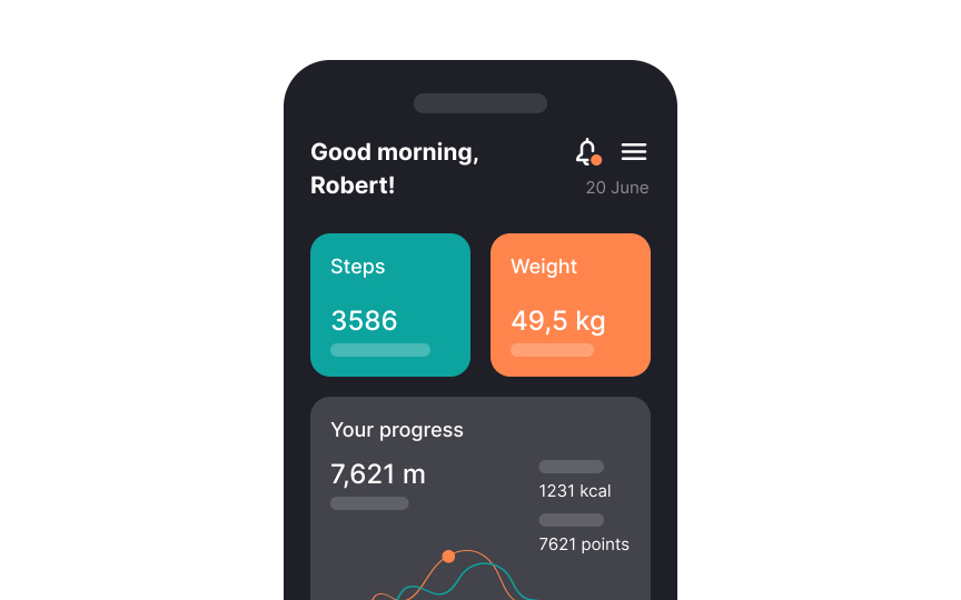
Adaptive interfaces change based on user behavior, which can be confusing because the interface might look different each time. This constant change forces users to remember new layouts and options regularly, which can be overwhelming and make the
However, adaptive interfaces can be particularly effective in interfaces where spatial memory isn't as crucial. Take an e-commerce website for example, it could display personalized product recommendations based on users' browsing history or past purchases. So while consistency can be user-friendly, there are scenarios where adaptiveness can enhance the user experience.
When users try to find something in an app or on a website, they often remember only the general area where it might be, not the exact spot. This can make finding specific things a bit like hunting for a lost sock in a messy room — we know it’s around, but we need to look around to find it.
To make this easier, add extra clues in the form of:
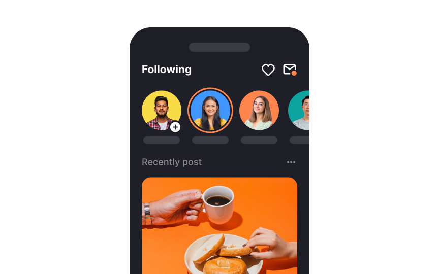
- Icon labels: For example, in a music app, a heart
icon might be unclear on its own. Adding alabel that says "Favorite" clarifies that tapping the icon will save the song to users’ favorites list. - Thumbnails for documents: When looking through a long document, small preview images of each
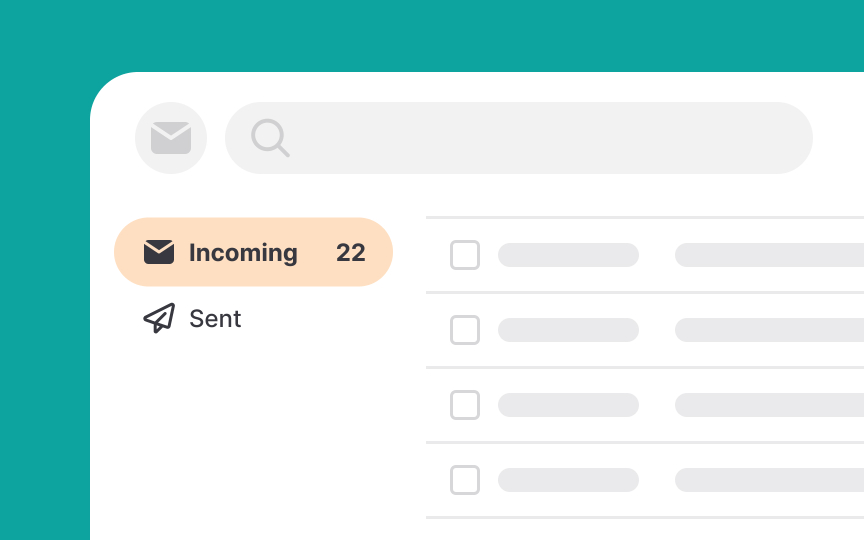
page can help users jump right to the page they need without flipping through each one. - Colors and badges: Highlighting important or different items on dense lists with a different color or a badge makes them stand out. For example, important emails could have a red dot next to them within an email app interface.
A broad and shallow hierarchy organizes information or options across a few layers that are easily visible and accessible. This contrasts with a narrow and deep hierarchy, where information is stacked under several layers, requiring more
This helps users find what they need faster without memorizing complex navigation paths or making many clicks. It makes the interface easier to use and enhances the overall
However, in some situations, there may simply be too many categories to show them all at one level. In other cases, showing specific topics too soon will just confuse your audience, and users will understand your offerings much better if you include some intermediate category
Use landmarks to help users navigate smoothly and quickly within a
Examples of digital landmarks include:
- Clickable logos at the top of each
page that, when clicked, always take you back to the homepage. - Browser tab titles that let you know what page you’re on, making it easy to switch between tasks without losing your place.
- Breadcrumb trails on websites that show you the path you’ve taken from the homepage to your current location. This lets you backtrack easily without hitting the Back
button repeatedly. - Visual changes such as different
colors orlayouts in different sections that help you recognize each area quickly.[5]
References
- How Short-Term Memory Works | Verywell Mind
- Working Memory and External Memory | Nielsen Norman Group
- Memory Recognition and Recall in User Interfaces | Nielsen Norman Group
- Spatial Memory: Why It Matters for UX Design | Nielsen Norman Group
- Wayfinding cues in UX design | Medium
Top contributors
Topics
From Course
Share
Similar lessons

Cognitive Biases

UX Laws

