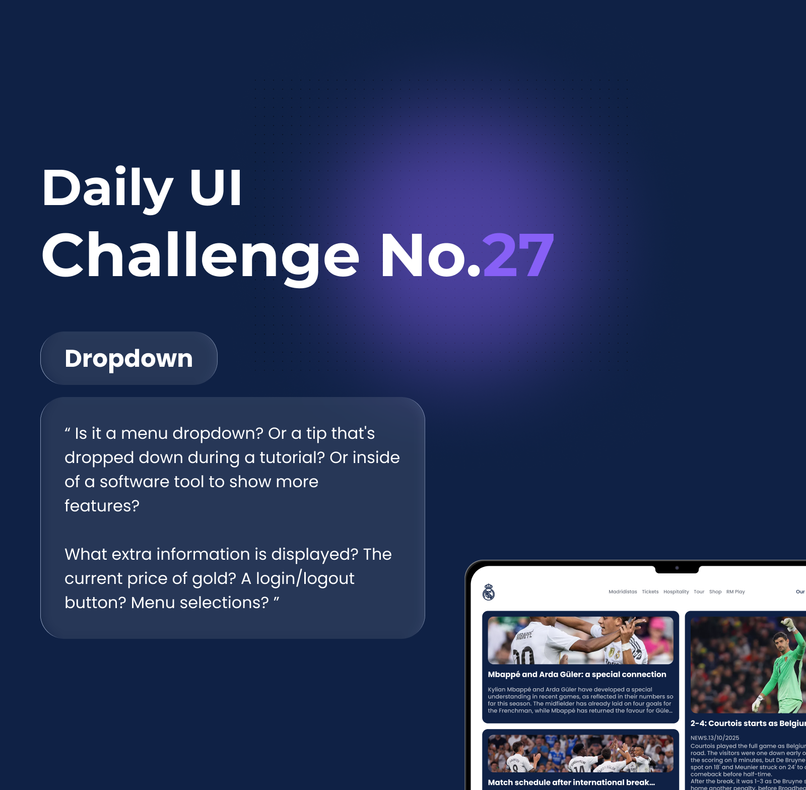
DailyUI #27 | Dropdown "Real Madrid"


Reviews
1 review

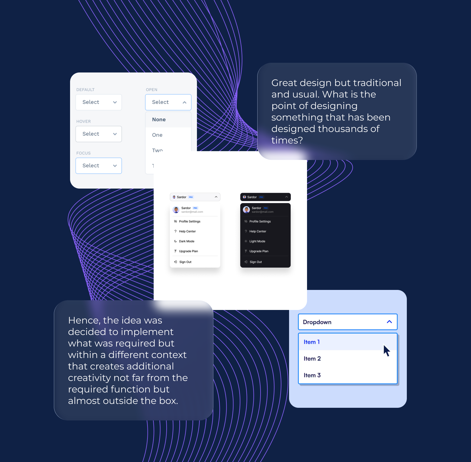
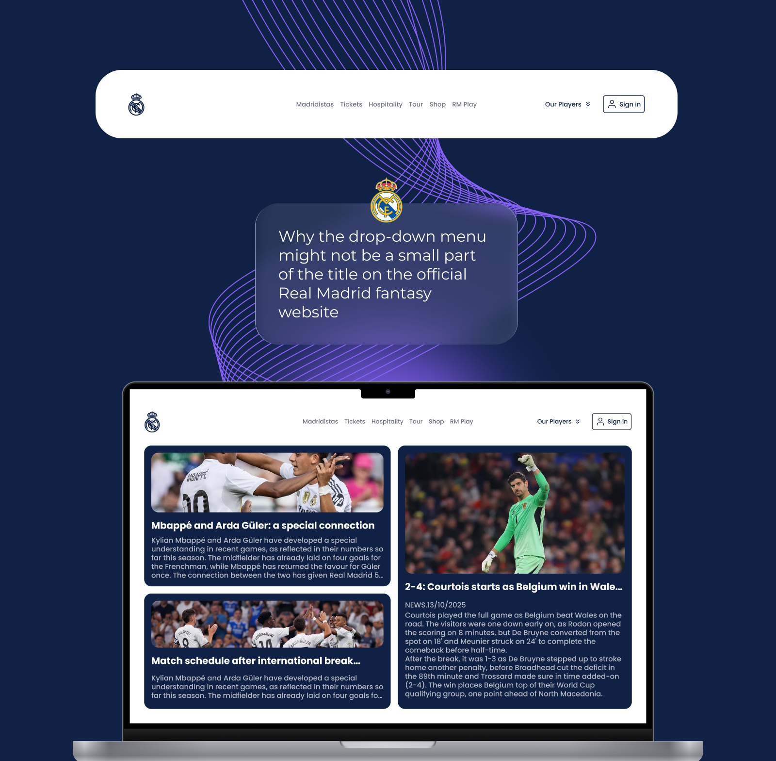
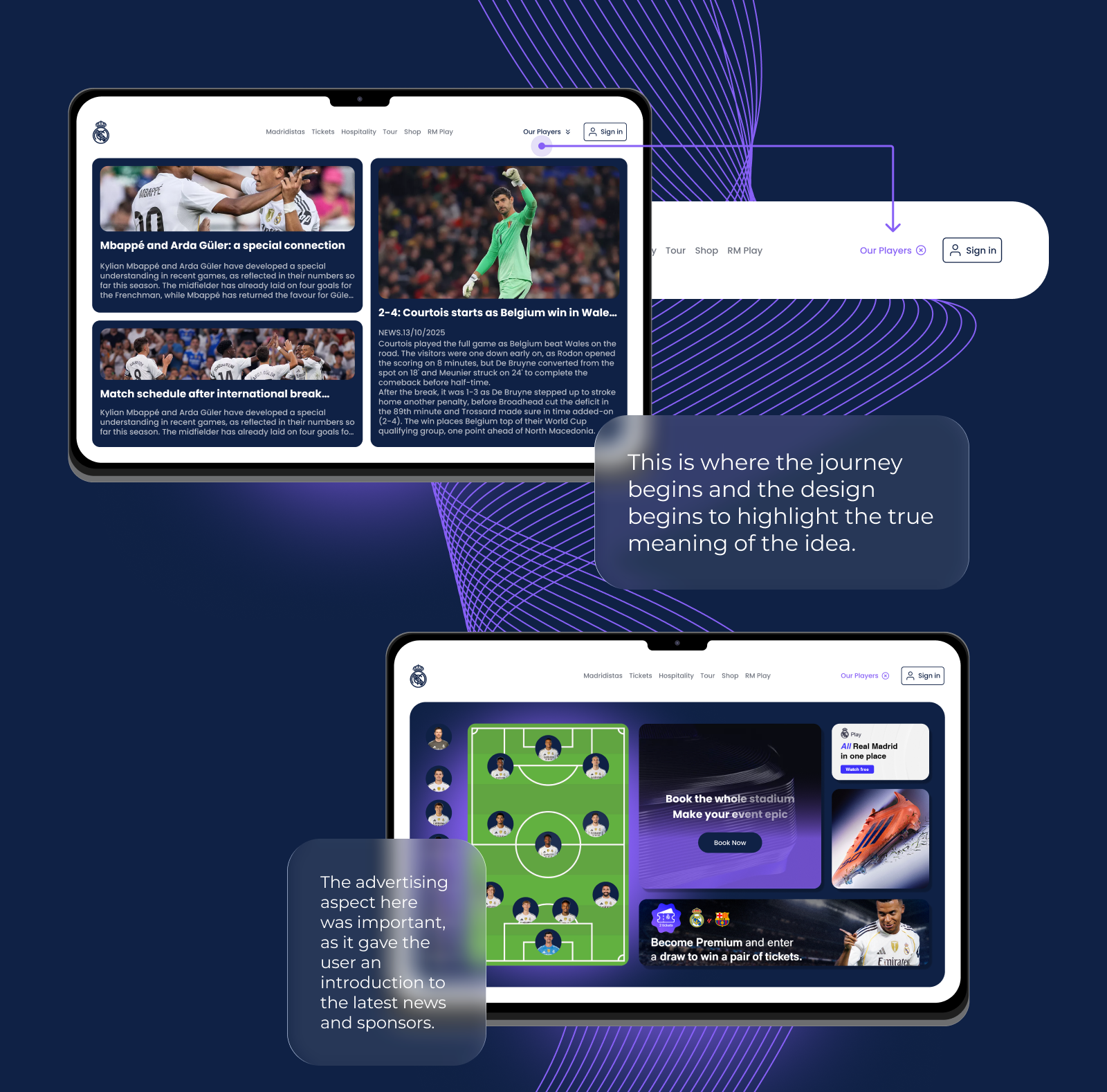
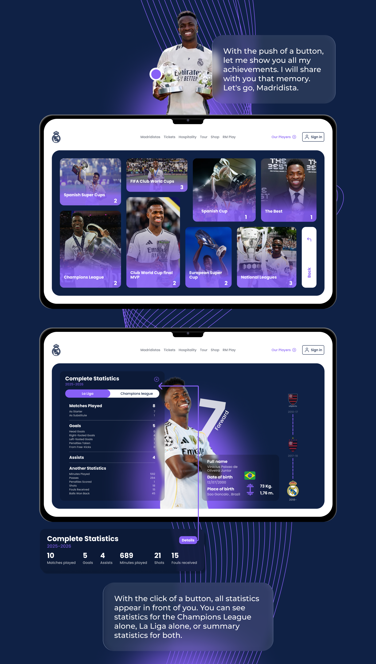
I'm not sure what the initial brief was here, Ziad 🤔 Is it designing a dropdown menu? Because none of the “players” dropdown looks like what we're used to seeing in a typical dropdown menu. I'm assuming you're trying to combine a menu and a page. By the looks of it, it became a “droppage” because when users click “Our Players ⇓” what's shown is a bento-like page instead of a simple menu, and the dropdown state is active, visible by the visual cue from the button that turned into “Our Players ⓧ”.
From a UX POV, this could work, similar to how modal windows function: The players page will be served on top of the current page. But seeing how complex the page is (players dashboard, stadium booking(?), and each player stats page), technically this might not be good for users. It might be too heavy to access for some. You see, menus and modals are designed simply for a reason.
It would make more sense if “Our Players ⇓” was just a menu that redirects to a dedicated page, not in a dropdown state. It's too heavy and complex to be put in a temporary state such as a menu or modal window. I'd recommend simplifying this to a standard navigation pattern: make “Our Players ⇓” a direct link to a full page where users can explore the dashboard and player stats without the constraints of a dropdown. This approach would improve load times, provide better scalability for the content, and align with user expectations for navigating complex information …or you could just change the brief to not design a dropdown but a page instead 😄
You might also like
SiteScope - Progress Tracking App


FlexPay


CJM for Co-Working Space - WeWork


Ubani Design System


Accessible Signup Form for SaaS Platform

Loginino

Popular Courses

UX Design Foundations


Introduction to Figma

Design Terminology
