Skiyii Website Design Exploration

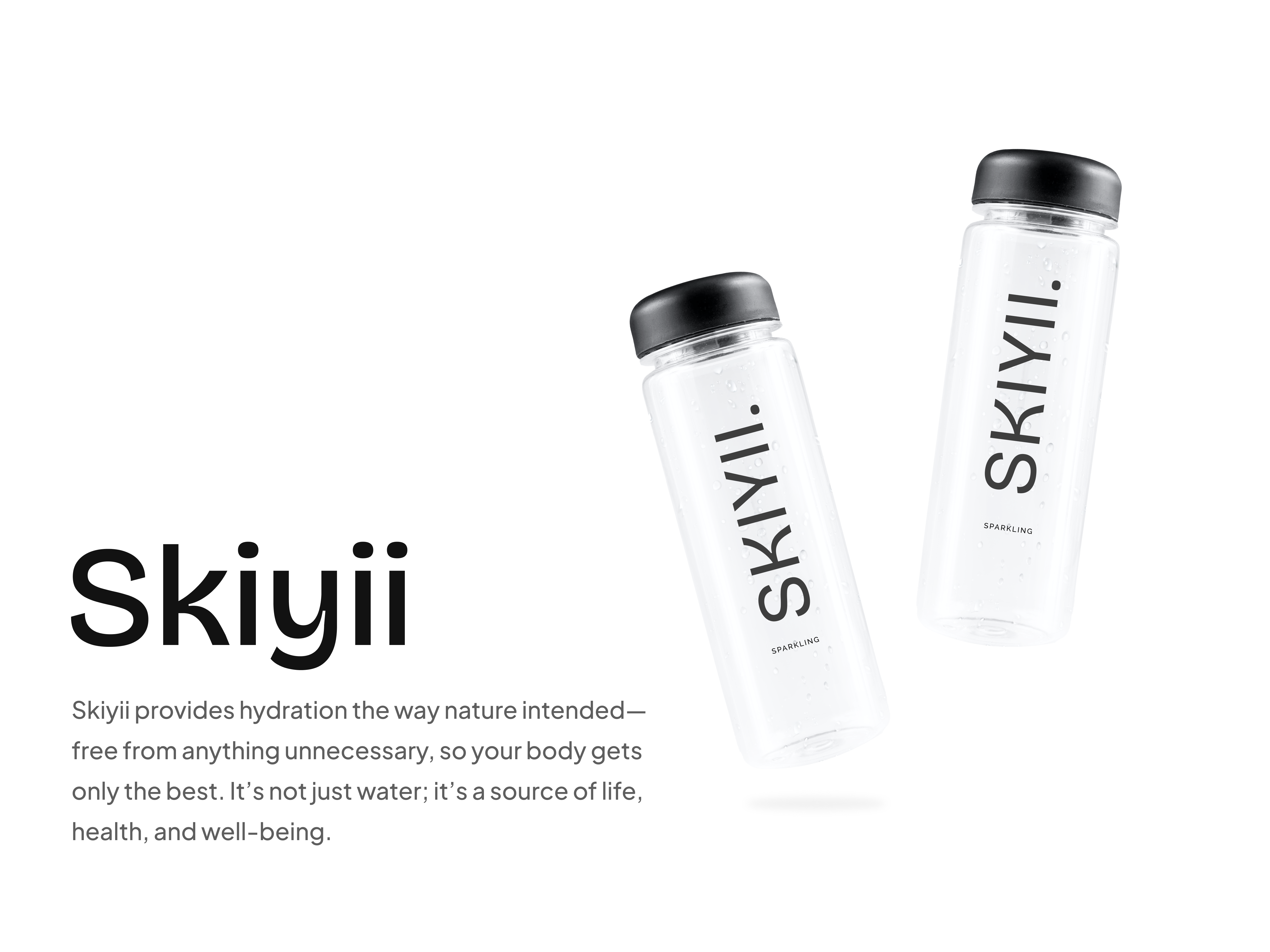
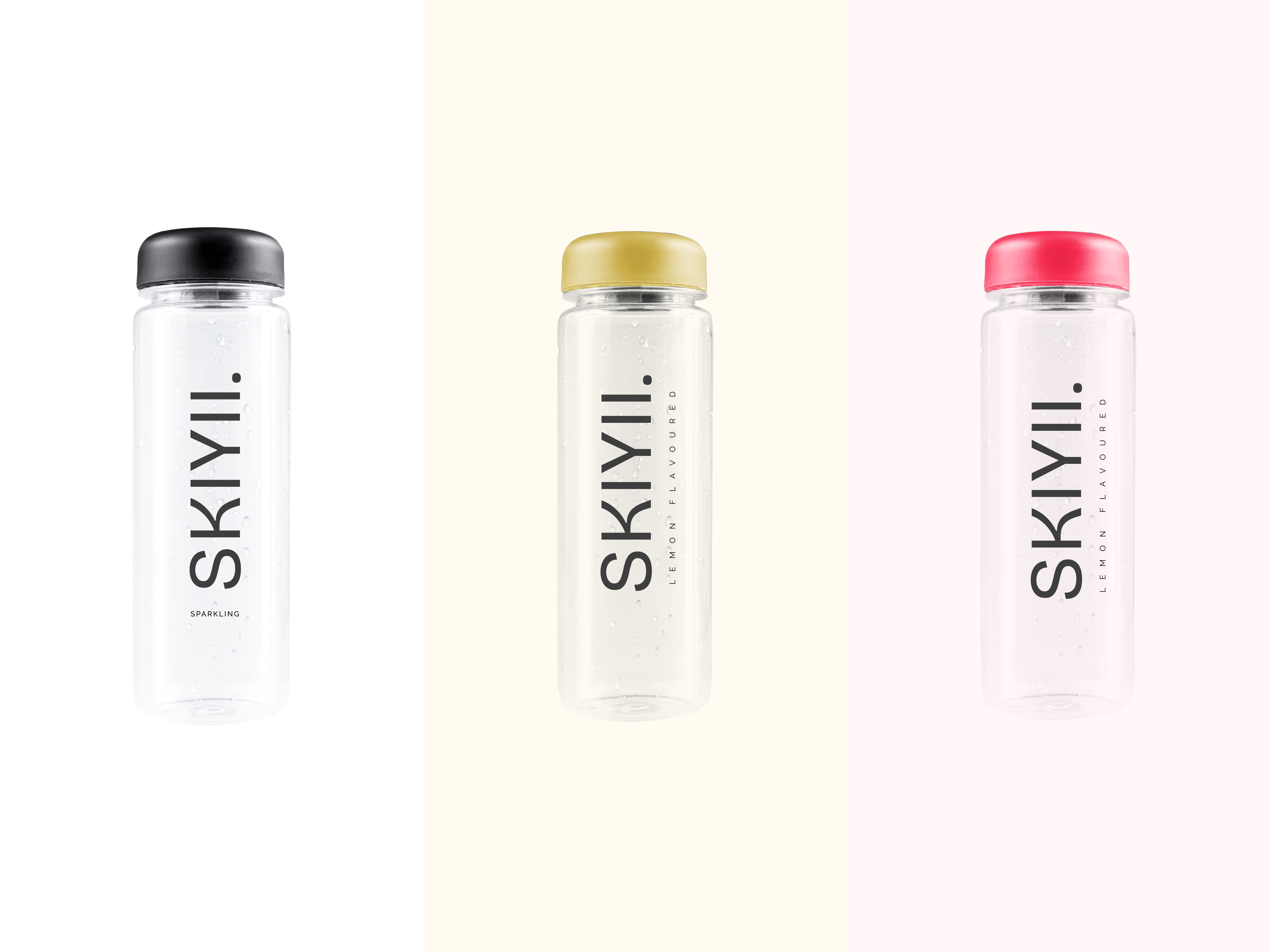
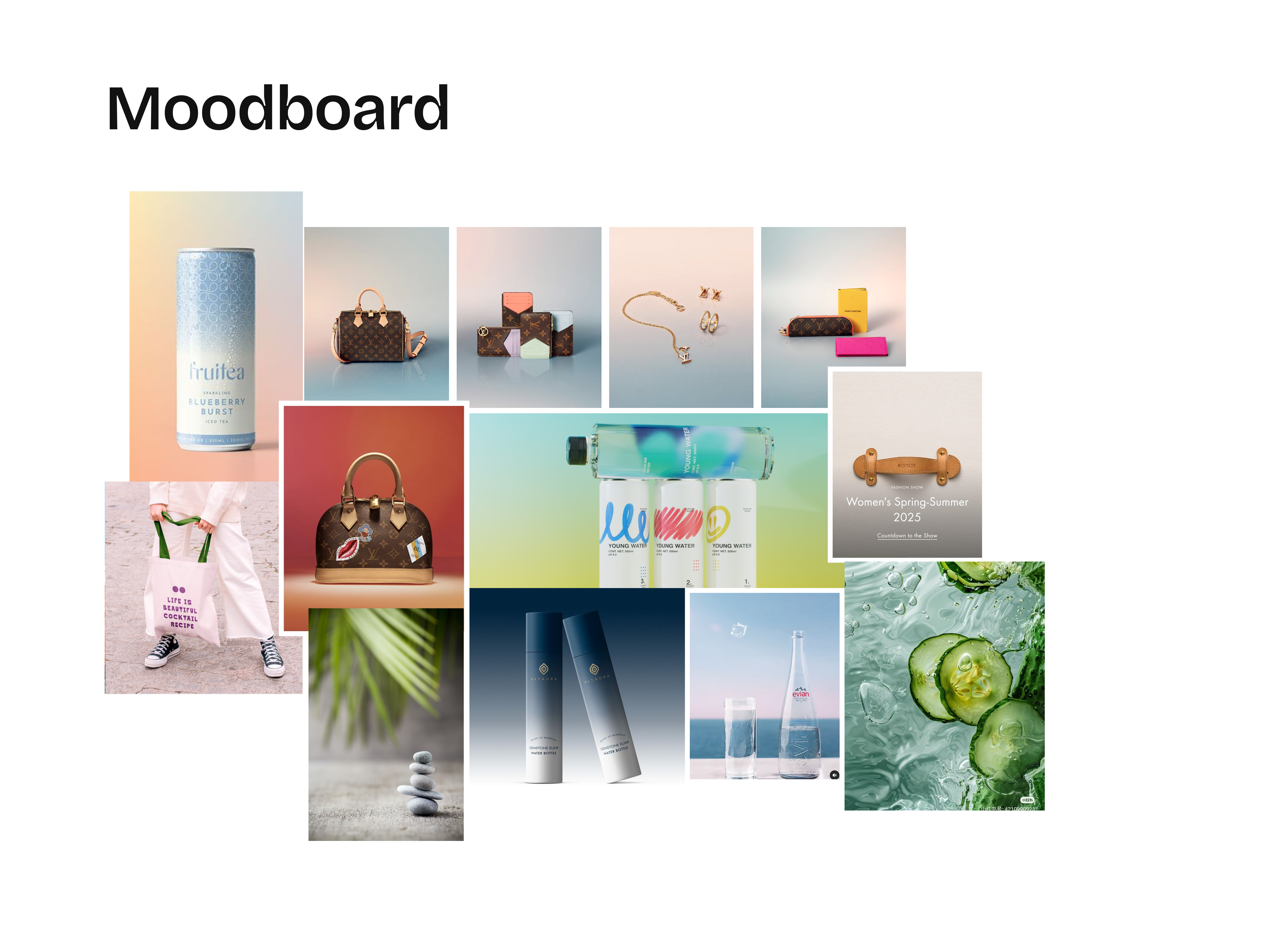
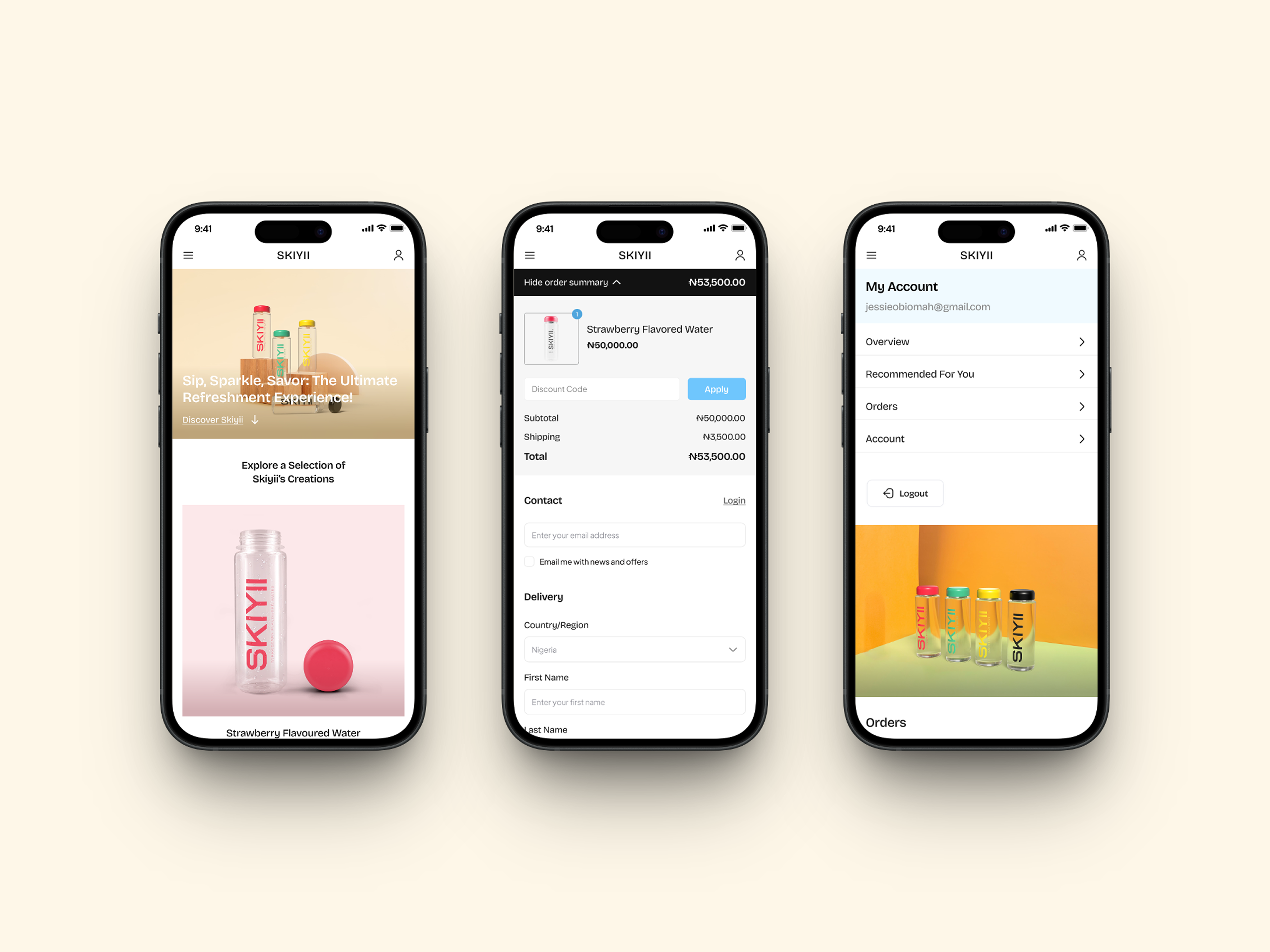
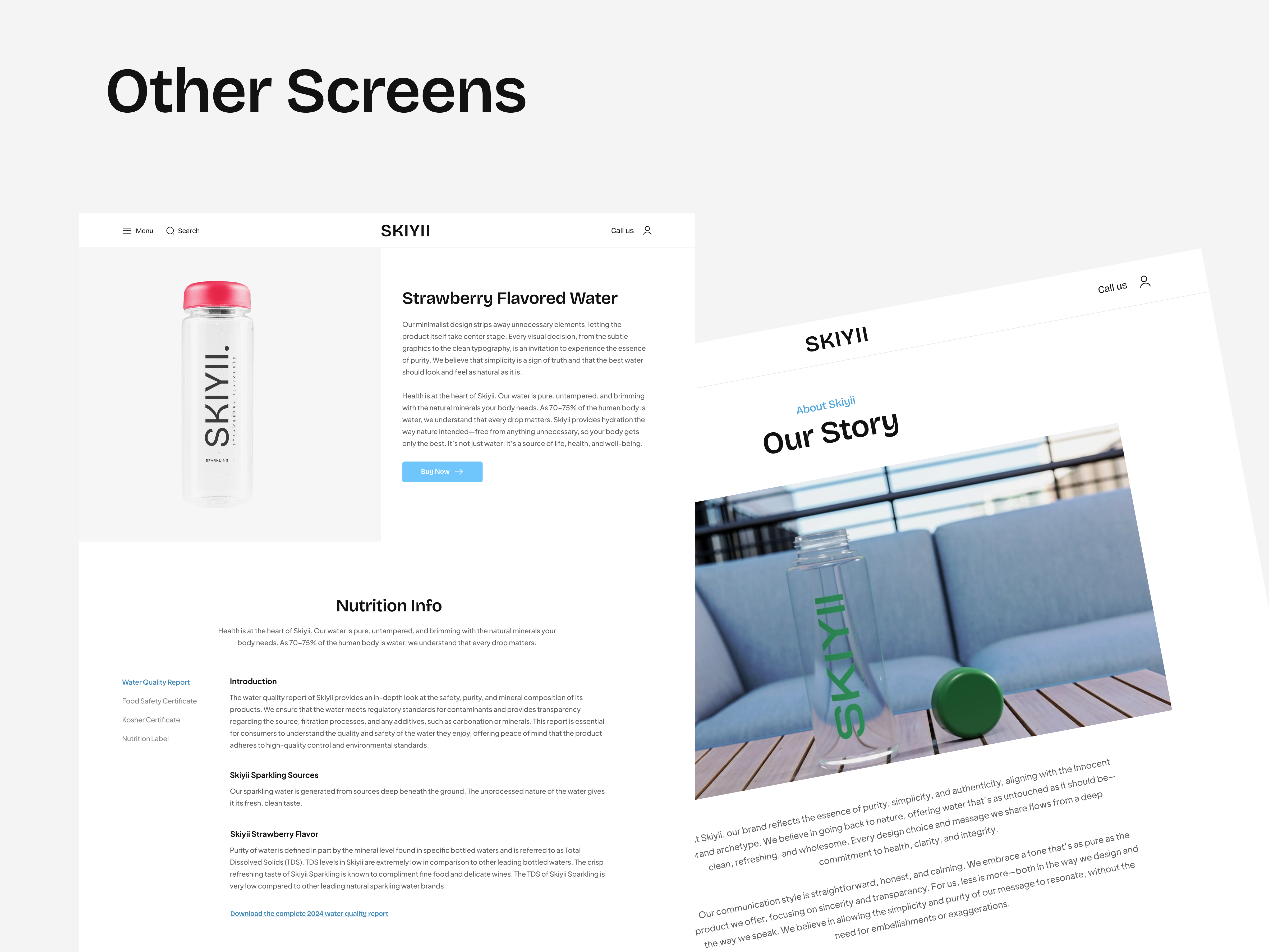
The idea was to create a minimalist design, letting the product take center stage. Every visual decision is an invitation to experience the essence of purity. The simplicity is a sign of truth, and the best water should look and feel as natural as it is.
This is a design exploration I worked on months ago. Let me know what you think.
Reviews
4 reviews

Hi Jessica✨
Oh my goodness, what a truly beautiful and super modern website you've created! I absolutely adore how you've managed to capture that concise and thoughtfully refined mood – it's honestly an art form when every single element feels perfectly placed. There’s just this wonderful sense of clarity and intention that comes through, and it's so powerful! You've genuinely crafted such a lovely, inviting digital space.
Just a Few Thoughts to Explore & Grow From!
Your site is already looking absolutely fantastic, but you know, there’s always that exciting little bit of room for tiny tweaks that can just elevate it to the next level. Here’s what gently popped into my mind as I was looking at it:
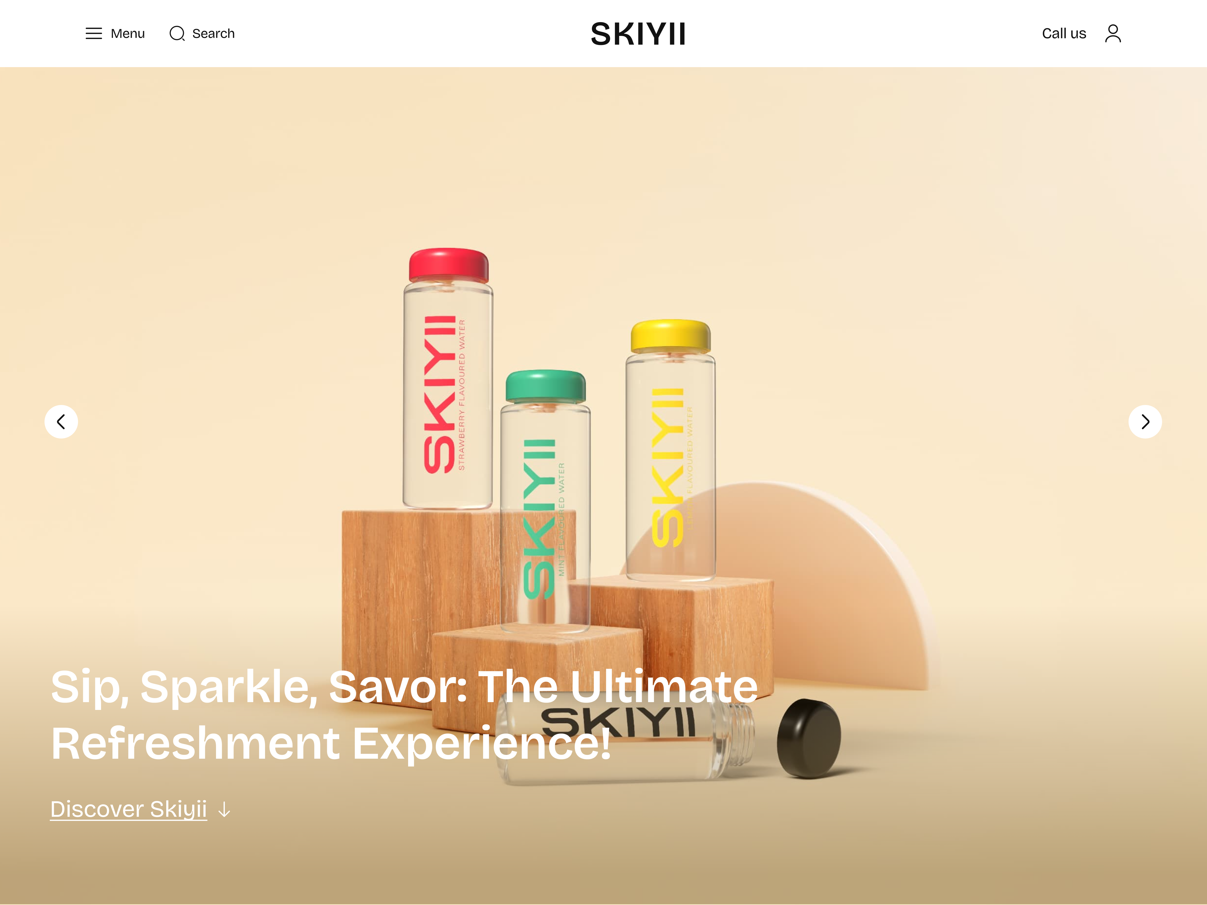
- Your Main Headline's Pop & Readability: I couldn't help but notice that the main headline on your homepage, while beautifully designed, gets a little lost in the background image sometimes, making it just a tad tricky to read at first glance. For readability and accessibility (which are so important!), and to really let your visual hierarchy shine, it would be awesome to give it a bit more punch! Maybe you could play around with changing the text color, or perhaps adding a super subtle, almost transparent, background shape behind it? Or even just ever-so-slightly darkening/blurring just the area of the background image right behind the text. This would really help that headline "breathe" and immediately grab users' attention, making their experience even smoother.
You've seriously done an outstanding job bringing this stylish and contemporary vision to life. It truly highlights your talent for creating designs that are both elegant and effective. Please, please keep up this incredible work; you're doing so wonderfully! Keep shining bright!☺️

Very Nice Jessica! 👏👏

Beautiful work, Jessica!
I really like the minimalistic design — it effectively draws focus to the content. To elevate the page even further, consider adding subtle graphic elements or animations that could evoke a sense of freshness and help address the user's thirst on a more emotional level.

Great work, Jessica.
I love the level of detail shared about the brand and the work you put in. I would look out for some of the copy going over the images as it creates some noise and makes it hard to read.
All in all, fantastic work!
You might also like
SiteScope - Progress Tracking App


FlexPay


Mobile Button System


CJM for Co-Working Space - WeWork


Ubani Design System


Accessible Signup Form for SaaS Platform
Popular Courses

Introduction to Figma


Information Architecture


UX Design Foundations