Icons & Symbols Guidelines
Create clear, meaningful, and platform-consistent iconography using Apple's symbol system.
Icons speak louder than words in digital interfaces. A checkmark, a plus sign, or a simple arrow can instantly communicate meaning, guiding users without a single word. Apple's SF Symbols brings this visual language to life through thoughtfully designed icons that work in perfect harmony with system fonts and interface elements. Each symbol adapts its weight, scale, and color automatically, making interfaces feel responsive and alive. Like a well-designed traffic sign system, these icons become familiar guideposts that help users navigate confidently.
When system icons aren't enough, clear principles for custom icon design ensure new symbols feel right at home on Apple platforms. The result is a cohesive visual language where every icon has its place and purpose, making apps both beautiful and instantly understandable.
Well-designed icons share key characteristics that make them instantly recognizable and functional:
- Clear silhouettes — easily identifiable at any size
- Simple shapes — reduced to essential elements
- Consistent stroke weights — matching system typography
- Optical alignment — properly balanced with text
- Systematic layout — following platform grid guidelines
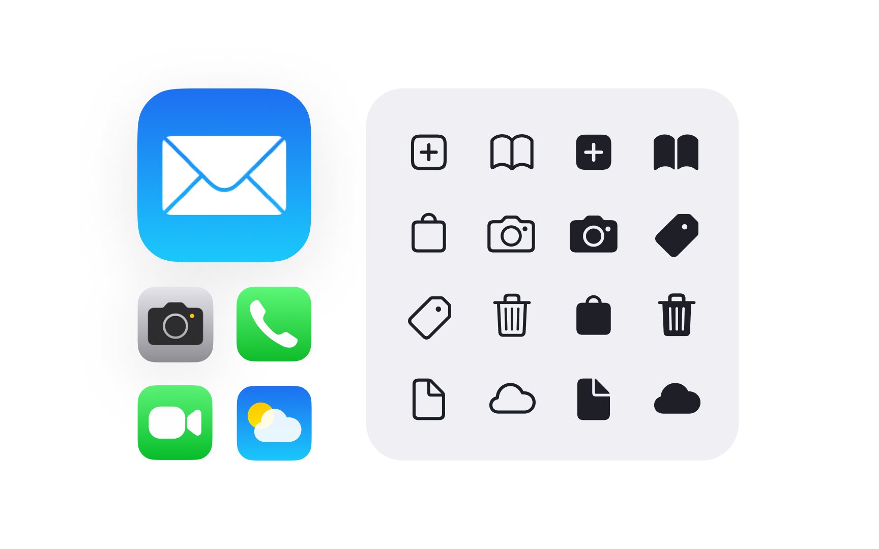
Apple's icon system extends from tiny menu items to large app icons. Each type has specific roles and requirements, but all follow core principles that ensure visual harmony. SF Symbols provide the building blocks for this system, while custom icons expand it for unique needs.[1]
Pro Tip: When choosing icons, prioritize clarity over cleverness — users should instantly understand what each icon means.
SF Symbols represent a comprehensive library of
The library includes thousands of symbols organized into clear categories:
- Communication — messages, calls, sharing
- Objects — devices, tools, items
- Actions — add, delete, edit
- Transportation — vehicles, navigation
- Human — accessibility, gestures
- Weather — conditions, forecasts
Each symbol automatically aligns with the San Francisco
Pro Tip: Browse the SF Symbols app to find the right symbol — searching by keyword often reveals related options you might have missed.
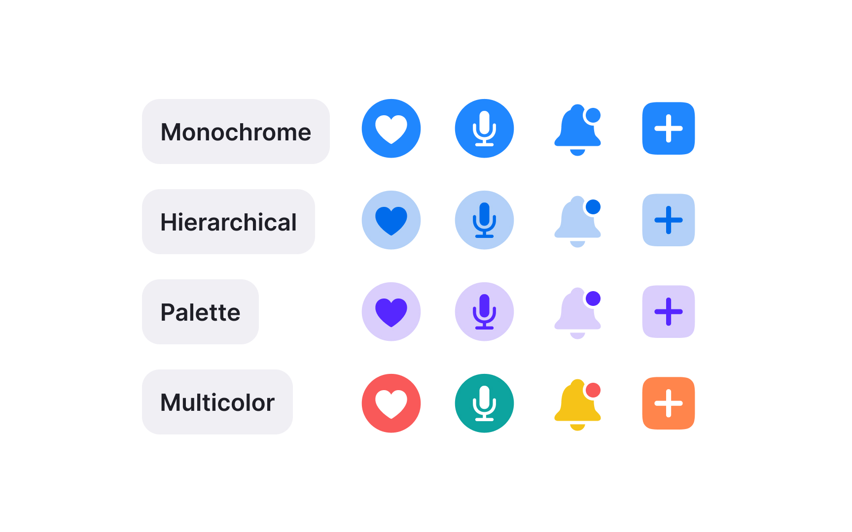
SF Symbols offer different rendering modes that determine how symbols appear in interfaces. Each mode serves specific design needs while maintaining legibility across contexts.
Available rendering modes:
- Monochrome — single
color , perfect for interface elements. This mode provides the most flexibility, allowing any color to be applied uniformly. - Hierarchical — single color with varying opacities for depth. Hierarchical rendering creates visual depth through opacity variations within a single color.
- Palette — enables custom colors for different parts of symbols.
- Multicolor — predefined system colors for specific semantic meanings.
Rendering modes affect how symbols respond to interface states and
Pro Tip: Default to monochrome mode unless your symbol needs to convey additional meaning through color variation.
SF Symbols match text appearance by automatically adjusting their scale and weight. This ensures symbols look natural next to any text style in the interface.
Symbols come in nine weights — from ultralight to black — matching San Francisco
Scale options range from small to large, with standard size matching text height. As symbols get bigger or smaller, they keep their clarity while maintaining proper weight. This helps symbols look balanced whether they're small

SF Symbols align automatically with text baselines and respect standard spacing metrics. This built-in behavior creates consistent layouts without manual adjustments.
Symbols follow 3 key alignment principles:
- Baseline — symbols sit on the same line as text
- Center point — symbols align vertically with the text center
- Padding — symbols maintain consistent spacing with surrounding elements
Different symbols might appear to have varying sizes, but their alignment points ensure they feel balanced in the interface. For instance, a circular symbol and a tall one will align correctly despite their different shapes. This optical alignment matters more than mathematical centering.
Apple platforms handle spacing automatically based on context.
Pro Tip: Trust the system's automatic alignment — avoid manual adjustments unless absolutely necessary.
Common color patterns in system interfaces:
- Blue — interactive elements and links
- Red — destructive actions or errors
- Green — success states or progress
- Gray — disabled states or secondary actions
Color intensity and prominence should match the symbol's importance in the interface. Primary actions use more vibrant colors, while supplementary elements use subtler tones. This creates a clear visual hierarchy while maintaining a balanced appearance.
Pro Tip: Let color communicate meaning — use the same color for similar actions to help users learn your interface patterns.
While SF Symbols cover most interface needs, apps sometimes require custom symbols.
Custom symbols should match SF Symbols characteristics:
- Consistent stroke weights
- Simple, clear shapes
- Single-point alignment
- Proper canvas dimensions
- Support for different weights
- Ability to scale smoothly
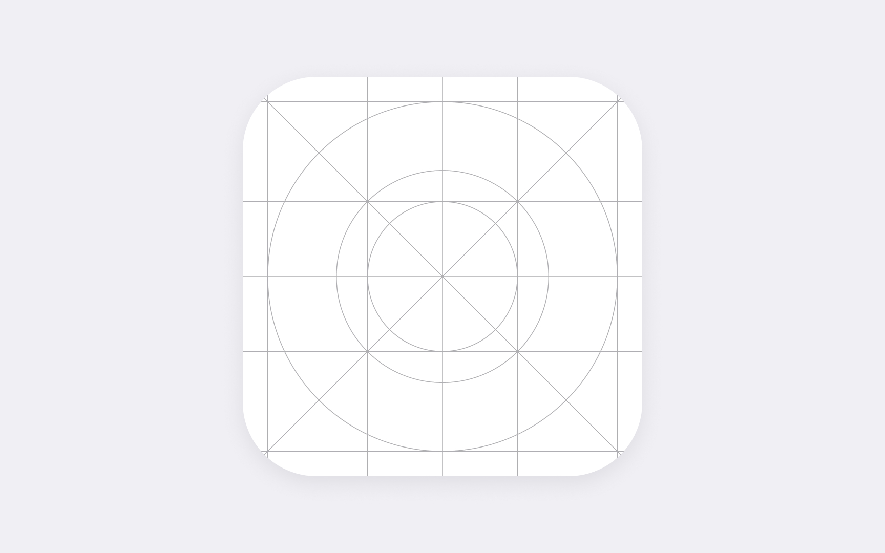
The symbol canvas uses a standard
Every custom symbol needs both optimized and simplified versions for different sizes. Small sizes require simpler geometry to maintain clarity, while larger sizes can include more detail.
Pro Tip: Start custom symbol design at regular weight — it's easier to adjust to lighter and bolder weights from there.


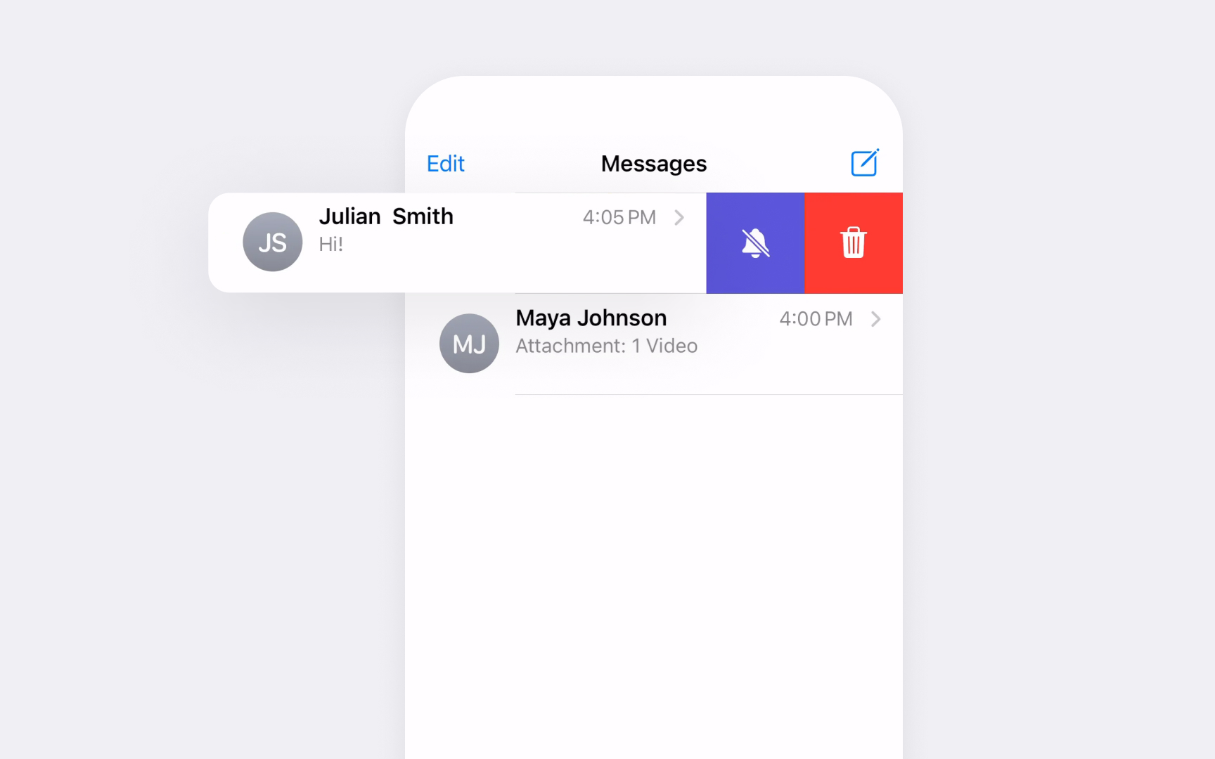
Symbols play a vital role in communicating interface state changes. They help users understand when elements are selected, pressed, or disabled.
State changes in symbols should be clear but subtle:
- Selected — filled variant or stronger
color - Pressed — subtle scale change or highlighted state
- Disabled — reduced
opacity or gray color - Active — color accent or weight increase
- Error — change to alert color
SF Symbols provides specific variants designed for different states. For instance, a bookmark symbol has outlined and filled versions to show the saved status. These built-in variations ensure consistent behavior across the interface.
Pro Tip: Use symbol variants rather than color alone to show state changes — this ensures clarity in all accessibility modes.
Symbols adapt their appearance to match each Apple platform's unique characteristics. Understanding these differences helps create interfaces that feel native to each environment.
iOS and iPadOS:
- Touch targets need adequate size
- Full-color support in
navigation elements - Bold weights for primary actions
- Regular weights for most interface elements
macOS:
- Small, precise pointer targets
- Monochrome common in
toolbars - Lighter weights preferred
- Support for sidebar tinting
visionOS treats symbols differently:
- High contrast is needed for
legibility - Environmental lighting considerations
- Size adjustments for viewing distance
- Simplified details at small scales
Pro Tip: Test symbols on actual devices — what works on one platform might need adjustment on another.
Symbols must remain clear and meaningful for all users, regardless of their
Accessibility requirements for symbols:
- Clear meaning with VoiceOver
- Sufficient
contrast in all states - Recognition at various sizes
- Meaningful
color alternatives - Support for increased contrast
- Labels for complex symbols
When users enable accessibility
Avoid using symbols alone to convey critical information. Always provide text labels or alternative indicators that work with assistive technologies.
Pro Tip: Test symbols with VoiceOver enabled — every symbol should have a clear, descriptive label.

Symbols need to work across different languages and cultures. While many symbols are universal, some require careful consideration for global audiences.
Common localization challenges:
- Directional symbols need RTL support
Gestures vary across cultures- Writing systems have different heights
- Calendar symbols vary by region
- Currency symbols change by market
- Cultural symbols need alternatives
SF Symbols handle most localization automatically. Directional symbols flip for right-to-left languages, and text-related symbols adapt to different writing systems. When creating custom symbols, follow these same principles.
Some symbols might carry different meanings or be inappropriate in certain regions. Always research cultural implications and provide alternatives when needed.
Pro Tip: Test your interface in right-to-left languages to ensure symbols adapt correctly.
References
- Icons | Apple Developer Documentation | Apple Developer Documentation
- SF Symbols - Apple Developer | Apple Developer
- SF Symbols | Apple Developer Documentation | Apple Developer Documentation
Topics
From Course

Images provided by

Share


