KOTA: Landing Page (A Techwear Styling Experience)

Project Overview: KOTA
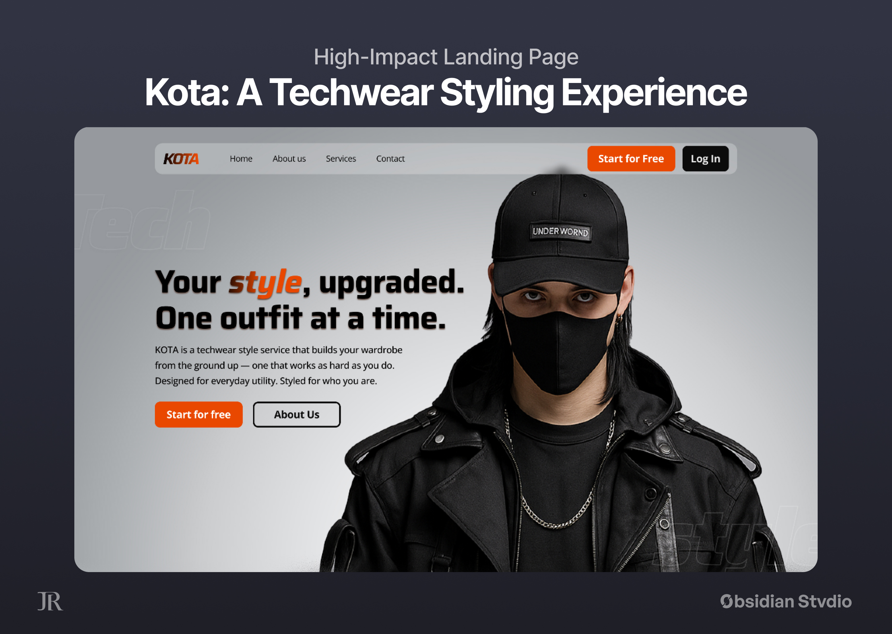
KOTA is a fictional but conceptually grounded techwear styling service created specifically for this project. Its core mission is to build a functional, curated wardrobe for clients from the ground up — one that reflects their lifestyle and works as hard as they do. KOTA blends utilitarian streetwear aesthetics with personalization and modularity, offering full outfit plans or incremental upgrades to individual looks.
The brand stands at the intersection of practicality, futurism, and personal expression, offering a product that feels personal, wearable, and elevated.
Design Process
KOTA’s brand language was carefully designed to reflect confidence, clarity, and utility. Phrases like:
“Your style, upgraded. One outfit at a time.”
“Designed for everyday utility. Styled for who you are.”
These set a tone of competence and personality, appealing to a modern user who values form and function equally. Copywriting supports a user-first philosophy, guiding them smoothly through the experience.
Typography
Typography is a crucial part of the design’s hierarchy and voice.
Headlines (H1–H5): Saira
A modern, geometric sans-serif that feels clean, futuristic, and strong — matching the techwear aesthetic.
Used for titles and callouts where a bold, attention-grabbing presence is needed.
Body Text (B1-B3): Open Sans: Open Sans
Humanist sans-serif, chosen for legibility and neutrality.
Supports accessibility and readability across devices, particularly for the explanatory sections and FAQ blocks.
Color Palette
The color system was intentionally limited to evoke a utilitarian and urban feel, while ensuring strong contrast and clarity:
Background: #EAE7E6
A soft, light neutral that provides a modern and clean canvas, allowing darker elements and images to stand out without feeling stark.
Primary brand color and accent: #FF4F00
A bright, fiery orange — energetic and high-impact. Used for buttons and calls to action to draw the eye and guide user flow.
Neutrals: #1A1A1A, along with deep blacks and mid-grays
Support the minimal, technical style of the techwear fashion. Also increases the visual weight of key components like headers, borders, text and outfit visuals.
The visual identity mimics the language of utility and tactical gear — emphasizing precision, structure, and a purpose-built feel.
Layout & UI Decisions
Hero Section: High-contrast full-width imagery with bold typography. The model in techwear immediately sets the tone for what the user can expect.
"How it Works" & "What You Get": Grid-based sections with icons and captions simplify the onboarding and value proposition.
Outfit Gallery & Real Clients: These sections build trust and aspirational appeal, showing real-world outcomes. The alternating layouts and real photography add credibility.
FAQ & Footer: Rounded edges, subtle drop shadows, and consistent spacing ensure a soft yet structured user flow, ending in a footer that wraps everything cleanly.
Imagery and Visual Style
All images used were AI-reworked and retouched to match the brand tone, ensuring:
Cohesive visual style
Diverse but unified techwear looks
Urban, stylized backgrounds that reflect the brand’s streetwise attitude
The visual texture is deliberately matte, functional, and lightly grungy — echoing urban mood, utility, and aesthetic clarity.
Conclusion
This project’s design merges branding, utility-focused user experience, and techwear fashion storytelling to create KOTA — a style service for the modern minimalist with a tactical mindset. From typography and color and layout, each element supports the narrative of personalized, styled utility.
Tools used
From brief

Topics
Share
Reviews
10 reviews

Great job!

João, your KOTA project looks bold and well thought out 💡—tightening consistency in typography could make it even sharper, but overall you’ve nailed a stylish and functional design 👏.

Impressive, João! What I really like is the applied linear gradient with texture in the hero section, which creates a nice and crisp segue to the next section (how it works). You also boldly applied some brave, out-of-the-grid visual elements, which is really nice—not overdone, just enough. One thing that I think I could improve visually is to switch the footer typeface from Saira to Open Sans. Other than that, it’s great!

First of all, Great work. Here are my takes for this project.
- Keep the button variant limited to 2 on home page. Right now, we have filled-primary, filled-secondary and outline button, all in the hero section.
- Consistent padding for button at the top navigation bar.
- Hero section title comes with drop shadow which make it difficult to read, can try out making the text more simpler without the effects.
- Keep the cards consistent and also the font weight- At the How it works section
- The background text on the "what you get" section, its unreadable. You can think of replacing with some other visual elements, if the text is not readable, then it doesn't serve its purpose.
- Start now CTA at "what you get section" is hidden, can be more prominent- maybe centre aligned.
- "Real clients" section, the instagram tag for each one can be made prominent to show it as clickable. You can try out with a linear gradient background and then placing the text.
- Frequent questions, the expand button should look like enabled, right now the opacity is lower which makes it look like the button is disabled.
- Can work on the padding and text alignment inside the frequent section boxes.
- At footer, "Personal Fit" the text looks difficult to read, can bring in some letter spacing so that it becomes readable.
Overall, I loved the effort you have put in to bring this. All the best and keep creating. :)
Amazing
This project truly inspired me to work on my own ideas. Such an amazing and well-done piece of work — absolutely impressive!

I really like the aesthetic here, João. Great color scheme and use of imagery. I also think the information in the "Task and Rationale" section is easy to follow and well laid out.
One thing I noticed was some variation in the CTA fonts. It might be worth choosing a single CTA font style to reinforce consistency. In a real-world situation it could even be A/B tested.
Well done on the project.

Amazing work!

i think more and more projects are getting used to blur effects

Nice work
You might also like

HealthFlow: Designing a Simple and Insightful Wellness Dashboard


Improving Dating App Onboarding: A/B Test Design

FORM Checkout Flow - Mobile


A/B Test for Hinge's Onboarding Flow


Accessibility Asse


The Fitness Growth Engine

Content Strategy Courses

UX Writing


Common UX/UI Design Patterns & Flows


Building Content Design Systems
