Helpful 404 Error Page for a Fintech Mobile App

Project Context
Error pages are often overlooked in product design, yet they play an important role in maintaining trust and guiding users when something goes wrong.
In this challenge, I designed a mobile 404 error page for a fintech platform. The goal was to create a clear, supportive experience that explains what happened and helps users quickly resume useful actions, such as accessing their dashboard or finding the page they need.
The Problem
Traditional 404 pages often create dead ends for users. They display a technical error message but provide little guidance on what to do next.
On financial platforms, this can be particularly problematic because users may feel confused or worried when they cannot find a page for their account or transactions.
The solution
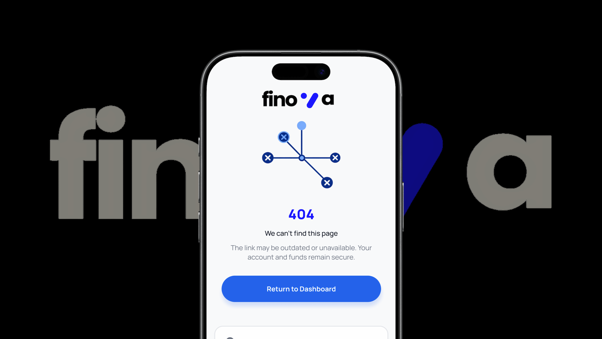
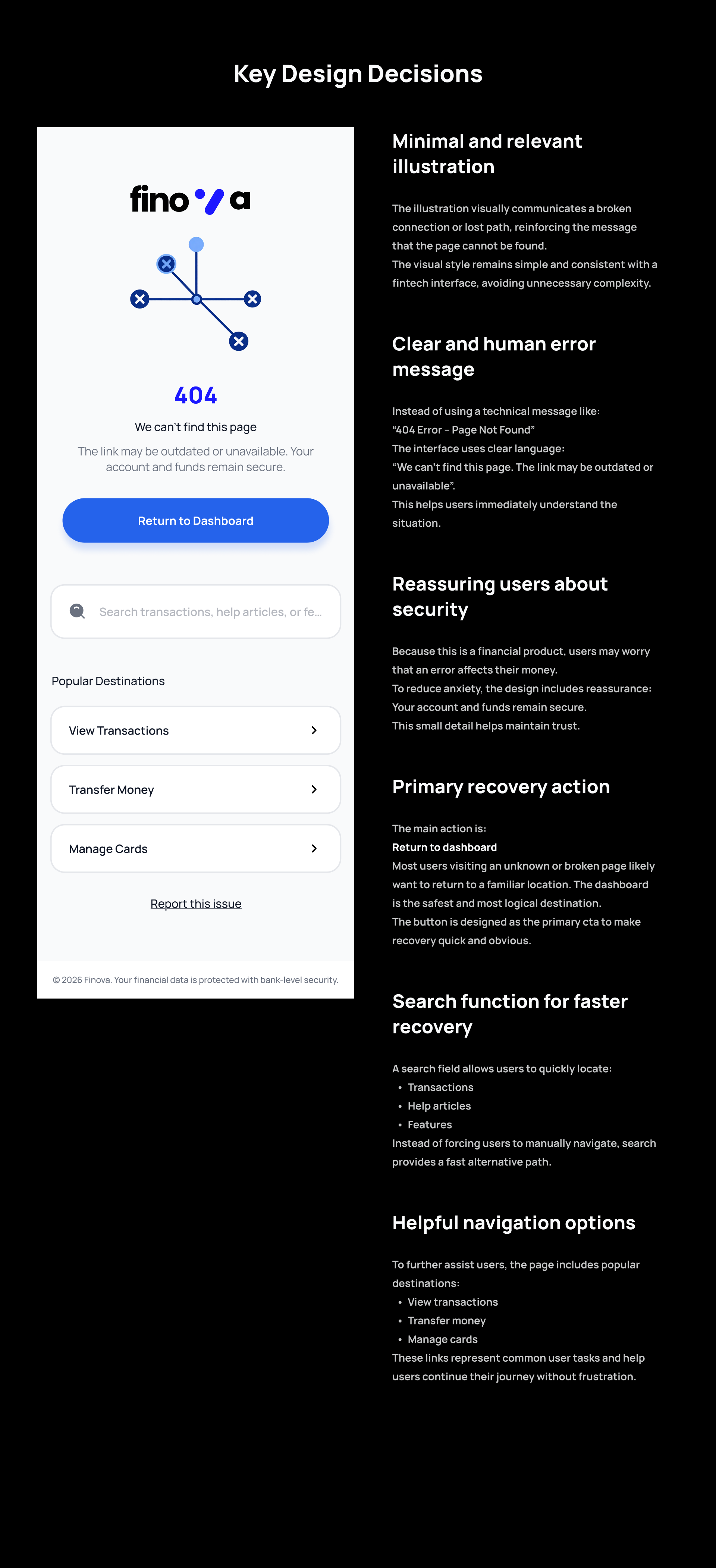
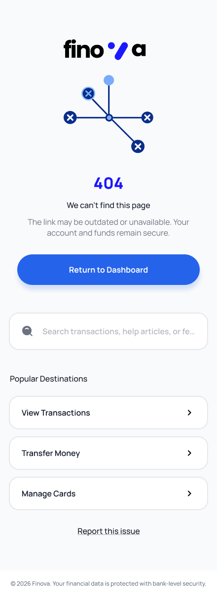
I designed a supportive and action-oriented 404 page that helps users recover quickly. The page uses friendly language, a clear explanation of the issue, and multiple navigation options to guide users back to important areas of the app.
Key features include:
- A clear and polite explanation of the error
- A search bar to help users find the page they were looking for
- Primary and secondary navigation actions
- A friendly illustration to reduce frustration
Design Decisions
Clear and Human Error Message
The copy avoids technical jargon and explains the issue in simple language. It also reassures users that their account and data are safe.
Action-Oriented CTAs
Primary and secondary actions help users recover from the error quickly:
- Return to Dashboard
- Search for a page
- Visit common sections
Visual Support
A fintech-themed illustration softens the experience and keeps the page aligned with the brand’s tone.
Minimal Layout
The page follows a clean mobile layout to avoid overwhelming users while still offering helpful navigation options.
This challenge helped me understand that error states are not just system messages — they are part of the user experience.
By designing a thoughtful 404 page, we can reduce frustration, maintain user trust, and guide users back to meaningful actions instead of leaving them at a dead end.
Tools used
From brief

Topics
Share
Reviews
0 reviews
You might also like

🖥 Desktop Checkout Flow Design


Website CRM Dashboard


Pebble Accessible SAAS Signup Flow


Create a UX Research Survey


Nestra from homepage to checkout process


QuickScan Onboarding

Content Strategy Courses

UX Writing


Common UX/UI Design Patterns & Flows


Building Content Design Systems
