eWallet App Development Project

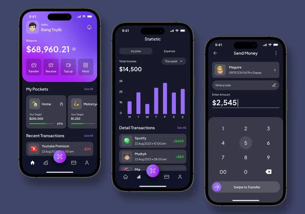
✨ Experience the future of digital payments with our innovative eWallet App design! Our concept combines powerful fintech capabilities with a sleek and intuitive interface, making everyday transactions faster, safer, and more convenient. Designed with a focus on security 🔒, simplicity, and modern user experience, this eWallet app empowers users to manage their money effortlessly.
📱 The UI highlights a clean and user-friendly dashboard that allows users to quickly check wallet balances, send or receive money, and monitor transactions in real time. With just a few taps, users can transfer funds, track expenses, and manage multiple payment options without navigating through complex menus.
🔐 Advanced security features such as biometric authentication, secure encryption, and transaction verification ensure that every payment remains protected. The design focuses on building user trust while keeping the experience smooth and seamless.
🎨 With modern gradients, intuitive navigation, and clear financial insights, the interface is crafted to make digital payments both visually appealing and easy to use for users of all experience levels.
💡 The app also supports spending analytics, transaction history, and smart financial tracking, helping users stay in control of their finances and make better financial decisions.
🚀 If you’re planning to launch a next-generation digital wallet, Nimble AppGenie offers expert eWallet app development services to turn innovative fintech ideas into secure, scalable, and user-friendly mobile applications.
Let’s shape the future of digital payments together. 💳📱
Thanks for the love on our posts! 🥰 Follow our
Design Team 🎨 on Instagram, and Pinterest for more creative vibes.
Let's explore together beyond UXCEL!
Made with ❤️ at Nimble AppGenie.
Questions or ideas? ✉️ Contact us!
Tools used
From brief

Topics
Share
Reviews
4 reviews

I like the style, it looks very modern and stylish. The Home page is vivid, and I appreciate that the most important information is visible at a glance, allowing for quick actions. In financial apps, "Time to Action" is a key metric.
The "Pockets" feature is a great way to group savings or goals, which significantly simplifies the user flow and helps with mental accounting.
Here are a few recommendations to improve the product:
- Accessibility: I highly recommend checking the contrast ratio between the small text (especially in the "Recent Transactions" and "Pockets" sections) and the card backgrounds. Ensuring readability for users with visual impairments is critical for inclusive fintech products.
- In the Statistics view, users often need to generate or export income/expense reports for specific periods. Adding a "More" or "Export" button with additional actions would make this page much more functional for long-term wealth management.
- For the "Swipe to Transfer" action, ensure there is enough visual feedback to indicate it’s a slider and not just a standard button, to avoid user frustration.
The rest looks good, great job!

Amazing project, Ravi! I love how consistently you've used colour across the screens. Even from a glance you can see where the main CTA's and focal areas are. The spacing is used nicely and the graph is clear.
Awesome job! :)

The project makes a very strong first impression.
The dark theme with purple accents is consistent and modern, and the information hierarchy on the Home Screen is well thought out. Balance, quick actions, and the "My Pockets" section are immediately accessible, which in fintech is absolutely key.
I agree with Anastasiia, the contrast of small text in the "Pockets" and "Recent Transactions" cards is worth checking with a tool like Stark or Contrast Checker, as dark backgrounds can easily create accessibility issues.
The "Send Money" screen is clean and intuitive, though the "Swipe to Transfer" button could better communicate that it's a slider for example through an animation or a directional arrow icon.
The Statistics view looks readable, but an export option is missing, which would be a natural next step for a budgeting app. It's clear the project isn't fully finished yet. A few states and views are probably still waiting to be refined, and that's completely fine.
You have solid foundations. The style, structure, and flow all work. Polish the accessibility and microinteractions, and this project will be truly portfolio-ready. Great work, keep pushing forward! 💪

The project is great; in fact, it clearly uses recommended data presentation and clear hierarchy. However, the transfer icon and the receive icon are the same, thereby creating confusion when a user relies on icons.
You might also like

SONZ - Entertainment platform


Camp & Travel Explorer - App Design


Solar system Dashboard Utility


Uxcel Halloween Icon Pack


Signup page for a SaaS website


Color System

Content Strategy Courses

UX Writing


Common UX/UI Design Patterns & Flows


Go-to-Market Strategy Fundamentals
