Microinteractions
Microinteractions are button animations, toggles, or notifications that provide feedback, guide users, and improve digital product experiences.


TL;DR
- Small, focused design elements in interfaces.
- Provide feedback and guide user actions.
- Include animations, toggles, and error cues.
- Improve usability, delight, and engagement.
Definition
Microinteractions are small, contained design elements in digital products that serve one purpose, such as providing feedback, confirming actions, or guiding users through tasks.
Detailed Overview
Microinteractions are the subtle details in digital interfaces that make products feel responsive and alive. They handle small moments of interaction, like showing a button press animation, displaying a typing indicator, or confirming that a setting has been saved. Although small in scope, they contribute significantly to usability and emotional connection.
A frequent question is why microinteractions matter when they seem so minor. The answer is that they shape how users perceive responsiveness. Without them, interfaces feel static and unhelpful. For example, when a user presses a button and sees no visual feedback, they may wonder if the action worked. With a subtle animation or highlight, confidence and clarity are reinforced.
Another common query is how microinteractions affect user trust. By signaling that the system is processing or that input has been received, they reduce uncertainty. For instance, a loading spinner assures users that progress is happening, while a vibration confirms that a phone command was registered. These signals create reliability in the user’s mind.
Designers also ask about the role of delight. While functionality is critical, microinteractions often add personality to products. Small animations, sound cues, or playful transitions can create a sense of enjoyment. This emotional layer helps differentiate products in competitive markets, fostering loyalty and positive associations.
Another point of discussion is accessibility. Microinteractions should not rely on a single sensory channel. A system that only uses color changes to signal errors may fail users with color blindness. Effective microinteractions combine visual, auditory, and sometimes haptic cues to ensure inclusivity.
Finally, product teams often ask about balance. Overusing microinteractions can overwhelm or distract users, while too few make an interface feel cold. The best microinteractions are purposeful, quick, and consistent with the product’s overall design language. They support functionality first and layer personality only when it enhances the task.
Learn more about this in the Microinteraction Exercise, taken from the Common Design Concepts Lesson, a part of the Design Terminology Course.
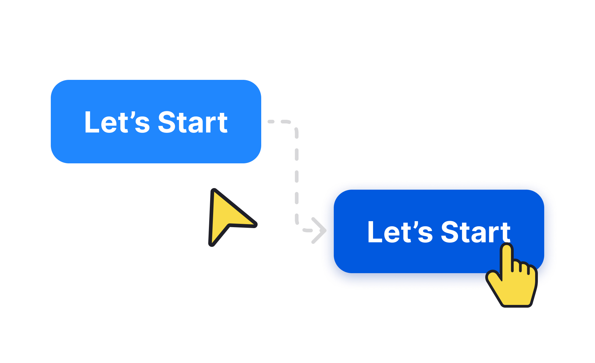
They provide instant feedback that reassures users their actions are working. Without them, interfaces feel unresponsive and confusing. For example, a toggle switch that animates smoothly makes the change feel acknowledged.
Microinteractions also add subtle polish, making the product feel thoughtful and reliable.
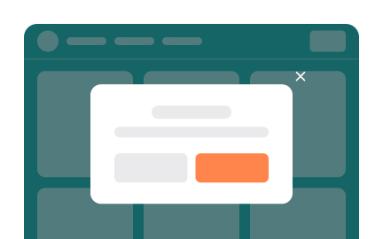
By signaling progress, completion, or error states, microinteractions keep users informed. A typing indicator in messaging apps, for example, confirms that a response is coming. This reduces uncertainty and builds confidence in the system.
Clear feedback moments prevent confusion and reduce abandonment during tasks.
Yes. Small details like playful animations or sound cues create emotional connections. While not necessary for functionality, they often turn ordinary interactions into memorable ones.
This sense of delight can improve retention and differentiate a product from competitors.
They should not rely solely on color or motion. Adding text labels, haptic feedback, or sound alternatives ensures inclusivity. For example, an error state should include both color and a message to avoid excluding users with visual impairments.
Inclusive microinteractions expand usability for diverse audiences.
Microinteractions should always serve a purpose. If every action is animated or every notification vibrates, the product becomes distracting. The best approach is restraint: use microinteractions for critical feedback and subtle enhancements.
This balance ensures they elevate the experience rather than overwhelm it.
Recommended resources
Courses

UX Design Foundations


UI Components I


Design Terminology

Lessons

Design Workflow

Design Principles of Apple Platforms

Microinteractions in UX/UI Design

Projects

RetroPlum - Skeuomorphic Style Button Kit


UI design / protein e-commerce


Interactive Hover