Common Design Concepts
Learn the basic concepts of design that you should be familiar with as a designer
The design world is complex and has many terms and design concepts. Not all designers — not to mention non-designers — are familiar with all of them.
Is dark mode a bad thing? What do clients mean by saying, "Make it pop!"? What is the difference between animation and microinteraction?
This knowledge will improve your communication with designers, clients, and other team members. Also, you'll never embarrass yourself by saying that there's no difference between UI and UX.
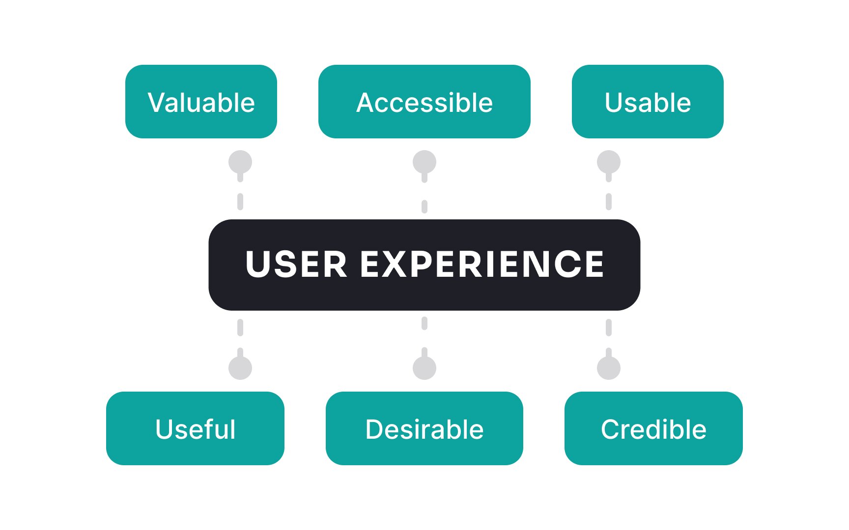
User experience or
It's also important to distinguish the total user experience from the
A
Essentially, the UI is not just about what users see but also how they interact with an application, making it a critical aspect of software design that directly influences user satisfaction and engagement.
Human-centered design is a practice where designers focus on the product users' human needs. Instead of concentrating on profits or aesthetics, this approach puts real people at the center of the development process.
For example, when adding a function to the product, the goal is to make it helpful for users instead of making it look pretty or maximizing conversion. Doing so results in superior products that resonate with their target audiences.
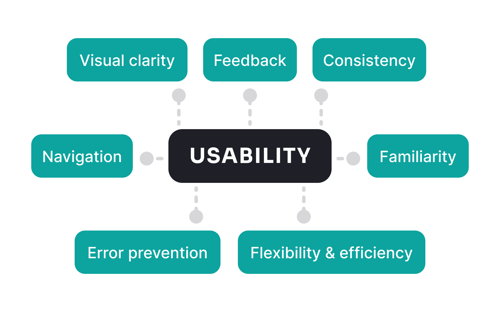
Usability is a quality attribute that assesses how easy an interface is to use. The word "usability" also is used to denote methods for making a product more customer-friendly.
Usability can be described with 5 components:
- Learnability: the product should be easy to learn so users can achieve their goals
- Efficiency: once users learn an interface, they should have no trouble performing tasks quickly
- Memorability: if users don't use a product for a while, they should be able to remember it effortlessly
- Errors: the product should prevent users from making errors or help them recover from them quickly
- Satisfaction: the
interaction with a product should bring joy and pleasure to users[2]
Usability is a necessary condition for the survival of any digital product. If a website is difficult to use or the app crashes, people leave — poor usability directly results in losing your users to competitors.
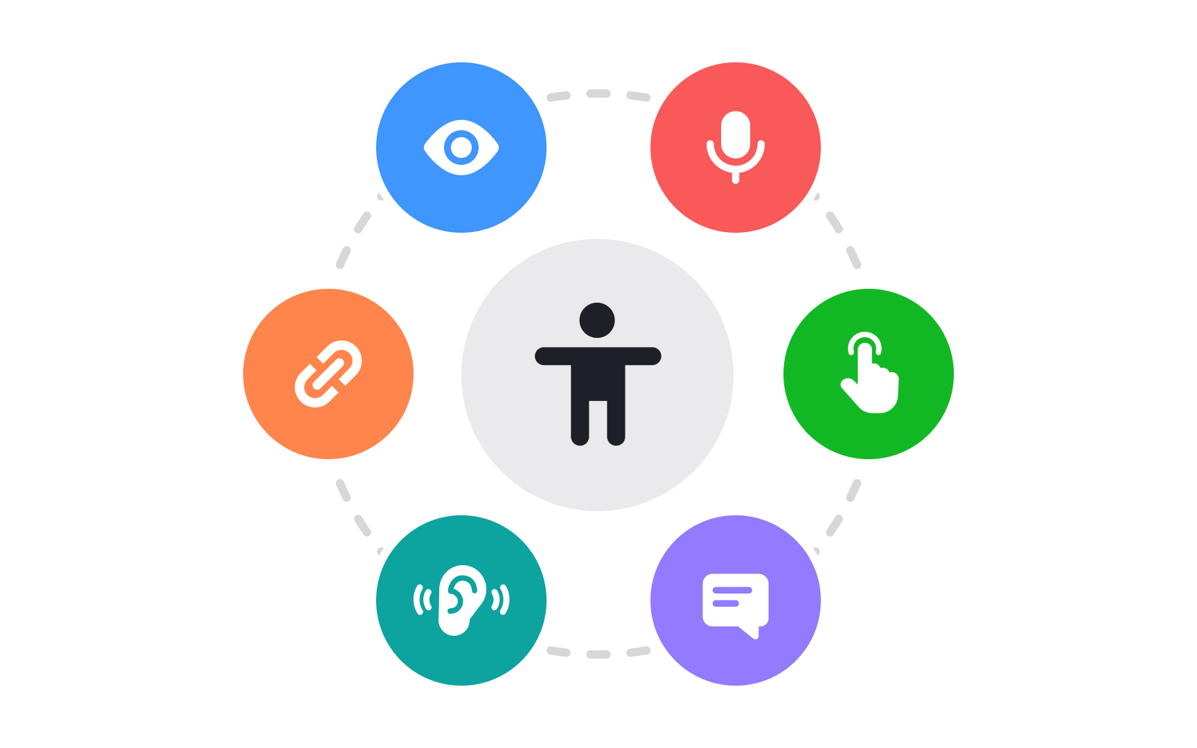
Accessibility in design means designing products for all so people with disabilities can also equally perceive, understand, navigate, and interact with websites and tools. At the same time, improving the
Making your digital product more accessible can seem intimidating at first. However, there are understandable guidelines to help you do it.
While microinteractions play a crucial role in enhancing
Pro Tip: Microinteractions can be a great help in preventing errors and communicating your brand personality.
Animations play an important role in:
- Representing a
brand - Providing feedback on what's happening in the system
- Indicating status
- Educating people on how to use a certain feature[4]
The benefits of dark mode extend beyond aesthetic preferences. It's not only easier on the eyes, especially in low-light conditions, but it also offers potential benefits like increased battery life on OLED screens. Additionally, the contrast can make text more readable, improving
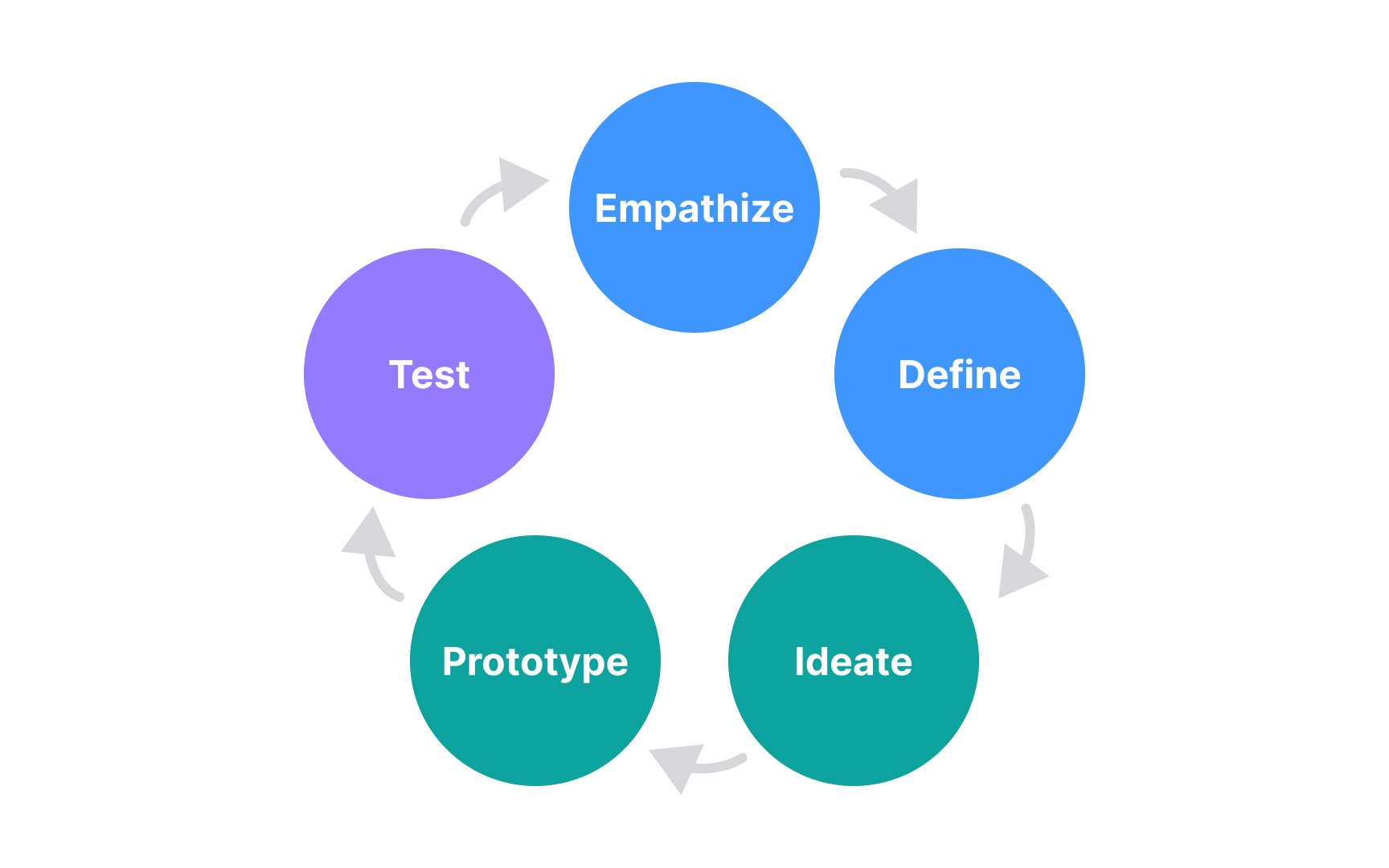
Design thinking ideology is based on the idea that a user-centric approach is the key component of innovation, success, and competitiveness.
The process of design thinking comprises 6 stages:
- Empathize: at this stage, you conduct
user research and explore users' needs - Define: analyze the collected research data and gain insights into users' problems
- Ideate: brainstorm with your team the craziest ideas about how users' problems can be solved
- Prototype: visualize your ideas using paper or digital mockups to evaluate what hypothesis will work and which don't
- Test: return to your users to gain their feedback on your prototypes and explore whether these solutions can help them achieve their goals
- Implement: transform prototypes into real features or products
The design thinking approach isn't a linear but a cyclical process. It's common to come back to phases of empathy and problem definition after you test your ideas or test your ideas and get back to prototyping.[5]
Affordances refer to the cues or signals an interface element gives to indicate its functionality or interactivity. Essentially, affordances help users understand what actions they can take without having to think too much. For example, a
In the digital world, affordances are crucial because they guide users' behavior and make navigation more intuitive. Poor affordances can lead to confusion and frustration, while good ones make for a seamless, enjoyable experience. Overall, affordances bridge the gap between design intention and user expectations, playing a vital role in
Flat design is a minimalist design approach that focuses on simplicity and clarity. It eliminates embellishments like
However, this doesn't mean flat design is purely aesthetic; it aims to enhance
References
- Usability 101: Introduction to Usability | Nielsen Norman Group
- Accessibility, Usability, and Inclusion | Web Accessibility Initiative (WAI)
- Material Design | Material Design
- Design Thinking 101 | Nielsen Norman Group
Top contributors


Topics
From Course

Share


Similar lessons

What is UX Design?

Design Disciplines
