Design Workflow
Explore the design workflow, a systematic approach to the design process that involves various stages and activities
The design workflow is a non-linear multifaceted process that involves cooperation with team members, user research practices, churning out, testing, refining, throwing away dozens of ideas, sketching, wireframing, and other essential activities. Sometimes, you may even turn out to be the only designer on a project to handle such an enormous scope of tasks. Don't panic, though.
Your design workflow may include more or less 10 steps, the amount of prominent activities is up to you. The only thing to worry about is that they lead you from initial conception to realization.

The first stage of any product is communication. Initiate discussions with your clients to ideate — to stimulate the brain thinking and define what product you're going to implement. Take all information provided by stakeholders, including marketing research and their business goals. If it's not enough or you have time and resources, conduct your own
All ideas start on paper — make sure to have a pen handy to visualize your ideas. Don't think of color, typography, media, or features. Sketches shouldn't focus on the details. Instead, they focus on the big picture — it's the skeleton of what's to come. Don't get attached to your ideas on sketches. Instead, use them to ignite discussions, communicate, and find the best solution.
Pro Tip: Create quick and cheap sketches to get immediate feedback, test ideas, discard them, and repeat.
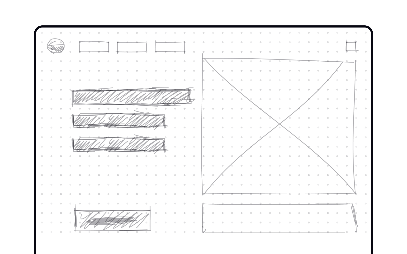
Okay, now's the time to get your hands clean — let's put down the pen and pick up a computer! This is the time to start putting together a digital visualization. Without being distracted by fancy
Pro Tip: We recommend creating a color palette of 6 grey tones to help speed up your mockup workflow.
Now, with your barebone mockup in hand, you can define the grid. It's essential to carefully consider your grid at this point, as it'll help speed up your workflow further down the line. Depending on the
Pro Tip: More columns mean more complexity. If you strive for simple solutions, stick to simpler grids.
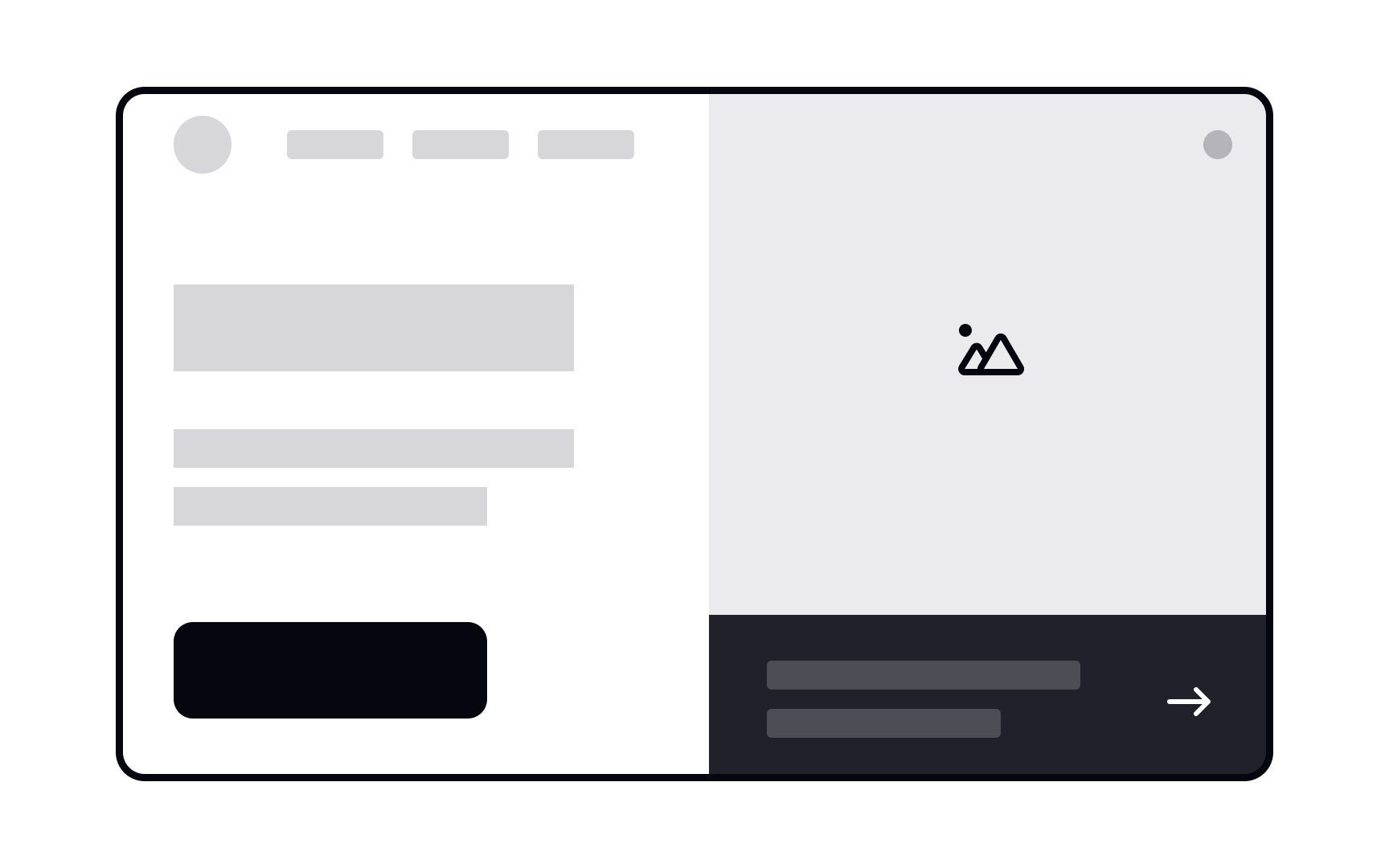
A wireframe is a simplified version of your future product. Its level of detail and interactivity is up to you, but remember that we create wireframes for testing ideas and insights. You can use some basic drag&drop software for drawing the
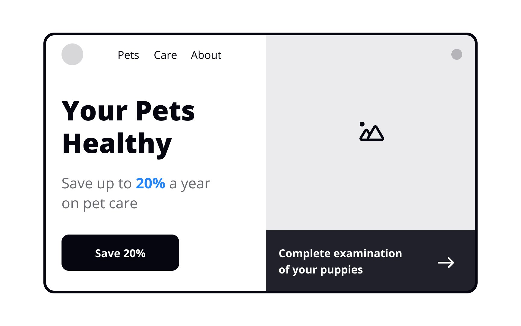
Keep it simple and informative, gradually replacing placeholders and dummy text with actual or more or less realistic
Once you've done a couple of rounds of
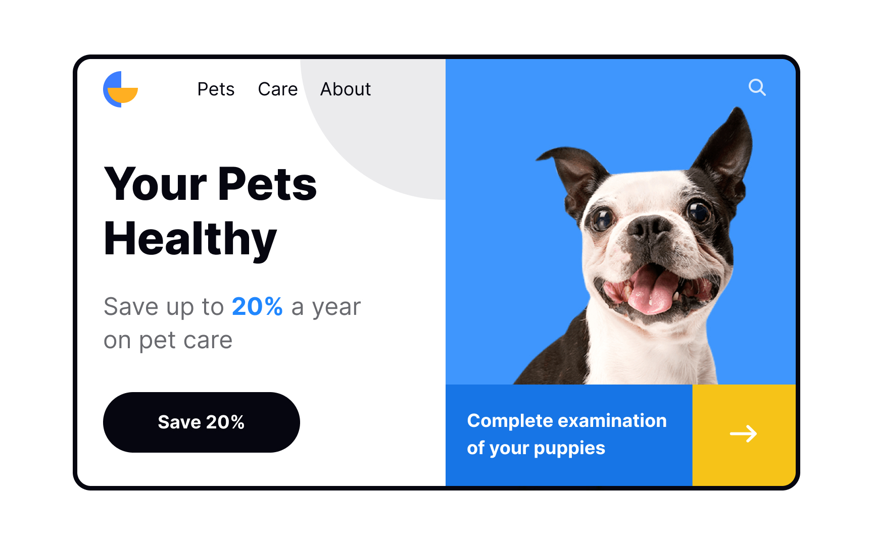
At this stage, you can start thinking of the aesthetics of a product. One of the components of visual design is
We know how your head goes spinning when it comes to this subject — there are so many choices! There are also plenty of aspects to consider. Start selecting the legible
Pro Tip: Feel free to select more than one typeface. One for headlines and another for body text.
Once the
What does a style guide usually contain? Generally, it consists of branding guidelines (logo usage, typography, color palette, brand principles) and a pattern library that describes basic UI components, including
Successful usage of microinteractions not only enhances the user experience but also helps users accomplish their goals.
Microinteractions let users know what is happening in the system and provide feedback, often helping them prevent errors. Simply put, users should clearly see what they can click, tap, or swipe and view the response on their actions. Examples include pull-to-refresh animation or a validation message on wrong data input.[1]
With the help of tools like Invision, Figma, or Marvelapp, you can add simple microinteractions to your designs and visualize how users will interact with your product.
Pro Tip: Use microinteractions to enhance the general user experience and brand personality.
When the first
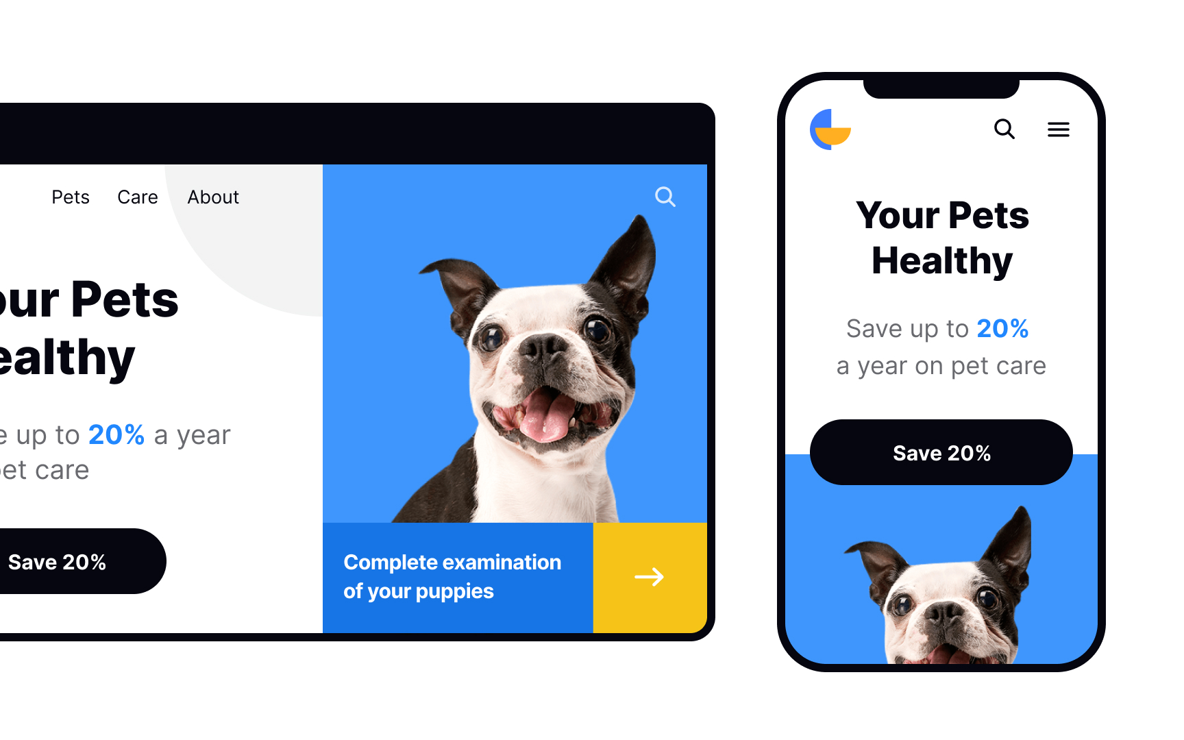
The days are long gone when users accessed your website from only one device — that's all water under the bridge. Nowadays, users jump between multiple devices to complete even one task. As designers — no wait, as product people — we should take responsive design seriously. Initially, it takes a lot of time, but once you've established the rules and breakpoints, the execution will be smooth as butter.
When designing a website, aim for at least 3 types of screens: desktop, mobile, and tablet. Always consider the product's
Pro Tip: Don't forget to adapt grids for mobile screens — they are limited in space and require a different approach.
References
- Microinteractions in User Experience | Nielsen Norman Group
- Maintain Consistency and Adhere to Standards (Usability Heuristic #4) | Nielsen Norman Group
Top contributors


Topics
From Course

Share


Similar lessons

Intro to Wireframing

Wireframe Fidelity
