Design Principles of Apple Platforms
Master Apple's core design principles to create intuitive and platform-native experiences.
Ever notice how every Apple app feels instantly familiar, even when it's your first time using it? This isn't magic — it's the result of carefully crafted design principles that have evolved since the first Macintosh. These principles go beyond simple guidelines, shaping how millions interact with technology daily. From the satisfying bounce of the iOS scroll to the subtle transparency of macOS windows, each detail serves a purpose.
The principles guide when to use familiar patterns and when to innovate, how to make complex tasks feel effortless, and why certain design choices resonate with users while others fall flat. They're the difference between an app that merely works and one that feels genuinely Apple-like. These foundational ideas have influenced not just Apple's ecosystem, but modern digital design as a whole, setting standards for what users expect from high-quality interfaces.
Clear interfaces help users focus on their tasks without distracting visual noise. Apple achieves clarity through the intentional use of color, typography, and white space. SF Pro and SF Symbols provide a consistent visual language that guides users naturally through interfaces. High-contrast text, sufficient touch targets, and purposeful information hierarchy ensure content remains legible and actionable.
Apple's interfaces minimize decorative elements that don't serve a functional purpose. This approach helps users quickly understand what they can do and how to do it. Every visual element in Apple's interfaces serves a clear purpose. System-wide gestures, animations, and interactions maintain predictable behaviors that users can rely on. When designing new features, clarity means choosing familiar patterns over novelty when they better serve user needs.[1]
Pro Tip: Before adding a new visual element to your interface, ask yourself: "Does this help users understand or accomplish something?" If not, consider removing it.
Every design decision in Apple's interfaces serves a clear purpose — from the subtle haptic feedback when setting an alarm to the dynamic island's smooth transitions. These intentional choices create interfaces that aren't just aesthetically pleasing but help users achieve their goals efficiently. Purpose-driven design starts with understanding user needs and context. When users open Weather, they immediately see current conditions through visual metaphors that match real-world weather.
Designing with intention means questioning each element's role in the user experience. The Focus feature demonstrates this through its minimal interface that removes distractions while keeping essential functions accessible. Even simple choices like button placement follow a purpose — frequently used actions stay within easy thumb reach on
Pro Tip: When making design decisions, write down the specific user problem each interface element solves. If you can't identify a clear purpose, reconsider its inclusion.
Depth in Apple's interfaces creates a meaningful spatial relationship between elements. The subtle shadows behind notification cards, translucent materials in the Control Center, and layers in Stage Manager help users understand how interface elements relate to each other and their current context. Visual hierarchy guides users through
Each layer of depth serves as a visual cue about the element's importance and interactivity. When users pull down a notification, its shadow grows to indicate temporary prominence over other content. Motion reinforces these depth relationships. When opening an app, it scales up from its icon location, maintaining spatial continuity.
Pro Tip: Use no more than 3 levels of depth in your interface. Each level should represent a clear relationship — content, controls, and temporary overlays.
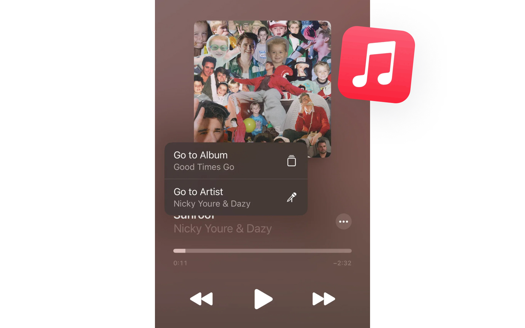
Apple Music's now playing screen exemplifies this — album artwork dominates the view while playback controls remain easily accessible but visually subtle. The controls use translucent backgrounds and minimal contrast, appearing when needed without overshadowing the artwork. The background
Pro Tip: When designing controls, ask yourself: "Can this be more subtle without losing clarity?" If yes, simplify until only essential visual elements remain.
Aesthetic integrity means aligning visual design with app functionality. Visual elements shouldn't just look good. They should enhance the app's purpose and help users understand its function at a glance. Every design choice should strengthen the app's core functionality rather than distract from it. An app's appearance should reflect its role. Professional apps like Pages use refined
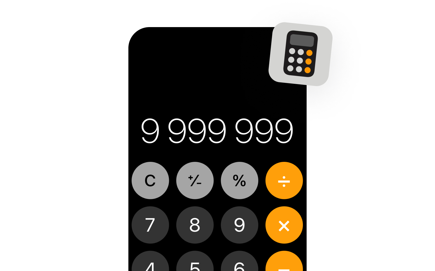
The Calculator app has a simple interface that reflects its straightforward purpose, using a clear
Pro Tip: Consider your app's primary function. Would a user understand what your app does just by looking at its main screen? If not, revisit your visual choices.
Direct manipulation lets users interact with
These responses provide clear feedback that helps users understand the results of their actions. Physical metaphors guide interface behavior but shouldn't slavishly copy real objects. Instead, they enhance digital interactions with familiar patterns. When adjusting the volume or screen brightness in the Control Center, the slider gives subtle vibration feedback. Lists bounce gently when you reach the end of scrolling, showing you've hit the boundary without stopping abruptly.
Pro Tip: When designing gestures, follow the principle of effort matching result — small gestures for frequent actions, larger ones for significant changes.
Every action in
These subtle cues help users discover features naturally through the interface design. Good feedback should match the action's importance. A wrong passcode attempt triggers a prominent device shake to signal a critical error. These clear responses create a hierarchy of feedback that helps users build a mental model of the interface and understand the weight of their actions.
Pro Tip: Match feedback to user expectations — bigger actions deserve more noticeable feedback, while frequent actions need only subtle confirmation.
Consistency creates predictable experiences across Apple's ecosystem. Common actions maintain their behavior — sharing works the same way in Photos, Safari, or Notes. System-wide patterns like swipe
A sidebar that users access through a button on an iPhone might be permanently visible on an iPad. The share menu displays more options on macOS but keeps the same familiar organization and iconography across devices. Consistent experiences don't mean identical ones. Each platform respects its unique characteristics while maintaining familiar elements. Settings are always found in the same place, but their layout adjusts to take advantage of each device's screen size and
Pro Tip: Before creating a custom interaction, check if a standard system pattern could work. Users already know how system patterns work.
Apple uses familiar metaphors to make digital
The metaphor provides a foundation for understanding without limiting functionality. Digital metaphors should feel natural without being overly literal. Instead of copying a physical book's page-turning
Pro Tip: Choose metaphors that explain core functionality quickly. Avoid forcing physical-world behaviors that don't serve your digital interface.
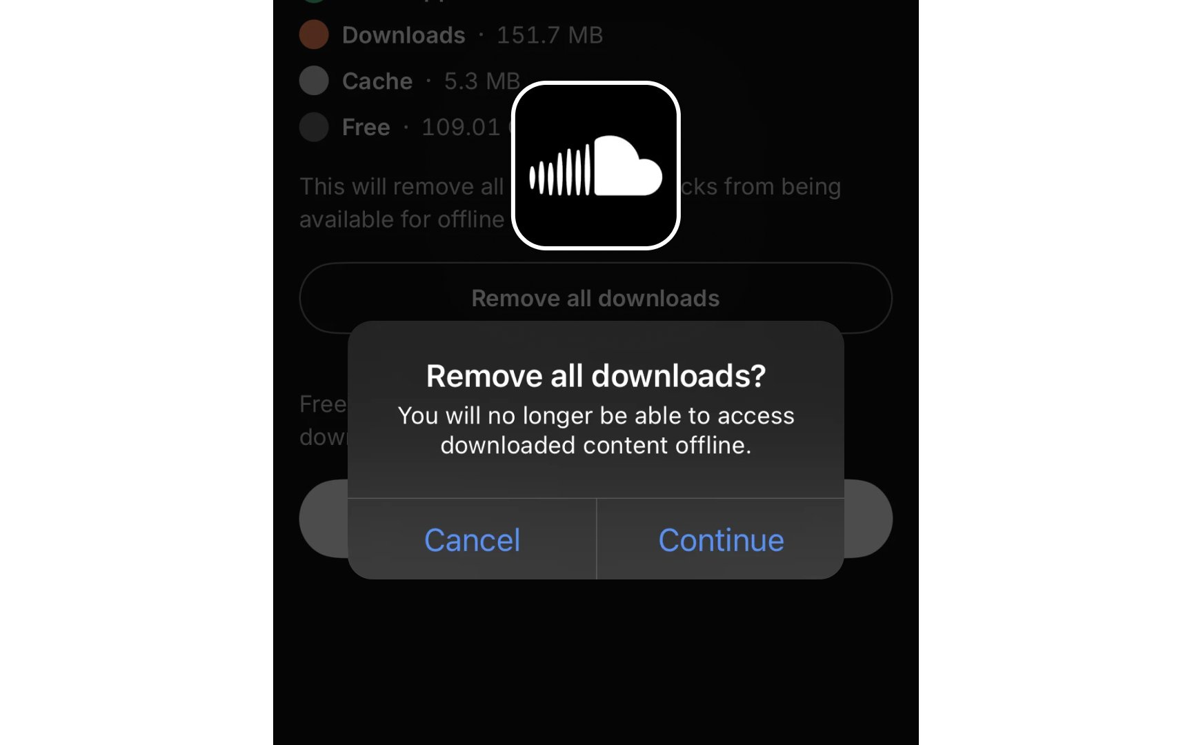
Users should always feel in control of their experience.
Apps should avoid making assumptions — let users choose when to update, save changes, or share
Pro Tip: Give users a safety net. Confirm destructive actions and provide a clear way to undo recent changes.
References
- Foundations | Apple Developer Documentation | Apple Developer Documentation
- Design for spatial user interfaces - WWDC23 - Videos - Apple Developer | Apple Developer
- The Aesthetic-Usability Effect | Nielsen Norman Group
- User Control and Freedom (Usability Heuristic #3) | Nielsen Norman Group
Top contributors

Topics
From Course

Images provided by

Share


Similar lessons

Designing for Mobile Interfaces

Responsive vs. Adaptive Design
